1875 Scott 22b 1pi vermilion
Perf 12 1/2 Rough
Blurred Impressions, Thinner paper
Color: Scarlet to Vermilion (shades)
All 1875 printings are Typographed
Into the Deep Blue
This blog post will look at the 20 Paras and 1 Piaster denominations for the 1872 and 1875 printings.
These denominations are the only ones within the 1872 issue that were printed both lithographically and with typography. For the collector, the lithographic stamps are rarer (20 Paras: $65-$80 vs $4.75-$22; 1 Piaster: $20-$50 vs $2.25-$4). That means it is much more difficult to find them. And then, when one is on sale, is it in fact a lithographic specimen? (Dealers and collectors are terrible at this: many purported Litho specimens are in fact Typo.) Reality is, if I have a specimen I think is Litho, even with all the knowledge shared in this post, I would need to send for a Cert to feel absolutely comfortable.
But, comparing the more common typographic specimen printings of 1872 and 1875, is there a surprising pearl of advice I can give at the outset that will separate them out nicely?
Yes! Color!
The typographed 20 Paras for 1872 are Prussian blue, while the 1875 examples are commonly slate-blue to grey-blue.
The typographed 1 Piaster for 1872 is rose red to deep rose red, while the 1875 examples are scarlet to vermilion (shades).
That is enough of a color difference so one can almost always place the stamp into the correct printing based on color alone. (Of course, recommendation is to also check other confirming signs.)
(Now, for color, the 1872 lithographic stamps versus the 1872 typographic stamps is a different kettle of fish ( more color possibilities for lithographic stamps), and we will get to that further along the blog post.)
By the way, the postal authorities did not plan in an intentional way to change the colors of the 1875 printing compared to the colors of the 1872 printing. It just happened to some stamps. The happy result is, for the 10 Paras, 20 Paras, and 1 Piaster stamps, there is enough color drift found within the 1875 printings compared to the original 1872, that this can be used to place the stamp into the correct printing.
Before we get started in detail on the 20 Paras and 1 Piaster differences, if you haven't done so, I recommend reading the prior blog post in this series to get you up to speed.
What are the differences between the 1872 and 1874-75 stamps for Egypt?
1972 Scott 21 20pa blue
Perf 12 1/2 X 13 1/3 clean cut
Clear Impressions, Thick Opaque paper
Color: Prussian Blue
Peter A.S. Smith (Egypt- Stamps and Postal History- A philatelic History 1999) states that the 20 Paras stamp is the most complicated of the issues. He has a number of pages detailing plate flaws and other details. For instance, there was a Stone A and a Stone B. The bottom frameline is partially split with Stone A, while the frameline was redrawn for Stone B.
I should mention that, for both the 20 Paras and the 1 Piaster, the lithographic stones were made from transfers from the typographic plate. So flaws on the Typos can be matched with their Lithographic counterparts. Consequently, there is basically no difference between a typographic stamp and a lithographic stamp, except for the process itself (The Litho process, and what it does to the stamp vs the Typo process and what it does to the stamp).
Production was 440,000 stamps (2200 sheets) for the 1872 20pa stamps.
The 20pa denomination served no particular postal rate, but often paid fees for postal orders With the formation of the UPU in 1874, it paid the foreign rate for printed matter up to 50g.
1972 Scott 21 20pa blue, Example 2
Perf 12 1/2 X 13 1/3 clean cut
Clear Impressions, Thick Opaque paper
Color: Prussian Blue
The Prussian blue color is so distinctive for the 1872 issue, that there should be little worry in placing these stamps correctly. Once more, the 12 1/2 X 13 1/3 Perf (Scott 21 CV $4.75 used) and the 13 1/3 Perf (Scott 21a CV $22 used) are unique for the 1872 20pa stamps.
The worry is, that one would like to know if the 20pa stamps one has are Typo or Litho..
1872 Scott 21m 20pa blue
Perf 12 1/2 X 13 1/3
Lithographed, Stone B
APEX Cert (not my stamp)
OK, what I did was raid the APEX site (APS web site), and download (for educational purposes) image scans of the 20pa and 1pi lithographic stamps. I needed Cert examples to make sure I wasn't leading you and I astray. (If I get Cert examples for myself in the future, I will add them to this post.)
Lithographic impressions are described as "flat", as the stones have a smooth surface. The ink is evenly spread. Typographic impression may show a more heavily inked border. (I've done discussions about Litho/Typo differences in the past, so I am not going to get into an extended discussion - read the intro to catalogs for more information.)
Stone B lithographs are evident because of the redrawn (filled in) lower frameline (see above example). Turns out many Litho stamps are Stone B stamps (not all). The lower framelines have uniform thickness, in some cases showing slight extensions at the corners.
Another feature is color: If "Indigo" or "Light or Pale or Milky Blue" (Colors only found with 20pa lithographs), then probably a Litho stamp. Unfortunately, the common color Prussian blue also appears with both Typo and Litho stamps- in fact the majority of Litho stamps are "Prussian blue".
It is also thought the majority of lithographic 20 Paras stamps were actually produced first (A small consignment went out December, 1871 (Went on sale January 1, 1872)). The bulk of the order (6,790,000 stamps) was delivered in March. According to Dr. Byam (Egypt specialist), in a 1948 report, he saw no 20pa typographs postmarked prior to April 6, 1872. I'm not sure this is still an absolute date, but clearly there should be very few (perhaps none?) 20pa typographic stamps found between January 1, 1872 and April 6, 1872.
1875 Scott 21b 20pa gray blue
Perf 12 1/2 Rough
Blurred Impressions, Thinner paper
Color: Slate-blue to grey-blue and (Rare-azure (light sky blue))
All 1874-75 printings are Typographic
Here is our first 1875 20pa stamp- note the distinctive color difference. - more gray than blue. The Perf is 12 11/2 rough, which is unique to the 1875 printings. The image is definitely blurred also.
Note that the 1875 printing was from new plates from the original dies used for the 1872 issue.
The first date cancellation was Feb 4, 1875. If a postmark is earlier, should be a 1872 printing. (But, if a postmark is later, could be either a 1872 or 1875 printing.) Production was 1,300,000 stamps (6500 sheets). CV for Scott 21b is $4/$105 used/unused.
1875 Scott 21b 20pa gray blue, Example 2
Perf 12 1/2 Rough
Blurred Impressions, Thinner paper
Common Color: Slate-blue to grey-blue
Note the stamp appearance is sometimes described as "oily". According to Smith, the thinner paper used for the 1874-75 issue may have a bearing on the oily, translucent appearance of a large proportion of the stamps.
1875 Scott 21c 20pa gray blue
Perf 13 1/3 X 12 1/2 Rough
Blurred impressions, Thinner Paper
Common Color: Slate-blue to grey-blue
Scott 21c has Perf 13 1/3 X 12 1/2, and is unique to the 1875 printings. CV is $3.75/ $11.
1872 Scott 22 1pi rose red
Perf 12 1/2 X 13 1/3 clean cut
Clear impressions, Thick Opaque Paper
Color (typographed): rose red to deep rose red
The rose red to deep rose red are the usual colors found for the 1pi denomination during the 1872 printing. The Scott 22 has the 12 1/2 X 13 1/3 perfs, which confirms this is a 1872 issue. The perfs, although blunted, look clean cut. The upper horizontal panel with Arabic inscriptions does not show the fine background scrollwork (basically shows a solid background), which would argue this is a later printing with a worn plate. This stamp, without the fine scrollwork, is, no doubt, a typographed stamp.
1872 Scott 22m 1 pi rose red, Lithographed
13 1/3, Clear Impressions
Color: carmine-red? (lithograph only)
APEX certificate (not my stamp)
Well, the 1872 1pi, if it is a lithographic stamp, can also come in a rose-red to deep rose red color. And, unique to the lithographic stamp, it can also be found in a deep carmine red.
I borrowed some images (for educational purposes) from the APEX site (APS web site), and this shows a carmine red? color 1pi stamp that is lithographed, according to the Cert. It does have a clear impression, and a clear cut 12 1/2 X 13 1/3 Perf, which would make this stamp a Scott 22m (CV $20/$550 used/unused). The upper horizontal panel with the Arabic inscriptions show a hint of the fine scrollwork, but not much. Perhaps this a a later printing? Although this has a Cert, and indeed has a clear central impression, and perhaps the right color (carmine red?), I prefer that a lithographic 1pi stamp also show fine scroll work, just to make sure. ;-)
1872 Scott 22m 1 pi rose red, Lithographed
12 1/2 X 13 1/3, Clear Impressions
Color: rose-red (glossy)?
APEX certificate (not my stamp)
Well, this lithographic stamp (according to the Cert) does show more of the fine scrollwork in the upper panel. It is labeled as a Scott 22m (as is the stamp before). I think the color is more of a red-rose-red.
Smith states "The ink of the lithographs is slightly glossy compared to the softer texture of the typos". This stamp (to me) does seem a bit glossy.
1872 Scott 22n 1 pi rose red, Lithographed
13 1/3, Clear Impressions
Color: carmine-red? (lithograph only)
APEX certificate (not my stamp)
This is a Lithographic Scott 22n (Perf 13 1/3): CV $50/$875.
872 Scott 22m 1 pi rose red, Lithographed
Close-up: Fine scrolling in upper panel
APEX certificate (Not my stamp)
This is the fine scrollwork, which frankly one want to see in a 1pi lithographic stamp.
This is important , so I am including Smith's paragraph on this: "On the 1pi, the background of the top panel consists of fine scrollwork. The lithographs show this more or less clearly, whereas all but the very earliest impressions from typographic plates have a nearly solid background. This feature is a consequence of the fine lines becoming filled with ink crusts. In extreme cases many other thin white areas are filled in also. A blotted impression is thus a sure sign of a typograph, and a sharp clean impression is highly likely (but not certainly) to be a lithograph. "
1872 Scott 22 or 22m? 1pi rose red
Typographic or Lithographic?
Perf 12 1/2 X 13 1/3 clean cut
Clear impressions, Thick opaque paper
Color: Rose-red shade?
O.K., how about some more of my own 1872 1pi stamps? : Let's play a game: Typographic or Lithographic?
This is a rose red color to me, which can be found with either typographic or lithographic stamps.
The fine upper panel scroll work is definitely present. So, this stamp is either lithographic or very early typographic when the plates were fresh.
I see no clear squeezing of ink as seen with a typographic stamp.
This is a fine looking stamp with very clear impressions. CV is $20 used if lithographic Scott 22m. If Scott 22m, it is the most common of the lithographic varieties.
Once more, it has a postmark (Feb 21?, 1872), which is very early. This could be a lithographic, or perhaps a very early typographic stamp with a very clear impression.
So what do you think?
I think there is enough evidence to at least consider sending in for a Cert.
1872 Scott 22 or 22m? 1pi rose red
Typographic or Lithographic?
Perf 12 1/2 X 13 1/3 clean cut
Clear impressions, Thick opaque paper
Color: Deep red shade?
This stamp also has excellent fine scroll work for the upper horizontal frame, but I'm bothered by the blotchiness of the frame lines.
What do you think?
My inclination is to think this is an early Typographic print - 1872 Scott 22 (CV $2.25/$$72.50).
By the way, the 1pi was the only die constructed as a single unit. For all the other denominations, the dies consisted of the central part common to them all, and a separate die for the denomination panels and a part of the frame. They were put together, and locked in a frame for the casting step.
1872 Scott 22a or 22n? 1pi rose red
Typographic or Lithographic?
Perf 13 1/3 clean cut
Clear impressions, Thick opaque paper
Color: rose-red (glossy)? (Not my stamp)
This last example I borrowed from the internet (for educational purposes). The collector wanted to know if this was a lithographic specimen, and then decided it was. It does have fine scroll work with a very clear impression. I see no ink squeezing.
I think the collector was right. ;-) If so, this is 1872 Scott 22n (CV $540/$850).
1875 Scott 22b 1pi vermilion
Perf 12 1/2 Rough
Blurred Impressions, Thinner paper (Oily appearance)
Color: Scarlet to Vermilion (shades)
All 1875 printings are Typographed
Well, we finally reached the 1875 1pi printing. The quantity printed was ~ 6,600,000 (33,000 sheets) - large amount!. The first postmark recognized for the 1pi 1875 printing was April 11, 1875.
You might notice that the 1pi denomination was the work-horse of the values, as the 1pi was the letter rate up to 10 grams.
One doesn't have to worry about litho/typo differences with this printing, as all stamps were typographed.
You will note that the 1875 printing differs in color, and should be enough of a difference to place them correctly. Smith does state that some people have difficulty in distinguishing between rose red and vermilion. For myself, I think the difference in color is quite telling.
The above stamp has all the characteristics one would expect for the 1875 issue - in spades. ;-)
CV for Scott 22b is $1.75/$12.
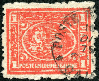
1875 Scott 22b 1pi vermilion, Example 2
Perf 12 1/2 Rough
Blurred Impressions, Thinner paper
Color: Scarlet to Vermilion (shades)
Another example of the 1875 22b 1pi vermilion.
I should mention that the catalogs use different color descriptions for the 1875 printing. Scott has "vermilion", while SG has "red (shades)", and Michel has "brick red". I prefer Scott's description.
Out of the Blue
Well this was fun! I learned a lot, and hope you did too. I must admit I am especially getting a bit more comfortable with the 1pi lithographic/typo differences after this review.
Next up in the 1872 & 1874-75 blog post series is a review of the 2pi, 2 1/2pi and 5pi. They present their own challenges as we shall see.
Comments appreciated!


No comments:
Post a Comment