A is for Aden and Z is for Zanzabar


A is for Aden and Z is for Zanzibar... Now what is between? For the world wide classical era philatelist and stamp collector, a country specific philatelic survey is offered by the blog author, Jim Jackson, with two albums: Big Blue, aka Scott International Part 1 (checklists available), and Deep Blue, aka William Steiner's Stamp Album Web PDF pages. In addition, "Bud" offers commentary and a look at his completely filled Big Blue. Interested? So into the Blues...

Thursday, June 28, 2018

Bermuda - A Closer Look 1936-1951

1936 Scott 106 1p carmine & black
"South Shore"
Into the Deep Blue
As most WW collectors know, the British colonies often provide two pictorial issues: towards the end of the George V reign (early 1930s), and then at the beginning of the George VI reign (1938 into the 1940s). The pictorial scenes are often duplicated with the two issues, but, for Bermuda, they are not.

As the engraved scenes, mixed with the bi-colored presentation, are quite attractive measured against the more usual staid definitive British colony stamps, I am going to present the 1936-1951 Bermudian examples here for everyone's enjoyment (Part B).

Bermuda
The Harbors, and places for ships to disembark:
Hamilton, St. George's and the Royal Naval Dockyard
Part A, the 1865-1934 stamps of Bermuda, is here.

The original blog post for Bermuda and the BB checklist is here.

A Closer Look 1936-1951
4 Farthings = 1 Penny
12 Pence = 1 Shilling
20 Shillings = 1 Pound
1936 Scott 105 1/2p blue green
"Hamilton Harbor"
Fairly late in the game, on April 14, 1936 (after George V had already passed away), a nine stamp engraved pictorial set was released.  Of the six designs, two had an inset portrait of George V.

CV for the nine stamps released in 1936 range from <$1 to $4.

The lowest denomination (1/2p blue green) shows Hamilton Harbor.

Hamilton Harbor
A natural harbor, the port area serves the capital city of Hamilton. Bermuda is surrounded by reefs, and it wasn't until after U.S. Independence ( and the loss of Naval bases along the Atlantic seaboard), that the narrows area was discovered that allowed fairly large ships passage way to Hamilton.

Today, most large cruise ships moor at the (former) Royal Naval Dockyard, and passengers use ferries to get to Hamilton.

1936 Scott 107 1 1/2p chocolate & black
"South Shore"
The south shore of Bermuda is where rocks, sand, and water meet. Pink sand, turquoise water, outlying reefs, and the dark blue of the ocean create an idyllic scene indeed.

Warwick - Long Bay - South Shore
The beach sand is from the remains of shells, corals and clams. On the underside of Bermuda's coral reefs grows the dark red skeletal animals (Foraminifera) that give the sand that pink hue.

1936 Scott 108 2p light blue & black
Yacht "Lucie"
Briggs Cunningham won the Bermuda Gold Cup (Prince Edward VII Gold Cup) on the six meter yacht "Lucie", named after his first wife, Lucie Bedford Cunningham Warren, at the inaugural 1937 match racing event.

1938 Scott 109 2p brown black & turquoise blue
Yacht "Lucie"
The design was used three times! The second iteration, with brown black & turquoise blue, was issued January 20, 1938.

CV for this stamp is a rather high $10+.

1940 Scott 109A 2p red & ultramarine
Yacht "Lucie"
Then on November 8, 1940, a red & ultramarine version was issued.

Lucie is still going strong
"Lucie", the last (and best) six meter, designed by Clinton Crane in 1931, had an outstanding racing record, lasting over seventy-five years. She was restored in 2006, and current owner Matt Brooks of the St. Francis Yacht Club of San Francisco * raced her in the 2011 World Cup in Helsinki (6th of 45 boats). She has placed first in International 6 Metre World Cups ("Classic" division) as recently as
2013.

* My middle daughter's wedding reception was there. Sadly, my only personal link to this iconic yacht club. ;-)

1936 Scott 111 3p carmine & black
"Typical Cottage"
Scott calls the house scene on the 3p carmine & black "Typical Cottage", and no doubt it is, but Stanley Gibbons gives a discrete name: "Point House, Warwick Parish".

Old Style Bermudian Cottage
I couldn't find that particular house, but here is a still standing old style Bermudian cottage.

1936 Scott 112 6p violet & rose lake
"Scene at Par-la-Ville"
What a lovely scene indeed! Doesn't it evoke a quieter time? Actually Stanley Gibbons labels this "Gardener's Cottage, Par-la-Ville, Hamilton". Par-la-Ville was an area of Hamilton with a large park, now renamed Queen Elizabeth park to mark the Diamond Jubilee.

1936 Scott 113 1sh deep green
"Grape Bay" (Paget Parish)
"Grape Bay" is  a particular lovely pink sand beach area on the south shore, south of Hamilton.

Grape Bay Beach
Although the beach itself is part of the public seashore, it is difficult to get there now, because of private properties limiting access. I'm sure it was much more accessible in 1936 when the stamp was issued. ;-)

1938 Scott 118 1p red & black
"Hamilton Harbor"
Between 1938-1945, a new pictorial eight stamp series with George VI was issued.

CV is <$1 to $2+.

There were four designs, three of them new. The "Grape Bay" design, from the 1936-40 George V pictorials, was reused.

"Hamilton Harbor", on the 1p and 1 1/2p stamps, shows a new scene of the harbor.

1938 Scott 119 1 1/2p violet brown & blue
"Hamilton Harbor"
If one follows the Stanley Gibbons, the above stamp is parsed into three shades and dates.

SG 111 January 20, 1938 1 1/2p deep blue and purple brown
SG 111a March, 1943 1 1/2p blue and brown
SG 111b September, 1945 1 1/2p light blue and purple brown

I don't put much credence in stamp shades in general, as often stamps can show shades that have more to do with environment (changelings).

But if a stamp shade is clearly linked to an issue date (as the SG does), then game on!

1938 Scott 121 3p carmine & black
"St. David's Lighthouse"
There are two famous "tourist attraction" lighthouses in Bermuda: St. Davids (1879) on St. Davis's island, and Gibbs Hill (1846) on the main island.

St. David's Lighthouse
St. David's Lighthouse for many years has a red band day mark half way up the tower, but the lighthouse, built with local limestone, was originally painted white.

1941 Scott 121D 7 1/2p yellow green, blue & black
"Bermudian Water Scene and Yellow-billed Tropic Bird"
Lovely, lovely stamp! This is the scene that convinced me to do a blog post on the Bermudian pictorials!

White-Tailed Tropic Bird (Yellow-billed tropic Bird)
The Yellow-billed Tropic Bird nests in Bermuda about the first of May in holes along the shore line along the high rocky cliffs. Actually, there has been a name change, and it is now known as the White-Tailed Tropic Bird (Phaethon lepturus).

1938 Scott 125 5sh red & green/yellow
"King George VI", Perf 13
Between 1938-1951, the 2 shillings and higher denominations were represented by a large format "George VI" bi-color on colored paper. There were six stamps in the issue.  Revenue cancellations are also found on these stamps. CV is $8+-$70+.

1938 Scott 125 5 Shilling Close-up
Digital Microscope
If one looked carefully at the 5sh stamp, one will notice a fault. Using my digital  microscope, the tear is quite evident.

1942 Scott 121A 3p deep ultramarine & black
"St. David's Lighthouse"
Out of the Blue
It is fun, with these pictorials, to revel in the scenes, and perhaps learn more why they were chosen. This idle dalliance serves as a bit of a "vacation" from the more serious pursuit of philately. !! ;-)

Note: Map and pics appear to be in the public domain.

Comments appreciated!

Monday, June 25, 2018

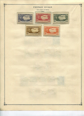
French Sudan - Bud's Big Blue

1882 - "Does anyone have a stamp?"
Bud's Big Blue
Bud's Observations
One might wonder why the French bothered to colonize West Africa. A continuously deteriorating economy, spreading desertification, and ungovernable peoples might have dampened their ambitions. 

It didn’t. 

They wanted West Africa to have European style frontiers with defined borders that separate neighboring colonies; Africans identified with cultural centers which had, if any, fuzzy boundaries. The French wanted to bestow the benefits of European civilization; the Africans were ambivalent about that, sometimes resistant. Neither the French nor the local leaders understood the importance of these differences in territorial negotiations like the one pictured above.

So, none of the ever-changing lines the French drew on West Africa maps worked very well on the ground. 

During BB’s classical era, maps suffered frequent Frankenstein-type surgeries with territories lopped off of or joined to: Niger, Middle Niger, Mauritania, Senegal, Senegambia and Niger, Upper Senegal and Niger, French Guinea, Ivory Coast, Benin, Dahomey, Upper Volta and, of course, French Sudan (first stitched in 1892, cut apart in 1899, then re-stitched in 1920). 

The results: lots of stamps, lots of stamps with overprints, lots of wet paint on post office signage, but not much political coherence.

With the exception of the common designs, all French Sudan stamps depict the Sahara -- camels, caravansaries, and desert life. The one showing the entrance into Djénné, a seat of ancient high culture and prosperity similar to Timbuktu, offers a clue about the persistence of French colonial efforts in the area. Might the romance of recovering lost, great civilizations have been their motivation?

Census: 107 in BB spaces. Two tip-ins, 29 on supplement pages

*Photo source: http://www.stampworldhistory.com/country-profiles-2/africa/french-sudan/

Jim's Observations
French Sudan ( Soudan Français) was a colony that was part of French West Africa. 

The colony first existed from 1890-99. The "Navigation and Commerce" issues were produced for French Sudan during 1894-1900. Then in 1899 the colony was split up and divided between Dahomey, French Guinea, Ivory Coast, Senegal and Senegambia and Niger. From 1906-21, part of the territory was known as  Upper Senegal and Niger.

The colony was reborn in 1921. Issues for French Sudan (under French West Africa administration) were resumed in 1921 with overprinted Upper Senegal and Niger stamps.

French Sudan Blog Post and BB Checklist

Page 1

1a

1b

1c

Page 2

2a

2b

2c

Page 3

3a

3b

3c

Page 4

4a

Page 5

5a

5b

5c

Page 6

6a

Supplements
Page 1

Page 2

Comments appreciated!

Tuesday, June 19, 2018

Bermuda - A Closer Look 1865-1934

1866 Scott 2a 2p bright blue "Victoria"
Perf 14, Wmk 1
Into the Deep Blue
The 2017 Scott Classic 1840-1940 catalogue has, for Bermuda 1865-1949, 147 major descriptions. Of those, 50 are CV <$1-$1+, or 34%. Raising the bar to CV $5, yields 72, or 49%. A representative collection is attainable, but Bermuda is popular with British Commonwealth and North American collectors, so one may need to spend more.

The handstamped/surcharged specimens of 1874-1875 (six stamps) range from CV $300+ to CV $19,000, and needless to say, are more the province of specialists/ well healed collectors - we ordinary WW collector types may need to take a pass. ;-)

There are also the Postmaster stamps of 1848-1861, some of the great rarities in philately (CV $38,000 - $$225,000).

Bermuda
Basic historical information about Bermuda, as well as coverage of Big Blue is available at:

Bermuda Blog Post and BB Checklist

This blog post (Part A) will give close-up views of the stamps issues of 1865-1934.

The following post (Part B) will cover the 1936-1951 pictorials.

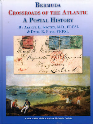
Bermuda: A Postal History
Groten & Pitts; 2017 Publication APS
If the reader would like to further pursue Bermudan philatelic history, especially the 17th to early 19th century postal history, may I suggest the above publication, recently available from APS? Fascinating.

More information about the stamps of Bermuda are available at:
http://www.bermudacollectorssociety.com/

A closer look at the stamps 1865-1934
4 Farthings = 1 Penny
12 Pence = 1 Shilling
20 Shillings = 1 Pound
1874 Scott 5 6p lilac "Victoria"
Perf 14, Wmk 1
The first issue for Bermuda consisted of six denominations released between 1865-1874. The 1p, 6p brown lilac, and the 1sh were issued on September 25, 1865. The 2p (1866), the 3p (1873), and the 6p lilac (1874) were issued later. The 1p rose red was for the internal rate, while the other denominations were for the overseas rate.

The typographic issue is from De La Rue in London, and has the same Victoria portrait on all stamps, accompanied by various frame designs. The watermark is "Crown and C C" (Wmk 1). The usual perforation is 14. There are Perf 14 X 12 1/2 stamps extant for the 3p, 6p, and 1sh, issued between 1882-1903 with a much higher CV.

CV(used) for the 1865-1874 issue range from $1+ for the 1p rose red, to $90 for the 6p brown lilac.

If we could go back in time, what advice we we give for those that saved stamps?  Keep them on the cover! Values for stamps range from 5X to 30X more if they remain on cover for early issues!

1880 Scott 17 4p orange "Victoria"
Wmk 1
In 1880, two additional denominations (1/2p, 4p) were released.

CV is $2+-$5+.

Note here the "Hamilton" (Capital) postmark.

British Colonial and Crown Agent Watermarks
Top Row: Wmk 1 "Crown and C C"
Bottom Row, Left: Wmk 2 "Crown and C A"
Bottom Row, Right: Wmk 3 "Multiple Crown and C A"
For a refresher, here are the first three British Colonial watermarks referenced on this blog post for Bermuda. The Wmk 4 "Multiple Crown and Script C A" is not shown, but should cause little confusion. If you need to see an example of Wmk 4, refer to the Gibraltar post.

1898 Scott 21 2p brown purple "Victoria"
Wmk 2
Between 1883-1904, eight stamps were released on Wmk 2 ("Crown and C A") paper. Some of the stamps were the same color (1p,2p), some were different colors (1/2p, 2p brown purple, 3p, 4p,1sh), and there was one new denomination and design (2 1/2p ultramarine).

CV is <$1-$10+ for six stamps.

1901 Scott 26 1f on 1sh gray "Victoria'
Black Surcharge
On January 11, 1901, a one shilling stamp was released with a black "One Farthing" surcharge. The stamp design and watermark (Wmk 2) were similar to the 1893 one shilling release, but the color was changed from olive bister to gray.

CV is $1+.
1906 Scott 37 2 1/2p blue & brown "Dry Dock"
Wmk 3 "Multiple Crown and C A"
In 1902-03 (three stamps - Wmk 2) and in 1906-10 (nine stamps- Wmk 3), a mostly bi-colored typographed issue was released featuring a "Dry Dock" design.

These were the first stamps of the British Empire that did not show the monarch's portrait (in this case, Edward VII).

CV is <$1-$4+ for eight stamps.
Bermuda Floating Dock under construction in England
Towed to Bermuda in 1869 

The Royal Navy Floating Drydock "Bermuda" 
at the Royal Navy Dockyard, 1869 
Of interest, the porous limestone of Bermuda prevented a conventional drydock, so a floating drydock was constructed in England and towed to Bermuda in 1869.

1913 Scott 45 3p violet/yellow "Caravel"
Wmk 3
Between 1910-1924, a nine stamp engraved issue with a "Caravel" design was released on Watermark 3 ("Multiple Crown and C A") paper. In addition, the higher denominations (six stamps) had a large format bi-color "George V" presentation. also on Wmk 3 paper.

CV for the Caravel stamp design issue is <$1-$10+.

The "Caravel" design is considered to be from the Seal of the Colony.

A actual caravel type sailing ship, originally developed and used by the Portuguese, was popular for exploration voyages during the 15th and 16th centuries. Christopher Columbus used caravels.

I'm not sure exactly why the stamps of Bermuda depict  a "caravel", as Bermuda's history is more directly linked to "The Sea Venture", built in Aldeburg, England, as the first single timbered armed merchant ship, and launched in 1609. Her maiden voyage was supposed to be to Jamestown, Virginia.

The Sea-Venture, the flag ship of Virginia Company, was subsequently ship wrecked on Bermuda in 1609. The ship, part of the third supply mission to Jamestown Colony, Virginia, was driven onto the reefs of Discovery Bay in eastern Bermuda. All 150 people landed safely ashore. Thus began the fledgling settlement of Bermuda.

The Sea Venture ship wreck was thought to have been the inspiration for The Tempest, by Shakespeare.

1920 Scott 55 1/4p brown, Wmk 3
"Seal of the Colony and King George V"
In 1920-21, a six stamp (Wmk 3) and a three stamps (Wmk 4) typographed issue was released for the "Tricentenary of Representative Establishment of Institutions", apparently originating in 1620.

The stamp is rather busybody, and, in fact, was designed by an amateur, the Governor of Bermuda, General Sir James Willcocks.

1920 Scott 67 1p rose red, Wmk 4
"Seal of the Colony and King George V"
CV for the six stamps total is <$1-$30+.

1921 Scott 75 2 1/2p ultramarine, Wmk 3
"King George V"
In 1921, an engraved  "George V" design, also commemorating the "Tercentenary of Establishment of (Local) Representative Institutions", was issued with three stamps (Wmk 4, lower denominations) and six stamps (Wmk 3, higher denominations).

1927 Scott 92 1sh black/emerald "Caravel"
Wmk 4
Between 1922-1934, thirteen engraved stamps were issued similar to the 1910-24 Wmk 3 "Caravel"stamps, but on Wmk 4 paper.

I must admit, this is really a lovely classical design - and engraved also!

CV ranges from <$1 to $1+ for ten stamps.

1922 (T I) & 1928 (TIII) 1p carmine "Caravel"
Wmk 4
The one penny carmine actually has three types in the catalogue.

Type I (Scott 83b) was issued in 1922 (CV <$1), Type II (Scott 83a) in 1926 (CV $7+), and Type III (Scott 83) in 1928 (CV <$1).

1p carmine TI & TIII Scroll
Both Scott and Stanley Gibbons mention the Type I and Type II stamps have a scroll at top left that is "very weak". The Type III scroll is redrawn, and the scroll is completed with strong line.

I could not find the area they were talking about for awhile, until I focused on the area of the scroll design over the "B" of BERMUDA. Let's take even a closer look....

Type I (and Type II) Characteristics for top left of Scroll:
Note the top horizontal line of the scroll to the left of the "U shaped" dip
 is weak and not completed
Note the horizontal line to the left of the "U shaped" dip is weak, and not attached to the left curly cue portion of the scroll.

Type III Characteristics for top left of Scroll:
Note the top horizontal line of the scroll to the left of the "U shaped" dip
 is strong and completed
In contrast, Type III shows a horizontal line in the same area that is redrawn, and is strong and completed to the left curly cue portion of the scroll.

Obvious now, isn't it?

1p carmine TI - TII- TIII
Scanned from Stanley Gibbons Catalogue
The second major sign for TI-TII-TIII is the shape of the "1 d" denomination, which varies by type.

As I do not have a Type II from my own collection to show, I am using the Stanley Gibbons illustration from their 1840-1970 catalogue.

Type I: Figure "1" has pointed serifs
Type II: Figure "1" has square serifs, and "1 d" is thicker
Type III: Figure "1" has long square serifs. (Recall also that the scroll has been redrawn.)

1p carmine TI & TIII 1d
Looking at my own stamps, I believe the left stamp is a Type I (pointed serifs). Also the cancellation date on the stamp appears to be "1924" which precedes the other two types.

The right stamp has long square serifs (and shows the scroll has been redrawn) - Type III.

This is fun!
1926 (TI) & 1932 (TII) 2 1/2p ultamarine "Caravel"
Wmk 4
The 2 1/2p ultramarine likewise exists as Type I (Scott 87a) & Type II (Scott 87).

Both types are CV <$1.

2 1/2p ultramarine TI & TII
Type I: shorter "d", thick figures of value
Type II: taller "d", thinner figures of value

1924 Scott 96 10sh red & green/emerald
"King George V"
The four higher denominations, issued between 1924-1932,  have a "George V" design with large format, are engraved, and are on Wmk 4 chalky paper. (Earlier, this design was also used between 1910-1922, was typographed, and was on Wmk 3 chalky paper.)

CV(unused) is $50+-$300. Genuinely used have a higher CV.

However, many of these large format stamps have revenue cancellations (as does my example). Apparently these stamps were often utilized as "Head Tax" for travelers leaving the country. 

Deep Blue
1922-34 "Caravel" Wmk 4 Issue in Deep Blue
Deep Blue (Steiner) has twelve pages for the 1965-1949 stamps of Bermuda. All of the major Scott numbers have a space.

1927 Scott 95 2sh 6p red & black/blue
"King George V"
Out of the Blue
I'm only scratching the surface with the Scott catalogue presentation. The Stanley Gibbons 1840-1970 catalogue has many more minor numbers (color shades, wmk inverted specimens etc), and considerable information/illustrations on plate flaws found with the Bermuda issues.

The next blog post will discuss/illustrate the pictorials of 1936-1951. More fun soon!

Note: The scan of types of the 1p carmine "Caravel" 1922-34 Wmk 4 issue is from the Stanley Gibbons 1840-1970 catalogue, and is used here for educational purposes. The map and Pic scans of the Drydock "Bermuda" and the Hamilton Panorama appear to be in the public domain.

Comments appreciated!

Hamilton Panorama, 1911