A is for Aden and Z is for Zanzabar


A is for Aden and Z is for Zanzibar... Now what is between? For the world wide classical era philatelist and stamp collector, a country specific philatelic survey is offered by the blog author, Jim Jackson, with two albums: Big Blue, aka Scott International Part 1 (checklists available), and Deep Blue, aka William Steiner's Stamp Album Web PDF pages. In addition, "Bud" offers commentary and a look at his completely filled Big Blue. Interested? So into the Blues...

Wednesday, March 29, 2023

France - A closer look at the Bordeaux Issue - 20c

France 1871 Scott 45 20c blue/ bluish "Ceres"
Bordeaux Issue,  A11 (Type III), Report 2
Example Seven

Into the Deep Blue

The Bordeaux issue 20c blue is probably the most fascinating for those of us that like to take a careful look at our stamps.

Why?

Because the stamp comes in three major image types (A9, A10, A11): catalogued as Scott 43,44, & 45. In Maury, the major types are referred to as T1, TII, & TIII.

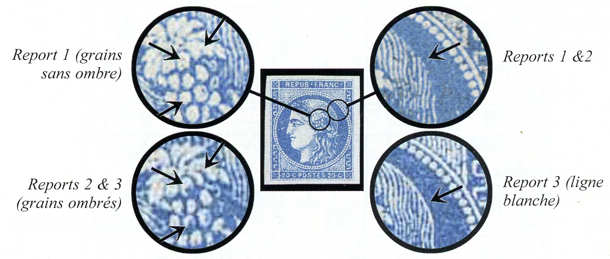
And then the Maury France catalogue breaks the listing down further as sub-types (French "Report" (Litho Block Type)). There are two Reports for Scott 43, three Reports for Scott 44, and two Reports for Scott 45.

Finally each Report (which consists of a Litho block of fifteen cliches or individual stamp images) can itself be identified by individual cliche, as each one is slightly different. In other words, fifteen cliche identifications for each Report.

For this blog post, I will try to identify my group of Bordeaux 20c blue stamps by categorizing them as major type TI, TII, TIII (Scott 43, 44, 45), and then determining which Report they belong to for each major type. I am not going to identify the fifteen individual cliches within each Report, as that would be a bit too much, even for me. ;-) (If one is interested in identifying at the cliche level, Maury shows the identifying markers.)

In order to make the correct identification, I scanned some of the illustrations from my Maury catalogue that I own (under educational use exception). We will then compare my stamps and determine their Type and Report. 

Identification of Bordeaux Issue
Litho (cruder) vs Typo (other issues)
Note horizontal thick neck lines 

The first order of the day is to assure oneself that one has a Bordeaux issue stamp.

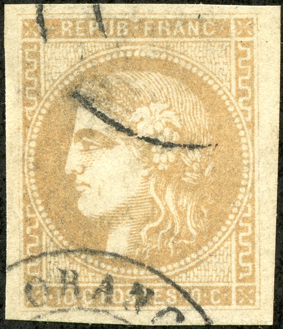
The 20c blue ( and similar 25c blue) "Ceres" is also found among the 1849-50 issue, the perforated 1870-71 issue, and the French Colonies general 1871-72 issue. These other issues are typographed.

The Bordeaux issue, in contrast is Litho, cruder, and the thick linear neck markings (as opposed to dots and dashes) are generally diagnostic. 

Bordeaux 1870-71 20c blue Type I-II-III (Scott 43, 44,45) Differences


Note the inscription is smallest for Type I, and largest for Type III.

Notice, for Type I, the space between the circle containing the head and the upper label appears to be wider than the other two types.

Note the R's and C's are quite different for each type.


There is a missing hieroglyphic for Type III. Different mouth images for each type. There is little shading of the neck for Type I.

Again notice, for Type I, the space between the circle containing the head and the upper label appears to be wider than the other two types. 

The inscription is largest for Type III.

Notice the 20's and O's are different for each type.

Type 1 (Scott 43)

OK, let's look at some examples for Type I (Scott 43). Oops, I don't have any. ;-) The problem is the CV is $550 and rare. I'll bet, though, that some unsuspecting Type I's are hanging out in various collections. Now that you and I know how to identify a Type I, the hunt is on! !!

If you do find a Type I, the above illustration should help to identify if it is Report 1 or Report 2. Report 2 has about a 20% higher CV (Maury) than Report 1.

Type II (Scott 44)

OK, do I have some Type IIs? Fortunately I do! CV is $45.

Of interest, once one has identified a Type II stamp, then one needs to determine which Report- and there are three of them!

Report 1 lacks some detail (dark spots, shadows) among the grains, and there is no white line outlining the head.

Report 2 has the dark spots and shadows among the grain, but no white line outlining the head.

Report 3 has similar dark spots and shadows among the grain, but also a white line outlining the head.

The CVs for the three Reports are about the same ($45).

Let's take a look at my examples.

France 1870 Scott 44 20c blue/ bluish "Ceres"
A10 (Type II), Report 3
Example One

Example One has an upper label inscription which is smaller than Type III, and the "C" looks like Type II. Heavy neck markings (not Type I), and Mouth looks like Type II. The lower panel shows "20" characteristic of Type II, and the script is not as large as Type III. 

Type II.

There is a white line outlining the head, so this stamp is also Report 3.

France 1870 Scott 44 20c blue/ bluish "Ceres"
A10 (Type II), Report 3
Example Two

Example Two shows a script not as large as Type III, and the "R" does not look like Type I. "C" looks like Type II. Last hieroglyph is present and has a Type II mouth. Circle is close to the upper panel (not Type I). "20" of lower panel looks like Type II. 

Type II

White outline of head determines this stamp is also a Report 3.

France 1870 Scott 44 20c blue/ bluish "Ceres"
A10 (Type II), Report 3
Example Three

Here is another Type II Report 3 stamp. Verify for yourself by checking the signs. 

France 1870 Scott 44 20c blue/ bluish "Ceres"
A10 (Type II), Report 2
Example Four

This is another Type II, but there is no white outline of the head, and there are dark spots and shadows among the grain: This is a Report 2.

The color range for my TII stamps vary from pale blue to blue. Maury lists some six colors for the TII Report 3 stamps, including the rare ultramarine color.

Type III (Scott 45)

The Type III is generally characterized by larger script for the top and bottom horizontal panels. The CV is $16 for the blue color (1871). But there is also, in the catalogue, an "ultramarine" color (Scott 45a) @ $675!

But the stamp also exists in two Reports.

Report 1 has a CV of ~$110, according to Maury. No wonder why I didn't find any Report 1s in my collection.

France 1871 Scott 45 20c blue/ bluish "Ceres"
A11 (Type III), Report 2
Example Five

The upper panel script is large (Type III).

The "R" and "C" look like Type III.

Of interest, the Maury illustration for the upper panel Type III does not show a dot between REPUB and FRANC. But all five of my stamps that look like Type III have a dot there. I think the dot is more common.

The bottom hieroglyph is missing (Type III).

The gap between the circle surrounding the head and the upper panel is small (not Type I).

The face shading is strong, consistent with Type III (also T II).

The lower panel has large script (T III).

The "20"s are characteristic of Type III, as well as the "O".

Thick frame (Report 2). (See illustration and compare with stamp.)

Type III

Report 2

France 1871 Scott 45 20c blue/ bluish "Ceres"
A11 (Type III), Report 2
Example Six

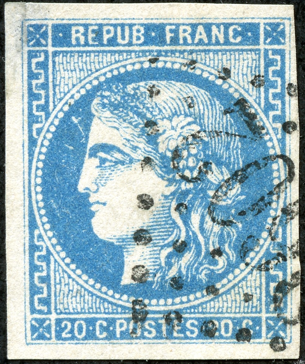
Example Six has the large script and thick frame.

Type III, Report 2

Also Example Seven heading the blog post is Type III, Report 2.

France 1871 Scott 45 20c blue/ bluish "Ceres"
A11 (Type III), Report 2
Example Eight

Check the signs. Yes, a TIII, Report 2.

France 1871 Scott 45 20c blue/ bluish "Ceres"
A11 (Type III), Report 2
Example Nine

Large script, thick frame - TIII, Report 2.

The colors BTW for my TIII stamps range from pale blue to strong blue. Maury lists five colors for the Type III, Report 2 stamps, including the rare ultramarine color.

Other Similar French "Ceres" Issues

Of course, there are other 20c (& 25c) blue "Ceres" stamps, but usually the 1870 Bordeaux issue is characteristic enough to tell. Nevertheless, why don't we take a look at the other "Ceres" issues.

1849-50 Scott 6a or 6b 25c blue/ yellowish "Ceres" 

I think this is the 1849-50 Typo 25c blue with "yellowish" paper (CV $40). Note the individual dots on the neck.

I show the 25c stamp ( which will not be confused with the Bordeaux issue, which is the 20c), as the 20c 1849-50 issue is quite rare (CV $2,000+), and only found unused.

France 1870 Scott 57 20c dull blue/bluish "Ceres"
Perforated

Here is the common typographic perforated 1870-73 French issue 20c blue (CV $6+). As the issue is perforated, it cannot be confused with the similar unperforated "Ceres" stamps.

1872 FC 12 or France 6

Finally, is this a French Colony general issue 1872 25c blue stamp (CV $13)? (There is also a FC 20c blue general issue @ CV $125 that I do not have.) Or could this be a 1849-50 25c blue? (CV $30)). You can see it gets a bit tricky. 

Out of the Blue

I hope you found this blog post useful for separating out the Bordeaux 20c blue types and reports. 

Comments appreciated!

Tuesday, March 21, 2023

Ponta Delgada - Bud's Big Blue

Portugal Scott #A2, blue, early Ponta Delgada precursor cancel
Bud's Big Blue
Bud's Observations

The next six posts will focus on Portugal, its colonies and territories, starting with Ponta Delgada, a city situated on São Miguel Island 740 miles west at sea from its discovering nation. São Miguel is the largest island of the Azores archipelago. “Delicate tip” and “thin cape” are often cited translations of the Portuguese “Ponta Delgada.”

Although uninhabited when the Portuguese discovered São Miguel (1427), it has remains that suggest a Viking presence some 700 years earlier.

Scott’s catalog lists 34 major numbers for Ponta Delgada stamps, plus 17 more for variations in perforations, paper color, and paper quality (enameled or chalky). Big Blue provides 17 spaces on half of a page. All are standard images of King Carlos issued for Portuguese colonies (1892-1905). The second of the two designs (below) illustrates the basic “key plate” variety that allowed for interchangeable colony names and values in black.

Scott #s: 4 lavender (enamel), 24 rose and 26 violet (key plates

The repetitive nature of Portuguese colony stamps may discourage collectors from specialization. Precursors and successors, however, add considerable variety and interest. Before the King Carlos issues, for instance, Portuguese stamps were cancelled in Ponta Delgada with a circular obliterator enclosing the number “50”. Other Azores offshore settlements were also given numbered cancellations – 48 for Angra, 49 for Horta, and 51 for Madeira. These designations were used between 1853 and 1869.

Early precursors tend to be scarce and expensive, although they do turn up occasionally in feeder albums. The second round of precursors are more common. In 1868 Portugal began overprinting stamps for the Azores, of which Ponta Delgada was the capital. Initially the numbered cancels changed from circles to ovals with 42 for Angra, 43 for Horta, and 44 for Ponta Delgada.(1) Later, common circular cancels came into use with Ponta Delgada spelled out. Madeira had its own overprint issues separate from the Azores.

Azores Scott #26, green, later Ponta Delgada precursor cancel 

The Azores overprints continued until 1931 and, apparently, were used simultaneously with the Ponta Delgada King Carlos issues (1892-1905). The Azores stamps with Ponta Delgada cancels are, therefore, both precursors and successors.

Azores Scott #235, yellow green, Ponta Delgada successor cancel

After 1931 the bulk of Ponta Delgada mail was franked with standard issue Portuguese stamps.

Portugal Scott #568A, blue, still later Ponta Delgada successor cancel

Besides precursors and successors, Ponta Delgada stamps can participate in other specializations. When Jim first posted his 2015 Ponta Delgada comment (click here), I remarked about the Frenchman Louis-Eugène Mouchon who designed the key plate stamps. His name is inscribed at the bottom. He also designed stamps for Abyssinia, Argentina, Belgium, Greece, Guatemala, Luxemburg, Monaco, the Netherlands, Persia, Russia and Serbia, as well as Portuguese coins and currency plates. I have never seen a specialized Mouchon collection but can easily imagine one.

Census: 17 in BB spaces, five on supplement page

(1) https://thecollectorsshopblackrock.wordpress.com/2020/05/16/stamps-the-world-ponta-delgada/

Jim's Observations

The stamps of Ponta Delgada are quite typical for a Portuguese colony, except the administrative district did not issue stamps for very long- only 13 years.

The first issue was released between 1892-93, and has the image of King Carlos. The Scott catalogue breaks the issue down to 12 major numbers and 16 bolded minor numbers. They differ by perforation, and paper (enamel surfaced, chalky). Most, but not all, of the Perf 12 1/2 stamps are given major numbers. The CV for both the major and minor varieties range from <$1-$30 for 28 stamps.


Page 1


1a


1b


1c


Supplements
Page 1


Comments appreciated!

Sunday, March 12, 2023

France - A closer look at the Bordeaux Issue - 10c

1870 Scott 42 10c bister/yellowish  "Ceres"
Bordeaux Issue; Lithographed; Type A; "deep bister" 

Into the Deep Blue

The lithographic Bordeaux issue 10c bister/yellowish "Ceres" should be recognizable, when compared to the typographic similar "Ceres" stamps, as the crude horizontal necklines are a good sign.

For review, check out the previous posts...


1870 Scott 42 10c bister/yellowish  "Ceres"
Bordeaux Issue;: Lithographed; Type A; "deep bister" 

The Scott catalogue, however, divides the 10c denomination into "Type A" and "Type B", This corresponds to the "Report 1" and "Report 2" of the Maury catalogue. Recall that, although the printing sheets were 300 stamps, a sub block plate of 15 cliches was used, and repeated 20 times. Two of these sub block plates (Report 1 & Report 2) can be recognized by certain signs.

1870 Scott 42 10c bister/yellowish  "Ceres"
Close-up: Type A; "deep bister" 

For Type A (Report 1), the sign for Type A consists of "The inner frame lines are of the same thickness as all the other frame lines". Note here the inner frame line (enclosing the wavy vertical railway track lines) is approximately the same thickness as the outer frame line. The CV for Type A 10c bister/yellowish is $60, while Type B is $90. 

Colors also are a factor, as "Type A" is often found in "deep bister".

1870 Scott 42 10c bister/yellowish  "Ceres"
Bordeaux Issue; Type A; "rouge?"

This is another example of "type A", and may be a bister-rouge color, which can be found with "Type A" stamps.

1870 Scott 42 10c bister/yellowish  "Ceres"
Bordeaux Issue; Type A; "bister-brown" 

This color is definitely "bister-brown", which Maurey lists for "Report 1" (Type A) stamps as a known color.

1870 Scott 42a 10c bister/yellowish  "Ceres"
Bordeaux Issue; Type B; "bister-yellow" 

Now, let's look at a "Type B" (Report 2) stamp. Note the color is "bister-yellow", which is the most common color found for "Type B' stamps.

1870 Scott 42a 10c bister/yellowish  "Ceres"
Close-up: Type B; "bister-yellow" 

For Type B (Report 2), "The inner frame lines are much thicker than the others". Note how thick the inner line (enclosing the wavy vertical railroad track lines) is here.

1870 Scott 42a 10c bister/yellowish  "Ceres"
Bordeaux Issue; Type B; "bister-yellow" 

Another example of Type B.

1870 Scott 42a 10c bister/yellowish  "Ceres"
Bordeaux Issue; Type B; "bister-orange" 

A "Type B" stamp. The color may be "bister-orange", which is listed for Report 2 (Type B) as a known color in Maurey.

O.K., we are done with showing the Bordeaux 10c stamp.

For completeness sake, let's mention or show the other 10c "Ceres" stamps.

First, remember that the France Scott 1 1850 Typographic Scott 1 is also a 10c bister/yellowish. 

France 3 (Clsp)

I don't have a copy of France 1, but the face markings would be similar to the above France Scott 3 20c black/yellowish. Note the discrete dots making up the horizontal neck markings.

1870 Scott 54 10c bister/yellowish "Ceres"
Typographed, Perf 14 X 13 1/2

Then, the perforated typographic 1870 issue also has a 10c bister/yellowish (Scott 54).

To complicate further, the French Colonies general issue 1871 Scott 9 10c bister/yellowish is imperforate. This stamp could be mistaken for the imperforate 1850 issue. One should look at paper and color hue to help distinguish, and especially French Colonies postmarks.

1873 Scott 55 10c bister/rose  "Ceres"
Typographed, Perf 14 X 13 1/2

There is also a bister/rose 10c for the 1870-73 typographic perforated French issue. 

Imperforate Typographic French Colonies General Issue
1876 Scott 20 10c bister/rose, "Guadel(oupe) Cancel

Similarly, there is an imperforate French Colonies 10c bister/rose. Note the Guadel(oupe) postmark, which shows a French Colonies use.  In addition, here, the "10c" numeral is larger.

1870 Scott 42 10c bister/yellowish  "Ceres"
Bordeaux Issue; Lithographed; Type A; "deep bister"
Out of the Blue

I hope you enjoyed the show/tell for the Type A/Type B Bordeaux 10c, as well as illustration of other "Ceres" 10c French stamps.

Comments appreciated!

Saturday, March 4, 2023

Poland - Bud's Big Blue

Bud's Big Blue
Bud's Observations

Specializing in Poland’s stamp requires patience as well as a good grasp of European geography and political history. Where and what Poland currently is, as reflected in the above map, only remotely corresponds to the several “Polands” encompassed by Scott International Part 1, 1840-1940 (aka Big Blue, or BB). A better map for Big Blue lovers, such as the one drawn by Gerben VanGelder (below), will show the many machinations that kept changing Poland’s borders during the classical stamp era. This volatility must have caused headaches for BB’s editors and led them to scatter Poland-related stamps throughout the album.

At minimum, Poland philately must consider stamps related to Allenstein (Oltztyn), Silesia, Danzig (Gdańsk), Prussia, Austria, Russia, Germany, Lithuania, Memel, Ukraine, Marienwereder and, of course, the various occupation stamps. Guided by VanGelder’s helpful map, this post will sketch the labyrinth of Poland’s stamps, 1860-1940, using scans of stamps collected in Bud’s Big Blue.

Map credit: Gerbern VanGelder

Although Poland’s postal system dates to 1558, the first identifiable Polish stamp appeared in 1860. Issued by the Congress Kingdom of Poland (dark green on VanGelder’s map), a political entity established in 1815 and controlled by Russia Czars, it was used solely for mail within Poland and to Russia. The design reflects its Russian heritage with the Kingdom’s arms at the center. These, not being formally approved by Russian authorities, were withdrawn in 1865, after which Russian stamps were used throughout Poland until 1918. 

Scott #1, blue and carmine or rose

At first, Russian stamps used in Poland were canceled with both languages in the inscription, but after 1871, only Russian. The examples show below were canceled in Warsaw (ВАРШАВА), both in 1913. Such cancels frequently pop up in feeder albums.

Russia, Scott #s: 99 brown and slate, 102, red brown

Similarly, Polish city cancels can be found on early Austrian stamps. From the late 18th century when independent Polish territory was divided among Austria, Russia and German states, postal service was controlled by outsiders. The late 19th Austrian century examples shown below were canceled in Kraków and Ustron, a health resort town in southwest Poland (Cieszyn Silesia). These may have been Austrian field post offices.

Austria: Scott 9 red, J10 brown, pr7 (brown)

The redefinition of Poland’s boundaries following World War I stirred yet another philatelic whirlwind. US President Woodrow Wilson supported the notion that cultural groups should be able to govern their own homelands. After the war, he favored Poland becoming an independent state. The light green area on VanGelder’s map shows the result. Some parts of ancient Poland – Upper Silesia, Allenstein, and Marienwerder -- were allowed to choose by a vote (plebiscite) either Poland or Germany as a homeland. VanGelder marks these areas in red. All three opted for Germany; all three issued stamps; all three are represented in BB.

At the time, Poland very much wanted Gdansk (Danzig) within their border, but that was not to be. It became an unaligned, free city. Memel was attached to Lithuania. BB has large sections for both Danzig and Memel although, by 1938, Poland issued stamps for its offices in Danzig (BB places four of these in Poland’s BoB section).

At the War’s end, a jubilant Poland issued its first ever stamps as an independent nation. These began with four overprinted local stamps and some twice overprinted occupation stamps that Germany had hastily issued when they invaded Poland at the War’s outset. BB divides the occupation stamps between the Germany and Poland BoB sections. However, the twice overprinted variety with the blackened German inscriptions merit a place in the Poland section proper (1918).

Scott #s: 12 green on buff (Warsaw local), 
19 carmine, 24 orange and black, 13 rose on buff

Poland also overprinted some leftover Austrian stamps, but BB includes none of these.

Scott #s 27-29 (Polish overprints on Austrian military semi-postals)

From 1919 thru 1925, Poland’s stamps celebrate newfound independence and ancient heritages. The traditional Polish eagle predominates. Peace breaks out like brilliant sunshine. Ordinary citizens ride stallions, sow seeds, reap crops, and mine coal. Historic notables – Copernicus and Konarski – are commemorated. Only a few politicians and contemporary leaders, such as Marshal Pilsudski (1919) and President Wojciechowski (1924), appear.

 Scott #s: 70 deep blue, 139 purple, 185 olive green, 158 red, 160 slate blue

These themes faded after May 1926 when Marshal Pilsudski carried out a successful coup d’état that ended the democratically elected government of President Wojciechowski. Piłsudski, hoping to restore “moral fitness,” supported Ignacy Mościcki as the new president and replaced the old constitution with one more to his liking. The philatelic upshot is more political leaders on stamps, particularly Piłsudski and Mościcki. Military themes come to the fore, including appreciation for George Washington and Poland’s role in US independence.

Scott #s: Pilsudski, 253 bluish slate; Mościcki , 255 black on cream

Piłsudski’s influence on Polish stamp designs continues beyond his death (1935) and into those issued for the Polish Government in Exile during World War II. Spaces for the exile stamps are included in Part II of Scott International. Part I, however, ends its Poland section with German stamps overprinted for yet another siege of occupation.

Scott # n25 ultra

Poland’s expanded frontiers, as illustrated by the map at the top of this blog post, resulted largely from peace negotiations following World War II. Marienwerder is now Kwidzyn, Allenstein is Olsztyn, Danzig is Gdańsk, Silesia is Katowice – all in Poland. Memel, controlled by Lithuania, is part of Klaipėda and Tauragė counties.

Census: 363 in BB spaces, 14 tip-ins, 112 on supplement pages.

Postal service 400th year commemoration, black on beige, Scott #829a

Jim's Observations

No country has been ripped apart, and put back together as many times as Poland.


Page 1


1a


1b


1c


1d


Page 2


2a


2b


2c


2d


2e


Page 3


3a


3b


3c


3d


Page 4


4a


4b


4c


4d


Page 5


5a


5b


5c


Page 6


6a


6b


6c


6d


Page 7


7a


7b


7c


Page 8


8a


Page 9


9a


9b


9c


9d


Page 10


10a


10b


10c


Page 11


11a


11b


11c


Page 12


12a


12b


12c


12d


Page 13


13a


13b


13c


13d


Page 14


14a


14b


14c


14d


Supplements (Note: Page 8 (above) is also under Supplement)
Page 1


Page 2

Page 3

Page 4

Page 5

Page 6
Page 7

Comments appreciated!