A is for Aden and Z is for Zanzabar


A is for Aden and Z is for Zanzibar... Now what is between? For the world wide classical era philatelist and stamp collector, a country specific philatelic survey is offered by the blog author, Jim Jackson, with two albums: Big Blue, aka Scott International Part 1 (checklists available), and Deep Blue, aka William Steiner's Stamp Album Web PDF pages. In addition, "Bud" offers commentary and a look at his completely filled Big Blue. Interested? So into the Blues...

Sunday, September 22, 2019

Filling Deep Blue: St. P&M, Samoa, Somaliland, Japan additions

1891 Scott 45 4c on 40c red/straw
Stamps of French Colonies surcharged in Black
Into the Deep Blue
Additions to a collection are always intriguing to look at.

What did I pick up recently? Read on...

St. Pierre & Miquelon Additions
100 Centimes = 1 Franc
1891 Scott 21a 2c brown/buff
Inverted Overprint
Stamps of French Colonies overprinted in Black or Red
St. Pierre & Miquelon, off the coast of eastern Canada, and (now) part of France, has left a complicated (and expensive) legacy of early issues. The stamps of 1885-1891 (35 major numbers) are all handstamped, surcharged, or overprinted, and there were plenty of overprint variations that have entered the catalogue (see above).

Naturally, this is the playground of the well-heeled specialist. I am not that, but it doesn't mean I couldn't pick up a few examples.

There is a dealer in Oregon who has a nice selection of these stamps, and one Saturday in March of this year, I spent several pleasant hours in his shop (real brick & mortar!).

Saint Pierre & Miquelon
From StampWorldHistory (By Permission)
The original post (& BB checklist) is here.

1891 Scott 23 4c claret/lavender
Stamps of French Colonies overprinted in Black or Red
The 1891 issue of seventeen stamps consisting of stamps of French Colonies overprinted in black or red are moderately expensive to expensive (CV $10+-$400). There are many varieties of mislettering on the overprint that can be found (CV 2-3X). This example, though, appears normal.

1891 Scott 25 5c green/greenish
Stamps of French Colonies overprinted in Black or Red
An example where the printing placement on the stamp causes some overlap (upper left).

I read somewhere that there was some shenanigans involved with all the availability of misprinted overprint stamps to the philatelic trade. Seems to not have harmed the CV though. 

1891-92 Issue
Stamps of French Colonies Surcharged in Black
The 1891-92 issue (ten stamps) are from stamps of the 1891 overprinted issue, and an additional surcharge was applied in black. The header stamp for this post is from this surcharged issue. CV ranges from a modest $10+ to $20+. Again lots of variations known (double-triple surcharges, missing letters).

1892 Scott 47 2c on 5c green/greenish
French Colonies 1881-86 Stamps Surcharged in Black
In 1892, the 5c green/greenish and the 25c black/rose were each surcharged with 1c, 2c, or 4c (total six stamp issue). CV is $10+. 

1906 Scott 73 35c black/yellow 
"Navigation & Commerce'
1892-1908 Issue
The familiar "Navigation & Commerce" colony stamps naturally are found for St. P&M. CV ranges from $1+ to $60+.

Samoa Additions
12 Pence = 1 Shilling
20 Shillings = 1 Pound
Express Issue - 2p Reprint
A local dealer had me look over a grouping of Samoa "1877-1882 Express Issue" stamps: I suppose in the hope that I would find a genuine. As usual, I found reprints and forgeries. In fact, I can't think of an issue where the dross to the gold ratio is more skewed: 90% reprints: 9% forgeries: 1% genuine.

For more background on this issue, see my original Samoa 1877-1899 & Forgeries post.

This poorly printed two pence example is either a Type IV (1882 2p lilac rose) or a reprint. Both have a spot of color below the "M". The reprints usually are perforated on all sides - this one obviously not. The Type IV is distinguished by the color of the stamp (lilac rose).

By the way, the 2p denomination only exists "unused", as it was never placed in use (Samoa Express service discontinued late 1891).

Note "Dot" below "M" on curved line
As one can see, the "Dot" indicates either a Type IV or a reprint. 

So is this stamp a reprint or Type IV (CV $25)? Frankly, I don't know. Because it is poorly printed, and much more likely, I am labeling this a reprint until proven otherwise.

Express Issue -2p Fournier Forgery
I picked up another example of a Two Pence, but this is clearly a Fournier forgery.

From my previous post blog on Samoa...

"There is no dot of color under the center of the "M", so this is not a reprint. The right leg of the "M" is rather thick, and the pearl dots between the curved lines seem larger also.


Note the line above "X" is "roughly retouched", as if it is a Type III, but the horizontal lines along either side of the "X" are rough and thick.

The clincher is the colored pearl dot below the white line on which the "X" rests is not complete or surrounded by white! This is the necessary and sufficient sign that the stamp is a Fournier counterfeit."

Express Issue - 9p Reprint
Here is another example where one has to make the best (probable) guess. This could be a Type IV, a reprint, or a Fournier forgery. The colored pearl dot below the white line on which the "X" rests is not complete or surrounded by white, which suggests Fournier, but I also see a dot below the "M" (not seen with Fournier).


Nine Pence Close-up
Note "Dot" below "M" on curved line
I think then that this is a reprint most likely. I would need to send this in for expert analysis if I thought Type IV (CV $75).

Express Issue - 2s Reprint
Also picked up a Two Shillings denomination -probably a reprint.

Two Shillings close-up
Note "Dot" below "M" on curved line
Note the dot on the curved line. The 2s denomination is not found as Type IV, so this must be a reprint.


1896 Scott 15 2 1/2p black, Perf 10 X 11
"King Malietoa Laupepa"
Wmk 62 "N Z and Star Wide Apart" 
I love it when an unassuming mixture of stamps (this time Samoa) yields something I don't have. Sure enough, I found this CV $1+ 1/2p black. Be sure to check the watermark (3 types) and perfs (See this blog post for details). A Perf 11 stamp would be worth CV $100.

1900 Scott 18g 1sh carmine "Palms"
O.K., if this is "carmine", it is a minor number with a CV of $1+. The Scott major number (18f 1sh rose) has a CV of $10. This looks "carmine" to me. There are plenty of shade variations to sort through for the "Palms" stamps.

1895 Scott 23a 5p vermilion "Flag Design"
Perf 11
The first "Flag Design" typographic stamp was released in 1894 (major number) with Perf 11 1/2 X 12 (CV $10). This example, however, is a Perf 11 1895 release (minor number) with a CV of $20. Pays to check perfs. ;-)

1899 Scott 33a 2p deep ochre 
Stamps of 1886-99 Overprinted in Red or Blue
Color.

I had the major number 2p "bright orange". I think, though, this example is the minor number "deep ochre". Both are CV $2.

Somaliland Protectorate Additions
16 Annas = 1 Rupee
100 Cents = 1 Shilling (1951)
1938 Somaliland Protectorate Issue
Although I put my stamps into Deep Blue (Steiner pages), I'm always on the lookout to add to my virtual Big Blue collection in which I have 30,000+ spaces filled out of 34,000+ total spaces. All nine of these stamps are in Big Blue, and hence I added them from an internet sale site.

1938 Scott 92 1r green 
"Map of Somaliland Protectorate"
It is always instructive to show a map stamp, especially for an obscure classical era territory.

The original Somaliland Protectorate (British Somaliland) blog post is here.

1938 Scott 87 3a ultramarine
"Blackhead Sheep"
The 1938 Issue can be confused with the 1942 issue. What is the difference?

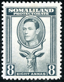
1938 Scott 90 8a gray black
"Greater Kudu"
The key to identifying the 1938 issue is George VI's head: his gaze is looking to his right.

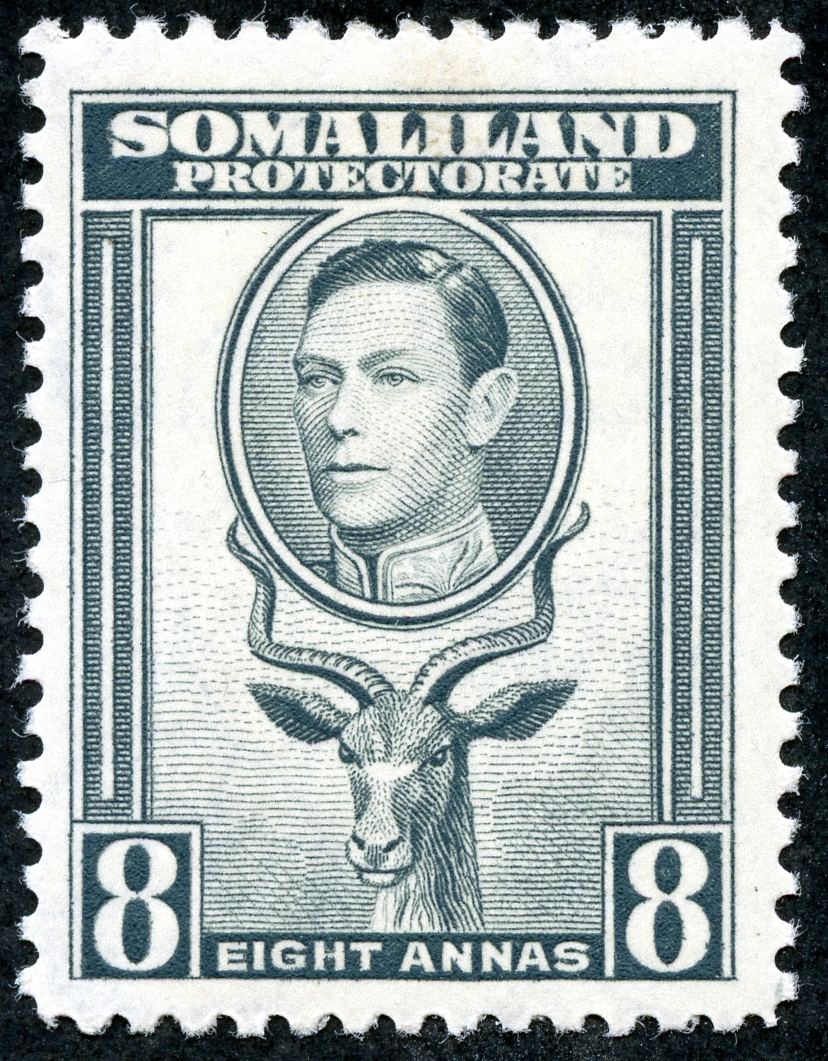
1942 Scott 102 8a gray
"Greater Kudu"
The 1942 issue (twelve stamps) has George VI's gaze more straight ahead (although he still isn't looking at us- why should he?..He is King!).

Japan Additions
100 Mon = 10 Sen
100 Sen = 1 Yen (or En)
10 Rin = 1 Sen

Japan's early stamps, the 1871 issue "Pair of Dragons Facing Characters of Value", the 1872 issue "Dragons and Denomination", and the 1872-73 & 1874-75 issues "Cherry Blossom" are an absolute nightmare for the WW collector because of numerous and excellent forgeries. Do not even consider collecting these stamps without specialty literature on forgeries.

I have the International Society for Japanese Philately monographs on The WADA Cherry Blossom Forgeries (1974- Tyler & Montgomery), The Koban Forgeries of Japan (1979- Wilhelmsen & Tyler), and the SPA handbook Characteristics of Genuine Japanese Stamps Cherry Blossom Issues of 1972-1876 (Varro Tyler).

Frankly, these monographs have been superseded by The International Society for Japanese Philately Forgery CD (All known forgeries up to 2002). 

 One can obtain the Forgery CD for $48, which includes a one year membership in the Society.

"1871 Japan 1 48m brown" WADA Forgery
"Pair of Dragons Facing Characters of Value"
Well, I obtained the CD several years ago, and identified these WADA forgeries.

According to my notes, this stamp (above) is a WADA Plate A forgery, mimicking Plate II.

"1872 Scott 6 1s blue (II) WADA Forgery
"Dragons and Denomination"
And this stamp (above), according to my notes, is a WADA Plate A with Sanko forgery mimicking Plate I.

So, what's the current problem? I can't find the CD! It's buried somewhere in my possessions. When I do, I will elaborate further on why these are WADA forgeries. ;-)

Since the 1871 & 1872 issues have a fairly high CV of $130+ to $650+ for major numbers (minor numbers -mostly shades - are more), a strategy would be to eliminate the plentiful WADA forgeries for these issues by using the CD, and then submitting any remaining genuine possibilities for certification.

1899 Scott 35 5p deep scarlet 
Blue Overprint
Out of the Blue
I hope you enjoyed this little excursion into recent acquisitions.

Note: For more on Gerben van Gelder's magnificent classic era maps, link here

Comments appreciated!

Wednesday, September 18, 2019

Labuan - Bud's Big Blue

One good - One not
Bud's Big Blue
Bud's Observations
Before writing these observations, I reread Jim’s original post on Labuan and its 19th century forgeries. Sure enough, some of my stamps are forgeries. The purple 8 cent (above and on Page 1) is clearly forged, and badly. The poor Queen suffers considerable distortion. Even her picture frame fails to approximate the genuine. So, well after the scans shown below were made, the forgery was banished to the supplement page and replace by a more credible example.

One might think that the simple line drawings used for making the early lithographs and engravings would be easily forged. But they aren’t. A line drawing has many tricky parts, such as the original artist sometimes using a solid line for a change of plane and other times an implied line. Forgers almost always get it wrong. So, the 8 cent Queen’s cheeks, as shown, look flat and the forger gave her a chin dimple, while in the genuine example the cheeks appear rounded and there is no dimple. Shading lines on the back of the 8 cent Queen’s neck are shaky, a characteristic sometimes labeled “criminal tremors.”  Moreover, all lines are generally thicker and smudged on the fake -- all clues that forensic handwriting experts quickly notice.

The supplement pages show additional comparisons of forged and genuine stamps.

The 1902-3 series featuring an approximation of the British crown (Page 2, top) seems a remarkable change of pace for Labuan -- from line drawings and overprinted North Borneo stamps to highly sophisticate engravings.  Among the last Labuan stamps, those with crowns have little risk of being forged.

Census: 59 in BB spaces, one tip-in, 20 on the supplement page (including forgeries).

Jim's Observations
Between the challenges of the genuine/forgery lithographed Victoria issues and the many superbly designed overprinted pictorial stamps, Labuan is a discerning collector's delight!

Labuan and Forgeries Blog Post & BB Checklist

Page 1

1a

1b

1c

Page 2

2a

2b

Supplements
Page 1

Comments appreciated!

Saturday, September 14, 2019

Kuwait - Bud's Big Blue

Oil Derrick
Bud's Big Blue
Bud's Observations
Few collectors specialize in Kuwaiti stamps, not because Kuwait lacks interesting history, but because the stamps show none of it. No mail-carrying camels, no sacred mosques, no dhows, no ancient artifacts, no sheiks, no pictorials common on stamps of British colonies, not even an oil derrick -- all might have been, but none were. The KUWAIT applied to stamps of India seems an afterthought.

Even the website titled “Kuwait Stamps and Postal History” (http://www.kuwait-stamps.com/) appears sadly moribund and unattended.

In previous centuries Kuwait was prosperous. Its strategic location fostered trade and ship building. It became the land bridge between India and European markets and was ethnically diverse -- the “Marseilles of the Persian Gulf”1, it was dubbed in the early 1900s.

Then the economy collapsed. War with Najd ensued and, in the post-war agreement, Kuwait lost territory. Britain assumed the role of protector as the dust settled in 1922. Given these circumstances, overprinted stamps were no doubt expedient, at least at the outset. But Britain continued with KUWAIT printed across crowned heads until 1958. Why? I dunno. Prosperity had returned with the oil boom of 1937, so no need for continuing austerity. And Kuwait was rich in subject matter for stamp images.

Census: 24 in BB spaces, 5 on supplement page.

1H. C. Armstrong, Lord of Arabia, 1905, p18.

Jim's Observations
From 1923-1940, overprinted stamps of India were used, and the Kuwaiti postal service was administered through the Iraqi postal administration.

Then the Indian postal administration assumed control between 1941-47. During 1941-45, unoverprinted stamps of India were used.  An overprinted 1945 issue was then produced using stamps of India.

Pakistan briefly (1947-48) administered control.

Great Britain assumed control on April 1, 1948, and the British postal administration issued overprinted British stamps from 1948-51- the end of our classical era coverage.

Kuwait,ended their British protectorate status in 1961, and became independent.

Of interest, Kuwait's major oil boom only really occurred after independence in 1961. I suspect the British  might have provided a little more postal attention otherwise.

Kuwait Blog Post & BB Checklist

Page 1

1a

1b

1c

1d

Supplements
Page 1

Comments appreciated!

Thursday, September 5, 2019

Cape of Good Hope - a closer look

1855 Scott 4 4p blue "Hope" Seated
White Paper
Into the Deep Blue

Update Note: The link for the updated COGH Triangulars posts are found in the original Cape of Good Hope post.

The iconic Cape Hope triangles I remember from enticing stamp dealer ads in magazines when I was a kid. All one had to do was find one in the attic attached to old correspondence. Of course, I never found one, and they were too expensive for a kid budget.

But, as a WW collector, I've managed to snag one or two. Cape of Good Hope stamps still have that exotic thrill.

Read on...
Cape of Good Hope 1899
From Gerben Van Gelder's Stamp World History Site
The best new original classical era maps I know of comes from Gerben van Gelder's site - at the time of constructing this post not active. I saved his maps (and have had general permission from him to use them), but I really hope his great contribution goes back on-line. 

The original Cape of Good Hope blog post and BB checklist is here.

A closer look
12 Pence = 1 Shilling
1857 Scott 3 1p rose "Hope" Seated
White Paper
Printed by Perkins, Bacon & Co.; Wmk 15-Double Lined Anchor
The imperforate Triangles of Cape of Good Hope were printed by Perkins, Bacon & Co. (1853- blued paper, 1855-58- white paper); Saul Solomon & Co. (1861- "Wood Block" local provisional issue,  Laid paper - unwmked); and De La Rue & Co. (1863-64 ). The Perkins and De La Rue stamps are on watermarked paper (Wmk 15).

Of the twelve major Scott numbers (and many minor numbers - mostly shade color variations), one will need to determine the type of paper, the watermark (if any), the color shade, and the ink impression. Needless to say, this is specialist territory (consult the philatelic literature and Stanley-Gibbons catalogues), and the stamps are expensive (CV $80+-$3,000). However, the Cape Triangles are fascinating, and if the WW collector is so inclined, a modest grouping at a somewhat immodest price might be accumulated.

Top - Wmk 15 - Double-Lined Anchor
Bottom - Wmk 16 - Single-Lined Anchor
Note the double-lined anchor watermark seen on the Cape triangles (Wmk 15): upper center of this specimen.

The single-lined anchor watermark (Wmk 16) appears later on the 1884-1904 issues.

1864 Scott 18 6p bright violet 
"Hope" and Symbols of Colony
Frame Line around Stamp (A3 Design) ; Wmk 1
Although the Cape triangles are iconic, the WW collector more likely will have stamps of this general design:"Hope" and Symbols of Colony. They are a bit tricky.

The first typographic issue of this design was released between 1864-77 on four denominations.

These stamps have the British Colonial and Crown Agents watermark 1 - "Crown and C C".

CV is $1+-$40+.
Close-up: 1864 Scott 18 6p bright violet 
Frame Line around Stamp
These stamps (1864-77 issue) have a frame line around the entire stamp. Note the horizontal frame line under the "postage" tablet, and the outer vertical frame line along the side of the stamp. The outer frame line around the stamp distinguishes this issue from subsequent issues.

1872 Scott 24 1p rose
"Hope" and Symbols of Colony
Without Frame Line around Stamp (A6 Design); Wmk 1
The 1871-81 issue, with Wmk1, is identical to the 1864-77 issue EXCEPT there is no outer frame line around the stamp.

There are six denomination stamps, and the CV ranges from <$1 to $40+. 

Close-up: 1872 Scott 24 1p rose
Without Frame Line around Stamp
A close-up shows no outer frame line around the 1871-81 issue (Wmk 1).

1882 Scott 35 2p bister
"Hope" and Symbols of Colony
Without Frame Line around Stamp; Wmk 2
The issue of 1882-83 of six stamps also does not have an outer frame line, but the watermark is the  British Colonial and Crown Agents watermark 2 - "Crown and C A".

CV is $1-$3+.
Top - Wmk 1 "Crown & C C"
Bottom - Wmk 2 "Crown & C A"
To refresh the memory, here are examples of the British Colonial and Crown Agents watermarks 1 & 2.

1884-98 Issue "Hope" and Symbols of Colony
Wmk 16: Single-lined Anchor
Between 1884-98, there was another issue of 14 stamps. CV ranges from <$1 to $9+. As one can tell from the CV, used examples are quite common. 

1897 Scott 45 2p chocolate brown
(A6 Design); Wmk 16
These stamps in this issue also are without an outer frame line (with two exceptions - see below). BUT they are distinguished from the previous issues by having a new watermark: The single-lined anchor watermark (Wmk 16)

Examples of Wmk 16 are shown earlier (scroll up a bit).

1884-98 Scott 49 6p violet
Note: The  6p violet has "Frame Line around Stamp" (A3 Design)
Wmk 16 - Anchor
The first exception for the 1884-98 issue is the 6p denomination DOES show the frame line around the stamp. 

The other exception is Scott 50 1sh dull bluish green which is an A3 design also. Additionally, the issue has Scott 51, a 1sh blue green, which is an A6 design.

Double check to make sure these A3 designs are Wmk 16. Otherwise, if Wmk 1, then they are part of the 1864-77 issue.

Confession: I misplaced some of these stamps myself, and only discovered it while double checking for this blog post. !! Tricky!

1884-98 Scott 49b  6p bright mauve (A3 Design)
Wmk 16 - Anchor
There are a number of minor number shades listed in Scott. Here is an example for 6p: bright mauve rather then violet.

1891 Scott 55 2 1/2p on 3p deep magenta
Type of 1871 Surcharged in Black
In 1891, a 1871 type (A6) 3p was surcharged as shown. CV is <$1.

I should mention that some 15 stamps (major numbers) of A3 & A6 designs were surcharged between 1868-1882.  Some are CV expensive ($180), some are CV inexpensive ($2+), but I alas have none of them. 

1896 Scott 57 2 1/2p ultramarine "Hope Seated"
Between 1892-96, a new "Hope Seated" design (A13) was issued for the 2 1/2p denomination in sage green (see header for "Out of the Blue" section), and in ultramarine (above).

CV is <$1.
1893 Scott 58 1p on 2p bister
Scott 44 Surcharged in Black
In 1893, the 2p bister (1894 Scott 44) was surcharged "One Penny" as shown. CV is <$1.

1898 Scott 59 1/2p green "Hope Standing"
Between 1898-1902, apparently tired of "Hope Seated", the design was changed to "Hope Standing" for a three stamp issue. CV is <$1-$3+.

1900 Scott 62 1p carmine rose 
"Table Mountain and Bay; Coat of Arms"
Abandoning the "Hope" motif altogether, the 1900 1p carmine rose is distinctive, and also common. CV is <$1.

1903 Scott 67 3p red violet "King Edward VII"
Wmk 16 - Single Lined Anchor
Finally, King Edward VII appears on a nine stamp issue between 1902-04. CV is <$1-$20+.

Cape of Good Hope became a province of  the Union of South Africa on May 31, 1910, and hence Cape's stamps ceased.

Deep Blue
1902-03 King Edward VII Issue
Deep Blue (Steiner) has seven pages for the stamps of the Cape of Good Hope. All Scott major numbers ( and some minor numbers) have a space. 

I should mention that included in the coverage are two Steiner pages for the CV expensive surcharged overprinted "Besieged" Mafeking issued stamps, and those issued in Vryburg under Boer occupation and British occupation. I have none of these, and there are many excellent forgeries. Either avoid this area (as I have done), or become a specialist.

1892 Scott 56 2 1/2p sage green "Hope Seated"
Out of the Blue
Cape of Good Hope has a well documented and fascinating history and philatelic history, and would be a real candidate for specialization. But as a WW collector, I must reluctantly move on.

Comments appreciated!