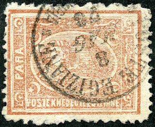
1872 Scott 21 20pa blue "Sphinx and Pyramid"
Perf 12 X 131/3 Clean Cut; Clear Impressions
Into the Deep BlueThe 1872 (typographed mostly, some lithographed) issue and the 1874-75 issue (typographed) by the Government Printing Works ("Khedive's Paper Factory and printing House") in Bulag, Cairo, used the same original dies for both issues, except the the second printing of 1874-75 was from new plates.
But the differences seen between the issues (Paper differences, Impressions (Clear vs Blurred), different Perfs, different color of stamps, Plate changes and touchups) are significant enough that they are considered different issues, and not just different printings. The Scott catalogue and Stanley Gibbons recognize this, and breaks them out into respective issues with major and minor numbers. Interesting, the Michel keeps them all under the "1872" category.
Yet, I think most collectors are somewhat confused by these stamps. A perusal of web sites illustrating Egyptian stamps of the era by non-Egyptian specialist collectors show limited understanding and, at times, outright mistakes.
True, the major characteristics outlined in the catalogues (clear impressions and clean cut perfs for the 1872 issue; blurred impressions and "rough" perfs for the 1874-75 issue) are a useful marker, but not a guaranteed one, as it can involve "judgement calls".
I was helped immensely in my own quest to understand the issue differences by obtaining the "bible" of classic Egyptian philately - "Egypt- Stamps and Postal History- A philatelic Treatise (1999) by Peter A.S. Smith. This 874 page book with 36 pages covering "The Third Issue" (1872 & 1874-75) is out of print, and fetches hundreds of dollars (if one can find a copy) in the used book market.
So, with Peter A.S. Smith, former President of the Egypt Study Circle, as our mentor, let's take a look at the real and important differences that exist among and between the 1872 and 1874-75 issues.
This blog post will cover the 5 paras and 10 paras denominations, while subsequent posts will cover the 20 paras, 1 piaster, 2 piasters, 2 1/2 piasters, and 5 piasters values.
1872 Scott 19 5pa brown
Wmk 119, Perf 12 1/2 X 13 1/3 Clean Cut
Clear Impressions, Thick Opaque Paper
Colors: dull chestnut to deep red brown
Note: All 5 Paras (1872 & 1874-75) are Typographed
The difference between the 5 paras 1872 issue and the 5 paras 1874-75 issue is ridiculously (and amusingly) easy as we will see in a moment.
But let's look at some of the factors evident here.
Checking the perf for every stamp is very important. Here Perf 12 1/2 horizontal sides by 13 1/3 vertical sides. Therefore Scott 19.
NOTE: the measurement is more accurately 13 1/3, not 13 1/2 as listed in all the major catalogues. So every "13 1/2" perf ( and there are many stamps so listed) , substitute 13 1/3 - it fits exactly. Thanks Peter A.S. Smith!
What was the 5 para denomination used for? On newspapers. Apparently, there are not very many examples left today on newspapers because the stamp might be saved, but the newspaper was thrown away.
5 Paras Quantity? About 720,000 stamps (200 stamps/sheet) was delivered in March 1872.
1872 Scott 19 5pa brown, Example 2
Wmk 119, Perf 12 1/2 X 13 1/3 Clean Cut
Clear Impressions, Thick Opaque Paper
Colors: dull chestnut to deep red brown
Here is another example of Scott 19. I should mention that both the 1872 issue and the 1874-75 issue were used through 1879. But if a postmark on a 5 para is before March 11,1875 (earliest known postmark date for 5 para 1874-75 issue), then it has to be from the 1872 issue. This date here is January 5, 1875, so this stamp should be from the 1872 issue. Note the date stamps for "month" are in Italian? And note the bottom panel script is "Poste Knedevie Egiziane"? Also in Italian! Turns out the postmaster at the time was Italian.
CV for Scott 19 is $5.50/$10 used/unused.
1872 Scott 19a 5pa brown
Wmk 119, Perf 13 1/3 Clean Cut
Clear Impressions, Thick Opaque Paper
Colors: dull chestnut to deep red brown
The Perf here is 13 1/3 clean cut. The 13 1/3 perf ( 13 1/2 in catalogues) is about 1/3rd as common as the 12 1/2 X 13 1/3 perf for the 1872 issues.. Hence the 13 1/3 perf is often valued more CV wise: Here, for Scott 19a, $10/$27.50 used/unused.
Also, it turns out that the 13 1/3 perf is only found within the 1872 issue. So, if you get this measure, you are golden within the 1872 issue. ;-)
(Note the 12 1/2 X 13 1/3 Perf: Could be a 1872 issue, or a 1874-75 issue if 2pi, 2 1/2pi or 5pi denominations. One may need to determine then if "clean cut or "rough". )
1872 Scott 19a 5pa brown, Example 2
Wmk 119, Perf 13 1/3 Clean Cut
Clear Impressions, Thick Opaque Paper
Colors: dull chestnut to deep red brown
Here is another example of 1872 Perf 13 1/3 clean cut.
What about colors on the 5 Para? Smith states the colors for the 1872 5 Para (based on SG color guide) can range from dull chestnut to deep red brown. I see "red brown" color variations for the stamps I have shown.
The catalogues are less specific, less accurate (and hence less valuable) with color. Scott has "brown" for all the 5 Paras varieties. SG has "brown (shades)" for the 1872 issue and "brown" for the 1874-75 issue. Michel has "red brown", "pale brown". ( I think Michel is the most accurate here.)
The bottom line, for the 5 Paras denomination, is the 1872 shades and the 1874-75 shades (as we will see in a bit) differ slightly, and may be helpful, but probably not enough to be definitive.
Note: Wmk is outlined roughly in blue
Scott Wmk 119 "Crescent and Star"
SG 8a (TI & TII)
What about watermark? Almost all of the 1872 issue stamps have a watermark on the back, while the 1874-75 issue may have one, or it may be off to the side, or occasionally missing entirely. Also, inverted watermarks can be present. The SG catalog lists CV prices for inverted watermarks. The most value a watermark has for diagnostic purposes is if one is suspicious of a forgery. Most forgeries do not have a watermark.
Then the Scott and SG catalogues handle these watermarks differently (Scott remarkedly badly). Scott has "Wmk 119" for the 1867 issue (even though it is not a true watermark, being pressed on the back), and the watermark crescent is more narrow than the true watermark found on the 1872 and 1874-75 issue, which has a fatter crescent! - which Scott also calls "Wmk 119". !!
SG parses the 1872 & 1874-75 "8a" watermark into two types which differ slightly. See SG for detail.
1875 Scott 26 5pa brown
Blurred Impressions, Thinner Paper
Perf 12 1/2 "Rough"
Color: dull red brown (light to deep)
This 1875 5 Para has a light dull red brown color, which is slightly different than the "red brown" (shades) I have for the 1872 issue. Subtle. Perhaps helpful, but not diagnostic.
As mentioned earlier, the first postmark for the 1875 5pa issue was March 11, 1875. If one has a postmark prior for a 5pa stamp, it should logically belong to the 1872 issue. (Remember, though, that the 1872 stamps were also available during the period of the 1875 issue stamps.)
The 1875 5pa printing had ~ 1,080,000 stamps.
But what is the major difference?
The "5"s are upside-down, and the PARA and Arabic inscription are on opposite sides of the stamp! (Compare with 5 Paras 1872 issue stamps above.)
Smith says..."The 5pa stamps have the most outstanding important difference: the center and the side panels were assembled upside down and every stamp is in effect an error. When the sphinx is upright, the inscriptions are inverted. The fact that this gross error was not noticed and corrected before printing says a lot about quality control and supervision at the Khedive's Printing House. The error, however, can be commended on one aspect: it removed the possibility of uncertainty in distinguishing the 1874-75 printing from that of 1872!"
Practically, this means that there should be no errors in placement of the 1872 5 Para and the 1875 5 para stamps, as they are truly different. Also, if one needs to learn and see examples of what "clear impression" vs "blurred impression" means; what "clear cut" vs "rough" for perforations means; what "thick opaque paper vs "thinner paper" means, then practice by examining the 5 Para stamps in your collection!
Note that the Perf 12 1/2 is only found for the 1874-75 issue.
CV for Scott 26 is $3.75/$22.50 used/unused.
1875 Scott 26c 5pa brown
Blurred Impressions, Thinner Paper
Perf 13 1/3 X 12 1/2 "Rough"
Color: dull red brown (light to deep)
Here is another "upside-down" 1875 example of 5 Paras, except with a Perf of 13 1/3 X 12 1/2. This perf combination is only found for the 1874-75 issue.
CV for Scott 26c is $4.50/$26 used/unused.
A few comments about "rough" perforations and "blurred impressions" in general and for this stamp.
I think we can all agree that these perforations do indeed appear "rough". But it can get to be a judgement call with other stamps. Why? Smith speculates that, besides deterioration of the printing heads being a reason, in order to finish the job quickly, two to three sheets were stacked together at once, and ran through the perforating process. The top sheet might have decent perforations, while the bottom sheet might end up with much less clean cut perforations as the pins penetrated through the stack.
What about "blurred impressions"? Remember, we KNOW this stamp is a 1874-75 issue. I submit the center oval Sphinx and Pyramid does not look too bad. Yes, it is a bit ragged, but is that enough? A judgement call. Fortunately, we measured the perfs as 13 1/3 X 12 1/2, which is only found for the 1874-75 issue, so that is another piece of evidence. The point is, the more discrete information one has about a stamp, the greater the chance one will correctly identify it. (Sometimes, relying on a specific feature will lead one astray.)
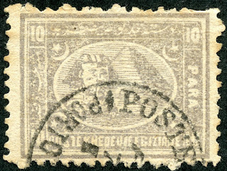
1872 Scott 20 10pa lilac
Perf 12 1/2 X 13 1/3 clean cut
Clear impression; thick opaque paper
Color: dull violet to reddish violet
Note: All 10 Para stamps (1872, 1874-75) are typographed
The 10pa denomination, which was frequently used for Greeting Cards, had, for the 1872 printing, 820,000 stamps (4100 sheets).
We will, of course, look at all the differences that distinguish the 1872 10 Paras from the 1875 10 Paras, but there is ONE difference that quickly meets the eye....
COLOR! The 1872 stamps are dull violet or reddish violet, while the 1874 stamps are pale slate or deep slate. !! Why is this not know better? The catalogues muddy the waters with their color descriptions, some of which have no basis in reality. Scott has lilac and dull lilac for the 1872 issue, and gray lilac for the 1875 issue. SG has mauve for the 1872 issue, grey-lilac (shades) for the 1875 issue. Michel has light violet for the 1872 issue, and gray lilac for the 1875 issue.
Smith says, in regards to the the 1875 10pa issue color catalogue listings: "The color of the 10pa has been consistently described as shades of lilac in the general catalogs for many decades, yet I have never seen a single example having a trace of lilac, mauve, or purple. Perhaps the initial listings simply assumed it must be lilac since it was a reprinting of the 1872 stamps."
It is difficult to mistakenly mix up "violet" vs "slate", so ergo, you now know a quick way to tell apart the 1872 10pa issue from the 1875 10pa issue. ;-)
Additionally, no other 10pa 1875 stamps have a 12 1/2 X 13 1/3 perforation, so this stamp above is confirmed to be a Scott 20 1872 issue. CV is $3.75/$9 Used/unused.
1872 Scott 20 10pa lilac, Example 2
Perf 12 1/2 X 13 1/3 clean cut
Clear impression; thick opaque paper
Color: dull violet to reddish violet
Here is a second example of the Scott 20.
Let's talk about paper differences between the 1872 and 1875 printings.
The catalogs state: "Thick Opaque Paper" for the 1872 printing, and "Thinner paper" for the 1874-75 printing.
But the paper used was the same for the 1874-75 printing as the 1872 printing, only a little thinner.
Smith says "The paper appears much the same as that used in 1871, and the same dandy-roll was evidently used for the watermark, However, the paper is thinner and nearly always less than 0.11 mm (but occasional examples of thick paper turn up). The thin paper may have a bearing on the oily translucent appearance of a large portion of the 1874-75 stamps."
In regards to the 1871 printing, Smith says "The paper has a slightly rough surface and is distinctly off-white. It contains Egyptian and Indian cotton fibers and was undoubtedly manufactured by the Khedive's Paper Factory. The thickness varies mostly between 0.11 and 0.115 mm."
So, how do I evaluate paper? Frankly, yes, I look at it, but I usually evaluate other things first (Perforation, clean cut vs rough perfs, Clear vs Blurred impressions). Paper, for me, is often more of a judgement call, or confirms what I already know about the stamp. I do think the comment about thinner paper creating more of an oily translucent look in the 1874-75 printings is quite valuable and helpful.
1872 Scott 20a 10pa dull lilac
Perf 13 1/3 clean cut
Clear impression; thick opaque paper
Color: dull violet to reddish violet
The 13 1/3 perforation is unique to the 1872 issue. As mentioned, this perforation is thought to be about 1/3rd as common as the major number 12 1/2 X 13 1/3 1872 perforation. CV is $3.50/$7 used/unused.
I find I tend to measure perforations first when I evaluate a new stamp in my collection for the 1872 & 1874-75 issues. It is important to do it carefully, and perhaps measure twice to make sure one is correct.
The reality is, by measuring perf first, one can already often determine the correct printing (1872 vs 1874-75). It is a very objective sign if done right.
1872 Scott 20a 10pa dull lilac, Example 2
Perf 13 1/3 clean cut
Clear impression; thick opaque paper
Color: dull violet to reddish violet
Here is a second example of the Scott 20a Perf 13 1/3.
1875 Scott 20b 10pa gray lilac
Blurred impressions, Thinner paper
Perf 12 1/2 Rough
Color: Pale slate to Deep Slate
For the second printing of the 10pa, the earliest date of use is August, 1875. Production was 1,200,000 stamps (sheets 1,200,000). CV for Scott 20b is $3.75/$16 used/unused.
It is sad that Scott still has this stamp as a minor number, as, with the significant change in color, and other well documented differences for the 1875 printing, it certainly deserves a major number!
Note the blurred appearance, the rough perfs, and the somewhat oily image. :-)
There is another example of Scott 20b below, heading the "Out of the Blue" section.
I should mention that there is also a 1875 Scott 20c 10pa gray lilac ( Perf 13 1/3 X 12 1/2 rough) that I don't have in my collection. The Perf 13 1/3 X 12 1/2 is unique for the 1875 printing. CV is $3.50/$37.50 used/unused.
1875 Scott 20b 10pa gray lilac, Example 2
Blurred impressions, Thinner paper
Perf 12 1/2 Rough
Color: Pale slate to Deep Slate
Out of the Blue
This has been illuminating and fun! To get the most out of this blog post (which contains many pearls from Peter A.S. Smith), I recommend opening up a Scott (or SG) catalogue to Egypt, and reading the post for a second time.
Speaking of the SG catalog ( Mine is Commonwealth & British Empire Stamps 1840-1970), I do have to give kudos to the Egypt 1872 & 1874-75 "Third Issue" coverage. There is much small type information included, and clearly was compiled by someone familiar with these issues.
Within the next month or so, I hope to complete a blog post on the 20pa and the 1pi denominations for the 1872 & 1874-75 printings. These can be a bit more complicated, especially for the 1872 printings, as they were produced both lithographically and with typography. !!
Comments appreciated!