A is for Aden and Z is for Zanzabar


A is for Aden and Z is for Zanzibar... Now what is between? For the world wide classical era philatelist and stamp collector, a country specific philatelic survey is offered by the blog author, Jim Jackson, with two albums: Big Blue, aka Scott International Part 1 (checklists available), and Deep Blue, aka William Steiner's Stamp Album Web PDF pages. In addition, "Bud" offers commentary and a look at his completely filled Big Blue. Interested? So into the Blues...

Tuesday, October 27, 2020

The Certs are back and Reality Bites

"Portuguese Guinea 1881 Scott 6  200r orange" 
Triple play: Forged Stamp, Overprint, Cancel
Into the Deep Blue
Two years ago I published a post under the title Bad Certs - Part A, in which was shown a group of stamps that returned bad news: namely the Certs revealed forgeries and other shenanigans.

Well, I have more from the cache to show today.

There was a bit of confusion with the title of my original post. I've changed the title to reflect that these are not literally  "Bad Certs", but rather the underlying stamps are "bad".

What I said in my original post....

"For the WW collector, there is much to be learned from Bad Certs.

I have a dealer acquaintance, very ethical, who sends away for many certs. He is rewarded with many good ones, but the bad ones (and the stamps) are pulled, and put into a reference folder. At times he sells the folder, having no further need of it, and that is how I acquired a cache of bad certs, with the accompanied stamps.

Let's pick over the Cert rejects, and see what lessons can be learned..."

A closer look

Portuguese India Scott 131 Cert

OK, here is a "Portuguese Crown" design stamp from Portuguese India. The CV for the Scott 1t on 10r green is $325. The other 27 stamps in the 1881-82 issue are CV $9-$160, so this is the most expensive stamp in the group, if genuine.

Portuguese India Scott 131 Forgery

Caution!: ALL of the Portuguese Crown design stamps for ALL of the Portuguese colonies were forged by Fournier! The forgeries were all off of one template design, so the forgeries are fairly easy to detect.

It is a very good idea for the WW collector to check for these common Fournier forgeries before sending off for a cert and spending hard earned money.

The Fournier forgeries are ubiquitous, and checking my own 1877 and 1880-81 "Portuguese Crown" stamps for Portuguese India, I harvested three forgeries out of eleven stamps. :-( 

The genuine....

"Crown" design stamps Portuguese Colony- Genuine

Note the "scallop" shell shape in the right upper quadrant? There are seven scallops. And the colored outer circle below the "CORREIO" tablet barely touches the lower horizontal line of the tablet. There are other signs, but this should probably be sufficient.

The Fournier Forgery...

"Crown" design stamps Portuguese Colony
Fournier Forgery

The shell "scallop" in the right upper quadrant is cruder, with, at most, six scallops, with the large central one divided partially by a thick line. The colored outer circle below the "CORREIO" tablet  abuts and clearly touches the lower horizontal line of the tablet along the "RR"'s. 

No doubt the overlying 1...T overprint is also a fake, but I don't have to try to check it, as the basic stamp has already been shown to be a forgery.

It might be wise to check all of your Portuguese colonies "Crown" stamps, as the Fournier has a way of sneaking into collection holdings. I know I plan to put that on my to-do list. ;-)
France Scott J23 Cert

Sergio Sismondo Certs are a favorite of dealers and collectors that want results from multiple countries at a reasonable price. He can usually provide a Cert for most major WW countries. He clearly must have detailed genuine/forgery comparison holdings and a large philatelic literature reference collection  in order to provide his services. He is well known to readers of the APS journal, as he frequently has major articles in it. 

I think he presents a good counterargument to the often expressed idea that one should only seek Certs from the expert(s) of a philatelic society from the country in question.

 In many cases, it is not necessary.  

If I, as a WW collector can figure much of this out on my own, a guy with the resources of Sergio Sismondo can certainly provide judgement in most cases! (Granted, for very tricky stamps, very minefield stamps, very obscure stamps, very expensive stamps, or as an absolute necessary "seal of approval" for selling purposes, the recognized expert(s) in the field might be the way to go.)

France Scott J23 1fr black Forgery

The "Duval Noirs", the typographic black postage dues of France (perforated) and French Colonies (unperforated) of 1882-1892, can be expensive in the higher denominations. Unfortunately, our old nemesis, Fournier, did some rather good lithographic and photogravure forgeries.

This 1 Franc black (unused) has a CV of $750, if genuine. How can we tell? Although I appreciate Sismondo's Certs, he only gives his judgement, and not the reason why.

So a bit of sleuthing is in order. The Serrane Guide (American Philatelic Society, 1998) provides the answer.

Let's look at a genuine "Duval Noir" close-up...

France Scott J22 60c black Close-up Genuine

Although there are multiple subtle signs, I'm going to present what I found helpful. Below "E" of "CHIFFRE" is a double line. And below the double line is an ornament that almost touches the double line, but a very small gap remains. (diagnostic genuine) There is also a close horizontal line just above the black "CHIFFRE" tablet.

Now, let us look at the 1 Franc in question...

"France Scott J23 1fr black Close-up Forgery
Probable Fournier ("Geneva") (first cliche) -Lithographed

Note the ornament below "E" and the double line has a large gap (.25 mm) from the double line. (Diagnostic - Forgery Fournier first cliche) Also note there is no close horizontal line visible above the black "CHIFFRE" tablet.

Now--- a bonus! I happen to have another "Duval Noir" forgery in my collection....

"1884 France J25 5f black"
"Probable Forgery"

I labeled this stamp as a "probable forgery:, as, no doubt, it was so labeled in the feeder collection. If genuine, the stamp has a CV of $1,600. But which forgery is it?

"France Scott J25 5fr black Close-up Forgery
Probable Fournier ("Geneva") (second cliche) -Photogravure

I think this is the "Geneva" "second cliche forgery (Fournier) as described in Serrane.

Note the ornament below "E" and the double line, is smashed up against the double line (diagnostic).  Compare/contrast with Fournier first cliche and the genuine. 


Spain Scott 15 Cert

Spain is a veritable minefield when it comes to early era forgeries. In fact, I have heard some opine that early Spain has the most number of printed forgeries of any country on earth. ;-)

The CV for the 1852 Scott 15 5r yellow green (unused) is $2,750 if genuine. But this example is a forgery, according to Sismondo.

Spain Scott 15 5r yellow green Forgery

As I mentioned, Sismondo's Certs provide a judgement, but not a why. So, can I figure this out?

There are many forgeries of early Spain because, during 1850-56, new issues were published yearly, and only valid for one year: in this case 1852. That meant the higher typographic denominations in the 1852 five stamp set had limited production and were scarce: the 5 reales 79,000 stamps vs 6 cuartos 11,250,000 stamps. Demand from collectors exceeded supply. The Forgers were happy to oblige. ;-)

1852 Scott 12 6c rose "Queen Isabella II"
Typographed; Thick Paper

Lets look at a genuine 1852 stamp: in this case the 6c rose...

Closeup 1 Genuine

1) Shading lines in the eyelid (actually this example it is difficult to determine).
2) Four increasingly longer lines in the hair band.
3) Note the markings for the nose.

Closeup 2 Genuine

4) Note the ribbon end in the lower center has a double layer (seldom done right with the forgeries).
5) Note the neck markings are more dashes than dots.

Now.let's look at the 5r yellow green forgery close-ups...

Closeup 1 Forgery

1) No shading lines on the eyelid
2) Four shading lines in the hair band do not reach as far as the genuine (compare).
3) Note the different markings for the nose.

Closeup 2 Forgery

4) Note the ribbon end in the lower center only has one layer (compare).
5) Note the neck markings are more dots than dashes.

So, what forgery is it?

It is a Segui forgery printed with typography on thick yellowish paper. (Thanks to SForgca for providing the information resources, in which I could determine that this was a Segui forgery. !!)

From The London Philatelist, Volume 15 (Google ebook (free))...

"We have received a pamphlet issued at Barcelona on Christmas by Senor Miguel Segui, in which he details the indignities suffered at the hands of Messieurs A. Maury and Yvert and Tellier, the well known French dealers, who have denounced the wares of M. Segui as forgeries, and have refused to accept his advertisements. It appears that M. Segui has made and is selling "at thirteen of the principal establishments of Barcelona" imitations of the complete series of Spain 1850-54, but in his pamphlet he states that these reproductions all bear the words "fac simile". We are, however, informed that this statement is open to modification."

Poland Scott 21a ? - No, Scott 21 Cert

Sometimes one wants a cert, not because of the stamp per se, but because of a unique color. 

For Poland, the occupation stamps Scott N6-N16 were overprinted/surcharged between 1918-19. The Scott 21 20pf blue is CV $1 in that color. But Scott 21a is described as "ultramarine", and has a CV (used) of $2,250!

Poland Scott 21a ? and Scott 21

The stamp in question (Is it the ultramarine variety?) on the left was submitted for a possible genuine cert. The submitter also included a Scott 21 (on the right) in the common blue color.

There clearly is a difference in shades.  (Heart rate up to 120 ;-)

But the Sismondo cert says the stamp falls within the common Scott 21 shades.

A clue perhaps is Sismondo describes the shade as violet-blue. I checked my own collection, and sure enough, I have both a blue shade stamp, and a clearly violet-blue shade stamp. 

Scott states in their catalogue that Scott 21 "blue" exists in a number of shades, and a suspected Scott 21 "ultramarine" needs to have competent expertization. Also, counterfeits exist.

Scott also states the Scott 21a comes with a German overprint that is very glossy.

"Forgery" says Sismondo
1881 Portuguese Guinea Scott 6 Cert

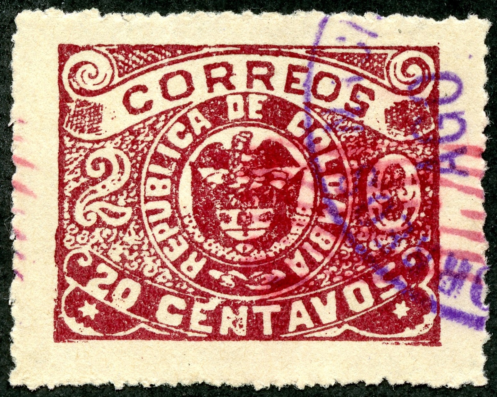
Here is another "Portuguese Crown" colony stamp, in this case a Portuguese Guinea Scott 6, submitted for a cert. If the stamp, an 1877 Cape Verde 200r orange stamp with "Guine" overprint, is genuine, the CV (used) is $475.

Remember, though, we talked about screening for the common Fournier forgeries for the "Portuguese Crown" colony stamps?

Portuguese Guinea 1881 Scott 6  200r orange Forgery
Stamps of Cape Verde 1877, Overprinted in Black
Triple play: Forged Stamp, Overprint, Cancel

Let's glance at the upper portion  of the stamp....

Right Upper Quadrant - Fournier Forgery

Note the "Scallop" design has, at the most, six scallops (it is supposed to have seven complete scallops), with the large central heart shaped scallop partially divided by thick line. The colored circular area abuts heavily on the "CORREIO" tablet along "RR". Both signs are diagnostic of a Fournier forgery.

Genuine

Note the genuine "Portuguese Crown" stamp has seven scallops in the right upper quadrant, and a colored circular area that barely touches the "CORREIO" tablet.

Sismondo also notes that the cancellation and the "GUINE" overprint are counterfeits. That determination is above my pay grade, as I would need to have reference material on counterfeit cancellations that were used, as well as a genuine "GUINE" overprint example to compare.

It makes sense, though, that the cancellation and the overprint would also be forgeries if the underlying stamp is a forgery - a triple play!

Out of the Blue
Well, I hoped you enjoyed viewing these Certs that turned out to not have the answer that was hoped for by the submitter. (And I have more of these, so expect future posts on this topic.)

And, as was demonstrated, a little investigation on the stamp specimen might yield the answer and not require spending money for a cert. Of course, a dealer does not have the time to run down all the possibilities, and, for them, it is just easier to submit an expensive CV possibility for a Cert (they will need one anyway if the Cert shows genuineness for an expensive stamp).

Comments appreciated!

Friday, October 23, 2020

Bud's L of N Album: Coat of Arms over the Matterhorn 1925-36


League of Nations (SdN) Album
 9.  Coat of Arms over the Matterhorn Issues, Variations 
1925-36
(part 9 of a series)


The Swiss coat of arms, radiant, rising over the Matterhorn, scattering clouds -- wow! -- it’s enough to make a rock-jock yodel. Scott #s 200-203 are among the finest, most patriotic designs ever issued by the Swiss Post.

And there are many varieties -- granite paper and ordinary, surface tinted paper and plain, smooth gum and grilled, with and without overprints, plus a host of plate flaws, color shades, and other anomalies. A collector could spend a lifetime admiring this one design and its many abnormalities.

This post narrows its focus to the overprints on these four stamps made for the League of Nations, Scott #s 2o32-2o34 and 2o31a-2o34a. A similar overprint made for the International Labor Organization is discussed in Post #25 of this series (forthcoming).


Both smooth and grilled gum varieties exist. Of course, you cannot see the grills on the above top row. But if you can magnify the scan sufficiently on your computer, you might be able to detect tiny squares on the stamps’ front side. Used grilled examples are rather more scarce than mint or CTOs. A brief discussion of grilled gum on SdN stamps can be found here.


Curiously, Scott Catalog editors decided in this instance to subordinate the stamps issued at an earlier date to those issued later, the opposite of their normal pattern. Hence, the 1925 issues --those without grilled gum -- get the “a” designation.

Yellow or no surface tinting, light blue tinting, three shades of gray ink,
the last with low overprint placement

Scott #2o34, mint, very dark gray paper tint

The bottom row of these #2o34s has three stamps (1, 4, and 5) with broken cervices on the Matterhorn, a plate flaw. The top row has none. Magnification of the scan is likely necessary to see them. They are visible without magnification on hand-held examples. The postal service sold the above mint block of ten, as well as the following full page, sometime after 1 February 1944.

Scott #2o32, mint, full page

The #2o32 page was struck from a relatively new plate and has few if any anomalies.

Scott #2o33, CTO at Geneva 10, 17 January 1944, full page

Later printings are understandably prone to faults. The above #2o33 page, undoubtedly a late printing, has multiple broken Matterhorn crevices, shading inconsistencies, and other defects. Either the tinted paper with a slick surface absorbed ink poorly, the deteriorating printing plate had many small breaks, or both. 


Monday, October 19, 2020

Bud's L of N Album: Grilled Gum Issues 1930


League of Nations (SdN) Album
8. Grilled Gum Issues, 1930 
1930
(part 8 of a series)

Switzerland began using grilled gum (aka, geriffeltes papier) in 1930 to prevent mint stamps from curling or rolling into annoying tubes.  Most collectors’ albums have smooth gummed stamps that refuse to flatten. The grill, a waffle-like matrix of tiny squares pressed on top of the gum, corrects this problem. It can be best seen on the back of mint stamps with undisturbed grills.


Courvoisier, the printer of many stamps for Switzerland and Liechtenstein, used a gum breaking machine to affix the grills. Sometimes, but not always, the thrust was heavy enough for the grill to be noticeable on the front of stamps and even on used stamps that have been soaked in water.

 Dates and Scott numbers

Scott Catalog lists the grilled SdN stamps with the letter “a” following the number for the corresponding smooth gum types, thereby subordinating them to the earlier stamps. Scott also uses the same system for distinguishing grilled from smooth gum issues for regular issue Swiss stamps. In addition to the eight stamps shown above, grills were also applied to the issue with the Swiss coat of arms over the Matterhorn. See post #9 in this series

Magnification of a grilled stamp

Stamps that might have grills, but are attached covers, present an identification dilemma. If the grill marks are not obvious on the front of the stamp, a restoration specialist might be required to partly detach the stamp for observation. Of the stamps shown in this post, probably only #s 2o17a and 2o23a are valuable enough to warrant seeking a specialist.

Comments appreciated!

Saturday, October 10, 2020

Colombia 1899-1904: Cartagena and Barranquilla Issues

Cartagena 1902 Scott 193 20c maroon 
Magenta Overprint
Into the Deep Blue
We have, so far, taken a look at some of Colombia's earlier issues....

Colombia 1859-1870 - a closer look
Colombia 1871-1883 - a closer look

I could continue chronologically with another post, but I'm going to jump ahead a bit to the 1899-1904 era: The time of the Thousand Days' War (Oct 17, 1899 - Nov 21, 1902).

https://en.wikipedia.org/wiki/Thousand_Days'_War

This little known civil war (for those outside Colombia) fractured the national government (Republic of Colombia). In fact, there were no national postal issues released between 1900-1902.

With fatalities well over 100,000, this war was the most bloody of any conflict ever for Colombia. It eventually led to the loss of Panama as a territory within Colombia in 1903.

Colombia

With no national stamp production, provisionals were released by the cities of Cartagena, Barranquilla, and Medellin between 1899-1904.

This is a fascinating period for the philatelist, and deserves a closer look.

To that end, we will look at some of the (admittedly fairly crude lithographic) issues of Cartagena and Barranquilla.

If the following stamp examples from my collection whet your appetite, then check out the award winning Philatelic exhibit ("Colombia - The Unknown War " The 1000 Days"") by James Cross.

A Closer Look
100 Centavos = 1 Peso
Cartagena

1899 Scott 172 5c maroon/greenish blue
Sewing Machine Perf./ Purple Overprint
The military government for the Department of Bolivar, under martial law, issued provisional stamps to cover stamp shortages as they developed. 

This example is from a 1899 five stamp (major number Scott 169-173) release from Cartagena. It was lithographed by Eugene Delgado in Cartagena, and released Dec 8, 1899. It can be found with a sewing machine perf. or Perf 12.

The stamp usually is found with a seven parallel wavy line purple overprint (as a security measure). Considering how crude the lithographic print is, a security measure was probably a good idea. ;-) In fact, almost all of Cartagena's stamp output shows control marks (overprints) as a security measure.

The CV ranges from $10+ to $60.

1900 Scott 177 5c black/pink
Lithographed/ Perf 12 vertically
In 1900, a five stamp set with the above design was released from Cartagena. Note "Gobierno Provisorio" at top. CV is nominally $6-$8.

These stamps were also used by the rebel provisional government in Cucuta. They have "Gobierno Provisional" at top. They can also be distinguished by a vertical name (Andres B. Fernandes) along the side of the stamp in black or green. CV is $5-$8.

1901 Scott 185 1c black
Sewing Machine Perf./Purple Overprint
In 1901, a 1c black and a 2c black/rose was issued as above. Note the characteristic purple overprint.

CV is a very modest $1.

1901 Scott 188 2c brown
Rose Overprint
Another 1901 two stamp issue (above and 1c blue) was released with a characteristic rose overprint.

CV is $1.

1902 Scott 189 5c violet
Magenta Overprint
The 1902 issue of two stamps (other one is a 10c yellow brown) has a magenta star overprint.

CV is $2+.

1902 Scott 191 5c yellow brown
Magenta Overprint
The other 1902 issue has three stamps: as above, a 10c black, a 20c maroon (post header stamp).

CV is $1+-$4+.

Barranquilla

1902-03 Scott 195 2c dark blue "Magdalena River"
Imperf.
The Barranquilla provisionals began in 1902 with a twelve stamp three design set.

The set was lithographed from a design by Francesco Valiente F. of Barranquilla.

This stamp has great detail.

1902-03 Scott 196 2c rose"Magdalena River"
Imperf.
This stamp's detail: not so much.

Of interest, the CV for the 2c rose is $20+, while seven other stamps in the set are $1+-$3+.

1902-03 Scott 200 10c maroon
"Iron Quay at Sabanilla"
The 10c stamp design shows "Iron Quay at Sabanilla".

I note this 10c maroon might have a plate flaw (white dot to left of "10").

1903-04 Scott 243 10c dark blue/salmon
"Iron Quay at Sabanilla"/ Laid Paper Imperf.
The 10c design was also issued between 1903-04 in dark blue on six different colored papers - each given a major number (Scott 240-245) for imperforate examples. There are also minor numbers for Perf 12 examples.

These stamps were on horizontally laid paper.

Horizontal Laid Paper - Imperf.
You should be able to see the horizontal lines on the stamp back indicating the laid paper.

1902-03 Scott 202b 20c purple "La Popa Hill"
Sewing Machine Perf.
The imperf stamps on non colored paper (1902-03 issue) can also be found with sewing machine perf (as above) and perf 12 (below).

Note the "La Popa Hill" design for the 20c denomination stamps.

1902-03 Scott 203a 20c dull blue "La Popa Hill"
Perf 12
Here is an example of Perf 12 on a 20c dull blue. The Imperfs are major numbers, while the sewing Machine perf and Perf 12 are minor numbers. The Steiner album pages provides spaces for all of these minor numbers.

1903-04 Scott 210 5c bister "Cruiser "Cartagena""
Imperf. 
A new lithographic imperforate issue (major numbers) with sixteen stamps and five designs was released by Barranquilla between 1903-04.

The set is both interesting and crude.

1903-04 Scott 214 50c carmine/ Imperf.
"Bolivar"
If I didn't know better, I would think this is a crude forgery. But I believe it is genuine. ;-)

1903-04 Scott 214a 50c rose/ Imperf.
"Bolivar"
The Scott catalogue lists a rose color for the 50c denomination, and gives it a minor number.

1903-04 Scott 215 50c pale brown/ Imperf.
"Bolivar"
On the other hand, Scott has "pale brown" as a major number. But...

1903-04 Scott 215 50c brown "shade"/ Imperf.
"Bolivar"
....somehow this very dark brown shade merits no notice. What the ???? 

1903-04 Scott 216 1p yellow brown
"General Prospero Pinzon"
General Pinzon was an army general for the conservative government faction during the War of a 1000 Days.

He is on the 1 peso denomination, which is found in four colors (major numbers).

1903-04 Scott 221 5p pale brown
Imperf.
The 5p denomination was printed in three colors (Major numbers).

CV for the issue ranges from $1+ to $20+.

1903-04 Scott 223 10p pale green 
Imperf
This is certainly not the finest lithographic print ever seen. ;-)

Yet crude prints reveal a tangible history of the times.

1903-04 "Scott 222a" 5p blue green
Perf Forgery: 10.5 rather than 12
The 1903-04 issue can also be found with Perf 12, minor numbers in Scott. The CV for the Perf 12 stamps are higher ( $5+-$70+) than the usual Imperf examples.

Unfortunately there are perf forgeries also known: I have a Perf 10.5 stamp- a forgery.

1903-04 Scott 222 5p blue green/ Imperf.
Out of the Blue
The combination of a civil war, provisional issues, and crude examples makes for a fascinating era.

Colombia, in my view, is somewhat still unexplored territory for the collector.

It is hard to obtain detailed and useful information about the issues.

Copaphil*, the philatelic study group dedicated to Colombia and Panama states...

"The listings in Scott Catalog are incomplete; European catalogs include additional listings, some controversial. In depth information about Colombian philately can be difficult to locate as much of it has been published in journals with limited circulation and availability." 

*Copaphil - unfortunately the link I embedded for the post is not working at this time (10-14-2020). I hope this is not a bad sign. :-(

So, if you wish an adventure, Colombia can provide it!

Note: R.I.P. Gerben - We miss you terribly. As I had general permission to use Gerben's maps for my educational blog site, I have taken advantage to show off one of his superb examples here. Unfortunately, his web site is no longer available.

Comments appreciated!