
Austria 1854 Scott 5e "Coat of Arms"
Type III
Into the Deep BlueDon't worry - too much. ;-)
I'm not going to totally descend into the byzantine world of the Ferchenbauer Osterreich 1850-1900 catalogue, although I'm sorely tempted to do so. The early Austria issues are an obsessive specialist's dream.
Rather, I will present early Austria - here, the 1850-58 "Coat of Arms" issue, mostly at the level of the Scott catalogue, with occasional forays into Michel, Ferchenbauer, and Austria Netto for parts that interest me.
Well, the dipping into Ferchenbauer may be more than occasional - I'm afraid I cannot help myself. !
The concurrent Lombardy-Venetia issues, the same designs as Austria, except for currency, will be included.
The original and initial blog posts and Big Blue checklists for Austria and Lombardy-Venetia are here and here.
This post will actually be the first of five dedicated to early Austria. !!
Future topics include...
* Austria 1858-59 Embossed Issues: Complete vs Broken Loops
* Austria (and Lombardy-Venetia) 1860-64 and Newspaper stamps
* Austria 1867-72 & 1874-80 "Franz Josef" issue (including Offices Turkish Empire) - a questioning foray into"Coarse" vs "Fine"
* Austria 1867-80 "Franz Josef" 5 Kr rose stamp: A deep dive into the five types
Since I have finished the Aden-Zululand country survey for the classical era (400+ posts!), I can return and look at parts I wish to explore further. What fun!
A closer look at the stamps and issues
Austria
60 Kreuzer = 1 Guilden
Lombardy-Venetia
100 Centesimi = 1 Lira

Austria 1854 Scott 1d 1kr yellow
"Coat of Arms"

The first stamps issued for Austrian Empire were the imperforate typographic five stamp "Coat of Arms" issue, beginning in 1850.
The stamps were originally printed on rough hand made paper (thin to thick), and then, from 1854 to 1858, on machine made paper.
The Scott catalogue divides these issues into major types: Type I, Type II, and Type III.
(If Scott says nothing about types, then, by presumption, they are Type I.)
A major focus of this blog post will be determining types for this issue.
The Scott catalogue divides these issues into major types: Type I, Type II, and Type III.
(If Scott says nothing about types, then, by presumption, they are Type I.)
A major focus of this blog post will be determining types for this issue.
This 1 kreuzer denomination stamp in yellow (and yes, hard to see the design) was postmarked from Trieste on February 27th, in the evening (abend). What year is unclear, but apparently after 1854 - which will be more apparent in a moment. CV is $100+.
Of interest, in 1851, when several thousand sheets of the 1 kr yellow were deemed too light in print to read the denomination, they were deliberately turned over, and stronger stamp impressions were printed on the reverse! Look for them.

Of interest, in 1851, when several thousand sheets of the 1 kr yellow were deemed too light in print to read the denomination, they were deliberately turned over, and stronger stamp impressions were printed on the reverse! Look for them.

Austria 1854 Scott 1d 1kr yellow
In Cyan Tint; Type III

With the cyan tint, the design is much easier to see.
With Type I, there is a heavy thick line around the Coat of Arms center. With Type III, there are two thinner lines around the Coat of Arms center. There is no Type II for the 1 Kreuzer yellow.
The thick line/thin lines differentiation around the center Coat of Arms is very important, as that is a major way one can tell Type I (1850) for all denominations, Type II- for the 9 Kreuzer (Austria), 15 Centesimi (Lombardy-Venteia), 45 Centesimi (Lombardy-Ventetia), and Type III (1854)* for all denominations.
(* Actually, although all machine made paper (1854 and later) is T III, hand made paper can have T III also.)
(* Actually, although all machine made paper (1854 and later) is T III, hand made paper can have T III also.)

Close-up: Type III
Note the two thin lines around the shield, especially on the left, in this example? By definition, this is a Scott T III, has a Scott minor number (1d), was produced in 1854 or later, and is on machine made paper.


Close-up: Type III
Other signs for Type III, according to Ferchenbauer, include a fairly flat topped "1" that is a bit removed from the upper horizontal border line of the value tablet, and the upright spike seen in the horizontal line above and to the right of the "R" is blunted. (We will view later a Type I for comparison.)
A little about the cancel from Trieste...
The seaport of Trieste on the Adriatic Sea, part of northeastern Italy, but on the border of Slovenia, had been part of the Habsburg Monarchy for centuries, and became the fourth largest city of the Austro-Hungarian Empire (after Vienna, Budapest, and Prague) in the 19th century.

Austrian Empire 1816-1867
Recall that during this era, Austria was a vast Empire spreading over central Europe, and ruled by an absolute monarch - at the time (1850) by Emperor Franz Joseph I, who ascended the throne in 1848.
The capital was Vienna (Wien), and the population was 37.5 million in 1843.
Languages spoken within the Empire included German, Hungarian, Czech, Slovak, Polish, Ruthenian, Slovene, Croatian, Serbian, Romanian, Italian, Hebrew & Yiddish, and Ukrainian.

Austria 1854 Scott 1b 1kr yellow
This 1 Kreuzer yellow may have a postmark of Riva del Garda, a town in northern Italy, and at that time, part of the Austrian Empire.


Austria 1854 Scott 1d 1kr yellow
In Cyan Tint; Probable Type III
The cyan tint reveals a probable Type III, as I see a white line interspersed between the line surrounding the central Coat of Arms. Unfortunately, the "1" in the value tablet is obscured by a cancel, so I cannot check for Type I/III characteristics there.
Now we get to one of the vexing questions for the 1850-1858 "Coat of Arms" stamps: Hand made (1850) or machine made (1854) paper? The hand made paper stamps have the major numbers in Scott, while the machine made paper have italic minor numbers. The CV for "used" , which ranges from $4+-$100+, is approximately the same for either hand made or machine made paper.
Honestly, I wish I could tell you that it is "slam dunk" easy to tell the difference between the two, but...no. I'm sure a specialist who has examined thousands of stamps would have an easier time of it.
My criteria is...
Very thick paper.. more likely hand made; medium thick paper..could be machine made; thin paper (often 6kr brown) - my examples actually seem to be machine made.
"Rough" appearing paper that is surface mottled organic and more three-dimensional: hand made; smoother paper..machine made.
The rough paper has a script letter "K.K.H.M." watermark on the sheet that could appear partially on the margin stamps. Alas, I don't have any examples of those.
Recall, though, if the stamp is a Type III ( two thinner lines around the Coat of Arms center), then it is usually on machine made paper (there are notable exceptions that are on hand made paper).
Frankly, I try to determine first (before I even look at the paper) if a stamp is a Type III, as Type III is usually on machine made paper. And, if a stamp is Type I (or Type II) - heavy thick line around the Coat of Arms center- it should be on hand made paper.
And, for the purposes of this blog post, I will be focusing more on the types, rather than discussing paper, which is difficult to demonstrate.
(If one wishes to have a guaranteed hand made paper specimen for reference - pick up a 1850 Lombardy-Venetia Scott 1 5 Centesimi buff - the denomination doesn't exist as machine made. Unfortunately, the CV is $200.)

Austria 1850 Scott 1d 1kr yellow
"Coat of Arms"


This 1 Kreuzer yellow looks like a mess- just a mottled blob of yellow.
Bur sometimes that can even be a clue to the type. With Type I, the entire Coat of Arms area can appear dark. In contrast, Type III tends to have a less dense Coat of Arms area.

Austria 1850 Scott 1d 1kr yellow
Cyan tint
Let's switch over to a cyan view for greater clarity.
Note the solid color line around the center coat of arms - that would suggest Type I.
BTW, can any reader identify the postmark?
Update- NIEDERDORF in Italy? Thanks Dirk.
Update- NIEDERDORF in Italy? Thanks Dirk.

Close-up: Type I
Note the thick single line around the shield. Clearly, Type I.

Close-up: Type I
The "1" in the value tablet, on the top, is slightly indented in the middle. The tips of the "1" to the right and left on either side of the indent is close to abutting the upper horizontal border line of the value tablet. (Compare with T III shown earlier.)
Ferchenbauer also notes the blunted upright spike along the lower horizontal value tablet line below the "R-period" is slightly open. This makes the stamp a Ferchenbauer subtype 1b, as opposed to subtype Ia, where the spike is closed.

Austria 1854 Scott 2c 2kr black
Machine-made Paper; Scott "Type III"
The 2 Kreuzer black has two thin lines around the center Coat of Arms: Type III.

Austria Scott 2c 2kr black shield close-up
See a dot in the center of the shield?
Note the small dot in the center of the shield? This makes this stamp in the Ferchenbauer catalogue their Type IIIb. There is also a Ferchenbauer Type IIIa.
If one is getting seriously interested in early Austria, then one will need to brush up on German (or use Google Translate extensively), and obtain the Ferchenbauer catalogue, and perhaps the Austria Specialized Netto catalogue. With these resources, one can parse much more deeply than what Scott offers.
The close-up here also offers a view of the two-headed Habsburg Eagle with the Austrian Coat of Arms on the chest.

Austria 1854 Scott 3e 3kr red
A glance reveals this is a Type III stamp - two thinner lines around the Coat of Arms shield.
If one wished to make a study of an early Austrian stamp, this would be a good candidate. The 3 Kreuzer red had a run of 107,250,000 stamps that could have been used in some 10,000 post offices. There are five Ferchenbauer sub-types available for examination, perhaps some 15 color shades, and the stamp is relatively inexpensive (CV $4+).


If one wished to make a study of an early Austrian stamp, this would be a good candidate. The 3 Kreuzer red had a run of 107,250,000 stamps that could have been used in some 10,000 post offices. There are five Ferchenbauer sub-types available for examination, perhaps some 15 color shades, and the stamp is relatively inexpensive (CV $4+).
3 kr red
Ferchenbauer TIIIb
Speaking of sub-types, the 3 kr red shown here is a Ferchenbauer subtype IIIb, based on the two overlay dots imprinted on the feet of the "R".
3 kr red
Ferchenbauer TIIIb
....and the solitary dot visible above the laurel. If these findings are exciting, then you may have the makings of an Austrian specialist. ;-)

Austria 1854 Scott 4f 6 kr pale reddish brown
Thin paper, T III
My 6 Kreuzer stamps are on thin almost transparent paper. Nevertheless, they appear to be on machine made stock, as they are Type III.


6 kr Close-up
For Type III, Ferchenbauer states the "6" is a bit below the upper horizontal value tablet frame line, except some stamps will have a color dot attachment ( as this one shows). Also the upright spike along the horizontal line above the "R-period" is blunt. (Compare to Type I later.)

Austria 1854 Scott 4f 6kr brown close-up
"KKPOST...STEMPEL"
If one looks at the stamp, one will note that "Austria" (Osterreich) does not appear. Rather "KKPOST...STEMPEL" for "Kaiserlich...Koenigliches...." (Royal Imperial Post Stamps). Recall that the stamp served the needs of much of central Europe with disparate languages.

Austria 1854 Scott 4b 6 kr brown
Thin paper, T III
The 6 Kreuzer comes in two common shades- brown and reddish brown. CV is $6+-$8+.


1850 Scott 4 6kr brown
Type I
There appears to be a thick line around the shield - probable Type I.

6 kr brown Close-up- Thick Line
Note the thick line. A careful examination will reveal a little bit of a white intermittent line in the middle of the thick line. That can be acceptable for Type I. But it may be advisable to check for further evidence of Type I, perhaps with the Ferchenbauer criteria.

6 kr brown Close-up - Type I
For Type I, Ferchenbauer shows the "6" firmly butting up to and attached to the upper frame line.
There are three subtypes.
In Subtype Ia, the head and belly of the "6" are attached (shown here). The upright spike along the horizontal line above "R-period" comes to a sharp point.
Type Ia - Second "E" is deformed
And, for Subtype Ia, the last "E" in STEMPEL is deformed as shown.

Type I, II, III of Austria 9kr blue "Coat of Arms"
The 9 Kreuzer has three types (I,II,III) that is partially determined by the position of the "9".
In general, a "type" is produced when there is a change in Die between printings. All of the "Coat of Arms" denomination issues (except the 5 Centesimi) have had at least two Die changes, although, admittedly a small change in some cases. In total, for the ten stamp denominations of Austria/ Lombardy-Venetia, there are some 40 types, according to Sergio Sismondo, a recognized expert in the area.
The top of the "9" in Type I is closer to the level of "Kreuzer", and not near the top of the label. Recall that Type I also has a heavy thick line around the Coat of Arms center.
Type II continues with the heavy thick line around the Coat of Arms center, but then the "9" is positioned much higher than the top level of "Kreuzer", nearly touching the top of the label.
Type III is as in Type II, but with the two thinner lines around the center of the shield.

Austria 1850 Scott 5 9kr blue, T II
(Ferchenbauer TIIb)
(Ferchenbauer TIIb)
This is a Type II, as the "9" almost touches the top of the label, but has a thick line around the coat of arms center. Compared to Type I, the ball of the "9" is oval in Type II, rather than round in shape.

9 kr Type II
One Heavy Line around Coat of Arms Center
Note the heavy line surrounding the coat of arms center.
Now, there is a little fly in the ointment. ;-)
At times, with the thick heavy line, there may be a little bit of "thin white" splitting the line (note on the right - upper side of the line). That can be a problem at times in determining if a stamp is Type I/II or Type III. Recall that Type III has two thin lines overall. Nothing is perfect. ;-)

1854 Scott 5h 9kr dark slate blue
Type III; (Ferchenbauer TIIIa)
This stamp clearly has two thin lines around the coat of arms center. And the "9" is close to the top of the label. This is a Type III.

9 kr Type III
Two Thinner Lines around Coat of Arms Center
Two thin lines = Type III.

Austria Scott 5h 9kr dark slate blue
T III;(Ferchenbauer TIIIa)
This is a Type III in a shade variant - possibly the Scott 5h dark slate blue.


As this area used a currency different from the rest of the Empire (Centesimi (1850) & Sodi (1858), rather than Kreuzer), they had stamp issues produced identical to the rest of the Empire, except for denomination. The Lombardy-Venetia stamps were valid throughout the Austrian Empire.


Position of "9" for Type II and Type III
As we will soon be looking at a Type I 9 Kreuzer, let's review the basic difference between Type I and Type II/III: namely the position of the "9" within the value tablet.
Note for Type II/Type III, the "9" is very close to the top of the value tablet, and much higher than the letters. The ball of the "9" is oval.

1850 Scott 5a 5kr blue
There appears to be mostly a thick line around the shield - this could either be a Type II or a Type III, depending on the position of the "9".

Position of the "9" for Type I
The "9" is much further away from the top of the value frame, and the top of the "9" position is much lower, relative to the letters. The ball of the "9" is circular.
This is characteristic for Type I.
Since each cliche has the "9" in a different position for Type I, the "9" can vary from 0.3 mm - 1.2 mm horizontal distance from "K".
Vertically, measured from the lower horizontal value tablet line, the "9" can be as high as 0.6 mm, and as low as 0.2 mm. The bottom of the "9", though is always lower than a horizontal line drawn along the bottom of the letters.

9 kr blue -what is it?
O.K. we have reviewed all three 9 Kreuzer types - so which one is this?
First, check the line around the shield. It is a thick line, rather than two thin lines, so that eliminates Type III.

The position of the "9"
Next, check the position of the "9".
There is ample space between the "9" and the horizontal value tablet line. The "9" is much lower than the letters. The ball of the "9" is circular.
This is a Type I - 1850 Scott 5a 9kr blue. It has a CV ($18 vs $9) about twice the Scott major number Type II .
BTW, there are 9 kr hand made paper specimens that are Type III (CV $50). In fact, of the ten Austria and Lombardy-Venetia denomination, only two ( 5 Centesimi, 10 Centesimi) are not found with Type III hand made paper specimens (Ferchenbauer). So, although many Type IIIs are indeed on machine made paper, one still needs to check for hand made paper.

Lombardy-Venetia 1815-1859
Next, we will look at the similar 1850-1858 stamps of Lombardy-Venetia, but first a word about the Kingdom itself. Lombardy-Venetia (Milan, Venice) was part (Crown Land) of the Austrian Habsburg Empire since the defeat of Napoleon in 1815. There was a resident viceroy, and later a Governor-General.
The Battle of Solferno by Adolphe Yvon
This continued until 1859, when, with the Austrian defeat by the allied French/ Sardinian forces at the battle of Solferino, Lombardy was lost and annexed to Sardinia. Then remaining Venetia was turned over to the new Kingdom of Italy in 1866 as a result of the Austro-Prussian War.As this area used a currency different from the rest of the Empire (Centesimi (1850) & Sodi (1858), rather than Kreuzer), they had stamp issues produced identical to the rest of the Empire, except for denomination. The Lombardy-Venetia stamps were valid throughout the Austrian Empire.

1850 Lombardy-Venetia Scott 3 10c black
"Coat of Arms"; Type I
As mentioned before, the Lombardy-Venetia stamps were the same design-wise as the Austria stamps, except for the denomination.
The 10c black is CV $200 for 1850 man made paper, and CV $500 for 1854 machine made paper.
It can be found as Type I and Type III. Machine made paper is only found as Type III.
What type is this example?

Lombardy-Venetia 10c black Close-up
Clearly, it is type I with the thick line around the shield.

L-V 10c black Type I Close-up
Ferchenbauer breaks Type I into two subtypes. Subtype Ia shows a break in the lower transverse bar of the second "E" of CENTES (this example). Subtype Ib will also show a break in the "0" of "10" at the 12 o'clock position.

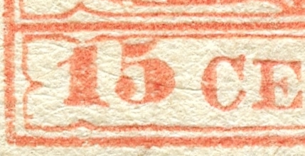
Lombardy-Venetia 1854 Scott 4j 15c salmon
Type III
The Lombardy-Venetia 15c reds come in three Scott types- I, II, & III.
This example is clearly a type III, as there are two thinner lines around the center coat of arms.
Also note that the "5" is higher (draw a line between the bottom of the "1" and the "C" to document), and the "5" is skewed slightly counterclockwise. The "5" touches the upper horizontal value label line. The "5" position is also found for Type II.
But Type II and Type I have one heavy line around the coat of arms center.

And Type I famously has a characteristic marker: The second "K" of KKPOST is missing the diagonal leg (or is shortened), and the first "E" in STEMPEL is missing the serif of the bottom horizontal stroke. This is not seen with Type II.

This example is clearly a type III, as there are two thinner lines around the center coat of arms.
Also note that the "5" is higher (draw a line between the bottom of the "1" and the "C" to document), and the "5" is skewed slightly counterclockwise. The "5" touches the upper horizontal value label line. The "5" position is also found for Type II.
But Type II and Type I have one heavy line around the coat of arms center.

15c red Type I close-up
And furthermore, Type I positions the non skewed "5" lower, on the same line as the bottom of the "1" and the "C". This is a crop of a genuine L-V 15c red Type I stamp from the internet (The stamp is not mine).And Type I famously has a characteristic marker: The second "K" of KKPOST is missing the diagonal leg (or is shortened), and the first "E" in STEMPEL is missing the serif of the bottom horizontal stroke. This is not seen with Type II.
Type III (and Type II) have the elevated skewed "5"
Note the (horizontal elongated) dot attached
to the lower left vertical value panel line? - FTIIIc
There is a great deal of fun to be had by examining the stamps with a Dr. Ulrich Ferchenbauer 1850-1900 catalogue in hand for us of an obsessive persuasion.
Ferchenbauer lists six types and subtypes for the Lombardy-Venetia 15 Cenetesimi red.
See the small dot by the left vertical line of the value panel? That clinches Ferchenbauer Type IIIc.


1850 Lombardy-Venetia Scott 4f 15c red
Type II
This specimen has a thick line around the center coat of arms, so either Type I or type II.
But Type I has a non-skewed "5", and positions it lower, online with the "1" and "C".
Therefore, this must be Type II.
Ferchenbauer parses this type more finely as Type IIa or IIb. Type IIa has a break in the lower transverse bar of the second "E" of "CENTES". While in Type IIb, the break has been repaired.
This is Type IIb.

Lombardy-Venetia 1850 Scott 5 30c brown
Thin Paper; Type III
There are only Type I and Type III for the 30c denomination in both Scott and Ferchenbauer.
This specimen is clearly Type III, as there are two thin lines around the central coat of arms.
Recall that Type I would have one thick line around the shield.

This specimen is clearly Type III, as there are two thin lines around the central coat of arms.
Recall that Type I would have one thick line around the shield.

L-V 30c close-up TIII
Ferchenbauer points out two other distinguishing characteristics for T III.
The lower ball of "3" is round (T III) rather than oval (T I). The upright spike seen in the horizontal line above the "S" is blunted (T III), when it is sharp and pointed for T I.


1850 Lombardy-Venetia Scott 5 30c brown
Type I
For this 30c brown, there is a thick line around the center coat of arms, so Type I.

L-V 30c close-up TI
The lower ball of "3" is oval (TI), and the spike seen in the horizontal line above the "S" is sharp (TI).
CV for the L-V 30c brown is $20+ for both Type I and Type III.

Lombardy-Venetia 1854 Scott 6d 45c blue
T III
Scott again has Type I, Type II, and Type III for the L-V 45c blue.
And a glance reveals this is Type III, with the two thin lines wrapped around the center coat of arms.
Recall that both T I and T II will have one heavy thick line around the central coat of arms.
In T III (as well as T II), the lower part of "45" is on the same level as the lower part of "CENTES". One can clearly see that for this stamp. And the distance between "45" and "CENTES" is approximately 0.6 mm.
In T I, the lower part of "45" is always lower than the lower part of "CENTES". And the "45" for Type I can vary in height and distance (0.2-0.7 mm) from "CENTES"

TIII (and T II) - lower part of "45" on same level as "CENTES"
Ferchenbauer also states that the "ball" of "5" for T II and T III is oval, while the "ball" is round for T I.

Lombardy-Venetia 1854 Scott 6d 45c blue, Shade
T III
There are many shades to be had for the 1850-1858 "Coat of Arms" issue. For the L-V 45c, there are seven listed shades.
Sergio Sismondo mentions some 100 shades altogether in his article about the 1850-58 "Coat of Arms" issue ("The first-issue stamps of Austria that set the standard for Europe"- Linn's Stamp News, September 28, 2016)!!!


Sergio Sismondo mentions some 100 shades altogether in his article about the 1850-58 "Coat of Arms" issue ("The first-issue stamps of Austria that set the standard for Europe"- Linn's Stamp News, September 28, 2016)!!!

Lombardy-Venetia 1850 Scott 6c 45c blue
Type II
This specimen has a thick ribbon around the central coat of arms - therefore either Type I or Type II.


45c blue Type I close-up
This is a crop of a genuine L-V 45c blue Type I stamp from the internet (The stamp is not mine). Note the lower position of "4" especially, and the closeness of "5" to "C". Note the ball of "5" is round.

45c blue Type II close-up
Determination between Type I and Type II for the 45c blue relies on the level of the "45" relative to the "CENTES". If the "45" is noticeably below the "CENTES", along a lower horizontal line, then the type is I.
If the level is essentially the same for "45" and "CENTES", then Type II (or Type III).
This appears to be Type II. A clincher is that the ball of "5" is round with Type I, but oval with Type II (seen here).
I was mildly put out by the results, because the stamp, when I bought it, was represented as Type I.
But the CV for Type I is $60, while $75 for Type II, so I wasn't burned. ;-)
But that is a reminder that description errors for the 1850-58 "Coat of Arms" stamps are not uncommon among sellers.
Caveat emptor.

Austria 1854 Scott 3e 3kr red
Out of the Blue
I hope the reader enjoyed this little refreshment on the endlessly fascinating Austria/Lombardy-Venetia 1850 issue.
And I hope it didn't feel too much like drinking from a fire hose. !!
And I hope it didn't feel too much like drinking from a fire hose. !!
Note: Maps and battle scene painting pic appear to be part of the public domain. The 9 kr types illustration is from Michel, and is used here for educational purposes.
The 15c red Type I and 45c blue Type I scan close-ups were cropped from stamps on the internet, and is used here for educational purposes. Permission was obtained. Thank you stampforgeries.com. !
The detailed breakdown of types for the 1850 issue is from the Dr Ulrich Ferchenbauer "Osterrreich 1850-1900' catalogue. Thank you Dr Ferchenbauer!
Links
Austria & BB Checklist
Austria: Lombardy-Ventia
Austria & LV: 1858-59 Issue
Austria & LV: 1860-64 Issues
Austria 1867-84:Franz Josef's Whiskers: Coarse or Fine?
Austria 1867-84 5k rose: a study
Austria - Bud's Big Blue
Austria: Lombardy-Venetia - Bud's Big Blue (Page 23 of Austria)
Comments appreciated!
Wonderful summary Jim! Question - how deep does the Netto specialized get? I do not have a Netto yet so curious esp since the Ferchenbauer catalog look very tempting to get..
ReplyDeleteHi Gene
ReplyDeleteOf course, the more catalogs, the better, but I used the Ferchenbauer as my go-to catalog. I was a bit surprised, because I thought I would use the Netto more than I did.
My guess for the 3rd yellow stamp would be NIEDERDORF in Italy.
ReplyDeleteDirkT
Thanks Dirk -yes, probable!
DeleteThanks for the tip on a cyan filter on the yellow Sc1 stamp, and others. They are nearly impossible to see clearly.
ReplyDeleteHi John
DeleteThe cyan filter does help a lot!
where does one get a cyan filter to check my austria #1?
ReplyDeleteGood question - thanks for asking.
DeleteOne probably only needs to do this to a stamp using filters for a color that is hard to examine - such as yellow.
What I do is open the stamp jpeg in whatever photo software you have - actually I just use the windows software that is supplied. There is an option to edit, including using filters. Pick an appropriate filter - one that will show the details on a stamp.
Just doing my Lombardy Stamps - Your Ifno was of GREAT Help - Thanks from Michael in Australia !
ReplyDelete