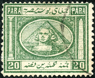
Egypt 1867 Scott 15 5pi brown
"Sphinx and Pyramid"
Into the Deep Blue
The stamps of early Egypt from 1867 to 1906 are known for their iconic design: namely the "Sphinx and Pyramid". They are fascinating, to say the least.
They also offer quite a challenge for the WW collector, as the earlier issues especially (1867, 1872, 1874-75) are filled with complexity. Can a WW collector (such as myself) dive a little deeper?
The 1867 lithographic issue (stamp example shown above), the first of the issues with this iconic design, is both simple and complex. "Simple" in that it is the only issue of its kind with the Sphinx placed directly in front of the Pyramid. With all the other issues, the Sphinx is off to the left side of the Pyramid. With the unique 1867 issue design, it is easy to identify.
1867 Lithographed Issue Scott 8,9,11,13,14,15
"Sphinx and Pyramid"
But a closer reading of the catalogue reveals the complexity. Namely, "each value was engraved four times, the resulting blocks being used to form sheets of 200. There are therefore four types showing minor variations for each value". Alas, the general catalogues do not give further clues, other than Michel states: "4 types each, which differ in the position of the pyramid in the middle oval and the shape of the Arabic letters". I am unable at this time of the post to locate a graphic illustration of the differences, as it is buried somewhere within the philatelic literature and not easily accessible to me.
(Note: This post was put together before I knew specifically the four type differences. I do now. Therefore, this post will serve as an introduction to the fascinating 1867 issue, while the next posts in the 1867 issue series will explore more specifically the four types for select denominations.)
Well, let's take a look at the stamps I have for the 1867 issue. Perhaps some of the differences between the four types might be found. (Hint: They do!)
Note: This post will cover the 5 PARA and 10 PARA values I have.
But there is another problem. The lithographic process often leaves a rough design, with degradation as the stamps are turned out. And plate flaws and repairs are possible. That might interfere or give a false signal as I try to figure out the four types.
And finally, lithography is the playground of many forgeries. Yikes!
August 1, 1867 Scott 8 5pa orange Copy one
"Sphinx and Pyramid"
The six stamp issue was designed by F. Hoff, and produced through lithography by V. Penasson, Alexandria. The perforations were 15 X 12 1/2. It was released on August 1, 1867. (Some color shades were issued on 7/1869.)
Today, the CV for the six stamps range from $1+(used) for the 1pi rose red to $200 (used) for the 5pi brown. The other stamps in the issue are CV ~$10+ (used).
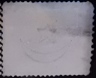
Scott Wmk 119 (SG Image 6)
"Crescent and Star"
Also the issue was "watermarked" with a "Crescent and Star" by pressing the "watermark" on the stamp reverse (some call this a "pseudo-watermark"). This "watermark" image for the 1867 issue is actually a bit different than the true "watermark" images used later for the 1872-75 issues, as Stanley Gibbons points out, even though Scott does not differentiate, and calls them all "Wmk 119".

1867 Scott 8 5pa orange yellow Copy two
"Sphinx and Pyramid"
You might notice that my "copy two" stamp has a different color shade. I call it "yellow orange", while "copy one" is "orange". For reference, Stanley Gibbons has "orange yellow", Michel has "yellow" and "orange", while Scott has "orange".
Ok, with my two stamps, do we have different types? Recall, there are four types, so I have a good chance they may be different.
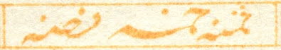
Well, actually, I found a number of differences. Let's check the center oval and the bottom Arabic script for differences, as they were mentioned specifically by Michel.
Position of the Pyramid in the OvalCopy one (top); Copy two (bottom)
1) The top of the Pyramid touches the oval (copy one), while the top of the Pyramid (copy two) does not touch the oval. (positional change)
2) The horizontal lines within the oval to the left of the Pyramid number 21 lines for copy one, while 22 lines for copy two.
Subtle but real.
Bottom Arabic Script
Copy one (top); Copy two (bottom)
Clearly, there are positional and length differences between the two scripts.
I found other differences not mentioned by Michel in other parts of the stamps. Whether these differences are also part of "Types", or due to vagaries of printing, degradation of the plate, or "states" of the stamp, I cannot say. Let's take a look.
(Update note: Yes, they are real, and part of different types.)
Copy one (top); Copy two (bottom)
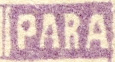
Right "PARA" tablet
The "A's" in particular are different.
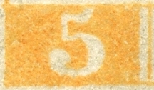
Left "5" tablet
Copy one (top); Copy two (bottom)
The "5's" are clearly different.
Left "PARA" tablet and top of column
There are differences in the PARA letters (especially the "A's"), but the top of the column (below the PARA tablet) shows noteworthy differences.
In summary, it does appear I have two different types for the 5 PARA denomination. I really don't know if all the differences are due to "types", though, as I mentioned above. (Update note: they are indeed "types". !) Also, I am obtaining six more copies of the 5 PARA stamp, so I plan another blog post if I find what might be additional types.
Could I be fooled, and one of these stamps is a forgery? Both stamps show the impressed watermark on the reverse, so that makes it more unlikely (but not impossible). The problem is I don't know what forgeries look like for this issue, although I know they definitely exist. (Update note: I have a better idea on forgeries now, and these examples are genuine.)
1869 Scott 9a 10pa lilac Copy one
"Sphinx and Pyramid"
The 10pa lilac was issued in 1869. Or is this a "violet"? Then 1867. I go back and forth. The catalogues have different descriptive colors for this value. Besides "violet" (1867), Scott has "lilac" (1869). Stanley Gibbons has "dull lilac" ('67) and "bright mauve" ('69). Michel has "violet" and "lilac".
1869 Scott 9 10pa brown lilac Copy two
"Sphinx and Pyramid"
My copy two of the 10 PARA is a brown lilac, perhaps accentuated, because it is on quite yellow paper. Both of my copies have impressed watermarks on the reverse, which would increase the chance that they are genuine, as opposed to forgeries.

Position of the Pyramid in the Oval
Copy one (top); Copy two (bottom)
1) The top of the Pyramid is closer to the oval line (copy one), compared to copy two. (positional change)
2) The horizontal lines within the oval to the left of the Pyramid number 21 lines for copy one, while 20 lines for copy two.
3) Facial markings on the left cheek are different (subtle).
Bottom Arabic Script
Copy one (top); Copy two (bottom)
There are positional, size, and length differences between the two scripts.
Let's look at other differences not mentioned by Michel. As said, whether these differences are also part of "Types", or due to vagaries of printing, degradation of the plate, or "states" of the stamp, is unclear.
(Update note: The differences are indeed because of "types".)
Copy one (top); Copy two (bottom)
Right "PARA" tablet
The end "A" is much narrower in copy two.
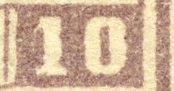
Right "10" tablet
Copy one (top); Copy two (bottom)
For copy two. the center hole in "0" is narrower, and the "1" is thicker. Note the purple colored bulge in the right lateral vertical line for copy one. (transient or consistent finding? - a plate flaw?)

There are differences in the PARA letters (especially the first "A"), but the top of the column (below the PARA tablet) shows noteworthy differences.
In conclusion, it looks like we have two types for my two 10 PARA stamps. I'm not sure, though, if all the differences shown here are strictly due to "types". (Update note: They are do to "types".)
1867 Scott 11a 20pa blue green
"Sphinx and Pyramid"
Out of the Blue
As we are getting pretty deep into the weeds with this issue, I decided to stop here, and will pick up the more about the 1867 issue with the next post.
There is certainly enough to digest here already. ;-)
Update note: The differences between my stamps shown here are indeed because of differences in "types". The above illustrations and discussion then serve as an introduction to the 1867 issue, which will be explored in more depth (and knowledge) with the next several posts. I am looking forward to it!
Update note: For the curious, look at the scan of the six stamp issue (second scan from the top). One of the stamps is a forgery! Can you spot it? ;-)
Comments appreciated!
 Scott #s 38 green, 39
rose carmine and 40 brown
Scott #s 38 green, 39
rose carmine and 40 brown