
1920 Scott 4a 1 1/2p orange brown "George V"
Quick HistoryThe former British southern African colonies of Cape of Good Hope, Natal, Transvaal, and the Orange River Colony became provinces within the new Union of South Africa on May 31, 1910. This was enabled by the 1909 South Africa Act by the British Parliament. Of interest, Rhodesia was also offered a future admission ticket, but this was rejected by the Southern Rhodesia colonists in a referendum in 1922.
The capital was and is Pretoria (in Transvaal), although the parliament was and is in Cape Town (in Cape Province).
The population was 10,700,00 in 1940.

Provinces of the Union of South Africa
The Union was a self governing dominion of the British Empire, and lasted until 1961, when a republic was created with a new constitution. (After 1931 the autonomy increased, as, the United Kingdom could no longer legislate on behalf of the Union of South Africa.)
The Union of South Africa government was historically elected, formed, and "run" mostly by the white minority.

South Africa (red); South West Africa (orange)
After WW I, German South West Africa, which had been occupied by South African forces in 1915, was mandated by the League of Nations in 1920 to the Union of South Africa. This territory was then essentially governed by South Africa as a fifth province- with their own stamps. (This would become a sticking point later,as South Africa's apartheid policy was enforced in South West Africa in 1948. The U.N. eventually took over responsibility, and the country became independent as Namibia in 1990.)
On November 4, 1910, the first stamp of the Union of South Africa was issued with a vignette of King George V, surrounded in each corner by the coat of arms of the four founding provinces.
Between 1926-1951, most stamps were issued in pairs: One with a SOUTH AFRICA script label, the other with a SUIDAFRIKA or SUID-AFRIKA script label.

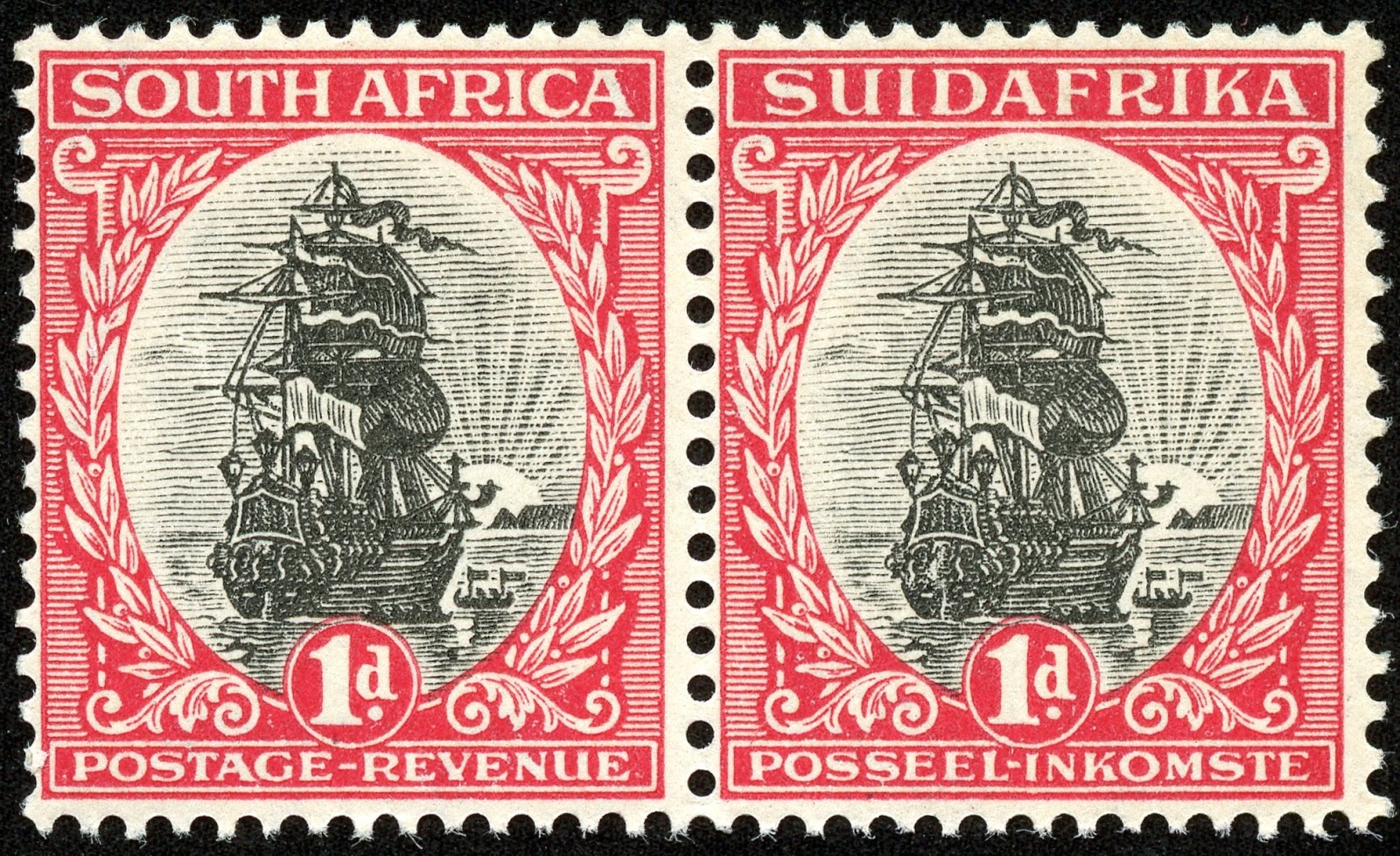
Scott 49 (SG 56h) 1d rose carmine & gray, pair
"Jan van Riebeek's Ship Drommedaris"
From 1948 booklet pane, postal slogans on margin
Into the Deep BlueThe 2014 Scott Classic Specialized 1840-1940 catalogue has, for Union of South Africa 1910-1952, 237 major descriptions. And, of major importance, 147 of these descriptions are for pairs- which break down to an English single (a subtype) and an Afrikaans single (b subtype). In other words, 90 descriptions are for the (usual) one stamp, while 147 descriptions are actually a-b pairs - or 294 stamps approximately (Some are actually collected in strips of three). Therefore, there are ~ 384 different stamps to collect, even if there are only 237 major descriptions. This is of major significance to WW collectors, as collecting separated pair singles is much less CV expensive than collecting intact pairs.
So, with the above in mind, of the total ~ 384 different stamps available, 266 are CV <$1-$1+, or 69%. This high affordability % would be much lower if the stamps are collected in intact pairs.
I should mention at the outset that the English-Afrikaans Se-Tenant pair issues of 1926-1954 (Scott 23-67) are a major identification challenge for the WW classical collector- almost on par with the Greek Hermes Heads in terms of difficulty. ;-)
And Scott presents a rather simplified identification matrix- ignoring the partly or wholly screened photogravure varients issued after 1947. Admittedly,Scott does a good I.D. job with the stamps they do cover. For the obsessive, I would recommend the addition of the Stanley Gibbons. No doubt Michel does an equally fine job.
But even for Scott catalogue users, albeit simplified, the above 1926-1954 Se-Tenant issues can be a major headache.
I will consider it an accomplishment if the WW collector is able to get through these issues reasonably well after reading this post. ;-)
A closer look at the stamps and issues
12 Pence = 1 Shilling
20 Shillings = 1 Pound

1910 Scott 1 2 1/2p blue "George V"
With the Union Parliament opening on November 4, 1910, this lovely engraved 2 1/2 pence blue was issued. Each corner has the coat of arms of the four founding provinces and ex-colonies.


1913 Scott 14 5sh blue & claret "George V"
The 1913-24 fifteen stamp typographed issue is bi-lingual (English and a Afrikaans scrip), and has a portrait of George V. Seven of the stamps are also bi-colored. CV is <$1-$1+ for ten stamps.
The issue is known for having very small top and bottom margins. The perfs generally are close to or touch the frame.
The issue is known for having very small top and bottom margins. The perfs generally are close to or touch the frame.

1921 Scott 20 2p dull violet "George V"
Coil Stamp - Perf 14 Horizontally
Between 1913-1921, four coiled stamps were also issued. The 1/2p, 1p, 1 1/2p, and 2p denomination coils are the same in color and image as the regular perforated issue

1926 Scott 21 4p blue gray "Hope"
In 1926, an imperforate homage to the Cape of Good Hope triangulars was issued. This consisted of two stamps: an English and an Afrikaans inscription, each issued on a separate sheet.
-----------------------------------------------------------------------------
Now lets pause briefly to gather ourselves for the main course of this blog post (and the next one): the English-Afrikaans Se-Tenant pair issues of 1926-1954 (Scott 23-67). I consider the presentation to be at the introductory- intermediate level. By no means is it exhaustive, or at the level of the specialist. The presentation also is based on the Scott catalogue- therefore a bit simplified- but I will provide some additional reference to the Stanley Gibbons.
I will cover the 1/2p, 1p, and 6p denominations for this Part I post. They were initially issued in 1926 as typographed; later issues were photogravure (rotogravure).
The remaining Se-Tenant 1927-1954 issues, either engraved or using photogravure, will be covered in the Part II post at a later date.
No man is an island- least of all WW classical era collectors. Besides referencing the Scott and Stanley Gibbons catalogues, I also mined on the following internet resources. Thank You!
* http://www.rjbw.net/SA1926-54.html
* http://www.stampboards.com/viewtopic.php?f=13&t=4360&hilit=South+Africa

1926 Scott 23 (S.G. 30)1/2p dark green & black "Springbok"
Perf 14 1/2 X 14; Typographed
The lowest denomination Se-Tenant pair is the 1/2 pence "Springbok" design, and was typographed by Waterlow & Sons in 1926 (as was the 1p and 6p) in London, and then Pretoria. (We will not get into identifying the respective printings as they are difficult to determine and fairly trivial. Suffice to say the London printings are clearer and sharper, the Pretoria printings are less so.)
The pairs are generally collected in a horizontal format, and vertical pairs are worth less. (No good reason, just convention!) The 1926 typographed 1/2 p and 1p pairs are only CV $3, so one may want to try to find intact pairs for these stamps. (Often, for the Se-Tenant pairs, intact pairs are much more expensive than a pair made up of two (non intact) singles.)
Note: There was a typographed "economy printing (to use up old paper)" issue in 1948 using the old 1926 plates in pale olive gray & blue-green (S.G. 126).
So what are the characteristics of the 1926 1/2p dark green and black "Springbok" stamp?
* Although the "Springbok" stamps can be found in many different shades over the years, the color of the 1926 typographed stamp is dark green and black. This is at least helpful.
* The only example that is typographed, all other later issues are printed with photogravure (also called Rotograph or Rotogravure). (Important!)
* Horizontal perf is 14 1/2: all other later issues are horizontal perf 15. (Important!)
* The "SUIDAFRIKA" stamp is without hyphen. (The 1930-45 photogravure examples are also without hyphen, but the 1933-54 photogravure examples are with a hyphen.)
* The leg of "R" in AFRICA or AFRIKA ends in a curved line in the typographed stamps, as opposed to a straight line for the photogravure stamps. (Important!)
Lets take a closer look....

1926 Scott 23 1/2p dark green & black "Springbok"
Typographed: Note the leg of "R" is curved in both stamps
Note the leg of "R" is curved in both stamps, - although each "R" is different, and curved in a unique manner.

1930 Scott 33 1/2p blue green & black
Photogravure: Note the leg of "R" is in a straight line
For comparison, the 1930 Scott 1/2p photogravure stamp has straight "R" legs- and even thickness. (The right stamp "R" is a bit obscured by the cancel, but can still be seen.)
Stanley Gibbons describes the leg of "R" as "ending squarely",and flush with the bottom of the frame.
Note also the color differences!

1930 Scott 33 (S.G. 42) 1/2p blue green & black
Perf 15 X 14; Photogravure; No hyphen
The 1930-45 photogravure issue, also without hyphen, has a number of differences that have already been described. Compared to the 1926 typographed issue, that includes horizontal perf (15 vs 14 1/2), color (blue green & black vs dark green & black), and the leg of Africa and Afrika (straight vs curved).

1936 Scott 45b (S.G. 54) 1/2p green & gray
Perf 15 X 14; Photogravure; Hyphen
The 1933-54 photogravure issue is characterized by a hyphen in SUID-AFRICA. Note the "gray" color of the Springbok, as opposed to black. (True- these stamps were printed in many different shades, but still helpful.)

1937 Scott 46 (S.G. 75c)1/2p green & gray, Redrawn
18 1/2 X 22 1/2 mm
The 1937 Scott 46 1/2p was redrawn- the most easy thing to see are the horizontal lines in the frame along the top and bottom of the stamp.
But there are other differences as well. We are going to back up, and get a closer look at parts of the frame, the central "Springbok" vignette, and the leaves. We will do this for all the 1/2p stamps illustrated so far. And, as a benefit, we might be able to observe some printing differences between typographed and photogravure specimens.


But there are other differences as well. We are going to back up, and get a closer look at parts of the frame, the central "Springbok" vignette, and the leaves. We will do this for all the 1/2p stamps illustrated so far. And, as a benefit, we might be able to observe some printing differences between typographed and photogravure specimens.
The Frame

1926 Scott 23 1/2 p, Typographed
The upper frame lines are vertical for the typographed specimen, as they are for the 1930 and 1936 photogravure specimens (examples below). But the 1937 photogravure Scott 46 has the upper frame lines horizontal (example below).
The typographic example above seems crisper and more filled in, compared to the photogravure specimens. And, remember, like typewriter letters, the pigment is sometimes stronger and more squeezed out at the edges with typography. I see that here.
Note the upper horizontal solid tablet in the middle is pigment "solid" also. The 1930 Scott 33 and 1936 Scott 45 photogravure printings to follow often show streaky diagonal lines in this area.
Note the upper horizontal solid tablet in the middle is pigment "solid" also. The 1930 Scott 33 and 1936 Scott 45 photogravure printings to follow often show streaky diagonal lines in this area.

1930 Scott 33 1/2p, Photogravure
Think dots, dot matrix, and screened (giving little squares arranged in straight diagonal lines) when thinking of photogravure. The pigment appears blotchy, like dots, and not well filled in.
Note the streaky diagonal lines in the upper middle tablet.
Note the streaky diagonal lines in the upper middle tablet.
(I'm not going to formally review- (except for some examples I have in my collection) - partially screened (frame) or fully screened Se-Tenant varieties issued after 1947 and 1949 respectively- as Scott does not cover them.)

1936 Scott 45 1/2p, Photogravure
The 1936 specimen also looks dotty Note there is a hint of diagonal lines in the upper frame solid rectangular tablet area.

1937 Scott 46 1/2p, Photogravure, Frame redrawn
The 1937 specimen has the frame lines in a thicker horizontal pattern. And note the thin white horizontal line through the solid area along the upper middle frame. Also, individual small dots can be seen with close inspection.
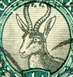
Springbok Vignette

1926 Scott 23 1/2 p, Typographed
I count 42 dark horizontal lines in the vignette on the left side (Springbok's right). The thicker lines are toward the bottom. Perhaps an easier count would be the the number of lines intersecting between the chin and the top of the ear on the left side. I count 26.
Note the eye (pupil) drawing.

1930 Scott 33 1/2p, Photogravure
It appears there are also 42 lines (The cancel somewhat obscures the count- could be 41). And, although the bottom lines appear closer together, they are not noticeably thicker. The lines impinging between the chin and the ear is 26- same as the 1926 typographed specimen.
Note the drawing shape of the pupil appears different.

1936 Scott 45 1/2p, Photogravure
I count 41 lines for sure. . Scott states there are 40 lines. The lines impinging between the chin and the ear is 26.
For practical purposes, the number of lines for the first three examples shown here are two close (40?-41?-42?) to create certainty about differences. The lines between the chin and the ear are clearly 26 for all three stamps.
I do see a difference for the pupil shape in the typographed stamp.

1937 Scott 46 1/2p, Photogravure, Lines thicker and fewer
Now here, there is clearly a difference in the number of lines, as well as thickness. I count 28 lines, which agrees with Scott. The number of lines impinging between the chin and ear is 18.
Leaves

1926 Scott 23 1/2 p, Typographed
The typographed stamp has clear strong multiple shading lines in the leaves.

1930 Scott 33 1/2p, Photogravure
The shading lines are weak.

1936 Scott 45 1/2p, Photogravure
Shading in leaves strengthened
The shading lines have been strengthened. But appears more "dotty" than the typographed specimen.

1937 Scott 46 1/2p, Photogravure
Fewer Shading Lines in Leaves
The lines are strong, but fewer.

Type of 1947 Scott 47 (S.G. 114) 1/2p green & gray
Photogravure; 18 X 22 mm
The 1947 Scott 1/2p is similar to the 1937 Scott 46 1/2p in that there are 18 horizontal lines impinging between the chin and ear of the Springbok vignette.
But there is a quite obvious difference: it is smaller- 18 X 22 mm vs 18 1/2 X 22 1/2 mm for the preceding Springboks. (S.G. says 17 3/4 X 21 3/4 mm for S.G. 114)
It can also be found as part of a booklet pane (with advertising) as shown here (Scott 47c, 1948 S.G. 114a).

But there is a quite obvious difference: it is smaller- 18 X 22 mm vs 18 1/2 X 22 1/2 mm for the preceding Springboks. (S.G. says 17 3/4 X 21 3/4 mm for S.G. 114)
It can also be found as part of a booklet pane (with advertising) as shown here (Scott 47c, 1948 S.G. 114a).
1948 Scott 47c (S.G. 114a) - from booklet with marginal adds
Frame Screened
I'm quite certain that my 1947 Scott 47 is a partial (frame) screen version, as the unscreened version is not that common. Notice how "fuzzy" it appears? Once more, my specimen is a 1948 booklet version, and the entire design screen stamp was not issued until 1949.
1943 Scott 98 (S.G. 105) 1/2p myrtle green
Photogravure
Finally, there is a monocolor myrtle green Springbok issued in 1943. This is a coil stamp, usually collected in vertical pairs.

1943 Scott 98 1/2p myrtle green
You might want to enlarge this example and take a look at at the pigment pattern- "mottled" does not do it justice. ;-) This stamp was produced in either fine screen or coarse screen. This appears to be a coarse screen.
1926 Scott 24 (S.G. 31) 1p carmine & black
"Jan van Riebeek's Ship, Drommedaris"
Perf 14 1/2 X 14; Typographed
So what are the characteristics of the 1926 typographed 1p carmine & black stamp?
(Many of the same characteristics that are found for the 1/2p Springbok stamp are found for the 1p. But it bears repeating. ;-)
* Although the "Ship" stamps can be found in many different shades over the years, the color of the 1926 typographed stamp is carmine and black.
* The only example that is typographed, all other later issues are printed with photogravure. (Important!)
* Horizontal perf is 14 1/2: all other later issues are horizontal perf 15. (Important!)
* The "SUIDAFRIKA" stamp is without hyphen. (The 1930-45 photogravure examples are also without hyphen, but the 1933-54 photogravure examples are with a hyphen.)
* The leg of "R" in AFRICA or AFRIKA ends in a curved line in the typographed stamps, as opposed to a straight line for the photogravure stamps. (Important!)
Lets take a closer look....
1926 Scott 24 (S.G. 31) 1p carmine & black
Typographed: Note the leg of "R" is curved in both stamps
The "Curved R" sign is present for the 1p typographed stamps.
1930 Scott 34 (S.G. 43)1p carmine & black
Photogravure; Note the leg of "R" ends squarely
The leg of "R" is straight with a square end. Note also the color differences with these two stamps, emphasizing that color can vary for these issues, despite what the catalogue says. ;-)

1930 Scott 34 (S.G. 43)1p carmine & black
Perf 15 X 14: Photogravure; No hyphen
1 mm space between Posseel - Inkomste
The 1930-45 photogravure issue, also without hyphen, has a number of differences that have already been described. Compared to the 1926 typographed issue, that includes horizontal perf (15 vs 14 1/2), and the leg of Africa and Afrika (straight vs curved).
The color for both the 1926 typographed stamp and the 1930 Scott 34 photogravure stamp is "carmine & black": now, who you going to believe: the catalogue, or your lying eyes? ;-)
There are actually two types of the 1d found for this no hyphen photogravure issue. (Scott 34,35; S.G. 43, 43d)
And there are two signs that distinguish them.
The first sign is the mm space between Posseel - Inkomste found on the SUIDAFRIKA stamp.
Lets take a look.....
1930 Scott 34 (S.G. 43)1p Photogravure, No hyphen
1 mm space between Posseel - Inkomste
There is a 1 mm space between Posseel - Inkomste found on the SUIDAFRIKA Scott 34 (S.G. 43) stamp. This close spacing is found on the so called "Type I"stamp in S.G.
1932 Scott 35b (S.G. 43d) 1p Photogravure, No hyphen
2 mm space between Posseel - Inkomste
There is a 2 mm space between Posseel - Inkomste found on the SUIDAFRIKA Scott 34 (S.G. 43) stamp. This wide spacing is found on the so called "Type II"stamp in S.G.

1932 Scott 35b (S.G. 43d) rose & black
2 mm space between Posseel - Inkomste
Here is the 1932 Scott 35 (S.G. 43d) stamp and the wide (2mm) spacing found on the SUIDAFRIKA stamp specifically.
Note also Scott calls the color "rose & black", which it appears to be, but we have already seen that color is not necessarily consistent.
I mentioned earlier that there are two signs that distinguish Scott 34 & Scott 35.
Let's look at the second sign....


Note also Scott calls the color "rose & black", which it appears to be, but we have already seen that color is not necessarily consistent.
I mentioned earlier that there are two signs that distinguish Scott 34 & Scott 35.
Let's look at the second sign....

Scott 34 : close spacing of the horizontal lines
Stanley Gibbons (S.G. 43) calls this stamp "Type I"
The side panel's horizontal lines are close together in Scott 34 (S.G. 43)- called "Type I" by S.G.
I count 24+ lines for this section.

Scott 35 - wide spacing of the horizontal lines
Stanley Gibbons (S.G. 43d) calls this stamp "Type II"
The side panel's horizontal lines are wider apart in Scott 35 (S.G. 43d)- called "Type II" by S.G.
I count 19 lines for this section.

1934 Scott 48 (S.G. 56) 1p carmine & gray
18 1/2 X 22 1/2 mm; Hyphen
The hyphenated 1933-54 photogravure issue yields three major Scott numbers (1934 Scott 48, 1948 Scott 49, 1951 Scott 50) for the 1p denomination. The corresponding S.G. numbers are 56, 56i, 135. S.G. also lists a screened version- 1950 S.G. 115.
What distinguishes these issues,besides the hyphen on the Afrikaans stamp?
The centers are in gray, rather than various tones of black. Some stamps are smaller. And the center "ship" vignette and surrounding sky can appear somewhat different.
Scott 48 is the "usual" size ( 18 1/2 X 22 1/2), but the vignette is definitely gray. (Compare with the varying levels of black seen for the vignette for preceding shown specimens.)
There is one other finding....
Scott 48 1p: "Pimple" on "O" of "SOUTH"
Frequently, one will find a "pimple" on the "O" of the SOUTH AFRICA script stamp. ;-)

1940 Scott 49 (S.G. 56i) 1p rose carmine & gray black
18 X 22 mm: Hyphen
Scott lists the color of Scott 49 as "rose carmine & gray black". (S.G. has it as "grey & bright rose carmine".) But the significant difference is the reduced size: 18 X 22 mm.
(The "pimple" on the "O" can sometimes be found for this issue also.)
Be aware that the screened version, 1950 S.G. 115- not found in the Scott- is also 18 X 22 mm. This "grey & carmine" stamp changes the appearance from solid colors to very small squares of color in straight diagonal lines to produce a rather fuzzy look. (I don't have an example of this.)

1951 Scott 50 (S.G. 135) 1p carmine & black
17 1/2 X 21 1/2 mm
Scott 50 (S.G. 135) is even smaller ( 17 1/2 X 21 1/2 mm). (S.G. states 17 1/4 X 21 1/4 mm.) The sky around the ship has been redrawn to clearly show a horizon.

1936 Scott 73 carmine & gray
(Single from "Jipex 1936" Souvenir Sheet)
(From booklet panes of 6, marginal ads: Scott 48j)
If you would like to compare an "unknown" 1p or 1/2p to a "certain" Scott 48 or Scott 45, obtain all or part of the 1936 Jipex sheets. The overprinted stamps on the two sheets (Scott 73 or 72) are from the 1p (Scott 48) or the 1/2p (Scott 45) respectively.

1943 Scott 99 (S.G. 106) 1p rose pink
Types of 1926 Redrawn
Lastly, in 1943, a mono-color (rose pink) hyphenated coil stamp was issued, that is generally collected in vertical pairs.

1926 Scott 25 (S.G. 32) 6p orange & green "Orange Tree"
Perf 14 1/2 X 14; Typographed
So what are the characteristics of the 1926 typographed 6p orange & green stamp?
(Similar to the 1/2p and 1p stamp characteristics, but worth repeating again. ;-)
* The color of the 1926 typographed stamp is orange & green.
* The only example that is typographed, all other later issues are printed with photogravure. (Important!)
* Horizontal perf is 14 1/2: all other later issues are horizontal perf 15. (Important!)
* The "SUIDAFRIKA" stamp is without hyphen. (The 1930-45 photogravure examples are also without hyphen, but the 1933-54 photogravure examples are with a hyphen.)
* The leg of "R" in AFRICA or AFRIKA ends in a curved line in the typographed stamps, as opposed to a straight line for the photogravure stamps. (Important!)
Lets look again....
Curled Leg of "R"
Typographed Scott 25 6p orange & green
Both "R's" in the English and Afrikaans stamps have a curled "R" leg- although I am only showing one here.
Squared (at bottom) and straight "R" Leg
Photogravure 1931 Scott 42 6p orange & green
Although the "R's" differ in shape, both have a straight leg with a square flat bottom.

1931 Scott 42 (S.G. 47) 6p orange & green
Perf 15 X 14; Photogravure
The 1930-45 photogravure issue, also without hyphen, has a number of differences that have already been described. Compared to the 1926 typographed issue, that includes horizontal perf (15 vs 14 1/2), and the leg of Africa and Afrika (straight vs curved). The color for both the 1926 typographed stamp and the 1931 Scott 42 photogravure stamp is "(light) orange & green",

1937 Scott 59 (S.G. 61) 6p orange & blue green; Die I
S.G. color description (S.G. 61) "green & vermilion"
S.G. color description (S.G. 61) "green & vermilion"
The hyphenated 1933-54 photogravure issue yields three major Scott numbers (1937 Scott 59 Die I, 1938 Scott 60 Die II, 1950 Scott 61 Die III) for the 6p denomination. The corresponding S.G. numbers are 61, 61b, 119. (S.G. also lists a screened version- 1950 S.G. 115.)
What distinguishes these issues,besides the hyphen on the Afrikaans stamp?
Generally, despite Scott calling the color "orange", the color is more of a red-orange for these issues compared to the light-orange typographed 1926 Scott 25 and the photogravure 1931 Scott 42. Also the orange tree color tends to blue-green
The 1950 Scott .61 is smaller ( 18 X 22 mm).
And, of interest, each major Scott number (59,60,61) also has corresponding Die changes (Die I, Die II, Die III).
Let's look at Die I for the 1937 Scott 59...

Die I
Shading in leaves framing oval very faint and broken
Green background lines faint
Part of the criteria (From Scott or S.G.) for Die I is the shading within the leaves tend to be broken and faint, and the background green horizontal lines are also not prominent.
The major criteria, though, is the length (in mm) of the SUID-AFRIKA script.
We will compare Die I and Die II for this major criteria next.

Size 18 1/2 X 22 1/2 mm
The 1938 issue Scott 60 has Die II characteristics...


Die II
Leaves more strongly shaded
Green background lines heavy
"S" near left end of tablet; Scroll open
Criteria are as described. The major criteria is that the length of SUID-AFRIKA is 17 mm for Die II, compared to 16 1/4 mm for Die I.
Die I: 16.25 mm long
Die II: 17 mm long
With Die I, the measured length is 16.25 mm (S.G.). (Scott states 16.5 mm.) Die II measures 17 mm long, and the "S" and "A" are closer to the lateral tablet borders.

1946 Scott 61c (S.G. 61d) 6p red orange & green, Die III
Size 18 X 22 mm
A major difference with the 1946 Scott 61c is it is smaller: 18 X 22 mm.
Let's look at the Die III characteristics....


Let's look at the Die III characteristics....

Die III
Scroll is closed up, and cleanly apart from
background horizontal shading lines
The Die III characteristics are quite evident.

1951 Scott 61b (G.B.119a) green & brown orange, Die III
Fully Screened Rotogravure
Here is another 18 X 22 mm stamp that is Die III. This one, though, is fully coarsely screened. I have placed it, therefore as a color type of S.G. 119 (actually 1951 S.G. 119a) or Scott "61".
To be continued......
Deep Blue

193-24 "George V" Issue in Deep Blue
Deep Blue (Steiner) has 22 pages for the 1910-1952 stamps of the Union of South Africa. All the major descriptive Scott numbers have a space, or a double space if an a-b pair. One may need several quadrilled pages for the various additional examples of the 1926-1954 Se-Tenant Scott 23-67 stamps one is likely to accumulate.

1937 Scott 46 1/2p green & gray, redrawn, pair, "Springbok"
Big Blue
Big Blue '69, on four pages, has 84 spaces. Many of the spaces (54) are actually for a-b pairs, so major descriptive numbers in BB is (30 +27) 57. Coverage, then, for major descriptive numbers (pairs are one descriptive number) is 34%. (The 70 descriptive catalogue numbers after 1940 in the Scott Classic catalogue were removed for this calculation.)
For spaces, the coverage is 31%. (The 116 stamps in the Scott Classic issued after 1940 were removed for this calculation.)
Big Blue has no "Official Stamps" category coverage of the 30 descriptive numbers (60 a-b stamps) issued between 1926-1940.
If, as a collector, one is put off by the complexities of the 1926-1954 (Scott 23-67) Se-Tenant issues, I have good news: Big Blue ignores the differences entirely and presents one (double) space for each pair. ;-)
(I need to point out, though, because of date specification (1926, 1927, 1928), only the first issue should be put in if one wishes to abide by BB's criteria.)
If one would like to parse these issues more finely (and I recommend that), then add a blank page or two.
Expensive stamps- the "Expensive Stamp" category is based on separate singles for a-b pairs. Intact pairs are much more costly.
With that, there were only two stamps with CV $10+ required in BB. (See Comment section below the checklist for specifics.)
Checklist
1910
1,
1913-22
2,3a or 3,4,5,6,7,
8,9,10,11,
1926
23a-23b,24a-24b,
1926
25a-25b, 21, 22,
1927
26a-26b, 27a-27b,
1927
29a-29b, 28a-28b,
1936
51a-51b,
1937
74a-74b,75a-75b,
Next Page
1937
76a-76b, 77a-77b, 78a-78b,
1938
79a-79b,80a-80b,
1940
57a-57b,
Next Page
Semi-Postal
1933
B2a-B2b, B3a-B3b, B4a-B4b,
1936
B1a-B1b,
1938
B5a-B5b, B6a-B6b,
B7a-B7b, B8a-B8b,
B9a-B9b, B10a-B10b,
B11a-B11b,
Next Page
Air Post
1925
C1,(C2),
1929
C5,C6,
Postage Due
J1,J2, J10 or J13, J3 or J15, J4, (J5),
1927-38
J22,J23,J24,J25,J20,J28,J29,
Comments
A) Expensive stamps ($10 threshold):
1925 (C2) 3p ultramarine ($10)
1932 J25 3p deep blue & black ($10+)
Note: the "Expensive Stamp" category is based on separate singles for a-b pairs. Intact pairs are much more costly.
B) a-b pairs: a is English single, b is Afrikaans single
D) ( ) around a number indicates a blank space choice.
E) Note South Africa BB pages: each part of a pair counts as a
stamp/space-84 spaces, but 57 major
numbers.

1934 Scott 48 1p rose carmine & gray, pair
Out of the Blue
Between accumulating material, the necessary investigation, and developing the presentation, this South Africa post took six weeks in preparation!
Worthwhile? If the WW collector is able to identify these complex issues with more confidence- then Yes!
Note: South African Collectors Society Resource
Worthwhile? If the WW collector is able to identify these complex issues with more confidence- then Yes!
Note: South African Collectors Society Resource
Note: Maps appear to be in the common domain.
Note: The second part of the Union of South Africa blog post will be published in a month.
Note: The second part of the Union of South Africa blog post will be published in a month.
Comments welcomed!
Jim, you have outdone yourself! Hope you don't mind when I put a page specific reference to this post in my South Africa profile.
ReplyDeleteNo problem Gerben! :-)
DeleteIndeed!!!!!
ReplyDeleteVery very very very very helpful post!!!!
Thanks Jim!
My pleasure lambros40!
DeleteHey Jim - I hoped you liked my stamboards tutorial on the series. I have always wanted to finish it off but just cant seem to find the time to do all the scans.
ReplyDeleteCheers
COLIN
Hi Colin
DeleteYour tutorial was one of the main sources for this blog post. Really good! and much appreciated!
Although I referenced the link in the post above, here it is again for those that would like to take a look..
http://www.stampboards.com/viewtopic.php?f=13&t=4360&hilit=South+Africa
All the best!
Jim
Hi, I love this in depth blog on South Africa stamps, I am an ordinary collector I have found SA too difficult to work out, however I have one of the ship stamp (as seen above) with a word overprinted that I cant understand. It is either ONDESSIEUN or DNDESSIEUN the end of the stamp has lost the rest of the word. I have tried Google translate it detects Afrikaans but cant help. I am just intrigued! Thanks
ReplyDeleteI'm glad you find the post useful!
DeleteI don't know about the overprint either. If it is the name of a town, looking at maps of South Africa might yield a clue.
Good job. Very helpful in the identification process. Thank you
ReplyDeleteThanks Anon - glad the ID's were helpful.
Delete