A is for Aden and Z is for Zanzabar


A is for Aden and Z is for Zanzibar... Now what is between? For the world wide classical era philatelist and stamp collector, a country specific philatelic survey is offered by the blog author, Jim Jackson, with two albums: Big Blue, aka Scott International Part 1 (checklists available), and Deep Blue, aka William Steiner's Stamp Album Web PDF pages. In addition, "Bud" offers commentary and a look at his completely filled Big Blue. Interested? So into the Blues...

Monday, September 11, 2017

Antigua - A closer look at the stamps and issues

1876 Scott 11 6p blue green "Victoria"
Engraved, Perf 14, Wmk 1"
Into the Deep Blue
The 2017 Scott Classic Specialized 1840-1940 catalogue has, for Antigua 1862-1951, 105 major number descriptions. Of those, 29 are CV <$1-$2+, or 27%. Raising the bar to CV $10+, yields 75, or 71%. Antigua, a desirable island British Colony, is somewhat expensive for the WW collector.

Antigua had their own stamps between 1862-1890, but then they were discontinued and Leeward island stamps were used. But in 1903, stamp production for Antigua was resumed, and Antigua and Leeward island stamps were used concurrently until 1956.

As the reader knows, I've finished a once over with all the countries from Aden-Zululand. But the earlier country blog posts got short shrift with a review of the stamps themselves. I plan to now go back and take a closer look at the stamps and issues. Hence, here is an auxiliary post for Antigua.

Original Antigua Blog Post and checklist

A closer look at the stamps and issues
12 Pence = 1 Shilling
20 Shillings = 1 Pound
1873 Scott 8 1p lake "Victoria"
Engraved, Perf 14, Wmk 1"
British stamps were used on Antigua between 1858-60. They can be identified by an "A02" cancellation for St. John's, and the "A18" cancellation for English Harbor. They are listed in Scott under an "A" prefix.

The first stamp, a 6p blue green,  for the Antigua Crown Colony was issued in August, 1862. It had an engraved portrait of Queen Victoria (after a drawing by Edward Corbould) by the London printer, Perkins, Bacon. Three more stamps were issued between 1863-67 on Wmk 5 "Star" paper.

In 1872, De La Rue took over the printing, using the Perkins, Bacon plates.

Between 1872-76, five stamps were released using Wmk 1 "Crown and C C" paper. Both Perf 12 1/2 and Perf 14 can be found, and all the specimens are engraved .

1884 Scott 18 1p carmine "Victoria"
Engraved, Perf 14, Wmk 2
Between 1882-864 Wmk 2 "Crown and C A" paper was used for three stamps. Again, all are engraved examples.

Clearly, watermarking, as well as checking perforations, is important for these Victorias.

The 12 stamps found with this Victoria design between 1862-1884  can be expensive (CV $30+- $100+ ), but there are 7 stamps @ CV $2+-$20+. 

Upper Left: " Wmk 1 "Crown and C C"
Upper Right: Wmk 2 "Crown and C A"
Lower Left: Wmk 3 "Multiple Crown and C A"
Lower Right: "Multiple Crown and Script C A"
Here is a nice visual review of the Crown Colony/Crown Agent watermarks.

1886 Scott 16 4p brown orange "Victoria"
Wmk 2
The Victoria keyplate design was used for Antigua beginning in 1879. Six typographic denominations were released by 1887. Five stamps are CV $2+-$10+.

As noted, use of Antigua stamps proper ceased in 1890, and only "Leeward Islands" stamps were issued.

But production for Antigua resumed in 1903 with a ten stamp "Seal of the Colony" issue. The "Seal of the Colony" design continued with an eight stamp 1908-20 issue. I won't show an example here, but the "War Tax" stamps of 1916-18 - illustrated later in this section- show the design.

1923 Scott 44 1p deep violet 
"George V and St. John's Harbor"
Wmk 4
Between 1921-29, a 23 stamp "George V and St. John's Harbor" issue was released. Some stamps are on ordinary paper, some stamps on chalky paper, and both Wmk 4 and Wmk 3 paper was used.

This example shows a Wmk 4 stamp on ordinary paper.

1921 Scott 52 6p violet & red violet
Chalky Paper, Wmk 4
This illustration shows a chalky paper variety.

Fortunately, only ordinary paper was used for the 1p -2 1/2p denominations, while chalky paper was used for the 3p and higher denominations. But the chalky paper stamps can be found with either Wmk 3 or Wmk 4, so watermarking is necessary.

CV for 14 stamps is <$1-$6+.

1932 Scott 68 1p scarlet 
"Old Dockyard, English Harbour"
For the Tercentenary of the colony, a ten stamp engraved pictorial was released with four scenes.

The 1p scarlet shows the Old Dockyard at English Harbour. English Harbour was in use by the British since 1704 as a garrisoned station. Horatio Nelson served as a captain there between 1784-1787 for the Leeward Island Station. The Dockyard was significantly improved during Nelson's tenure, and is referred to today as "Nelson's Dockyard".

The Royal Navy abandoned the Dockyard, and it  fell into a state of decay after 1889, hence the stamp image refers to the "Old Dockyard".

But, the Dockyard was restored in 1951, and is now a major tourist attraction.

1932 Scott 71 2 1/2p ultramarine
"Government House, St. John's"
This Government house - pictured on the 2 1/2p ultramarine- is naturally where the governor of the Leeward Islands resided. The current building, which still exists, was selected in 1800, and then improved.  The first building burned in 1710, and the unpopular governor, Colonel Daniel Parke, was beaten and killed by an angry mob.

CV is $3+-$10+ for seven stamps.

1943 Scott 86 1 1/2p red brown "Nelson's Dockyard"
The George VI twelve stamp pictorial engraved set was released between 1938-1951. Four scenes are illustrated.

CV ranges from <$1-$2+ for eight stamps.

Of interest, Scott lists a number of minor number color shades defined by year of issue for the various denominations.

Nelson's Dockyard was named, as already mentioned, for Admiral Horatio Nelson who lived there between 1784-87.

It is now a cultural heritage site, and it is part of Nelson's Dockyard National Park.

1938 Scott 87 2p gray "English Harbour"
Located on the south of Antigua Island, English Harbour was the base of operations for the Royal Navy, not least because they had a direct view of Guadeloupe Island and the rival French.

Former Naval Officers House - Nelson's Dockyard, English Harbour
A number of buildings have been preserved/restored, including the Dockyard Museum, formerly the Naval Officers House.

1944 Scott 89 3p pale orange "Fort James"
Fort James (named after King James II of England) is at the entrance to the harbor of St. John's on Antigua.

Ft. James
The fort was built from 1706-1739  to forestall a French invasion (which never occurred). Today, only one cannon is left.

1938 Scott 91 1sh brown & black
"St. John's Harbour"
Time is clearly marching on, as the image of a plane over St. John's Harbour is illustrated for the 1sh brown & black.

Would you like an image for today?

St. John's Today
Yes, the tourist trade is now ascendant with colorful houses and scenes. Antigua is now promoted  as luxury Caribbean destination. In fact, my niece had a destination island wedding there last year.

1916 Scott MR1 1/2p green 
"Seal of the Colony"
Overprinted in Black
The September, 1916 "War Tax" overprinted stamp was on a "Seal of the Colony" 1908 1/2p green.

The "War Tax" stamps were overprinted in London.

1917 Scott MR2 1/2p green, Red Overprint
A red overprint was used on the 1/2p green after January 10, 1917.

1918 Scott MR3 1 1/2p orange 
Color Type, Overprinted in Black
Finally, an orange "color type" 1 1/2p of the "Seal of the Colony" design was released in July, 1918.

All of the "War Tax" stamps are CV inexpensive @ $1+-$3+.

Deep Blue
1921-29 Issue in Deep Blue
Deep Blue (Steiner), for Antigua 1862-1951, has ten pages for the stamps. All of the major Scott numbers have a space.

1882 Scott 12 1/2p green "Victoria"
Wmk 2
Out of the Blue
Reviewing the stamps and scenes on stamps for Antigua was worthwhile. I learned more about the history behind the images. !!

Note: Ft. James pic and St. John's pic appear to be in the public domain.
Pic of the Dockyard Museum is courtesy of the author-
By David Stanley - Flickr: Dockyard Museum, CC BY 2.0, https://commons.wikimedia.org/w/index.php?curid=24985402

Have a comment?

Friday, September 8, 2017

Cyrenacia - Bud's Big Blue

Mussolini in Libya
Bud's Big Blue
Bud's Observations
Why, shortly after Mussolini became Italy’s Prime Minister, were stamps issued for Cyrenaica (and Tripolitania, too) to be use concurrently with Libya’s already existing Italian colonial stamps? They must have played some part in Il Duce’s fantasy of making Italy great again by reassembling the Roman Empire. His delusions turned atrocious as he crushed resistance to Italian rule in Cyrenaica, with many thousands killed or left to die in concentration camps. Cyrenaica’s stamps, lovely as they are, have blood stains.

And bloody expensive, too, some are. I would not have them except for their turning up in feeder albums. Michael Atkins provides an excellent historical summary in his Dead Country Stamps and Banknotes blog (http://www.dcstamps.com/?p=6943).

Census: 93 in BB spaces, three tip-ins, 15 on supplement page.

Jim's Observations
Many of the 1923-31 Cyrenaician issues are overprinted Italian stamps, albeit in different colors than the Italian originals. Of Big Blue's coverage, almost all (90 stamps) are less expensive "unused". Prices generally for Cyrenaician stamps are a bit high; usually ranging in the $1+-$10 category. This might explain why I have only 36 Cyrenaician stamps at the moment in the "virtual" BB. 

There is also a  "most expensive stamp" candidate, the $85 1930 B28 5L+1.50L indigo & green semi-postal (See Bud's page slice 3c).

Big Blue, though, almost has "perfect" coverage, as I was only able to find only four additional stamps (<$5 CV) that could be added by the collector.

Cyrenacia Blog Post and Checklist

Page 1 (Click and enlarge for examination)

1a 

1b

1c

Page 2

2a

2b

2c

Page 3

3a

3b

3c

Page 4

4a

4b

4c

Supplements
Page 1

Note: Photo of Mussolini appears to be in the public domain.

Comments appreciated!

Saturday, September 2, 2017

The Austrian 1867-1884 5 Kreuzer rose stamp: Coarse, Fine, Types, and Ears

Parsing the 5kr into Types, "Coarse" vs "Fine",
and checking "Ears"!
Into the Deep Blue
As we know from the last Austria post, the Austrian 1867-1884 Franz Josef issues can be divided (more or less) into coarse and fine print.

But a special treat awaits those who examine the 5 kreuzer rose stamp: types and subtypes!

Interesting indeed for those of us of the parsing sort!

The Ferchenbauer catalogue divides the regular issue 5 kr stamps into four categories (types/subtypes Ia,Ib,IIa,IIb) - actually five, if one considers one of the categories can include a "coarse print"and a "fine print" (IIa-coarse, IIa-fine).

The Michel catalogue uses the same nomenclature, and has identical types and subtypes as the Ferchenbauer.

The Scott catalogue divides the 5 kr into three types (I,II,III).

The types/subtypes are only found for the 5 kr regular issue, and not the Office in the Turkish Empire 1867-1883 5 kr stamps, which only exists in the usual "coarse print" vs "fine  print" states. Therefore, this post will only cover the regular issue 5 kreuzer.

Let's begin...

5 Kreuzer Ferchenbauer Type 1 (1867) (Scott Type I)
The Type I 5 kr is only found as a "coarse print", and nominally between the years of 1867-1872.

The most marked characteristic that distinguishes the types, in general, are changes in the arabesque design that surrounds the central oval portrait: most significantly the left lower arabesque portion.

 Ferchenbauer Type 1a (Coarse Print) – Ear normally drawn (Scott Type I)
The Ferchenbauer subtypes for Type I are determined by whether the ear is normally drawn (Ia), or is disturbed (Ib). Scott makes no "ear" determination (or even mentions it), and lumps everything as "Type I".


Austria Scott 29d 5kr lilac rose, Scott Type I
Coarse print
Ferchenbauer Type 1a
First things first: This looks like a coarse print, and note the postmark date is '1870", when only coarse print stamps were being issued. If one needs a refresher on "coarse" vs "fine", review the last Austrian post.

Ferchenbauer mentions that for Type I (both Ia and Ib), the "5 kr." script is shifted over to the right slightly, compared to Type II (both IIa and IIb), where the "5 kr." is more centered. The number "5" has a curved flag (bent top) for Type I, while flatter for Type II. These findings are rather subtle (and sometimes equivocal), in my opinion, and I didn't use them- rather, I relied on the changes in the ornaments in the left lower arabesque.

Let's look at the left lower arabesque area of the stamp...

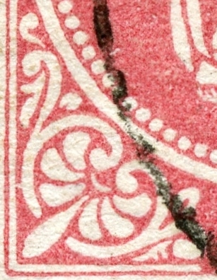
Left lower corner Arabesque
Scott Type I/ Ferchenbauer Type I
There are two pieces of ornaments that one should focus on.


Shorter free standing ornament
(Shaped like an anteater with a thick tail)
No curling of ornament around ball to right
Scott Type I/ Ferchenbauer Type I
The free standing ornament along the lower horizontal line looks, to me, like a petroglyphic drawing of an animal. The heavy tail, the two legs (visible), and the short snout: I call it an anteater, although I suppose an anteater would have a longer snout. The snout does not wrap entirely over the top of the ball to the right. (Type II does.)

This anteater petroglyph ornament is found for Ferchenbauer Type I (Ia and Ib), and Scott Type I.


The ornament is separate from the curve above
Found for Ferchenbauer Type Ia, Ib, & IIa
Seen with Scott Type I and Scott Type II
Near the upper left vertical line of the left lower arabesque is a free standing ornament that looks like a thick "7". It is not attached to the scroll above it (as found for Ferchenbauer Type IIb/Scott III).

Crude Print - Note the ear
Scott Type I (1867-1872) is only found with coarse print
 Ferchenbauer Type 1a (Coarse Print) – Ear correctly drawn
As mentioned, Scott does not pay attention to the ears, but Ferchenbauer does, and divides Type I into Ia and Ib, depending on the ear drawing.

Note here the middle line concave drawing of the ear doesn't continue to the end of the ear lobe, but turns to the right and joins the anterior ear line. The ear is nicely and "correctly" drawn.

This is Ferchenbauer Type Ia. 

 Ferchenbauer Type 1a (Coarse Print) – Ear correctly drawn
Here is a close-up of the ear for a Type I stamp that shows the middle concave line turning to join the anterior ear line. This is Ferchenbauer Type Ia. (Scott ignores all ear drawing variations.  They are all "Type I".)

Ferchenbauer Type 1b: (Coarse print) – Ear drawing is disturbed (Scott Type I)

Austria Scott 29a 5kr rose, Scott Type I
Coarse print
Ferchenbauer Type 1b
This stamp is clearly a coarse print.

To determine type, let's look at the left lower arabesque area of the stamp...


Left lower corner Arabesque
Scott Type I/ Ferchenbauer Type I
The thick "7" ornament is detached and clear: Seen with Scott Types I & II, and Ferchenbauer Types Ia,Ib, & IIa.

There is an "anteater" ornament along the lower right portion of the arabesque: Type I

Crude Print - Note the ear
Scott Type I (1867-1872) is only found with crude print
 Ferchenbauer Type 1b (Coarse Print) – Ear drawing is disturbed
Now, let's look at the ear to determine whether Ferchenbauer Type Ia or Ib.

Hmmm, the middle ear line is thicker, and drops down to the ear lobe.

 Ferchenbauer Type 1b (Coarse Print) – Ear drawing is disturbed
Note thick heavy middle line to bottom of the ear
This is characteristic for Ferchenbauer Type Ib - a "disturbed" ear. ;-)

This stamp is indeed Type Ib. (Compare with Type Ia above.)

5 Kreuzer Ferchenbauer Type IIa (1872) (Scott Type II)
From 1867, there were Type I 5 kr "coarse print" stamp produced, but, about in 1872, a subtle, but noticeable change in design was made. Ferchenbauer calls these new stamps Type IIa, while Scott labels them Type II. This new type can be determined by examining the lower left arabesque area of the stamp.

Furthermore, between 1872-1874, these were of the "coarse print" variation, while between 1874-1881, they were of the "fine print" variation. In other words, Scott Type II or Ferchenbauer Type IIa can either be coarse print or fine print. !! It is too bad that Ferchenbauer (of all catalogues!) does not make a formal notation for this important finding, so we will need to do it for ourselves.

Ferchenbauer Type lla:  (Coarse print) (1872-1874)

Austria Scott 29 5kr rose, Scott Type II
Coarse Print
Ferchenbauer Type 1Ia
This is, no doubt, a course print. Also note the (subtle) shift of the "5 kr.", more to the center of the stamp, which is a finding for Type II. The "5", I suppose, is a little more "flat" on top- but not by much. ;-)
Left lower corner Arabesque
Scott Type II/ Ferchenbauer Type II
The formerly called "anteater" ornament now displays a long curl that goes over the top of the ball to the right. This is characteristic of a Scott Type II (& Type III), and a Ferchenbauer Type IIa ( and IIb) stamp.

Ferchenbauer Type IIa (Fine print) (1874-1881)


Austria Scott 29e 5kr brick red, Type II
Fine Print
Ferchenbauer Type 1Ia
This is the first fine print we have come across for this post, and I think you will agree that it meets the definition.

Left lower corner Arabesque
Scott Type II/ Ferchenbauer Type IIa
The formerly called "anteater" ornament is now curled over the top of the ball to the right.

The thick "7" ornament is still clear of the ball ornament above.

These two findings determines that this stamp is a Scott Type II / Ferchenbauer Type IIa.


Fine Print (1874-1881)
Type II/ Ferchenbauer Type IIa
The fine print Scott Type II / Ferchenbauer Type IIa were produced between 1874-1881, while the coarse prints of these types were issued around 1872-1874. 


Austria Scott 29 5kr rose, Type II
Fine Print
Ferchenbauer Type 1Ia
Here is another example of the fine print Scott Type II / Ferchenbauer Type IIa. perhaps in a little different shade.

Austria Scott 29 5kr rose, Type II
Fine Print
Ferchenbauer Type 1Ia
Scott Type II (and Type I) stamps, by definition, have a thick "7" ornament that is clear or not attached to the rest of the arabesque above. But sometimes it is difficult to tell without careful examination. A close look here will reveal that it is almost attached, but not quite. 

Austria Scott 29 5kr rose, Type II
"Fine Print" - but a coarse one!
Ferchenbauer Type 1Ia
I want to show you a stamp that is clearly Scott Type II, but is it a coarse or a fine print stamp? (Remember, this type can exist as both.)

Note the postmark date appears to be "1875", which is early in the "fine print" era that began in 1874. The stamps in the 1874 period can have intermediate impressions that can take on both coarse and fine characteristics.

I would call this example a "coarse" fine print. ;-)

 Ferchenbauer Type llb: (Fine print) (1881-1884) (Scott Type III)
The last type was issued between 1881-1884, and was a fine print.

And there was again a change to the lower right arabesque that is characteristic for this type.

Scott calls these Type III, while Ferchenbauer considers these still a subtype (IIb) of Type II.

Austria Scott 36 5kr rose, Type III
Fine print
Ferchenbauer Type IIb
Clearly a fine print.

Left lower corner Arabesque
Scott Type III/ Ferchenbauer Type IIb
The formerly called"anteater" ornament (which looks now much more like a snail or slug) is draped over the top of the ball to the right: Either Scott II or III (Ferchenbauer Type IIa or IIb).

But the upper thick "7" ornament now appears attached on top!

This is Scott Type III / Ferchenbauer Type IIb.

Longer free standing ornament
(Two pod legs, and curls over the ball on the right)
Scott Type II or III/ Ferchenbauer Type IIa or IIb
A close look at what is now a "gastropod" ornament: Either Scott II/III or Ferchenbauer IIa or IIb.


The ornament is attached to the curve above
Seen with Scott Type III/Ferchenbauer Type IIb
The thick "7" is definitely attached. !!

Austria Scott 36 5kr rose, Scott Type III
"Fine Print" - but a coarser one!
Ferchenbauer Type IIb
There can be variations in how "fine" the Type III fine print is. This example is definitely a Type III, which was only issued during the fine print era, but is of the "less fine" variety.

Austria 36f 15kr deep chestnut brown
Scott Type III/ Ferchenbauer Type IIb
Here is a color shade of Scott Type III / Ferchenbauer Type IIb.


Austria Scott 29 5kr rose, Scott Type II
"Fine Print" - but a bit coarse!
Ferchenbauer Type 1Ia
Out of the Blue
It might behoove the collector to read and examine this post for a second time, as there is much to absorb.

I must say this was fun. WW collectors are known to have broad knowledge - a mile wide - encompassing many countries. But there is no reason why we can't strive to have depth considerably more than an inch deep at times. ;-)

Links
Austria & BB Checklist
Austria: Lombardy-Ventia
Austria & LV: 1850 "Coat of Arms"
Austria & LV: 1858-59 Issue
Austria & LV: 1860-64 Issues
Austria 1867-84:Franz Josef's Whiskers: Coarse or Fine?
Austria - Bud's Big Blue

Comments much appreciated!