A is for Aden and Z is for Zanzabar


A is for Aden and Z is for Zanzibar... Now what is between? For the world wide classical era philatelist and stamp collector, a country specific philatelic survey is offered by the blog author, Jim Jackson, with two albums: Big Blue, aka Scott International Part 1 (checklists available), and Deep Blue, aka William Steiner's Stamp Album Web PDF pages. In addition, "Bud" offers commentary and a look at his completely filled Big Blue. Interested? So into the Blues...

Friday, November 5, 2021

Dutch Indies - 1915-1938 Semi-postal stamps

1930 Scott B7 15c (+5c) ultramarine & brown
Borobudur Temple Java

Into the Deep Blue

The Netherlands are famous for their finely designed semi-postals, and so it is for the Netherlands Indies.

For the Dutch Indies, the original post is here, and the 1864-1908 post is here.

1915 Scott B3 10c + 5c rose "Wilhelmina"
Regular issue of 1912-14 Surcharged in Carmine

Although many of the semi-postals for the Dutch Indies have their unique design, the first semi-postal issue of 1915 (three stamps) are surcharged Netherlands stamps. The surtax was for the Red Cross.

1930 Scott B4 2c (+1c) violet & brown
Bali Temple 

The 1930 issue of four stamps has this wonderful local building landmark imagery. One could argue that this is one of the all time great issues for colonial Netherlands.

1930 Scott B5 5c (+2 1/2c) dark green & brown
Watchtower

The watchtower almost looks hand drawn. I think the photogravure print is responsible for this elegance.

1930 Scott B6 12 1/2c (+ 2 1/2c) deep red & brown
Menangkabau Compound

The surtax was for "jeugdzorg" (youth care).

CV is $15 for the set.

1932 Scott B12 2c (+ 1c) deep violet  & bister
Weaving

In 1932, a four stamp issue was produced featuring local artisans.

1932 Scott B13 5c (+ 2 1/2c) deep green & bister
Plaiting rattan

The set was bi-colored, and used the photogravure printing technique.

1932 Scott B15 15c (+ 5c) blue & bister
Coppersmith

The surtax was donated to the Salvation Army. CV for the set is $5+ (used).

1933 Scott B18 12 1/2c (+ 2 1/2c) vermilion & olive bister
YMCA emblem

The 1933 set of four photogravure stamps had a surtax for the Amsterdam Young Men's Society for relief of the poor in the Netherlands Indies. CV (set) is $8+.

1935 B21-B24 bi-colored 
Photogravure

The 1935 set surtax was for the Indies Committee of the Christian Military Association for the East and West Indies. The subjects include "A Pioneer at work", "Cavalryman rescuing wounded native", "Artilleryman under fire", and "Bugler". CV is $8 for the set (used).

1937 Scott B32-B36 

The 1937 set surtax was for the Public Relief Fund for indigenous poor. 

Topics include "Sifting Rice", "Mother and Children", "Plowing with carabao team", "Carabao team and cart", and "Native couple".

CV set is $4 (used). Lovely design!

1938 Scott B36B 20c (+ 5c) slate
"Plane nose facing left", Photogravure

I picked this stamp because it has an ominous feel to it (anticipating  WWII?).

The two stamp semi-postal set was issued to honor the 10th anniversary of the Dutch East Indies Royal Air Lines (K. N. I. L. M.). The surtax was for the Aviation Fund in the Netherlands Indies. 

1932 Scott B14 12 1/2c (+ 2 1/2c) bright rose & bister
Woman batik dyer
Out of the Blue

I hope this selection of Dutch Indies semi-postals demonstrate the exquisite nature of these stamps for you.

Comments appreciated!

Thursday, October 28, 2021

Niger Coast Protectorate - Bud's Big Blue

Oil Palm
Bud's Big Blue
Bud's Observations

British sailors and traders dominated the Oil Rivers area (the Atlantic coast along what is now Nigeria) long before formal colonization. From the 17th to the early 19th centuries they traded manufactured goods (tools, cooking utensils, weapons, as well as salt and rum) for slaves and looted artifacts. Millions of Africans were delivered into slavery and transported from such places as the Bight of Bonny to the Americas.

In 1807, Britain outlawed slave trading for all its citizens. Slave smuggling continued, sadly, but the economy and political power of the slave trade kingdoms, such as the Oyo Empire, declined severely when the “legitimate” slave market ended. Wars broke out and many of the Oyo themselves were smuggled into slavery. A reinvented but reduced economy emerged based on the export of palm oil, it being a machinery lubricant and a main ingredient of a beauty soap much desired in Europe and elsewhere (think Palmolive®). The delta’s rivers were lined with wild oil palm trees. 

A 19th century watercolor sketch of the harbor at Bonny, a major trading port. Canoes laden with palm oil are approaching the hulks. (Image © National Maritime Museum, Greenwich, London)

The Berlin Conference (1884-5) effectively ended the “European Scramble for Africa” by dividing up the continent among the colonizers. Britain was awarded the Oil Rivers area, the expansive and densely populated delta of the Niger river. No Africans were invited to or consulted by the Conference. Formal colonization ensued and, with it, the stamps: first for Oil Rivers (1893), then the Niger Coast Protectorate, Lagos, Northern and Southern Nigeria and, eventually in 1914, for an amalgamated Nigeria. The earliest post office can be traced back to 1852; it was an extension of the London General Post Office. (1)

Credit: https://www.nairaland.com/2453728/map-ethnic-groups-nigeria-it

The stamps – Oil River overprints on British stamps and the series with Queen Victoria’s “widow’s weeds” image – are attractive but otherwise unremarkable. The cancellations, however, have potential for making and interesting collection. The various delta rivers had unique cancels – such as Bonny River and Old Calabar River. The scans in this post show cancels from these two and the Opobo River.

There are others; they tend to be more expensive than mint examples and those with unidentifiable cancels. Sometimes Royal Niger Company cancels can be found. For specialists, costly hand stamped surcharges and anomalies abound; watch out for forgeries.

I suspect that many of the mint stamps currently on the market never traveled to Oil Rivers, the high humidity there would have spoiled the gum.

Niger Coast Protectorate, #42, black, showing Old Calabar River cancel and a partly hidden but still visible Oil Rivers inscription. The region’s name had changed to Niger Coast.

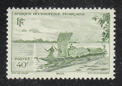
Scenic views of the Niger River can be found among the French West Africa stamps (see below). Even in the 1940s canoes propelled by sails and poles were still transporting oil to the coast. The canoe in #38 looks remarkably like those in the 19th century watercolor (above).

French West Africa #38, gray green, 1947.

The Niger River’s course is odd. It begins on the east side of Guinea’s coastal mountains, then flows northward, then eastward through the western Sahara, then at Timbuktu southward toward Nigeria, and finally westward to discharge through the delta into the Atlantic. Early European cartographers were befuddled and mystified about it. African canoeists weren’t.

Census: six in BB spaces, 18 on supplement page.

https://www.nipost.gov.ng/company_information

Jim's Observations

The handstamped surcharges of 1893 (31 stamps) and the the 1894 bisects and whole stamps surcharged (6 stamps) are CV $ hundreds- $ thousands, and out of the league of readers of this blog. ( I think ;-) Besides, Scott has a note about dangerous forgeries of all surcharges.

But the 1893-1898 Queen Victoria stamps particularly ( 21 stamps) are quite lovely, in my opinion, and definitely worth a look.


Page 1


1a


1b


Supplements
Page 1


Comments appreciated!

Tuesday, October 19, 2021

Dutch Indies 1864-1908 - a closer look

1868 Scott 2 10c lake "King William III"
Engraved; Perf; "Batavia" postmark 
Into the Deep Blue

The Dutch Indies (the name in Big Blue), or Netherlands Indies (the more accepted name) was a Dutch colony on a series of islands in the East Indies. Stamps for the colony were issued throughout the classical era (1864-1940). 

Netherlands Indies
Map courtesy of Stamp World History

For more on the background and history see:

This blog post will look at some of the stamps and issues from 1864-1908.

1864 Scott 1 10c lake "King William III"
Engraved; Imperf

The first stamp issue for the Dutch Indies was an unwatermarked engraved close-up portrait "King William III" imperforated 10c lake stamp that was released April 1, 1864. The half-facing portrait was one that is not found on Netherlands stamps proper, so increases the interest. I wonder how much he enjoyed being king? He looks reluctant here, doesn't he?

A perforated version (Perf 12.5 X 12) was released in 1868, and is shown here as the "header" stamp above.

CV is $100 for the 1864 unperforated stamp, and $150 for the 1868 perforated variety.

I checked Stamp Forgeries of the World website, and these Scott 1 & 2 appear genuine.

1870 Scott 3 1c slate green "William III"
Type I

Between 1870-88, a typographed fourteen stamp set featuring William III in side portrait was issued.

There are multiple different perfs known (see catalogue for specifics).

The "1 cent" has two types. Type I (above) has "CENT" 6mm long.

1876 Scott 4 1c slate green "William III"
Type II; Batavia postmark

Type II has "CENT" 7.5mm long.

Scott also breaks out perfs that are "small holes" (minor numbers) for the issue. "small holes" are defined as "spaces between the holes wider than the diameter of the holes". See the 2.50g stamp below as an example. (The Michel catalogue not only breaks out the small holes, but also includes the perf for the stamp.)

1870 Scott 16 2.50g green & violet "William III"
"small holes" Perf

CV for the issue ranges from <$1 to $95. The 2.50g above (the only bi-color for the issue) is CV $17+.  I'm sure in some catalogue or stamp journal is a list of which settlement the center number means for this cancellation.

1893 Scott 29 50c carmine
"Princess Wilhelmina"
"Soerabaja" postmark

Between 1892-97 an eight stamp set showing Princess Wilhelmina was issued. The portrait appears to be the same as the Netherlands 1891-96 issue. She actually ascended the throne at age 10 in 1890, but under her mother's regency (Queen Emma), until age 18 (1898), when her mother's regency ended.

I picked out this stamp to illustrate the issue because of the postmark. Surabaja is now a port city on the island of Java.

1902 Scott 37 2.50g on 2 1/2g brown lilac "Wilhelmina"
On Netherlands 1899 Scott 84 Surcharged in Black

Between 1900-02, seven Netherland stamps were surcharged in black for use in the Dutch Indies.

The Scott 37 (above) as a CV of $11, while the original Netherlands stamp is CV $3+.

1905 Scott 58 10c on 20c greenish slate "Wilhelmina"
Surcharged in Black

Between 1903-08, a ten stamp set with the circular portrait of Queen Wilhelmina was issued. An example is shown heading the "Out of the Blue" section below. CV ranges from <$1 to $2.

In 1905, the 20c greenish slate from the issue was surcharged in black, as shown above. CV is $2.

1905 Scott 2 1/2g slate blue "Wilhelmina"

Also, between 1905-12, four larger format "Wilhelmina" stamps were issued for the larger denominations. CV is <$1-$40.

1908 Scott 75 22 1/2c brown & olive green "Wilhelmina"
Previous Issues Overprinted "Buiten...Bezit."

For the territory outside of Java and Madura, in 1908, eighteen previously issued stamps were overprinted as shown (above). 

1908 Scott 79 1g dull lilac "Wilhelmina"
 Previous Issues Overprinted "Buiten...Bezit."

For the eighteen stamp overprinted issue, CV ranges from <$1 to $65.

1908 Scott 86 5c rose red
Previous issues overprinted "Java"

Likewise, in 1908, eighteen previously issued stamps were overprinted "Java" for use in Java and Madura. CV is <$1 to $47+.

1908 Scott 90 15c chocolate "Wilhelmina"
Previous issues overprinted "Java"
Note the horizontal bars?

When I saw this stamp, I wondered if this could have be a "remainder", as other countries have done so by overprinted horizontal bars on their surplus stamps, and selling them at a discount to stamp dealers etc. But this is a legitimate issue. Some of the 1906 Scott 50 chocolate stamps were overprinted with two horizontal bars (making Scott 50a), and then in turn were overprinted "Buiten...Bezit" (Scott 72) or "Java" (Scott 90 above). !!

1904 Scott 57 50c red brown "Wilhelmina"
Out of the Blue

Well, that was fun! I suspect a postal history collection of early Dutch Indies stamps on cover would be interesting indeed.

Comments appreciated!

Monday, October 11, 2021

New South Wales - Bud's Big Blue

Scott #s 41, 38, 40, and 42
Bud's Big Blue
Bud's Observations

New South Welsh (NSW) stamps have so many curious aspects that I don’t know how to condense them into a single coherent article. So, I’ve settled on a rambling list of thoughts that occurred to me as I reviewed the scans posted below. When you study your NSW collection, no doubt you’ll come up with observation that I never thought about. As/if/when you do, please post them in the comment box.

Random thought 1: The “New” prefix on country names (e.g., NSW, New Guinea, New Hebrides, etc.), occurs mostly in the South Pacific. Explorers must have been homesick by the time they got there. After a year or so at sea, any land must have reminded them of home; hence, “New” something or other. BB albums have a clump of “New” country stamps from countries that clump, well, mostly clump, together in the south seas.

Random thought 2: The British founded NSW in the late 18th Century as a penal colony. After the American Revolutionary War, the British could no longer discard crooks in Georgia. So, they exported them to NSW instead.  Thieves had little hope of returning home, ever. The flow of criminals continued until 1868. Some of the early NSW stamps in our albums may have carried their letters to loved ones back in England. 

Black-eyed Sue and Sweet Poll of Plymouth mourning their lovers transported to Botany Bay, NSW (1792)

Random thought 3: NSW developed a system of coded number cancels for post offices. The stamp with a “30” ray-type cancel (see above, Scott #40) was pinked in Camden, a historic village now a suburb of Sydney. Sydney had the largest concentration of prisoners, but Camden had some, too. Ian Willis has written a history of the Camden crooks titled “Convicts in the Cowpastures” (1).

Random thought 4: NSW stamps provide abundant challenges for specialists -- perfs, watermarks, dies­­­, color variations galore. Scott lists a medley of 200; Gibbons has 400. Probably neither list has exhausted the possibilities.

Random thought 5: NSW boasts an early embossed postal envelope (1838) that precedes Britain’s penny black. Sadly, I don’t have one.

Random thought 6: The two postage due “specimens” on the supplement page have different fonts for the overprints. I think they’re genuine, but more research is needed. The Newcastle (another “new”) etiquette probably was used after the Australian states unified. Newcastle, like its British namesake, is a coal producing region. I wonder why they didn’t name it New Newcastle.

Postage due specimens, registration etiquette

Random thought 7: When designed or printed locally, British colonial stamps often have a quaint folkart quality about them. Scott #s 100 and 104 provide examples. The queen wears a scarf secured by a small diamond crown, a widow’s weeds accessory she often wore after Prince Albert’s death (1861).

Scott #s 100, 108, 104

 Random thought 8: Early NSW issues were printed with almost no margins, making well-centered examples with no shaggy perf encroachment on the design difficult to find.

Perf encroachment, Scott #s 32, 33

Random thought 9: NSW issued two stamp designs with a female personification of Australia (#108 shown above), a common practice in the mid to late 19th century. I wonder, though, why Australia was personified on a NSW stamp and not NSW itself. NSW did have a cartoon personification, the “Little Boy from Manly”, but he never made it onto a stamp. The little boy was later adopted by the newly unified Australia.

Random thought 10: NSW issued a two-stamp series in 1888 to celebrate its centennial -- considered to be the first commemorative stamps. I have only one of them.

Scott #87

So much for my random thoughts.

Census: 52 in BB spaces, 2 tip-ins, 21 on supplement page.

(1)           https://camdenhistorynotes.com/2017/03/04/convicts-in-the-cowpastures-an-untold-story

Jim's Observations

To go along with Bud's "random thoughts", here is a very random observation...

I should say something about the rivalry of Sydney and New South Wales with Victoria and Melbourne during the latter 19th century. The cultural differences exist even today, as was clear on our extended trip to Australia several years ago. Sydney- bold, brash, outgoing, sunny & surfers. Melbourne- cultured, cafes, much more "English".

What Australians have in common, though, is their love of sports. I became introduced to "Australian Rules Football" while staying with an Australian family, with whom we had become friends, when they lived in the U.S.. They were supporters of the Sydney Swans- even though they lived in Melbourne. It turns out that the Sydney Swans moved from Melbourne many years ago, but loyalty is forever. ;-)


Page 1


1a


1b


1c


Page 2


2a


2b


Supplements
Page 1


Comments appreciated!