1900 Scott 65A 5m slate & carmine, Type II
"Wilhelm II Speaking at Empire's 25th Anniversary Celebration"
Into the Deep Blue
One of the pleasures of stamp collecting, certainly for me, is the correct identification of a stamp. And if the identification is difficult, because of very similar stamp "type" issues, all the better!
Now truth be told, I find "fly-specking " (one-off stamp production flaws) not my cup of tea, although the occasional foray into
errors, freaks, and oddities is sometimes done.
But if a stamp offers the possibility of a difference, and is recognized by its own discrete catalog number, ...well...what fun!
And the question, "How is one not like the other?, sometimes obvious, sometimes maddeningly vexing, gets to the core of identification.
So to explore this aspect of stamp collecting, I chose some particular stamps from a few countries (Great Britain, Germany, Confederate States, Australia, Greece) to illustrate. They show the range from quite apparent differences, to differences only confirmed with high resolution scans.
Let's begin....
A closer look
Great Britain
12 Pence = 1 Shilling
1840 Scott 2 2p blue "Victoria"
Engraved, Imperforate, White Paper
Along with the "Penny Black", the "Twopence" Blue, without white lines, is iconic. Only two plates were used (Plate 1, Plate 2), and it was issued only for a short time: between May, 1840 and March 13, 1841.
CV is a handsome $900+ (used).
If the collector is looking for this stamp, one will find that the Twopence Blue with white lines (both imperforate and perforate) is comparatively more common, as it was issued in some form through 1858.
1841 Scott 4 2p blue "Victoria"
Engraved, Bluish Paper
Here is the other Twopence blue, now with white lines added above "Two Pence" and below "Postage". The imperforate issue used two plates (Plate 3, Plate 4), and was printed beginning March 13, 1841 into the mid 1850s. CV is a more modest $90.
1881 Scott 88 1p lilac "Victoria"
Typography, Die I
I remember as a kid puzzling over the inexpensive 1p lilac "Victoria", wondering if I had the more desired 14 dot variety. I had to wait until adulthood before obtaining one.
1881 Scott 88 1p lilac close-up
14 dots in each angle
The 14 dot variety (BTW, this refers to 14 complete dots) was released July 12, 1881, and was issued for only five months. CV is a respectable $30+.
1881 Scott 89 1p lilac "Victoria"
Typography, Die II
The much more common 16 dot variety was released December 13, 1881.
1881 Scott 89 1p lilac close-up
16 dots in each angle
CV is a very modest $2. But if you come across a group of 1p lilac Victoria's , check. as I did as a kid, to see if one might be the "14 dot" variety. !!
1888 Scott 118 5p lilac & blue "Victoria"
Queen Victoria Jubilee Issue
Type II
The inspiration and idea for doing this "How is one not like the other?" blog post was triggered by recently pursuing the Type I /Type II differences found on the 5p lilac & blue stamp for the 1888 Queen Victoria Jubilee Issue.
1888 Scott 118 5p close-up
Type II: Tiny vertical dashes to right of "d"
A good magnifying glass will reveal that most examples will have tiny vertical dashes to the right of both "d"s in the 5d value blue tablets
1888 Scott 118 5p
Left "5d tablet" close-up
Type II: Tiny vertical dashes to right of "d"
Here is a close-up of the vertical dashes to the right of the "d". This is Type II, and Scott 118. CV is $10+. It was issued in 1888.
1888 Scott 118 5p lilac & blue "Victoria"
Queen Victoria Jubilee Issue
Type II?
Here is another example. Let's take a closer look....
1888 Scott 118 5p close-up
Type II: Tiny vertical dashes to right of "d"
A close-up clearly shows the vertical dashes to the right of both "d"s in the "5d" tablets.
1887 or 1888 Scott 118 or 118a 5p lilac & blue
Type II or Type I?
But there is another type or die in the catalog - Type I or Die I. It was issued in 1887, before Type II or Die II superseded it in 1888. This variety is rarer, and is Scott 118a. It is characterized by "squarish dots to the right of both "d"s". Of note, Scott only gives a written description, while Stanley Gibbons shows a close-up illustration. Because the differences are tiny and small, I recommend, if one is suspicious for a Type I after a magnifying glass inspection, that a high resolution scan (1200) be done to study carefully.
So, the above example - is it Type I or Type II?
1887 or 1888 Scott 118 or 118a 5p close-up
Type II or Type I?
A close-up scan of both 5d value tablets show the right 5d value tablet with a hint of "squarish dots", while the left 4d tablet appears less promising.
Right 5d Value Tablet Close-up
Squarish dots or vertical dashes to the right of the "d"? Two of the dashes/dots are heavily imprinted, but the overall impression is more of vertical dashes than squarish dots.
1888 Scott 118 5p
Left "5d tablet" close-up
The left 5d value tablet of the same stamp shows clearly vertical dashes.
Verdict: To me, this is the more common Type II stamp, with the preponderance of evidence showing tiny vertical dashes to the right of "d"
1887 or 1888 Scott 118 or 118a 5p lilac & blue
Type II or Type I?
OK, here is another copy - let's take a good close look.... (BTW, the cancel says "1887", which would argue for a Type I.)
1887 Scott 118a 5p close-up
Type I: squarish dots to the right of both "d"s
Wow - there is no doubt: This is the rare Scott 118a with squarish dots. CV is $120+. One can usually pick up a copy, though, for ~ $20.
Germany
100 Pfennigs =,1 Mark (1875)
"Reichspost" 1900 Scott 64 3m black violet
"Unveiling Kaiser Wilhelm I Memorial, Berlin"
Type I
The Germans in general and the Michel catalog in particular are quite fastidious when it comes to noting small differences among stamps.
And so it goes with the engraved "Reichspost" 1900 Scott 64 3m black violet "Unveiling Kaiser Wilhelm I Memorial, Berlin" stamp, where there are subtle! differences with the Kaiser on his horse (Type I or Type II).
Scott 64 close-up Type I
Michel 65I (Type I) - note a looser rein
And the Kaiser's upper body leans back slightly
With a convex (rounder) front (Breastplate)
profile
Horse's mouth & muzzle have 3 vertical white stripes
(Note there is no "white indentation" between
the Kaiser's hand and his front torso -harder to see with black cancel)
The 2010 Michel (German Specialized) catalog has illustrations and a description (in German) of the differences. My 2011 Scott 1840-1940 WW catalogue makes no mention of the differences or types, while the 2020 Scott 1840-1940 WW catalogue now has a description of the differences, as well as an illustration. The Michel description is more useful (in my view) than the current Scott description, but both describe the largest difference: mainly the looser rein. The differences described above are from Michel, except I added the differences I noted with the Horse's mouth and muzzle.
CV is $45.
"Reichspost" 1900 Scott 64a 3m black violet
"Unveiling Kaiser Wilhelm I Memorial, Berlin"
Type II
The Type II stamp is shown here, and is now Scott 64a and Michel 64II (Type II).
Scott 64a close-up Type II/ Michel 64II (Type II)
Close-up of REICHSPOST Type II-Note tight/straight reins
Also, a "white indentation" between the
Kaiser's hand and his front torso
And the front (Breastplate) profile of the torso is
angled straight, not curved
Horse's mouth & muzzle have a small white dot and one larger white patch
bifurcated with a thin black line
CV for Type II is $55 (used)/ $120 (unused).
Summarizing the differences:
A) Loose rein (Type I) vs tight rein (Type II)
B) Kaiser's torso leans back slightly in Type I
C) Rounder (Type I) vs straight angled (Type II) front
Breastplate torso profile
D) "White indentation" noted between the Kaiser's
hand and his front torso in Type II
If you enjoy looking into the differences between these stamps, welcome to my club!
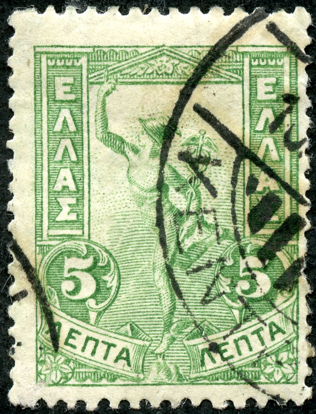
"Reichspost" 1900 Scott 65A 5m slate & carmine, Type II
"Wilhelm II Speaking at Empire's 25th Anniversary Celebration"
One of more famous differences found in a stamp involves the 1900 5m slate & carmine with the scene as above. The Scott 65A (Type II) has a CV of $350 (unused-used).
1900 Scott 65 5m slate & carmine Type I
Not my stamp - From Daniel F. Kelleher Auctions
The 1900 Scott 65 (Type I) is out of my league CV wise ($1,200 unused, $2,300 used), and I don't have one. (Perhaps if my ship comes in ;-) The scan is from a Daniel F. Kelleher auction, and is used here for educational purposes.
Type II - "5" is thinner, "M" has distinct serifs
The Type II stamp (Scott 65A) has the above differences.
Type I - "5" is thick, "M" has slight serifs
The Type I stamp (Scott 65) shows these differences. Frankly, one has to compare/contrast between the illustrations to be sure that one has the correct type.
Minister Boetticher (mustache and glasses)
Often shows an ear
Type II
Then there is another difference between Type I/Type II that is not mentioned in Scott, but is illustrated in the Michel catalogue: namely whether Minister Boeetticher's ear is shown. ;-)
Type I vs Type II: no ear shown vs ear shown.
Actually, my copy of Type II only shows a partial ear (at best), with the rest hidden by the black edge of the frame.
Note the ear?
Not my stamp - APS Stampstore Example
Scott 65A Type II
Here is another copy (not mine) of Type I which shows the ear better.
1900 Scott 65 5m slate & carmine Type I
Not my stamp - From Daniel F. Kelleher Auctions
No Ear
Here is a close-up of Type I: and yes, no ear. ;-)
Confederate States
100 Cents = 1 Confederate Dollar
1863 Scott 11 10c blue "Jefferson Davis"
The Confederate States have two stamps - the Scott 11 & 12 10c blue, which look almost identical (CV ~$20)-. And, in fact, I was confused regarding the differences (frankly, for years!) as the Scott catalogue described the major difference as "additional line outside the ornaments at the four corners" for Scott 12. What a poor choice Scott! The reality is it is often difficult to see the additional line! And so my Scott 11's and 12's sat in a pile waiting to be sorted.
Fortunately, Trish Kaufmann (a well known dealer and Confederate States expert) came to my rescue with her
Confederate States Primer Online website.
She pointed out the obvious: Scott 11's Jefferson Davis's rear head hairline is below the ears!
1863-64 Scott 12 10c blue "Jefferson Davis"
...and with Scott 12, the hairline cuts off at the ears!!!!
And, yes, one can discern an extra line with Scott 12 outside the ornaments (seen best along the right lower corner), but much less easy to see!!!
Australia
12 Pence = 1 Shilling
1913 Scott 17 1p carmine "King George V"
Engraved, Unwmk, Perf 11
I include the engraved 1913 1p carmine here, because it reminds me what a struggle it can be to tell similar stamps apart when just looking at a catalog when one is just beginning a WW collection.
I kept looking for this stamp, when all I had in my collection was the much more common 1p reds (shown below).
Finally, I went to a dealer and bought the stamp, as I could not find a copy in my Australia feeder albums and collections. CV is $6.
Note this stamp is engraved, has a whiter kangaroo and emu, and the "1" numeral is thicker.
1914 Scott 21 1p red "George V"
Typographed, Wmk 9, Perf 14
Here is an example of the 1p red, which comes in many shades, perforations and watermarks.
All of them are lithographed, have a darker kangaroo and emu, and a thinner "1" numeral.
1937 Scott 167 1p emerald "Queen Elizabeth"
Type I: Highlighted Background, Lines around letters of
Australian Postage and numerals of value
Quite easy- one just needs to pay attention.
1938 Scott 180 1p emerald "Queen Elizabeth"
Type II: Background of heavy diagonal lines without the highlighted effect.,
No lines around letters and numerals
I doubt anyone would have trouble with this. But these two show a delightful difference - no magnifying glass or scan required. ;-)
1937 Scott 169 2p scarlet "George VI"
Type I
The 2p "George VI" stamps are from the same issues as the 1p emeralds, so the differences with the 1p emeralds apply here too. But look at the eyes....
1937 Scott 169 Close-up Type I
Note the eyes look down and to the left....
1938 Scott 182 2p scarlet "George VI"
Type II
The Type II.
1938 Scott 182 Close-up Type II
The eyes are looking more straight ahead.
Greece
100 Lepta = 1 Drachma
1901 Scott 168a 5 l yellow green
"Giovanni da Bologna's Hermes
Type I
If you want to take a big bite into the "How is one not like the other", Greece has the ultimate challenge:
The Hermes Heads.
As I said about them...
The Large Hermes Heads hold for the classical era collector, in my opinion, a "Terrible Beauty".
"Beauty" because they are arguably the most perfectly designed classical stamps ever produced.
"Terrible" because they may be the most difficult issue to accurately classify for the non specialist.
But, here we will present some mildly challenging Greek stamps - nothing too scary.
The 1901 5 l yellow green comes in two types.
1901 Scott 168a 5 l green Close-up
Type I
Type I: Letters (above) not outlined at top and left. Few (if any) horizontal lines between the outer vertical lines at sides.
1901 Scott 168b 5 l yellow green
"Giovanni da Bologna's Hermes
Type II
Type II. CV (Type I & II) <$1.
1901 Scott 168b 5 l green Close-up
Type II
Type II: Letters (above) fully outlined. Heavy horizontal lines between the vertical frame lines.
1927 Scott 328 1d dark blue & bister brown
"Temple of Hephaestus"
Type I
The three engraved varieties of the "Temple of Hephaestus" stamps issued between 1927-1933 are inexpensive (CV <$1), but present a sorting challenge.
1927 Scott 328 Close-up Type I
Greek letters (1st, 3rd) have sharp pointed tops. Note serifs at bottom of the "1"s, and the "1"s are 1.5 mm wide at the foot.
1931 Scott 365 1d dark blue & orange brown
"Temple of Hephaestus"
Type II
Type II is determined by the letters and the "1".
1931 Scott 365 Close-up Type II
Greek letters (1st, 3rd) are flat at the top. The "1" is 2 mm wide at the foot.
1933 Scott 366 1d dark blue & orange brown
"Temple of Hephaestus"
Type III
For Type III, the lines of the temple have been deepened, so there are more details.
1931 Scott 366 Close-up Type III
The "1" on the left has no serif for the left foot (compare with Type I), while the Greek letters (1st, 3rd) are sharp pointed (compare with Type II).
1927 Scott 329 2d dark green & black
"The Acropolis"
The 1927 engraved 2d "Acropolis" shows a Parthenon that is indistinct.
1927 Scott 329 Close-up
"The Acropolis"
Besides the blurred Parthenon (on top), the blocks of marble between the two pillars on the lower right run together.
1933 Scott 367 2d dark green & black
"The Acropolis", Issue of 1927 Re-engraved
The 1933 re-engraved 2d shows a Parthenon that is strongly outlined and clear.
1933 Scott 367 Close-up
"The Acropolis", Issue of 1927 Re-engraved
Also, the cliffs lines are deepened, and there are four distinct blocks of marble between the two pillars.
1927 Scott 330 3d deep violet & black
"Cruiser "Georgios Averoff""
The 1927 3d stamp and the 1934 re-engraved stamp are both CV <$1. The frame for the 1927 stamp is "deep violet", while the 1934 version is "red violet".
1927 Scott 330 3d Close-up
The 1927 Cruiser close-up. Note the three smokestacks and their shading.
1934 Scott 368 3d red violet & black
"Cruiser "Georgios Averoff""
Issues of 1927 Re-engraved
The re-engraved Cruiser has more distinct lines.
1934 Scott 368 3d Close-up
Issues of 1927 Re-engraved
Specifically, look for the vertical lines of shading in smoke stacks and reflections in the water.
1927 Scott 333 15d bright yellow green & black
"Academy of Sciences, Athens"
Close-up
The 1927 15d frame is more muddled compared to the sharper 1934 version. There is very little horizontal shading of the sky. CV is $16.
1934 Scott 370 pale yellow green & black
"Academy of Sciences, Athens"
Close-up - Issue of 1927 Re-engraved
Many more lines of shading in the sky and foreground with the 1934 re-engraved version. CV is $17+.
Out of the Blue
The stamps presented here can be expensive or ordinary CV wise. What they share is some degree of difference between issues. Mastering the differences leads to a great deal of satisfaction. !!
Comments appreciated!