1872 Scott 25 5pi green "Sphinx and Pyramid"
Clear Impressions, Thick Opaque Paper
Perf 12 1/2 X 13 1/3 Clean Cut
Into the Deep Blue
The higher denominations (2pi, 2 1/2pi, 5pi) for the 1872 & 1874-75 printings pose their own identification challenges. But unlike the preceding post in this series ( 20pa, 1pi), there are no lithographic stamps to consider; They are all typographic.
Alas, the color differences between printings for the 2pi, 2 1.2pi & 5pi, although there are indeed some, are not enough for absolute identification. Therefore, one may need to lean on careful perforation measurement as a primary tool for identifying the printings.
For the 1872 printing, all three values considered here come as Perf 13 1/3 clean cut, and are not found in this perf combination for the 1874-75 printings. For the 1874-75 printing, all three values considered here come as Perf 12 1/2 rough, and are not found in this Perf for the 1872 printing. In addition, the 1874-75 printing has a Perf 13 1/3 X 12 1/2 rough for the 2pi value which is exclusive to the printing.
Then there is the general differences between 1872 and 1874-75 printings which are helpful (Clear impressions vs blurred impressions; Thick Opaque paper vs Thinner paper; Clean cut perfs vs rough cut perfs).
Unfortunately, the common 12 1/2 X 13 1/3 Perf is found for all three values considered here in both the 1872 & 1874-75 printings. That, clearly, will make it more difficult to identify these Perf stamps. (Perhaps "clean cut" vs "rough" perfs might help: not so much - see comments further below.)
Fortunately, Peter A.S. Smith (Egypt: Stamps and Postal History: A Philatelic Treatise, 1999) points out some constant changes seen in the plates between the 1872 & 1874-75 printings that will be most helpful indeed.
Lets begin, but if you haven't already read the preceding blog posts in this series, you should do so now, as much valuable information resides there.
1872 Scott 23 2pi dull yellow
Clear impressions; Thick Opaque Paper
Perf 12 1/2 X 13 1/3 Clean-cut
Color: Yellow
This is Scott 23 (this example and the next one) with unique perfs for the 1872 printing. CV is $15/$100.
Before we talk about more important variables between the 1872 & 1874 printings, let's look at color.
Scott has "dull yellow" for the 1872 printings; "yellow" for the 1874 printings: SG has "chrome yellow for the 1872 printings, and "yellow" for the 1874 printings: Michel has "chrome yellow" for the 1872 printings; "yellow" for the 1875 and later printings. (Interestingly, Michel says November, 1875 for "yellow" for the later printing, but Smith states the earliest postmark for the later issue was December 2, 1874. Is Michel wrong, or was there a subtle color switch a year into the later printing?)
Smith states the colors for the 1872 issue are "yellow", and, for the 1874 issue, "yellow to chrome yellow". I trust Smith's evaluation the most. For myself, I don't see much color differences between the 1872 & 1874 printings, other than some stamps are a bit orange-yellow, which might be die to oxidation of the color. Unfortunately, I don't think color evaluation will be helpful in parsing out the 1872 & 1974 printings.
1872 Scott 23 2pi dull yellow, Example 2
Clear impressions; Thick Opaque Paper
Perf 12 1/2 X 13 1/3 Clean-cut
Color: Yellow
I also think we will need to rely heavily on Perf measurements for the 2pi yellow stamps.
Why? For myself ( and I think for others), a "yellow" stamp is hard to evaluate for "clear" or "blurred" impressions. The state of the stamp does not pop out, due to the yellow color.
Also the "clear-cut" vs "rough" state of the Perfs do not show as much difference for the higher values (2pi, 2/12pi, 5pi) as the lower values. Many of the perfs for the 1874 printing actually look rather "clean-cut". Perhaps they took more care cutting the perfs for the higher values? Also, Smith states "Distinction on the basis of clean-cut vs rough perforations are not reliable for the three higher values".
The 1872 printing for the 2pi was 360,000 stamps (1800 sheets), and for the 1874 printing, 800,000 stamps (4000 sheets). What was the 2pi stamp used for? According to Smith: "The 2pi stamps were used to frank double-weight letters or single weight letters traveling between Egypt and the Consular offices. They were also needed to pay the registration fee on internal letters until April 1st, 1878".
1872 Scott 23a 2pi dull yellow
Clear Impression, Thick Opaque Paper
Perf 13 1/3 clean cut (Unique to 1872 Issue)
Color: yellow
This Scott 23a (and the next example below) are Perf 13 1/3, which is unique to the 1872 printing. CV is $4.50/$20.
Despite the yellow color, it is obvious that this stamp has a very clear impression. The quite early postmark would argue that too, in addition to confirming this is a 1872 issue (provided the postmark is not fake - although why would one ruin a more valuable unused to make a used? ;-).
1872 Scott 23a 2pi dull yellow, Example 2
Clear Impression, Thick Opaque Paper
Perf 13 1/3 clean cut (Unique to 1872 Issue)
Color: yellow
I have been holding back one of the most important ways to separate out the 1872 & 1874 printings until now. :-)
It turns out there are some Die characteristics that are markers respectively for the 1872 & 1874 printings.
1874 Scott 23b 2pi yellow
Blurred impressions, Thinner paper
Perf 12 1/2 rough (Unique for 1874 printing)
Color: yellow to chrome yellow (shades)
The 1874 Scott 23b (This example and the next one below) has Perf 12 1/2, which is unique for the 1874 printing. There is some roughness to the perfs in this example. CV is $5.75/$90.
Recall that the earliest postmark for the 1874 2pi found so far is December 2, 1874. That means if you have an earlier postmark on a 2pi, the stamp should be a 1872 printing.
Now, what is the Die difference between the 1872 & 1874 printing?
Top/Bottom: 1872 Scott 23/ 1874 Scott 23b
Example One
For the 1872 printing, The left hand Arabic character (next to the "2") in the top inscription is one complete shape, resembling an inverted "V" with a horizontal line on top. For the 1874 printing, the character is three separate components, consisting of a line and two dots below. (I am going to show you plenty of examples, so it should become clear, if it isn't for you at the moment.)
1874 Scott 23b 2pi yellow, Example 2
Blurred impressions, Thinner paper
Perf 12 1/2 rough (Unique for 1874 printing)
Color: yellow to chrome yellow (shades)
How did the Die change happen? Smith states: "The die for the 2pi apparently underwent a small touchup before the stereos were cast. At the left end of the top panel, the last Arabic letter should have a pair of dots below the horizontal stroke, but on the 1872 stamps there is instead a clearly defined inverted V. This was corrected on the die."
Top/Bottom: 1872 Scott 23/ 1874 Scott 23b
Example Two
This comparison should be easier to see, as there is no postmark ink obscuring the difference. Note the horizontal stroke with an attached inverted "V" below for the 1872 printing, while the 1874 printing has a fat horizontal stroke with two separate dots below?
1874 Scott 23c 2pi yellow,
Blurred impressions, Thinner paper
Perf 13 1/3 X 12 1/2 rough (Unique for 1874 printing)
Color: yellow to chrome yellow (shades)
The Scott 23c (This example and next one below) has a unique 13 1/3 X 12 1/2 Perf, which should help to place the printing. The perfs do appear a bit rough along the lower horizontal edge. CV is $6.25/$10.
Top/Bottom: 1872 Scott 23a/ 1874 Scott 23c
Example One
Another comparison. Hopefully, you are spotting the differences now.
1874 Scott 23c 2pi yellow, Example 2
Blurred impressions, Thinner paper
Perf 13 1/3 X 12 1/2 rough (Unique for 1874 printing)
Color: yellow to chrome yellow (shades)
OK, let's re-capitulate the major differences for the 2pi 1872 & 1874 printings.
1) Careful Perf measurements are important, because Perf 13 1/3 is unique for the 1872 printing, while Perf 12 1/2 and Perf 13 1/3 X 12 1/2 are unique for the 1874 printings. However, Perf 12 1/2 X 13 1/3 are found for both the 1872 & 1874 printings with the 2pi, 2 1/2pi & 5pi values. The 1875 Scott 23d 2pi yellow (CV $17/$80) and the 1872 Scott 23 (CV $15/$100) have the same perfs. (Note: I don't have a copy of Scott 23d.)
2) Look for the 2pi Die difference between the 1872 & 1874-75 printings. There is another comparison below, if you need more work on this. This is the "secret" that you have learned by reading this blog post. ;-) Why not use it?
3) The other features that distinguish the 1872 & 1874 printings are of variable help with the 2pi yellow stamp (Clear vs Blurred; Thick Opaque paper vs Thinner; Clean cut perfs vs Rough perfs). These can certainly assist to confirm the correct printing.
Top/Bottom: 1872 Scott 23a/ 1874 Scott 23c
Example Two
Last 2pi Die comparison example: I think of the 1872 Arabic character as looking like "Running Man", while the 1874 Arabic character is obvious with the two lower dots. What is good is, if you are buying this stamp and it is illustrated, you should be able to determine the printing before purchase.
1872 Scott 24 2 1/2pi dull violet
Clear impressions, Thick Opaque paper
Perf 12 1/2 X 13 1/3 clean cut
Color: slate violet (pale to deep)
The 2 1/2pi has its own challenges in determining the difference between the 1872 printing and the 1874 printing.
Color is a bit too close between the printings to be helpful. Scott has "dull violet" for the 1872 printings, and "deep violet" for the 1874 printings. SG has "violet" for all the printings. Michel has "dark violet" for the 1972 printings; "dark violet to gray violet (Nov, 1875) for the 1874 printing. Note the first postmark for the 1874 printing was November 15, 1874. (A stamp with a postmark prior should be a 1872 printing.)
Smith has "slate violet (pale to deep) for the 1872 issue; "slate violet" for the 1874 issue (a rare "reddish-slate violet" color can be found, most frequently on the 1878-79 provisionals).
Quantity of stamps issued for the 2 1/2pi are 20,000 for the 1872 printing; 500,000 for the 1874 printing. There was much more for the 1874 printing, as the 2 1/2pi could then be used for simple letter mail to Italy, or two 2 1/2pi stamps (5 pi total) for mail to Great Britain.
The Perf here (for the stamp above) is 12 1/2 X 13 1/3. This can be found for the 1872 printing (Scott 24 CV $25/$95) or the 1874 printing (Scott 24d CV(1875) CV $20/$80). The perf for 1872 is "clear cut", and the perf for 1874 is "rough", but that is not always reliable, according to Smith. The stamp above does have decent perfs on three sides, with not great perfs on the right side.
But here is, fortunately, another marker to evaluate.
1872 Close-up Scott 24 2 1/2pi
Perf 12 1/2 X 13 1/3
Smith states: "for the 1874 printing, the 2 1/2pi was not touched up, but it suffered minor damage to the shading of the left face of the pyramid at about the level of the eye. The fact that this feature does not show up on any of the other values which shared the same center Die implies that the plate for the 2 1/2pi was the last to be made."
As you will see in a bit when I show some 1874 printings, this 1874 change shows the left eye ink of the Sphinx smearing over into the left side. This stamp close-up (above) does not show the sign, so this is probably a 1872 printing.
I should mention that there are 1872 13 1/3 perfs, but they are extremely rare for the 2 1/2pi stamp. CV is $800 unused. Smith states " 2 1/2pi Perf 13 1/3 is a major rarity and is the rarest Egyptian stamp that is not an error or variety". He also states that he has never seen a genuine "used" for this, although catalogues do value "used" @ $225.
1872 Scott 24 or 1874 Scott 24b?
Perf 12 1/2
Now this stamp poses a question.
It has most of the characteristics of a 1872 printing, except it has Perf 12 1/2. This perf is ordinarily found with the 1874 printings as Perf 12 1/2 "rough" (Scott 24b CV $6.25/$9.25). The 1872 Scott 24 is CV $25/$95.
Close-up 1872 Scott 24 or 1874 Scott 24b?
Perf 12 1/2
The close-up shows no significant smearing of the eye ink toward the left side. Is this a 1872 printing? For the Perf 1 2/12 (ordinarily seen with 1874 printings), Smith states, for the 1872 printings, "As an exception, stamps are sometimes found with other combinations of gauge such as 12 1/2 X 12 1/2 X 12 1/2 X 13 1/3".
So, is this a 1872 or 1874 printing? It could be a 1872 printing, based on the fact that Perf 12 1/2 exists (although rare). But, perhaps this "smeared eye" sign for 1874 stamps is not universal, and this stamp is in fact a 1874 stamp.
1874 Scott 24d 2 1/2pi deep violet
Blurred impressions; Thinner paper
Perf 12 1/2 X 13 1/3 rough
Color: Slate violet
Here is a rough perf, blurred impression Perf 12 1/2 X 13 1/3 stamp. Should be Scott 24d (CV $20/$80).
Close-up 1874 Scott 24d 2 1/2pi
Note Left eye ink smears over to the left
I think this stamp shows the "left eye smeared" marker for the 1874 printing, to say nothing about the overall blurred impression.
1874 Scott 24d 2 1/2pi deep violet, Example 2
Blurred impressions; Thinner paper
Perf 12 1/2 X 13 1/3 rough
Color: Slate violet
Here is another example of what appears to be 1874 Scott 24d, although admittedly, the perfs do not meet the "rough" criteria.
Close-up 1874 Scott 24d 2 1/2pi, Example 2
Note Left eye ink smears over to the left
This shows the "Left eye ink smear" sign. Example 2 is not as blurred overall as Example 1.
Overall, the evaluation of 2 1/2pi stamps for 1872 vs 1874 printings is not as satisfying as the 1pi stamps.
If one has a 12 1'2 perf, it has a large probability of being a 1874 stamp. (But I showed an example where it could be a 1872 stamp, based on other criteria.)
One will probably not encounter a Perf 13 1/3 2 1/2pi 1872 stamp, as they are rare.
The Perf 12 1/2 X 13 1/3 stamps are found in both 1872 and 1874 printings. One will then need to double check other criteria listed below.
1) Is the image clear or blurred? (Judgement call in some cases.) I should mention that an "oily appearance" almost always means a 1874 printing.
2) Are the perfs clean-cut or rough? (Again, judgement call, and not all that reliable, according to Smith.)
3) Color? - not that helpful.
4) "left smeared eye" sign for 1874 printings - very helpful, but I wonder if this sign is universal for 1874 printings?
1879 Scott 29 5pa on 2 1/2pi dull violet
Perf 12 11/2 rough
Finally, I will show the provisionals of 1879, which used the 2 1/2pi stamp.
1879 Scott 28 10pa on 2 1/2pi dull violet
Perf 12 1/2 rough
You will note that the color here for the 10pa on 21/2pi is a dark violet, while the 5pa on 2 1/2pi is more of a light dull violet. Recall that there is a "reddish-slate violet" color, that is rare, but found more frequently on the provisionals.
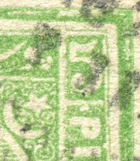
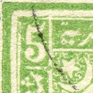
1872 Scott 25 5pi green "Sphinx and Pyramid"
Clear Impressions, Thick Opaque Paper
Perf 12 1/2 X 13 1/3 Clean Cut
Color: Bright green
The colors for the 5pi 1872 & 1874 printings are close enough, that the minor differences are not that helpful. And the catalog colors disagree with each other (Scott vs SG/Michel). Scott has "green" for the 1872 printing; "yellow green" for the 1874 printings. SG has the opposite: "yellow green" for the 1872 printings; "green" for the 1874 printings. Michel follows SG color scheme.
Smith has "Bright green" for the 1972 printing; "yellow green to bright green" for the 1874 printing.
The earliest first postmark for 5pi 1874 printing is November 2, 1874. (A stamp with a postmark prior should be a 1872 printing.)
Production for the 1872 printing was 30,000 stamps, and 90,000 stamps for the 1874 printing.
The 1872 Scott 25 (shown above) is CV $35/$325. The Scott 25a - Perf 13 1/3 ( I don't have) is CV $75/$375.
1874 Scott 25b 5pi yellow green
Blurred Impressions/Thinner paper
Perf 12 1/2 Rough
Color: yellow green to bright green
The Perf 12 1/2 is unique for the 1874 issue, and Scott 25b (CV $22.50/$65) is usually what people have in their collections for the 1874 issue. Yes, there is the Scott 25d with Perf 12 1/2 X 13 1/3, and can be confused with the 1872 stamp (Scott 25) of the same perf, except the Scott 25d is CV $300/$375, and so fairly rare.
So, besides the usual differences (clear vs blurred impressions, paper, clean cut vs rough perfs), are there other differences?
Yes, there was some slight damage to the 5pi Die in the side panels, and some touch-ups.
Close-up Right Upper
1872 printing top; 1874 printing bottom
The major differences are...
1) For the 1872 printing, there is a white dot above the "P" of PIASTER in the right side panel. This is altered significantly or absent for the 1874 printing.
2) The thin frameline above the upper right numeral "5" is bent downward slightly for the 1874 printing. (Unfortunately, I don't even see the thin frameline in my 1874 example I show here. (plate wearing?))
3) In the 1872 printing, the top frameline is horizontally split ( a colorless gap) along the entire frameline. The 1874 printing shows the frameline filled in (solid).
Close-up Left Upper
1872 printing top; 1874 printing bottom
3-repeat) In the 1872 printing, the top frameline is horizontally split ( a colorless gap) along the entire frameline. The 1874 printing shows the frameline filled in (solid).
4) Left side inscription panel framelines deformed at top "north-east" junction in 1874 printing (Small spur protruding in upper right corner). Absent in 1872 printing.
These changes between the 1872/1874 printings specific to the 5pi are quite helpful in determining which printing one has. And, remember, to carefully check perfs, as that is also very helpful.
Out of the Blue
Well, if you are this far - congratulations!...there was a lot of information here to digest, as well as information in previous posts.
I think the 1872 & 1874 printings are no longer scary. ;-)
Comments appreciated!