
1920 Scott 98 5 l brown
"Gabrielle d"Annunzio"
Forgery: "O" in "Postale" left leaning oval
Into the Deep BlueThis is the second of two posts discussing Fiume forgeries for the 1840-1940 classic era WW collector, as most of us would like to know if our stamp is real or fake. !!
The post for Fiume-1919, as well as the introduction to the Fiume forgery topic, is here.
This post will cover select issues of Fiume 1920-24.
For the 1920-24 period, Fiume stamps were in high demand back in the day. To satisfy the packet trade, forgeries were produced, often in considerable quantities.
Fortunately, today there are several resources (one book, two internet sites) at hand. (The information following is repeated from the Fiume-1919 post.)
The first is Varro Tyler's book "Focus on Forgeries" (2000), which offers five pages of discernable findings for five key stamps between 1919-1923. (I recommend that all 1840-1940 classic era WW collectors obtain this book - it covers 321 genuine/forgery comparisons.)
The second major resource (link above) is the brainchild of Denmark's Morten Munck, who has been compiling from his website Stamp Forgeries of the World, images and descriptions of stamp forgeries for many stamp issuing countries/entities. This effort has been going on for a number of years, and he has a particular valuable contribution for Fiume.
The third major resource (website link above) is relatively new, having only been published for less than a year, but presents precise research into many classic stamp forgeries, with additional material being added weekly. This is the magnificent effort from Ron, of Canada, and it well needs checking out by the WW classical era collector for all of the counties that he has now posted. In fact, it was his recent post on the forgeries of Fiume that made me decide to revisit this topic.
OK, let's begin....
A closer look 1920-24
100 Centesimi = 1 Lira

1920 Scott 90 25c dark blue (Genuine)
Pale Buff Background; "Gabrielle d'Annunzio"
The typographic fourteen stamp "d'Annunzio" issue of September 12, 1920 was highly popular with collectors. It is a very striking design. CV ranges from $3 to $40+.
Two forgeries (at least) were produced: the most common probably from N. Imperato of Genoa, Italy.

"1920 Scott 90 25c dark blue" (Forgery)
"Gabrielle d'Annunzio"
The marker for the forgery are the decidedly left-leaning "O"'s and the "S". Let's take a closer look


Genuine (top) - Forgery
Genuine: The outer aspects of the "O"'s of "Franco-Bollo" are nearly round. (Note that, even in the genuine, there is a hint of left-leaning "O"'s with some of the "O"'s; but that is because the inner white cut-outs for the "O"'s sometimes lean left.)
Forgery: The "O"'s of "Franco-Bollo" are oval and lean to the left.


Genuine (top) - Forgery
Genuine: The outer aspects of the "O"'s of "Postale" are nearly round. The base of "S" in "Postale" points slightly downwards.
Forgery: The "O"'s of "Postale" are oval and lean to the left. The "S" of "Postale" has a base that curves upward.
To me, the "O" in "Postale" and the "S" sign are the easiest to evaluate for the genuine/forgery differences.

1920 Scott 87 10c carmine
"Gabrielle d'Annunzio"
There is a more sinister forgery, where the "O"'s look like the genuines.

Look at the two eyebrow lines above the eye
The second forgery is reported as overall more crude, and the two eyebrow lines are blotchy. I think, though, my 10c carmine does not have the two eyebrow lines that are crude/blotchy enough, and so this is probably a genuine. ;-)

1921 Scott 135 10c carmine
1920 "d'Annunzio" issue overprinted
On February 2, 1921, a fourteen stamp "Governo Provvisrio" overprinted issue, using the 1920 "s'Annunzio" issue, was produced. There were three types of overprintings that were used. But fortunately, one doesn't have to become an expert on the three overprints to tell the difference between genuine/forgery. It turns out, (except for a rare 1 lira denomination), that if the underlying stamp is genuine, then the overprint is genuine, AND, if the underlying stamp is a forgery, then the overprint is a forgery.
This stamp appears genuine, as the "O"'s are round, and the printing is not particularly crude.
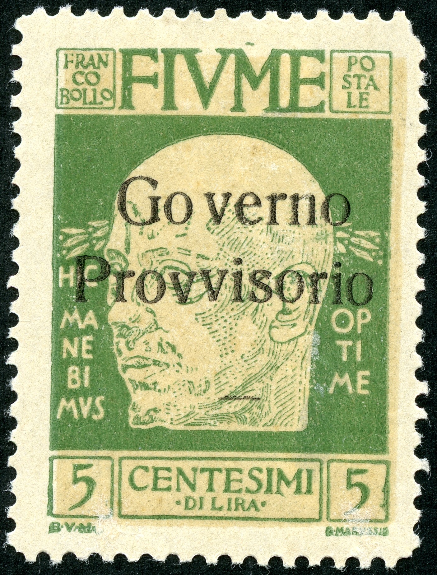
"1921 Scott 134 5c green" (Forgery
"1920 "d'Annunzio" issue overprinted"
Rather than examine closely the overprint, check the underlying stamp. Here the "O" in "Postale" is oval and leaning left. This is a forgery. Then, we know, that the overlying overprint is also a forgery. ;-)

Forgeries
Here, the whole overprinted set is a forgery, as the underlying stamps show oval "O"'s. in "Postale".
1923 Scott 173 10c violet "Venetian ship"
Probable Genuine
The 1923 typographic issue (four designs on pale buff background) consists of twelve stamps, and CV runs between $2+ and $50+.There are at least two forgeries. The easier one to pick up has an oval "O" in "POSTE", as opposed to the round "O" found in the genuine. I will show some of them later in this post.
The example above is a design found for the 5c, 10c, 15c denominations.

10c violet "Venetian Ship" Close-up
Cordage well defined (genuine)
The second forgery is definitely tougher to determine (judgement call). The "O" in "POSTE" is round, as in the genuine. The genuine will have good detail in the cordage, while the forgery will not. Cordage is defined as ropes or cords especially : the ropes in the rigging of a ship. The forgery may also be on rougher paper.
Here the cordage is well defined.

1923 Scott 172 5c blue green/ pale buff background
"Venetian Ship" (Forgery?)
OK, checking for forgeries: The "O" in "POSTE" is round, so not the "oval O" forgery.But the cordage is not well defined. So is this the second type forgery? It certainly cannot be ruled out.


1923 Scott 176 25c dark gray "Roman Arch"
Genuine
The second 1923 issue design (20c, 25c, 30c) features a Roman Arch. Note in this example, the "O" in "POSTE" is round. This is not an "oval O" forgery.

 The third design for the 1923 issue ( 50c, 60c, 1 l) has an image of St. Vitus.

1923 Scott 176 25c dark gray "Roman Arch"
Genuine Close-up
Characteristics of the genuine for this design include a gap in the horizontal line in the lower right portion of the arch. Do you see it? Also, the edge of the arch (left upper arch) is not interrupted.
In the "oval O" forgery, there is no gap in the horizontal line.
For the forgery with the "round O", all the lines are cruder and thicker, the paper is rougher, and there is an interruption (break) at the edge of the arch (left upper arch). This forgery does have a gap in the horizontal line.

1923 Scott 176 25c dark gray "Roman Arch"
Genuine
Note the "O" in "POSTE" is round, so this example is not the "oval O" forgery.

1923 Scott 176 25c dark gray "Roman Arch"
Genuine
The genuines tend to have few, thin, and interrupted drawn rays in front of the halo.
This example is probably a genuine.

 Note the complete and well drawn rays in front of the halo. This is probably a forgery - at least it cannot be ruled out.

 Genuine characteristics include a round "O" in "POSTE", and a very small dot in the "A" of "TARS"


 Here is another example of the "oval O" forgery.


1923 Scott 180 1 lira dark blue "St. Vitus"
Forgery?
Is this example a genuine or a "round O" forgery? (This is clearly not an "oval O" forgery.)
1923 Scott 180 1 lira dark blue "St. Vitus"
Close-up Forgery?

1923 Scott 181 2 l violet brown
"Rostral Column" Genuine
The last design (2 l, 3 l, 5 l) for the 1923 issue shows a Rostral Column. These denominations have higher CV ($20-$50+), so we may also encounter more forgeries.
1923 Scott 181 2 l violet brown
"Rostral Column" Genuine
Of course, there also exists the "oval O" forgery. Besides the "oval O", the forgery has a larger triangle cut-out for the "A" in "TARS", as we will see in a bit. Also, it turns out the image is 1 mm shorter than the genuine.
I should mention there does exist a second forgery, on rougher paper, with a "round O" and a small dot for the "A" in "TARS": both characteristics of the genuine. However, this forgery is also 1 mm shorter, like the "oval O" forgery.


1924 Scott 191 60c red (Genuine)
1923 Issue overprinted as shown
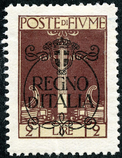
Also important to note that the 1923 issue (12 stamps) was overprinted (two different overprints) in 1924 to create two more 12 stamp issues. The good news regarding forgeries is, if the underlying stamp is a forgery, the overprint is also a forgery.

1924 Scott 193 2 l violet brown
Overprinted "REGNO d'ITALIA"
"Oval O" Forgery
Well, we have been talking about the "oval O" forgery for a long time without showing an actual example: Here it is on a 1924 overprinted issue.Admittedly, one has to look carefully at the "O" to determine if it is an oval or round: It does not immediately jump out as obvious.
Another way to tell genuine vs forgery, at least for the 1924 Overprinted "REGNO d'ITALIA" issue, is to look at the overprint...


1924 "Regno" Overprint
Upper (genuine) vs Lower (forgery)
See the difference? Most obvious to me is the lifted upper horizontal arm of the "E" in the genuine compared to the straight upper arm of the "E" in the forgery. Also, the "R" shape is much different.

1924 Scott 194 3 l olive
Overprinted "REGNO d'ITALIA"
"Oval O" Forgery
Let's compare a genuine "round O" with the "oval O"....


"round O" (genuine) vs "oval O" (forgery)
Note the "oval O' seems to be laying more on the left side and is clearly more oval. Note the "S" is a different shape also.

"oval O" Forgery close-up
Note "A" in "TARS" has a large triangular cut-out.
For the "oval O" forgeries of the "Rostral Column" design, note also the large triangular cut-out in the "A" of "TARS" The genuine only has a small dot in the "A".
1924 Scott 195 5 l yellow brown
"oval O' Forgery
Out of the BlueI hope you found this review, intended for the general WW collector, helpful.
I think the forgeries that show "oval O's" are fairly easy to determine.
I must admit, I find the forgeries, where the "O" is now round, like the genuine, to be problematic to determine. It seems to be a bit of a judgement call. The paper is often "rough" for these forgeries, so that should be helpful.
Comments appreciated!


