Batum 1919 Scott 5 (SG 5) 3 Ruble violet
Genuine, Forgery, Forgery
Overview
This post is a "special edition" for Big Blue that will cover Batum's "Aloe Tree" issues: namely the original 1919 issue (Scott 1-6, SG 1-6), the 1919 "British Occupation" overprinted issue (Scott 13-20, SG 11-18), and the 1920 "British Occupation" issue (Scott 57-65, SG 45-53).
I will say nothing about the overprinted Russian stamps for Batum here.
All of the stamps and overprints have been counterfeited, counterfeited, and counterfeited again.
We will attempt to lift the fog of confusion that is heavy, and at ground level with these 23 stamps
Consider....
• At Ebay one is as likely to be sold a forgery as a genuine copy- and for the same price. If you read this post, you will no longer, in the words of a prominent dealer, be an "Ebay Bunny".
• One of the prominent illustrated internet "World collections" has at least 10 forgeries included. This is not to denigrate the collection-which is most appreciated- but show how there is widespread confusion with these issues.
• The knowledge about these stamps is found in the philatelic literature, but tends to be locked up with small editions at specialized philatelic libraries. The internet provides some relief with thorough scouring, but no one has systematically provided an overview of the common forgeries. Even experienced philatelists wonder how to differentiate the "Ruble" stamps. (The "Kopeck" stamps generally have an easy sign which we will discuss presently.)
• And the catalogues have made things worse recently. Originally correct, when Scott added color stamp images in 2003 to the Classic Specialized 1840-1940 catalogue, the images were forgeries. Trust neither the Scott 1 5k green image (A Type I Forgery) or the Scott 13 5k green "British Occupation" overprint image (A Type II Forgery) until they are replaced. To Scott's credit, this will happen with the next edition. The same thing happened to the Stanley Gibbon British Commonwealth 1840-1970 catalogue when they substituted a color version (A Type I Forgery) of the "Aloe Tree" SG 4 1r chocolate. I have notified them about the forgery image.
Well, what about my credentials? I have none: I'm basically a WW classical era collector. But fortunately, this isn't rocket science. Judicious reference reading, internet searching, accumulation of a reference collection, and further review of hundreds of "Aloe Tree" stamps (Thanks ebay!) has come to fruition with this overview post of the common forgeries of Batum's "Aloe tree" issues. There still could be errors on my part around the edges; and if you have good information on this topic, I would appreciate hearing from you.
All the stamp images are from my collection, and for close study, I have uploaded 1200 dpi images.
Port of Batum,1881
Quick History
Batum, an important Black Sea port linking the Baku oilfields and the Transcaucasian Railway, had been an outpost of the Turkish Empire. But the Russians acquired control of the town in 1878. Then, with the Treaty of Brest-Litovsk, Russia began to leave the area, and consequently, the Turks occupied Batum on April 15, 1918.
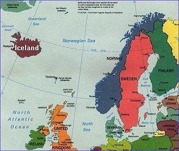
Batum, or Batumi, is located in present day Georgia on the coast of the Black Sea
However the armistice signed on October 30, 1918 required the Turks to withdraw, and the Allied Forces began to move forces into the area. A British Military governorship for the district (oblast) was declared December 25, 1918.
Postal Services was initially the responsibility of the Batum Town Council. The "Aloe Tree" design was selected. And using the old Imperial Government Printing Works, the issue (Scott 1-6) was released April 4, 1919.
But shortly after, the Batum Town Council supported a general strike (The occupation by the British was resented), and the British occupation forces had to take over the Post Office.
Of note, the initial force of 20,000 British and Indian troops was reduced to 2,000 by the end of 1919, while the refugees pouring in swelled the general population from 30,000 to 120,000, according to Ceresa (1993).
The military governorship released two more issues with "British Occupation" overprints in 1919, and 1920. The last issue had values up to 50 rubles due to the rampant inflation occurring in Europe at the time.
The British left July,1920, turning the administration over to Georgia.
1919 Scott 1-6 (SG 1-6) "Aloe Tree" issue
Original/Genuine
Into the Deep Blue
A Review of the 1919 original plain "Aloe tree" Issue (Scott 1-6, SG 1-6) with comparison to Forgeries
Scott 1 5k green 51,284 CV $8
Scott 2 10k ultramarine 51,482 CV $8
Scott 3 50k yellow 206,120 CV $4+
Scott 4 1r red brown (SG chocolate) 102,832 CV $6+
Scott 5 3r violet 26,522 CV $10+
Scott 6 5r brown 20,992 CV $10+
Note: All CV values are for unused
Note: Production figures are from Hughes
Suggestion: At any time when reviewing original or forgery scans, one can enlarge the above Scott 1-6 scan to view and compare all six values at once.
The first issue-the 1919 Scott 1-6 (SG 1-6) had a transfer block of 4 stamps in a Subtype A-Subtype B/ Subtype C-Subtype D (2X2) arrangement. This means each Subtype often will have some identifying characteristics- a color dot, a line or other change compared to the next Subtype. (The issue was in sheets of 198 subjects 11 rows of 18 stamps.)
1919 Scott 2 (SG 2) 10k ultramarine block of four
Transfer subtypes can often be identified
The Advantage of transfer subtypes is they are consistently there- every fourth stamp for the 1919 plain issue will show the same "spot"- as opposed to idiosyncratic plate flaws or plate wear. (Doesn't mean they will always show up, due to the vagaries of printing.)
So lets look at the 10k ultramarine above to identify the transfer subtypes....
Left upper...Dot below left tree branch, therefore subtype B.
Right upper...Small dot above CK at edge of Name tablet, therefore subtype A.
Lower left...Dot at outer edge of left vertical dots of left Value Tablet, therefore subtype D.
Lower right...Dot above M, therefore subtype C.
If there is doubt about a genuine stamp, this is clearly a way to identify.
Note: Identification from Ceresa (1993)
But caution is advised on turning a particular characteristic of one stamp subtype into a general identifying feature for all the stamp subtypes. In other words, to correctly identify a "stamp", use identifying characteristics that are found on all stamp examples for that denomination and color, and not a particular characteristic only found on one of the four stamp subtypes.
The common forgeries all, generally speaking, seem to have only one "type": A transfer block of "one".
1919 Scott 1 (SG 1)5k green Left
Forgery I Center, Forgery II Right
We will now begin our journey with the Kopeck variety 1919 plain genuine issue, and compare them to the two most common forgeries. One may want to click on the image and enlarge it.
Note: I am using the same naming convention (Forgery Type I and Forgery Type II) as this informative site:
Yellow circle: Necessary and definitive for the genuine Kopeck values:
six dots along the right upper Value Tablet versus seven dots for the forgeries. You should now already be able to determine genuine from the two common forgeries simply by counting the dots for the Kopeck values. Wow! How easy is that? ;-) Unfortunately, this doesn't work for the Ruble values, but that is why we are becoming familiar with the rest of the stamp.
Green arrow: Note the circle hanging down from the right ribbon is placed different, and has different internal markings for each stamp. ( I can describe the differences, but you can see them as well as I can.) This is a very good area to place close attention, as there are always differences here between the original/genuine and Forgery I and Forgery II. Of interest, the genuine/original Kopek values look different here compared to the genuine/original Ruble values, but the forgeries always look the same for both Kopeck and Ruble values.
Black arrows: The ribbons hanging down from the Name Tablet again are clearly different for the three stamps. The shape and size of the ribbon folds, and the internal lines and markings vary. Forgery I (Center) has a quite small ribbon image just below the right Name Tablet. This is a very good marker for this forgery when reviewing stamps. Of interest, the Kopeck and Ruble values look a bit different here for the genuine/originals, while the forgeries look the same.
Blue arrow: The "vertical" lines at the right end of the Name tablet are different for the three examples.
Genuine/Original (Kopek)- three lines, left line open in the middle. No dot. Note: Genuine "Ruble" values have different markings.
Forgery I: Small dot, two lines (sometimes merge) and a lower dot for all values.
Forgery II: An irregular dot-blob (most important sign), two lines (although the 5k doesn't have it), a lower dot, and occasionally a right third line of very small dots ( My 5r has it).
Red arrows: The reverse "R" and "A" on the Name tablet are a different shape for the Genuine/Original versus the forgeries. This differance is only seen with the Kopeck values.
Genuine/Original: Angular reverse "R",and more flat topped "A".
Forgeries: Round reverse "R", and more pointed "A". Also difference in the "A" for Forgery I and Forgery II.
Let's look at some more differences using the 10k value....
1919 Scott 2 (SG 2) 10k ultramarine Left
Forgery I Center, Forgery II Right
(Note: The "Forgery I" shown here is Ceresa F2, rather than the more common Ceresa F6-more about that later in the post.)
The 10k ultramarine examples above are marked up to show more differences. Enlarging the image is advised.
Green arrow: The green arrow points to the third tree branch, counting from the left. The Kopeck value Genuine/original stamps have a straight branch leaning to the left. (The Ruble Genuine/original values actually have a different branch design.) The Forgery I stamp branch is slightly curved, and more upright. The Forgery II branch is definitely curved to the right.
There are actually two important signs here.
• The "Straight branch" sign for the genuine/original "Kopeck" stamps is easy to see, and can be used for a quick evaluation tool.
• For Forgery II, the "Curved branch" sign (Important!) is easily seen, and one can quickly identify this forgery. Actually, the two middle branches (branch three and four counting from the left) both curve to the right with only a narrow space between. This is easy to pick up even when evaluating poor images on Ebay or elsewhere.
The "Curved branch" sign is seen for all Forgery II values.
Red arrow: The "O" sign (For kopeck values):
Genuine/original- The "O" is square-ish, but rounded around the edge. The center hole is narrow, but slightly rounded.
Forgery I: The 'O" is rounder compared to the original/genuine, with a larger center hole.
This sign is definitely helpful to pick out Type I forgeries.
Forgery Type II: The "O" is more square and blocky, with a narrow rectangular hole.
Quite characteristic.
Yellow Circle: The
"Dot Sign" (More fully, the "Left Value Tablet Right Upper Corner Dot Sign")
The "Dot Sign" (Important!) is a quick way to differentiate the genuine original from the two most common forgeries for
all values, both Kopeck and Ruble. It will work even with the poor images seen on Ebay or elsewhere.
Let's take a closer look, and compare to Forgery I and Forgery II.....
The Dot Sign for the Genuine Original -Kopeck Value
Note the right upper corner dot has no companion to the right. The dot below the corner dot has a small dot companion to the right that is not very obvious. (The qualifier will assume importance soon.)
Actually, the Ruble values for the original genuine will have a dot to the right of the corner dot: But also not very obvious. (This is illustrated later.)
Next, let's take a look at Forgery I with the "Dot Sign".......
The Dot Sign for Forgery I (Ceresa F2) - Identical for Kopeck/Ruble Values
The right upper corner dot has no companion to the right. But take a look at the dot below the corner dot: It has a very prominent dot of equal size to it's right. And clear of other markings. It is easily seen naked eye- and can be picked up nicely with the less than ideal images on Ebay or elsewhere. With a bit of practice, one can tell this prominent dot from the less obvious dot (which is close to other markings) on the original/genuine example. This should work for all Forgery I Kopeck/Ruble values. How cool is that? ;-)
The Dot Sign for Forgery II - Identical for Kopeck/Ruble Values
The right upper corner dot has a large rectangular dot to the right, and a smaller triangular dot further right. The dot below the corner dot has a small triangular dot to the right that is not very prominent.
The Forgery II stamp dot pattern is easily spotted: The dot(s) seem to continue along the top of the left value tablet past the edge of the right side of dots. Easily picked up with the naked eye, and a give-away with any Ebay stamps.
Finally, to finish up the "Dot Sign" section, here is how an original/genuine Ruble stamp looks...
The Dot Sign for the Genuine Original- Ruble Value
As mentioned, the original Ruble value does have another dot to the right of the upper corner dot; but it is not very prominent compared to the larger dot of the Forgery II stamp. (Compare with the Genuine Original- Kopeck image and the two Forgery images here.) Also the smaller dot to the right of the dot below the corner dot is not very obvious, and not as large as the Type I Forgery stamp.
The human eye is interesting. An object has to be a certain size before the eye will readily notice. So, although the scans easily pick up the smaller dots here, the human eye is drawn to the larger dots. Of course, a bit of practice is necessary, but I can go through a group of "Aloe tree" stamps quickly, and at least put them in initial separate categories.
Now let's take a look at the 50k yellow...
1919 Scott 3 (GB 3) 50k yellow
Original/Genuine & Forgery II
The 50k yellow was the most common of the original plain "Aloe Tree" issue with over 200,000 stamps: more than twice the 1r red brown @ 100,000. Consequently, it is also the least expensive with CV $4+. Of interest, in my experience, it is the most likely "genuine" to be included in a lot of mixed genuine/forgery stamps on Ebay or elsewhere.
From the point of view of this post, however, the yellow color does not show detail well. Therefore no arrows for this stamp. ;-) But one should easily determine it is a genuine "six dot" variety (on top of the right value tablet), and the "Dot Sign" is definite for "Genuine" also.
There are two markers for the Forgery II stamp which bear a comment.
• Note how easy it is to spot the two middle branches (Branch 3 & 4 from the left) with the narrow space between the branches. Notice particularly the curved third branch (The "Curved branch" sign).
• The white paper! Thin and transparent from the back with white gum. Found with all Forgery II stamps.
This is the end of the "Kopeck" section. Of, course, with the six dots seen for the genuine/original, it is child's play to pick them out among the common 7 dot forgeries. But we also learned a great deal about the rest of the stamp, and how it differs from the forgeries.
Now that training will be put to the test with the upcoming "Ruble" values....
1919 Scott 4 (SG 1)1r red brown Left
Forgery 1 Center, Forgery II Right
Here is the Scott 4 1r red brown with two common forgeries. One might want to enlarge the image for evaluation.
Although the original/genuine series shares a great deal of common elements, the "Ruble" stamps also differ significantly with their "Kopeck" counterparts in many details. Note the upper line of dots along the right value tablet now counts seven. No longer an easy 6 vs 7 for the originals vs forgeries as it was for the "Kopeck" stamps. (Note: I didn't circle this, as it should not be needed.)
The "Dot Sign" on the right upper corner of the left Value Tablet shows only two non prominent dots: one to the right of the corner dot, and the dot below the corner dot shows another dot. But that means "genuine", as the right side dot(s) are more prominent in the forgeries. (Again, no arrow/circle, as should not be needed.)
Red arrow: Circle (called the "rose" by some authors) hanging from the right ribbons have placement and internal markings that are characteristic for each stamp. An important area to examine.
Note especially how the large dot in the center and surrounding small circle (the "Eye") do not join each other in the original/genuine and Type II forgery. But the Type I forgery has the large central dot joining the surrounding small circle at the top ( the "Hooded Eye"). This is an important finding for Type I forgery stamps.
Other findings...
Original/genuine- The Circle touches the inner frame line of the circular panel and central vignette. Observe the markings. Remember these markings will only be seen for the "Ruble" values, as the "Kopeck" values will be different for the genuine/original stamps.
Forgery I- Circle is displaced to the right of the central vignette with a solid color of the circular lattice panel between.
Forgery II- Located similarly as the genuine/original. Has unique markings with careful examination. These markings are for all Forgery II stamps.
Blue arrow: An important part of the "Shrubbery" field, as each stamp has a unique pattern here. Helpful when trying to verify that a stamp is a member of a particular group. Remember that only the "Ruble" genuine/original value stamps will show this pattern, as the "Kopeck" genuine/original stamps have a different pattern.
Black arrows: Very valuable area to examine, as all three stamps have a different shape to the ribbons, as well as different markings. Particularly easily identified is the small "Amoeba" piece (where the right black arrow is pointing) for the Type I forgery. Important!
Green arrow: The markings on the right of the Name Panel are helpful, especially for identifying Forgery I.
Original/genuine- one dot, then three dots, then three "vertical" lines, the middle one being broken or open. Ending in a rather vertical shaped dot, not very prominent. ( Note: Description only good for the "Ruble" values.)
Forgery I- A dot, two lines, and a larger dot, all prominent.
Forgery II- a grouping of 3-4 small dots, then two lines -which can be broken or open. A third line closest to the right edge consisting of dots is noted for the 5r brown. Finally ends in a dot.
Yellow arrow: The left side of the Name Panel also is helpful to examine.
Original/Genuine- one dot, and then two lines which can merge. (Note: Description only good for the "Ruble" values.)
Forgery I- Two lines. The left-most line can be broken into several segments. Not very prominent.
Forgery II- A dot, then two lines that merge into a "crushed W". Prominent.
Also, don't forget about the white paper (Forgery II), or the "Curved branch" sign (Forgery II).
Let's explore more with the 3r violet.....
1919 Scott 5 (GB 5) 3r violet Left
Forgery I Center, Forgery II Right
Clearly, the Forgery Type I here has a different color- red violet? Remember to use the "Dot Sign", and the "Curved Branch" sign, as well as paper color awareness. Take a look at the right small "Amoeba" shaped ribbon below the Name Panel for the Type I's.
Blue arrow: W.E. Hughes, in the Scott Monthly February 1923 reports on a "new" Batum Tree forgery. He believes they are coming from Vienna. He says, for the 5 Ruble, the forged stamp has the "BA" letters of "BATYMCKAR" touching, while the Genuine does not. Well here, the Type I forgery has the "BA" letters touching.
Green arrow: The "P" sign. A quick way to separate out the stamps, especially the original/genuine from the Type II's. This can be used at Ebay or other selling sites. It consists of which direction the long axis of the "hole" in "P" is pointing.
Genuine/original- the hole in "P" is pointing at 12-12:30 (As the Clock points).
Forgery I- "P' sign is at 11:30-12.
Forgery II: "P" sign is at 1-1:30.
Red arrow: The arrow points to the "Aloe Tree" leaves, which for each stamp, have a characteristic look. Specifically, the Type I has a very flat two dimensional look to the leaves, while the original/genuine have white shading, which gives them a three dimensional look. The Type II's are somewhere between.
Onto the 5r brown, the last of the set....
1919 Scott 6 (SG 6 ) 5r brown Left
Forgery I Center, Forgery II right
Varro Tyler, in his book Focus on Forgeries (2000), describes two signs for the "Aloe Tree" Batum stamps, which I show above.
Green arrow: The green arrow points to the KA in the Name tablet for each stamp.
Original/genuine: The KA is joined at the bottom for the Scott 1-6 plain issue.
But caution: Do not use this sign for verification of genuine "British occupation" overprinted issues, as I found in my evaluation of the overprinted issues that ~60% are KA joined, ~40% are not KA joined.
Type I Forgery: The KA is not joined. (Important!) Sometimes, however, the K and A can be very close together, so use this sign in conjunction with other signs.
Type II Forgery: The KA is joined together - except the 5k is generally not.
Red arrow: The red arrow points to the right upper frame corner of the Type II forgery, where often a small extension occurs from the frame above vertically. This is sometimes difficult to always see, but can be a helpful sign.
Blue arrow: The blue arrow points to the Type I Forgery and the right circle area: more specifically, the large dot attached to the inner circle (The "Hooded Eye"). This "Hooded Eye" is a sign of a Type I Forgery, or, as we shall see, a family of forgeries. Important!
This might be a good time to talk a bit more about the Type II Forgery. It may very well be from the hands of Nino Imperato (N. Imperato), a stamp forger based in Genoa in the 1920s. He distributed them as "facsimilies", much cheaper than the real thing.
The Type II's are prolific indeed, and may outnumber the genuine/original specimens in collections. We will see them soon again when we turn our attention to the "British Occupation" overprinted issues of 1919 and 1920.
But it is time to bid adieu to the Type I's, as they are not found with the overprinted varieties.
Oh, one more thing about the Type I's....
Above: Type I Forgeries 26 mm tall
Below: Genuine/Original 25.4 mm
The Type I (Ceresa F6) forgeries are slightly taller than the genuine/originals. Sometimes this measurement can be helpful.
Are there other forgeries besides the Type I and Type II?
Well, yes.
We will very shortly become acquainted with Forgery III, commonly found with the overprinted issues.
And there are other Forgeries or Forgery subtypes.
But, for the original plain stamps (Scott 1-6) , Forgery I and Forgery II are the most common.
We will revisit this interesting question once we review the "British Occupation" overprint issues, and their commonly seen overprint forgeries.
A Review of 1919 Scott 13-20 and 1920 Scott 57-65 "British Occupation" overprints with comparison to Forgeries
1919 "British Occupation" Overprint Issue
Scott 13 5k green CV $20+ 28,894
Scott 14 10k dark blue $15+ 28,512
Scott 15 25k orange $20+ 31,892
Scott 16 1r pale blue $5+ 48,101
Scott 17 2r salmon pink $1+ 366,728
Scott 18 3r violet $1+ 257,964
Scott 19 5r brown $1+ 263,709
Scott 20 7r dull red $5+ 57,118
1920 "British Occupation" Overprint Issue
Scott 57 1r orange brown $2+ 501,424
Scott 58 2r gray blue $2+ 201,432
Scott 59 3r rose $2+ 200,816
Scott 60 5r black brown $2+ 203,280
Scott 61 7r yellow $2+ 203,280
Scott 62 10r dark green $2+ 202,972
Scott 63 15r violet $2+ 102,256
Scott 64 25r vermilion $2+ 153,692
Scott 65 50r dark blue $2+
Observations...
• The 1919 & 1920 overprints are in different colors than the 1919 plain originals, except for the 5k green.
• The 1919 5k green, 10k dark blue, 25k orange, 1r pale blue, and 7r dull red are less common than the other varieties.
• The 1920 issue all had a large print production, and forgery overprints seem to be less common for them.
• The 1919 2r salmon pink, 3r violet, 5r brown, and the 1920 issue have modest CV's.
Truths.....
• The originals were lithographed, the overprint "overprints" were lithographed, and the forgeries were lithographed. All unwatermarked.
• Rare exception aside, no stamps exist for the genuine 1919 and 1920 "British Occupation" issues that do not have the overprint on them.
• All genuine "British Occupation" overprints are found on genuine stamps. A corollary: If it is a genuine stamp, then the overprint is also genuine.
• All forgery "British Occupation" overprints are found on forged stamps. A particular forged overprint is always found with a particular forged stamp. So, to determine the identity of a forged overprint, it might be helpful to determine the identity of the forged stamp. Or vice versa.
• The two "British Occupation" overprinted issues had new "stones" prepared from the transfer designs, and in a a transfer block of six: ABC/DEF (3X3) arrangement.
The "British Occupation"
overprint was also in a transfer block of six (ABC/DEF (3X3). Consequently, "Overprint subtype A" is always on "Stamp subtype A", "Overprint subtype B" is always on "Stamp subtype B" and so forth. One can then identify a subtype by either the stamp or the overprint.
• The 1919 issue (Scott 13-20, SG 11-18) was in sheets of 432 (18X24), while the 1920 issue (Scott 57-65, SG 45-63) was in sheets of 308 (22X14).
1920 Batum 62 10r dark green
Transfer block of six: ABC/DEF
Note guidelines present for 1920 issue
Let's look at a Transfer block of ABC/DEF subtypes for the 1920 10r green...
Left Upper-Subtype A-identification not seen, but O.K., as they do not always show every time.
Upper Center-Subtype B- white line above "A" joining Name Tablet to the outer white margin.
Right Upper- Subtype C- small dots in both Value Tablets.
Left Lower- Subtype D- long step noted in left Pyramid (above left Value Tablet).
Lower Center- Subtype E- more dots in Value tablets
Right Lower- Subtype F- two dots noted in left Value Tablet
Note: Identification from Ceresa (1993)
The "British Occupation" overprint has some characteristic (small) differences between subtypes also. But that is better seen on a lighter colored stamp background.
1919 Scott 13 5k green "Aloe Tree"
Overprinted "British occupation"
The overprint is the same for both the 1919 and 1920 overprint issues. Some of the characteristics of the overprint include:
• An "R" that has a front leg that appears perhaps only slightly curved.
• A perceived "gap" between the "I" and "T"
• An "S" that appears only slightly larger
• An "H" that often shows little serifs on the ends
• A double "C", with the first "C" lower lip more upright, and the second "C" lower lip angled outwards and open.
• These characteristics will become clearer with comparison to the forgery overprints.
Now let's look at the stamp itself....
View of Scott I & Scott 13
Since the overprint editions had "new" stones prepared, any clear differences between the genuine/original and the genuine overprinted Scott 13 for the "Kopeck" designs?
• First, the similarities are clearly profound.
• It is known that the original plain issue for the 5k value did not sell well, as there was little actual need for the value, so some of them were withdrawn, and overprinted for the 1919 overprinted issue (Ceresa). So those specimens clearly should be the same as the original, save for some plate wear.
• As there were 4 transfer subjects for the genuine/original (AB/CD), and 6 transfer subjects for the overprinted issues (ABC/DEF), each stamp might be able to be sub-typed. For instance, the 5k green original plain image above is a subtype C based on a dot below the left tree branch, and the dot inside the left "5". The 5k overprinted is probably subtype F based on the forward projection of the bottom of the overprinted "B", and the appearance of the "5" numerals. I believe this is the best way to determine an original and an overprinted stamp on a consistent basis, but does require specialized reference volumes such as Ceresa (1993).
• Ceresa states the "Pearls" or dots surrounding the value tablets are more substantial in the overprints. I actually do not see the differences with these examples though.
• The right "5" of Scott 13 is different here. The problem is there are 10 "5"'s to evaluate ( 4 transfer subjects for the original plain, and 6 transfer subjects for the overprinted), and each "5" can look a bit different, to say nothing about plate wear. I found an overprinted transfer subject (Subtype C) in Ceresa that appears to have the same "5" as the original plain stamp here. So actually not a consistent "Difference".
• The right and left "pyramid" steps above the value tablets have different impressions on these particular stamps. Does this always hold? Reviewing the overprinted 6 transfer subject images in Ceresa, it appears that many of them do have a ragged "pyramid" step appearance. This is probably from plate wear. Could be a "soft" sign for the overprinted variety.
Fortunately, this exercise of determining differences between the original plain and overprinted varieties is academic, as the the overprinted variety always has....the overprint! ;-)
View of Scott 4, Scott 16, and Scott 57
Plain and overprinted 1 ruble values
So, any clear differences between three genuine issues for the "Ruble" design?
Not much -besides the color. ;-)
The Scott 57 here appears to be a cruder print, or over-inked, and my copy is on whiter paper.
• Determining subject transfer subtypes (4,6,6, respectively) for the three issues would most likely be the most sure way to identify. For instance, the break in the top frame line for the 1r pale blue indicates it is subject transfer Type D for the 1919 overprinted issue.
• The "apparent" differences in the "1" numbers, and the "pyramid" appearance is probably more a matter of plate wear, and sifting through many subject transfer subtypes, than true differences between the issues.
All academic, as the different colors, and plain/overprint categories define these stamps anyway.
Well, we are now ready to introduce forgery overprints to the mix.
Remember, the Forgery I stamp is never found overprinted, so we will not discuss them here.
The first forgery overprint to be illustrated is on our old friend, the Forgery II stamp. As stated, the Forgery overprint II is
always on the Forgery II stamp. Certainly makes identification easier.
The Forgery II stamp and overprint for Scott 13-20
The Forgery II stamp and overprint is common indeed for Scott 13-20. If you look at ebay's offerings for Batum, you will encounter this forgery very quickly
This Forgery II overprint is also found for the 1920 Scott 57-65 issue, but not as commonly, perhaps because the genuine overprinted 1920 issue is uniformly inexpensive (CV $2+).
Let's have a closer look....
1919 Scott 17 (SG 15) 2r salmon pink (Genuine)
"Scott 17" Type II Forgery
The left stamp shows the genuine salmon pink.
The right stamp has a forgery overprint associated with a Type II forgery stamp.
Before one looks at the overprint, observe the "Dot" sign and "Curved Branch" sign, confirming this is indeed a Forgery II stamp.
Some of the characteristics of the Type II forgery overprint compared to the genuine are....
• The lower portion of the "B" is larger.
• The front leg of the "R" is more curved than the original.
• The "I" is raised compared to the "R", and seems slightly tilted.
• The "S" is larger.
• The "H" does not have the little serifs.
• The "U" seems tilted.
• No serifs on the "A", "T", and "N" of "Occupation".
1920 Scott 64 (SG 52) 25r vermilion (Genuine)
"Scott 64" Type II Forgery
For completeness sake, here is the Forgery Type II on the 1920 overprinted issue. What I find particularly helpful is the larger "S", the more curved front leg of the "R", the tilted and shorter "I", and the tilted "U" on the Type II forgeries.
Of course, one can also check the underlying stamp for verification. Note the "Dot" sign and the "Curved Branch" sign, and the narrow space between the center branches for the Forgery II stamp.
We are now through with the Type II and Type II overprinted forgeries.
Let us meet for the first time what I call the Type III forgeries. These forgeries are almost always found overprinted. (We will have more to say about when they are not later.)
The Type III overprinted forgeries for 1919 Scott 13-20
They also can be found for the 1920 overprinted issue.
The paper itself is white and translucent, lending a "chalky" hue to the colors.
The Type III overprinted forgeries do not appear to be as common as the Type II overprinted forgeries, but one can usually find an example or two on ebay.
Let's take a closer look....
1919 Scott 15 (SG 13) 25k orange
Type II OP Forgery, Type III OP Forgery
Here lined up is a genuine 25k orange, and the two most common overprinted forgeries, Type II and Type III.
I will say nothing about Type II, as that has been thoroughly discussed.
Ignoring the Type III overprint for the moment, the stamp seems to lack as much detail (cruder print) as the genuine, and the numbers in the Value Tablet appear different.
But note the Kopeck value for the Type III stamp has 6 dots over the right Value Tablet, the same as the genuine stamp? What if this forgery is found without overprint? (Ominous music now playing in the background: more about this soon.)
But now let's look carefully at the Type III Forgery overprint....
1919 Scott 13 (SG 11) 5k green (genuine)
"Scott 13" Type III overprinted forgery
Fortunately, the Type III overprint is laughingly easy to distinguish compared to the original.
Some of the characteristics of the Type III forgery overprint compared to the genuine are....
• The "R" hole is much narrower and longer (As is the "R"). The front leg of the "R" is quite straight.
• The "S" has a "square" appearance
• The hole in the "P" is also long and narrow, probably the easiest difference to spot.
• The "O" and "N" on either end of "occupation" is larger than the other letters.
Again, note the dots over the right Value Tablet number six, the same as the genuine, and different than the seven dots for the kopeck values found for Forgery Type I and Forgery Type I
Note also the "dot" in the right circle which hangs down from the ribbons there does not attach to the smaller circle (the 'eye"), as seen with Forgery I stamps (the "hooded eye"), but looks similar to the genuine stamp in this area ( and also the Type II Forgeries) ? If this stamp shows up without the overprint, it might be difficult to tell from the original. (Ominous music now back.)
Let's look at a ruble value....
1919 Scott 16 (SG 14)1r pale blue (genuine)
"Scott 16" Type III overprinted Forgery
The forgery overprint has the long "P" and the other signs that gives this away as a Type III overprint forgery. Note also the white translucent paper here.
But, other than the cruder impression, and perhaps a difference in the numerals, the forgery stamp itself looks quite like a genuine Ruble value. And, if you check the Kopeck value for the Type III stamp, it also looks quite like the genuine Kopeck value. Could be trouble if these stamps show up without the overprint. (Ominous music more insistent.)
1920 Scott 60 (SG 48) 5r black brown (genuine)
"Scott 60" Type III overprint Forgery
Just to complete the picture, here is the Type III overprint forgery on the 1920 issue. Again, the long "P" and other signs gives it away. It appears, as with the Type II's, the Type III forgeries for the 1920 issue are not found as frequently.
This concludes the review of the two common types of overprint forgeries. Earlier, we also reviewed the two common forgeries for the plain Scott 1-6.
But let's complete the picture with what is known about other forgeries that, perhaps, are not as common. I should say I am on somewhat shakier ground here, as some of the forgeries I do not have or have not seen. I do have, however, some additional forgeries: some identified, some not totally identified by me.
Ceresa (1993) identified six forgery groups in his reference book. Let us review his groups.
• My Type I Forgery is strictly equivalent to Ceresa's Sixth forgery Series, Ashford's Type 2 (B), and Varro Tyler's second type forgeries. Remember that the Type I forgery is not found overprinted. Fairly common.
It turns out that the Type I forgery may be a Ceresa "Family" of forgeries -perhaps three kinds. More about that soon.
• My Type II Forgery is equivalent to Ceresa's First forgery series, and Varro Tyler's first type forgeries. (As I get additional correlation with other author's lists, I will add them here.) Remember, that Forgery Type II is found both plain and overprinted, as is quite common.
• Ceresa lists a Third forgery series, and these stamps are known mostly overprinted, although there has been an non-overprinted example found rarely. It has different designs for the Kopeck and Ruble value. This series is quite scarce. The overprinted stamp is easy to identify, however, as the "British occupation" overprint is small (letters 1.5 mm high), much smaller than any other series. For that reason alone, it will not be confused with a genuine copy. The design is coarse. Ceresa's Third forgery series is equivalent to Ashford's Third Type, and Barefoot and Hall's Third Type.
I do not have a copy, nor have I even seen one for sale.
• Ceresa lists a Fifth forgery series. As of 1993, he had a 50k, 3r and 5r of the series. The Forgery only comes as a "Ruble" design, no separate "Kopeck" design was produced - Similar to the common Type I and Type II forgeries we have discussed. Therefore the Kopeck values have 7 dots over the right value tablet. Ceresa states the stamps are found with "milky" tone on white paper. He states the markings in the left circle (or rose as he calls it) is the distinguishing feature.
But the right circle has the "hooded eye" or dot that touches the inner circle, a characteristic of the Type I forgery. So, although I have not seen or identified this forgery, I would place it close to Ceresa's Sixth Forgery (My Type I Forgery) as a close "Family Member".
• Ceresa lists a Second forgery series, which differs from his Sixth forgery series by a different spacing of the stamps in the sheet. But they are overall quite similar, and Ceresa's Second forgery series is definitely a "Family member" of his Sixth forgery series, or my Type I Forgery.
And I have a copy! BTW,the reader has already seen it, has it was labeled Type I (Ceresa F2) for the 10k ultramarine.
1919 Batum 2 (SG 2) 10k ultramarine (genuine)
Ceresa Forgery Group 2 10k, Type I Forgery 5k
I don't have a copy of the 10k Type I forgery, so I am substituting a 5k Type I forgery for comparison.
The Ceresa Forgery Group 2 stamp is in the middle (also known as Ashford's type 2 (A) ) . It is found only in the "Ruble design", so 7 dots should be noted above the left Value Tablet. It is also similar in appearance to the Type I forgery's right circle, with the "hooded eye", or dot touching the inner circle. That is why I believe it is "close" to the Type I Forgery ( Ceresa's Sixth forgery series). In fact, careful examination also shows basically identical right and left ribbons, left circle, Aloe tree, and shrubbery. The "dot" sign is identical.
Where it differs from Type I is the appearance of some of the letters in the Name Tablet. Specifically, the "Y", the "M", the "C", the "A", especially the reverse "R", the "N", and the"T". It clearly has a more chaotic appearance to the dots around the right Value Tablet. This actually is characteristic, at least for the 10k value, as Ceresa also shows this for all his 10k examples.
Ceresa says this Forgery series may have existed as early as 1921, and can be found in old time dealer's stocks. It is in a AB/CD transfer block. The break in the outer frame line at the lower right corner is found for the subtype C stamp.
I wonder if this was a less accomplished version of Type I (Ceresa's Sixth forgery series)?
In comparison to the Kopeck genuine, the Ceresa Forgery Group 2 has considerable differences, and therefore is not dangerous. Although I do not have "Ruble" values to compare, I would think many of the Forgery I differences with the genuine would hold here.
O.K., we've taken care of 5/6 of Ceresa's forgery groups. the last one, of course is my Type III, Ceresa's Fourth Forgery series. This is, recall, fairly common as an overprinted variety. The overprint is fairly easy to recognize, so no problem there. (This is also known as Ashford's forgery one, and Barefoot and Hall Forgery 2.)
But does Type III ( Ceresa's Fourth forgery series) exist unoverprinted?
Take a look....
"Scott 2 (SG 2)10k ultamarine" Type III Forgery unoverprinted
"Scott 14 (SG 12) 10k dark blue" Type III Forgery overprinted
Yes it does.
(Ominous music crescendo)
The two stamps above are identical save for the color and overprint.
How common? Ceresa states only one used unoverprinted copy was found in a U.S. collection, also a 10k value.
But the Reference was published in 1993, so there may be more today.
Clearly, I have this unused 10k copy in my collection.
There is a possibility, perhaps a probability, that there are more values out there.
If so, if one is using the "six dots" over the right Value Tablet as an indication of a genuine copy for the Kopeck values, one must now rule out also the Type III unoverprinted Forgery stamp.
1919 Scott 2 (SG 2) 10k ultramarine
"Scott 2" Type III Forgery, unoverprinted
O.K. so what are the differences with the genuine?
• The Forgery III is on whiter paper.
• It appears to be a much cruder printing: Notice the lack of detail with the shrubbery?
• Notice the left circle is missing a heavy line between the inner circle and the vignette?
• Less line marking detail in the ribbons.
• Clumping of color without detail (Example: In large Circular Lattice Tablet by the right Value Tablet).
• Left edge of Name tablet has different markings.
• "N" in KON has a wider opening, with the left vertical stroke extending below the right vertical stroke.
• The right "10" is missing a chunk out of the "0". This might be helpful for the 10k value.
• The dots surrounding the right value tablet clearly are different.
Perhaps the reader can find more. ;-)
This ends our review of the "Aloe Tree" forgeries. I had a great time putting together this post. I hope you have been able now to identify your own "Aloe tree" collection stamps - for good and bad. ;-)
But, is this the "final" end?
No, I still have about a half dozen more stamps that need to be identified. They may be from worn plates, examples of known types, perhaps subtypes, or even "new" types. ;-)
Perhaps for another post.
Comment? Please Do!
Note: Map and photos appear to be in the public domain.
References
Internet Sites
Big Blue's original Batum blog:
http://bigblue1840-1940.blogspot.com/2011/03/batum.html
A great site that shows the genuine Batum stamps:
Batum and Its Stamps
http://alphabetilately.com/batum.html
Another great site that shows the Scott 1 5k green genuine (in all four subtypes), and Forgery type I and Forgery type II:
http://www.numonesidentifier.com/country/1/
Both of these Stamp Forums have information on Batum. Do a search on their site. I have contributed to the discussion on SCF regarding Batum:
http://www.stampcommunity.org/default.asp
http://www.stampboards.com/
Books
• The Serrane Guide 1998 American Philatelic Society
• Focus on Forgeries Varro Tyler 2000 Linn's
Note: A discussion on Tyler's "KA" sign, and my contribution, can be found here:
http://www.stampcommunity.org/topic.asp?TOPIC_ID=26342&whichpage=2
• R.J. Ceresa's "The Postage Stamps of Russia 1993 1917-23 Volume 4. Trancaucasia Parts 13-16, Section A & B, British Occupation of Batum". Available from the APS Research Library.
(If you are seriously into Batum, this is the reference material to get!)
Descriptive Nomenclature
The stamp design consists of a central vignette with Aloe Tree and shrubbery, a circular panel surrounding the vignette with a lattice design, the name panel with Batumskaya Pochta (Batum Post) [ directly BATYMCKAR] inscription, a ribbon (in folds) dropping down from each side of the name panel, a circle on either side below the ribbon which has a central large dot or "eye", an inner circular line and surrounding markings, two small circles with comma type markings below and lateral to the circular panel, a "Pyramid step" structure above the value tablets on either side, two value tablets in the lower corners surrounded by "dots" or "pearls", the value figure inside the value tablets, and between the two value tablets on a plain colored background, are the KON (Kopecks) ot PYG (Rubles) inscriptions. There is a thin outer frame line surrounding the interior of the stamp.There is a plain colored background as one can note.
The design for the Kopeck and Ruble values differ somewhat.
I will try to use this nomenclature throughout the stamp descriptive parts of the blog.
-----------------------------------------------------------------------------------
Aloe Tree at the Huntington Library Entrance Garden