A is for Aden and Z is for Zanzabar


A is for Aden and Z is for Zanzibar... Now what is between? For the world wide classical era philatelist and stamp collector, a country specific philatelic survey is offered by the blog author, Jim Jackson, with two albums: Big Blue, aka Scott International Part 1 (checklists available), and Deep Blue, aka William Steiner's Stamp Album Web PDF pages. In addition, "Bud" offers commentary and a look at his completely filled Big Blue. Interested? So into the Blues...

Monday, August 29, 2022

Oltre Giuba - Bud's Big Blue

1926 Scott 31 25c olive brown
"Map of Oltre Giuba"
Bud's Big Blue
Bud's Observations

Trans-Juba (Jubaland; Ital., Oltre Giuba) stamps had a short span of use, issued 29 July 1925 and continued to 1 June 1926 when Trans-Juba was absorbed into Italian Somaliland. Britain had hoped to trade the northeastern part of Kenya, then a part of what was known as British East Africa, to the Italians in exchange for returning its occupied Aegean Islands to Greece, but Mussolini rejected the swap. So, the British agreed to give these 34,000 square miles to Italy unconditionally as a reward for supporting the Allies during World War I.

All of Oltre Giuba’s stamps are overprinted or inscribed Italian stamps of the mid-1920s, except for a definitive series of seven with a map of the area. Presumably, Italy needed to show where their war trophy is located. A strip of Kenya is shown on the left side of the stamp, Italian Somalia on the right.

Canceled stamps generally command higher prices than mint examples. Alas, I have none of the former. Bogus cancels abound. About 20 years ago, my entire collection (see below) came from a single feeder album.

Today, the former Jubaland is beset with the major problems faced by the rest of independent Somalia – armed conflict, piracy, lack of police protection, internally displaced people, physical abuse and perpetual humanitarian crises.

Census: 35 in BB spaces, two on supplement page.

Jim's Observations

I've never quite warmed up to Italian colony stamps. Generally, they are  unused, and many of them merely consist of overprinted Italian stamps, perhaps in a different color. They seem "artificial", intended primarily to extract money from collectors. (But, one can argue that is true for many/ most of the world's colonies. ;-)

And a large portion of Italian colony stamps tend to be expensive.

But little "Oltre Giuba" is interesting enough. And, if one wants to feel a bit superior, ask your non-philatelic friends where "Oltre Giuba" was located.


Page 1


1a


1b


1c


Supplements
Page 1


Comments appreciated!

Saturday, August 20, 2022

Cape of Good Hope Triangulars: 1853-64 One Penny Reds Part B

1864 Stanley Gibbons 18 One Penny carmine-red
(De La Rue printing)

Into the Deep Blue

This "Part B"  blog post will look at the 1863-64 De La Rue printings of the One Penny Reds. The Perkins, Bacon printings (on both blued paper and "white" paper) for the One Penny were covered in "Part A" - link below.

1853-64 One Pence Reds Part A

In addition, the Four Pence blues were covered with the blog posts below...


To review, the Perkins, Bacon stamps are found in colors "brick red" (upper row, shown below), "rose" (left lower row), and "deep red-rose" (right lower row).


In contrast, the De La Rue printings of the 1p reds (shown below) have a discernable change in color: namely "deep carmine red", "deep brown red", and "brownish red".

Compare and contrast the PB color hues with the DLR color hues. I think the "deep carmine red", with the "carmine" hue, is enough different from the "deep red-rose", with the "rose" hue, so there should be not too much difficulty telling them apart.


Above is an overall scan of my DLR 1d stamps. It is helpful in determining the comparative color hues.

There is not a huge difference in catalog pricing for the DLR one pence color hues: CV $325-$350 (used).

Now, let's look at each one.


Example 1:1864 Stanley Gibbons 18 One Pence carmine-red
(De La Rue printing)

This Example 1 one pence has the classic "carmine-red" color, and hence should be SG 18 (Scott 12 dark carmine). One will note that the Engine Turned Background is somewhat "wooly" - lacks some detail. In fact, the "carmine-red" color DLR stamps often show some wooliness. 


Example 2:1864 Stanley Gibbons 18 One Pence carmine-red

This Example 2 is not quite as red as Example 1, but still falls with the family group of "carmine-red".  The Engine Turned Background is "wooly".


Example 3:1864 Stanley Gibbons 18 One Pence carmine-red

Example 3 is also "carmine-red" and somewhat "wooly". Recall that the "wooly" aspect is thought not to be due to plate wear, but the DLR ink not adhering well to the DLR prepared paper, tending to clump and pool, and obscuring the background pattern.


Example 4: 1864 Stanley Gibbons 18 One Pence carmine-red

Example 4 is a little more difficult to characterize color-wise. In addition, the background (Engine Turned Background) is actually fairly sharp. I don't really see wooliness, as my other SG "carmine-reds" show. But the SG 18 "carmine-red", although often wooly, can be found "sharp". And the color, although browner than the other "carmine-reds", perhaps does not have enough "brownish-red" to make it a SG18c. 


Example 5:Stanley Gibbons 18c  One Pence brownish red

OK, I think Example 5 shows enough "brown-red" tint to qualify as a SG18c 1p "brownish red:. Also, the background (ETB) appears sharp, which is more characteristic of the "brownish-red" tints.


Example 6:Stanley Gibbons 18c  One Pence brownish red

My last example, Example 6, shows even more of a brown tint than Example 5. It clearly has a fiscal bank cancel, which is more common among the DLR issues. It has a quite sharp (not wooly) background, which is not uncommon with both the SG18c "brownish red" and the SG18b "deep red-brown". 

So is this a SG 18c or a SG18b? 

Richard Debney, a COGH triangle expert, opines that it is sometimes difficult to distinguish the two shades. That implies that there is not much difference between the two.

On the other hand, an internet example illustrated for the SG18b "deep red-brown" shows a REALLY dark brown color - a deep chocolate brown.

Chris Dorn of The Stamp Forum calls Example 6 a SG18c "brownish red", and he is probably right. 

Out of the Blue

I hope you found this review of the DLR 1p reds illuminating.

Fortunately the DLR 1p reds, because of their color hue differences compared to PB 1p red issues, are somewhat easy to identify. 

But I still don't have a SG18b "deep red-brown" stamp. Maybe someday. ;-)

Comments appreciated!

Friday, August 12, 2022

Obock - Bud's Big Blue

Map salvaged from Gerben Van Gelder’s now sadly defunct 
Bud's Big Blue
Bud's Observations

Obock’s life as a philatelic curiosity is short. It began in 1892, 30 years after the French purchased the property from the Sultan of Obock for coaling steamships before and after a Suez Canal transit. First, eleven “Obock” overprints on French Colonies Commerce allegory stamps were issued which, shortly, had new values added, often inverted as in the example shown below. Then Commerce was joined by Navigation in 13 standard French Colonies key plate stamps – a design particularly apt for a coaling station. 

Scott #23, blue, inverted overprint

Over the next two years 20 spectacular stamps were issued; Big Blue has spaces for only four of these. The two designs feature camels and nomadic warriors complete with spears and shields. Although imperf, these stamps have crenellated surrounds much like a medieval fortress – imitation perforations.

Scott # 56, rose and blue

 After four years, Obock’s philately ended. The French decided to move their refueling station 28 miles across the Gulf of Tadjoura to a new settlement, Djibouti, and the colonial government followed along. Obock’s eye-catching pictorials continued to be used in Djibouti, however, both with and without overprints. These will appear in the forthcoming post on Somali Coast.

Scott #60, violet and orange, Djibouti cancel

World travelers, military strategists, and politicians have largely forgotten Obock. While Djibouti thrives, only about 17,000 (former nomads, fishermen, traders) live in Obock, a population recently increased by Yemini refugees. But, because of these unusual stamp designs, collectors have good reason to remember Obock’s moment as a strategic dot north of the Horn of Africa at the southern entrance to the Red Sea.

Census: twelve in BB spaces, 18 on the supplement page.

Jim's Observations

A 1894 issue of 18 stamps- thirteen with the "Somali Warriors" design, five with the triangular "Camel Scene" design - is interesting indeed. It is imperforate with "fake" perforations. 

The back of the stamps have quadrille lines. Twelve of the stamps in the issue have a CV ranging from $1+-$9


Page 1


1a


Supplements
Page 1


Comments appreciated!

Wednesday, August 3, 2022

Cape of Good Hope Triangulars: 1853-64 One Penny Reds Part A

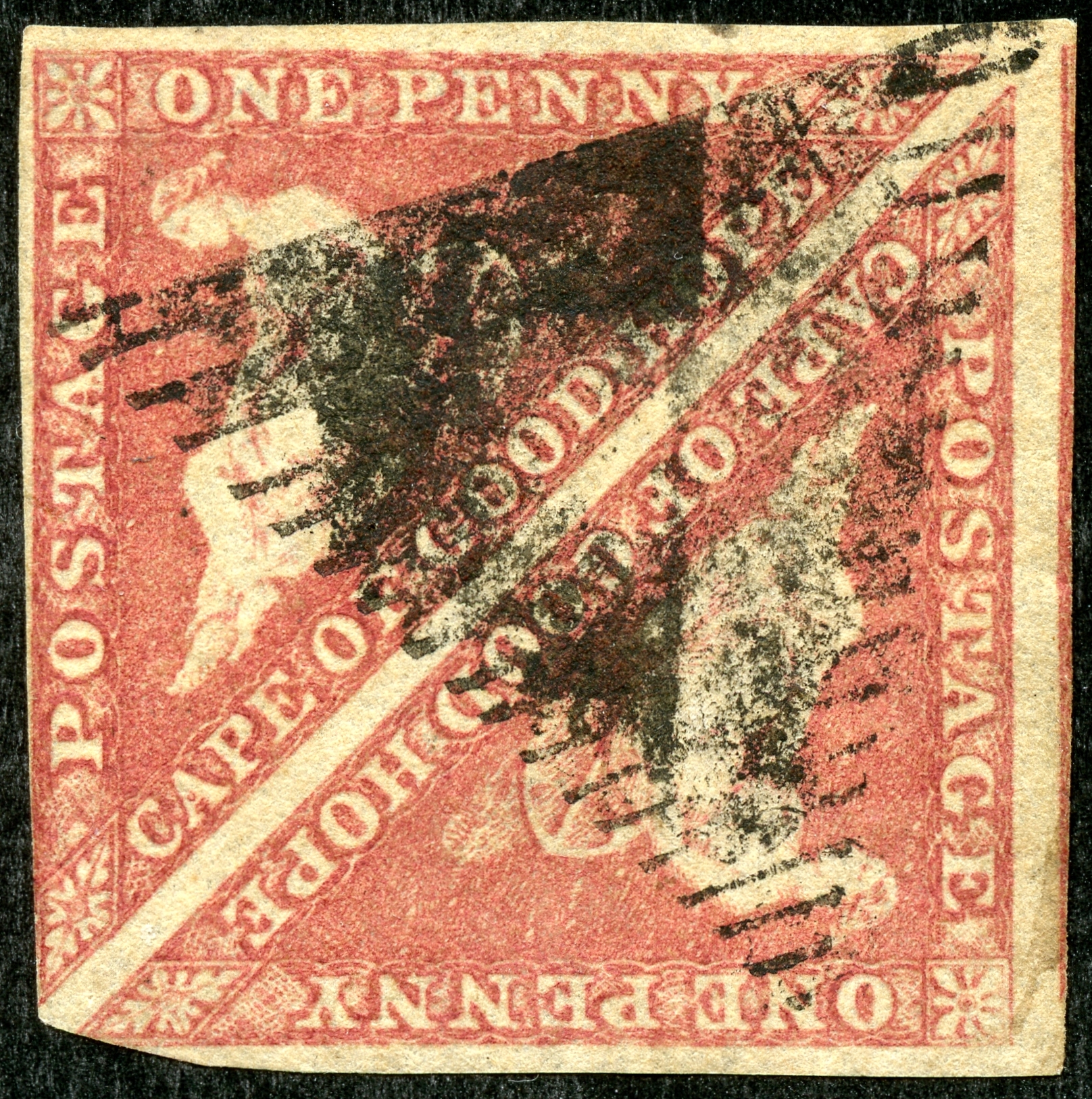
COGH 1853 SG 3 1p brick red/ slightly blued paper
Scott 1 brick red/ bluish paper

Into the Deep Blue

The One Penny Reds, intended initially for newspapers, offers a nice challenge for collectors, not the least that the CV runs in the $300-$400 range, about 2-3X as much as the Four Pence Blues.

It follows much like the history of Great Britain 1841-1869 One Penny Reds/ Two Penny Blues, also manufactured by Perkins, Bacon, in the complexity of the issues.

This One Penny Part A post is the third in the COGH series. It will cover the Perkins, Bacon One Pence issued stamps of 1853 (blued paper) and 1855-58 (white paper). The Part B post, the next one, will review the 1863-64 De La Rue One Penny issues.

1858 Stanley Gibbons (SG) 5a rose/ white paper (Block)

The Perkins Bacon printed issues of 1853 and 1855-58 for the One Penny denomination come in three basic colors, according to SG: Namely "brick-red", "rose" and "deep rose-red". 

The "rose" color is the most common (CV $325), and so we will begin there.

The One Penny block (above) is in the "rose" color range. If the block didn't have a crease running through it, the CV would be $750. But, let's look at the watermark placement....

1858 Stanley Gibbons (SG) 5a rose/ white paper (Block)
Note the two "Anchor" watermarks placed sideways between the two stamps
(9 o'clock & 3 o'clock position)

Normally, the "anchor" watermark hangs down vertically from the pyramid tip towards the pyramid base. But if the paper is fed for printing "upside-down", one ends up with so called "sideways" watermarks. They are not that common and command a premium (CV $700 for one stamp).

1858 Stanley Gibbons (SG) 5a rose/ white paper 
(Scott 3 "rose")

Let's look at a couple more examples of the "rose" color. They were issued beginning in 1858, according to SG ( Scott says 1857). SG has "5a" for the catalog number. Although most of us in the USA generally follow Scott numbers, for the COGH triangles, SG numbers are more popular for serious COGH triangle collectors.

1858 Stanley Gibbons (SG) 5a rose/ white paper 
(Scott 3 "rose")

Note that I always show the back of the stamp? That is because the 1858 PB "rose" stamps are on white or cream colored paper (a distinguishing characteristic). In contrast, the 1853 PB issue was on "blued" paper, as we will see later.

1858 Stanley Gibbons (SG) 5a rose/ white paper (Block)
(This might be an example of Scott 3a "dull red")

One problem with using two catalogs (SG, Scott) is trying to reconcile the different colors/numbers. 

For SG, they divide the "rose" category stamps into "rose" (SG5a) and "deep red rose" (SG5b). This stamp block has a different "rose" hue than the other "rose" stamps shown, but probably not enough to call this block "deep red rose".

Now Scott divides the catalog into "rose" (Sc3) and "dull red" (Sc 3a). To me, this color hue shown above might be what Scott had in mind for "dull red". Scott lists the "dull red" @ $425, and a block @$950.

1858 Stanley Gibbons (SG) 5a rose/ white paper 
(Perhaps SG 5b deep rose red/ white paper)

We are getting closer to a "deep red-rose" color.  They command a 20-30% increase CV compared to the "rose" color. Some would label this as such; others would not.

 SG 5b deep rose red/ white paper

I think we can all agree that this stamp does qualify as a "deep rose red" color. 

With the "deep rose red" stamps, this Perkins Bacon issue can sometimes be confused with the De La Rue (DLR) 1863-64 "deep carmine red" issue. Actually, I think the "deep red rose'" stamps still has a "rose" hue, while the DLR carmine stamp does not. (We will see DLR "deep carmine red" examples in the next blog post.)

1853 SG 3 brick red
Paper slightly blued

OK, we are done with the "rose" colored one penny, what about the "brick-red" stamps? The "brick-red" color often has a "orange-brown" hue to it - not a "rose" hue.

Note the color here has an "orange" tint to it.

All of the 1853 one penny "brick red" stamps should be on paper "more or less blued". Recall that I mentioned in the COGH Four Pence blog posts, that the degree of bluing of the paper had to do with how wet the paper was - really a random, incidental, and a not significant printing event. Yet, SG divides the catalog into "deeply blued" specimens (CV $400 + up to 50% premium) vs "paper slightly blued" (CV $400). I suppose this was done as collectors were willing to pay a premium for a deeply blued paper specimen. 


Here is the back of the One Penny - definitely a blue-green look to the paper. I will reluctantly give this a SG3 "paper slightly blued" designation, even though the eye test shows an obvious blue color.

1853 SG 3a brown red
Paper slightly blued

This example "brick-red" shows some brown-red color, and probably qualifies as SG 3a brown red. 


The back has the characteristic green-blue look, but in the "paper slightly blued" category.


Here is a good comparison look between the upper row "brick-reds" ( brown-red hue, orange-red hue), and the lower row "rose category" (rose, deep red rose).

I should mention that there is in the SG and Scott catalogs a PB 1857 SG 5 brick red on cream toned paper (paper NOT blued!). They are uncommon (I don't have one), and the CV is $1,050. 

But before you go looking for one, be aware that some quite prominent COGH triangle philatelic experts don't believe DG5 actually exists. If so, all one penny brick reds SHOULD have paper more or less blued.

1858 SG 5a (Sc 3) 1p rose/ white paper
Out of the Blue

I hope you enjoyed this brief review of the "rose" and "brick-red" 1853-1858 PB issues. Next, we will tackle the very interesting DLR One Penny stamps!

Comments appreciated!