
1862 Scott 12 10c bright blue "Christopher Columbus"
London Prints; Watermark f
Into the Deep BlueIf there is an issue era that makes one want to tear the hair out, but yet is fascinating, it is the first issue design (A1) of Chile!
Full of color shades, judgement calls (stamp impressions fine or worn?), and very expensive to fairly cheap, the imperforate issues of 1853-1865 (14 major, 74 minor Scott numbers) are a philatelic minefield.
All of the stamps were engraved, except for the 1854 Santiago lithographic 5c Print (Scott 7).
Let me tell you my tale. I obtained a large Chile collection several years ago, and naturally all of the first page stamp spaces were filled. Did I think the collector had correctly identified the $300 CV stamps from the $10 CV stamps? I didn't know, but I doubted it. Because of time constraints, I put the stamps into the Steiner pages, but with a notation that the identification needed to be checked.
Well, that time has come, and we together are going to examine the stamps here. Armed solely with the information supplied by the Scott catalogue, how far can we travel from being a dilettante "beginner" toward a state of core competency?

1862 Scott 13 20c green "Christopher Columbus"
London Prints; Watermark f
An easy way to begin is choose a stamp that cannot be confused. The 1862 "London Print" engraved A1 design issue consists of a 1 centavo, 10 centavo, and 20 centavo denominations. Lucky for us the 20c and 1c denominations are new and unique.
Take a look. This 20c appears to be a fresh print. The vignette of Columbus appears to have good detail. Nice four margin copy. It has a "f" watermark (we will get to watermarks later in the post). Note the cancel (pen or fiscal cancellations are worth considerably less). CV is $70.
Take a look. This 20c appears to be a fresh print. The vignette of Columbus appears to have good detail. Nice four margin copy. It has a "f" watermark (we will get to watermarks later in the post). Note the cancel (pen or fiscal cancellations are worth considerably less). CV is $70.

1862 Scott 13a 20c yellow green "Christopher Columbus"
London Print; Watermark f
This copy is more yellow green (Scott 13a), but has pen markings, and therefore CV is only $6+.
Note the print is not quite as fresh as the Scott 13 preceding.
Note the print is not quite as fresh as the Scott 13 preceding.

1862 Scott 11b 1c greenish yellow
London Print, Wmk a
London Print, Wmk a
The one centavo also cannot be confused, as it was produced only as an 1862 issue. The colors listed in Scott for this stamp are lemon yellow (#11, CV $40), or greenish yellow (#11b CV $25+). To me, this has more of a green yellow hue that lemon yellow.
Note CV prices are for postally cancelled stamps. This example is pen cancelled, and therefore CV is $1+.
Yellow stamps are more difficult to evaluate for design detail, but this stamp print looks less than fresh.
Note CV prices are for postally cancelled stamps. This example is pen cancelled, and therefore CV is $1+.
Yellow stamps are more difficult to evaluate for design detail, but this stamp print looks less than fresh.

1862 Scott 11b 1c greenish yellow
London Print, Wmk a
London Print, Wmk a
This example appears to be a worn print. Note no detail on the face.
Well, we are done with the easy ones. To evaluate other denominations, we must become comfortable with watermarks. !!!
Well, we are done with the easy ones. To evaluate other denominations, we must become comfortable with watermarks. !!!

Wmk a-g
OK, here are the watermarks found for the 1853-1865 issues. The good news is that they are relatively easy to spot.
Note there are three different watermarks for the 5 centavos, and two different watermarks for the 10 centavos. I didn't show the 1 centavo and 20 centavos watermarks earlier with their stamps, as there is no confusion about these denominations., which are only found for the 1862 issue.
Note there are three different watermarks for the 5 centavos, and two different watermarks for the 10 centavos. I didn't show the 1 centavo and 20 centavos watermarks earlier with their stamps, as there is no confusion about these denominations., which are only found for the 1862 issue.

Wmk e-f on the 10 centavos stamps
Watermark e on the 10 centavos is found with...
1853 London print Scott 2 ($150)
1854 Santiago fine print Scott 5-6 (different colors- ($150-$275)
1856-62 Santiago course print Scott 10 ($40)
Watermark f on the 10 centavos is found with...
1862 London print Scott 12 ($15)
One can tell that the Wmk e is shorter (8mm) and thinner, while Wmk f is taller (9mm) and larger.
I would suggest watermarking all of the 10 centavos stamps, and putting them into two piles - the "e" pile, and the "f" pile. One may want to watermark your examples several times to make sure one has the correct identification. The watermark identification is very important as it is the only truly objective measurement, as any subsequent evaluation is based on "judgement" (color shades, print quality).
Note that, based on CV prices, the most likely examples one will have are the 1862 Scott 12 ($15) - wmk f, and the 1856-62 Scott 10 - wmk e ($40).
Let's take a look at the f pile....

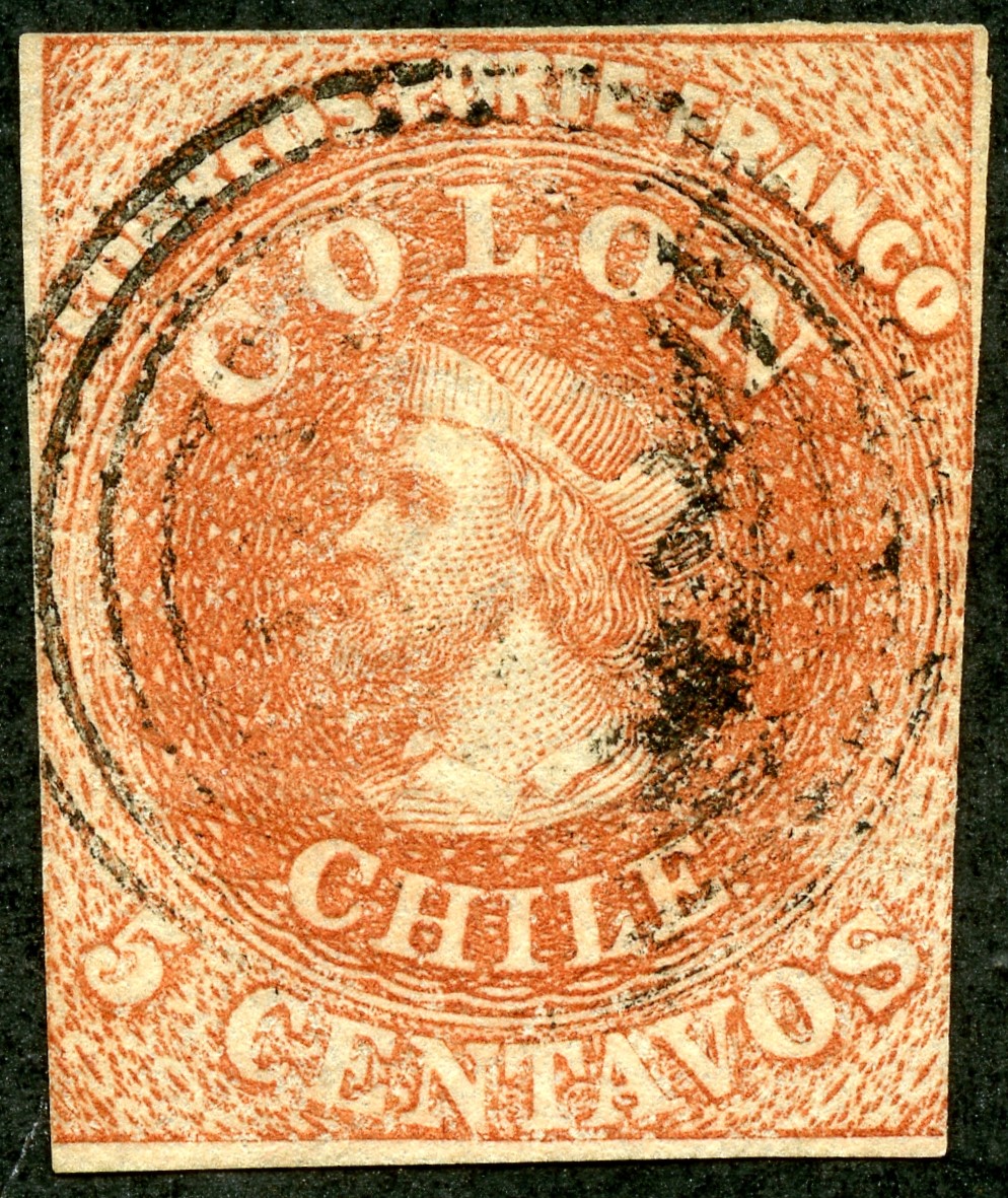
1862 Scott 12 10c bright blue "Christopher Columbus"
London Prints; Watermark f
The good news is, if a 10 centavos stamp has Wmk f, it has to be the 1862 London print issue.
This example looks like a fresh print (CV $15).
Now the color.. is this "bright blue" (major number)? I think so, but based on my limited experience with these issue, the identification is only tentative.
This example looks like a fresh print (CV $15).
Now the color.. is this "bright blue" (major number)? I think so, but based on my limited experience with these issue, the identification is only tentative.

1862 Scott 12a/b 10c deep blue
London Prints; Watermark f
What color is this example? The only other choice in Scott is "deep blue" (12a-$21). Also, the paper is blued, which fills the criteria for minor number 12b ($17+).
The print quality is good.
The print quality is good.

1857 Scott 10 10c sky blue (major number)
1856-62 Santiago prints, Wmk e
Impressions worn and blurred
1856-62 Santiago prints, Wmk e
Impressions worn and blurred
Now begins the evaluation of the 10 centavos Wmk e stamps.
This example is clearly a worn print. (#10 CV $40)
The color is just a guess - is this "sky blue"?
This example is clearly a worn print. (#10 CV $40)
The color is just a guess - is this "sky blue"?

?1859 Scott 10i 10c blue/bluish
?1856-62 Santiago prints, Wmk e
?Impressions worn and blurred
?1856-62 Santiago prints, Wmk e
?Impressions worn and blurred
The paper on this example is "bluish". Is the impression worn? Not exactly, but I am reluctant to say this is a 1853 Scott 2a 10c deep bright blue/blued which is a CV $225 stamp, compared to a Scott 10i which is CV $40.
Here is a Chile 1853-65 issues newbie (me) trying to judge some ten minor number color shades for the 1856-62 worn Santiago prints, AND trying to decide if perhaps the stamp belongs in the more expensive earlier Wmk e issues.
Note the cancel marking ("cancelled"). Hope it is legitimate.
Here is a Chile 1853-65 issues newbie (me) trying to judge some ten minor number color shades for the 1856-62 worn Santiago prints, AND trying to decide if perhaps the stamp belongs in the more expensive earlier Wmk e issues.
Note the cancel marking ("cancelled"). Hope it is legitimate.

? 1860 Scott 10j 10c dark blue
?Santiago Prints, Worn and blurred
White paper, Wmk e
?Santiago Prints, Worn and blurred
White paper, Wmk e
This stamp was put into the first issue space by the previous collector as the 1853 "London Print" Scott 2 10c deep bright blue, White paper, Wmk e - (CV $150). What do you think?
Although the print quality isn't bad, it isn't pristine either. That would argue it is not the 1853 issue.
Could it be the Santiago 1854 "fine and clear print" Scott 5 10c deep blue, white paper, Wmk e (CV $275)? Again, I'm not sure the print quality is fine enough.
So, for the present, I am lumping it in the "worn and blurred" Santiago print category - Scott 10j (guess) - CV $40. Note this example has a margin cut into, so the actual CV would be much less.
Now, let's look at the 5 centavos stamps...

Wmk b-c-d
Again, watermarking is your friend.
Put the 5 centavos into three piles: Wmk b, Wmk c, Wmk d.
Wmk d is large and distinctive. Wmk b and c are similar, but Wmk c is larger and taller.
Watermark b with the 5 centavos is found with...
1853 London Print (Scott #1) (CV $125)
1854 Santiago "fine" Print (#3) "pale red brown" (CV $75) (also three minor color shades)
1854 Santiago "fine" Print (#4) "burnt sienna" (CV $300) (also one minor number color shade)
1854 Santiago Lithographic Print (#7) "pale brown" (CV $300) (also six minor color shades)
1858 Santiago "worn" Print (#9) "rose red" (CV $8) (also five minor color shades)
Watermark c with the 5 centavos is found with...
1855 London Print (#8) "brown red", blued paper (CV $16)
Watermark d with the 5 centavos is found with...
1865 Santiago Print (#14) "rose red" (CV $20) (also three minor color shades)
Note that, based on CV, the most likely in a collection is Scott 8 (Wmk c), Scott 9 (Wmk b), and Scott 14 (Wmk d).
Note that all examples are engraved, except for the 1854 lithographic stamp. I don't have an example of the lithographic stamp, as the CV is high ($300). But I would think it should be enough different in looks compared to engraved specimens so one can make make an identification.
Let's look at the Wmk "d" stamp first....

1865 Scott 14 5c rose red
Santiago print, Wmk d
Santiago print, Wmk d
As I said, the Wmk d is distinctive enough that it makes the identification solid. And the d watermark was solely used for the 1865 issue (CV $20). There are also two minor number color variations (carmine red, vermilion) that exist for this issue.
Now, let's look at the Wmk c stamps..

1855 Scott 8 5c brown red
London print, blued paper, Wmk c
London print, blued paper, Wmk c
Wmk c was only used for the 1855 issue, so a solid identification (CV $16).
This paper is definitely blued.
I note that there is a minor number (8b) for an "ivory head" variation.

1855 Scott 8c 5c brown red
London print, Wmk c
Cream paper without bluing
London print, Wmk c
Cream paper without bluing
This stamp was a bit puzzling as it had Wmk c, but I saw no paper bluing.
But there is a minor number (8c) described as having "cream paper without bluing" (CV $67+).
But there is a minor number (8c) described as having "cream paper without bluing" (CV $67+).

1855 Scott 8 5c brown red
London print, blued paper, Wmk c
London print, blued paper, Wmk c
Another misidentification by the previous collector: He put this in as an 1853 "London Print" Scott 1 5c brown red, blued paper ($125). But if Scott 1, it should have Wmk b, rather than the Wmk c, which this stamp has.
In fact, this stamp appears to be the 1855 Scott 8 5c red brown. The bluing is less than my other example two stamps above, but it is there.
Now, let's look at the Wmk b stamps...
In fact, this stamp appears to be the 1855 Scott 8 5c red brown. The bluing is less than my other example two stamps above, but it is there.
Now, let's look at the Wmk b stamps...

1858 Scott 9 5c rose red
Santiago prints - Impressions worn and blurred
White paper, Wmk b
Santiago prints - Impressions worn and blurred
White paper, Wmk b
This example looks worn, and it is a Wmk b stamp.
High probability of a worn Santiago print - Scott 9 (CV $8)
The debate will be which color variation: there are six to choose from (major and minor numbers).
High probability of a worn Santiago print - Scott 9 (CV $8)
The debate will be which color variation: there are six to choose from (major and minor numbers).

1858 Scott 9 5c rose red
Santiago prints - Impressions worn and blurred
White paper, Wmk b
Santiago prints - Impressions worn and blurred
White paper, Wmk b
Another example.
This was put in the collection by the previous owner as the Scott 7 lithographic stamp "pale brown"
This was put in the collection by the previous owner as the Scott 7 lithographic stamp "pale brown"
?1857 Scott 9c 5c dull reddish brown
?Santiago prints - Impressions worn and blurred
White paper, Wmk b
?Santiago prints - Impressions worn and blurred
White paper, Wmk b
The print impression is not very worn, except just left of the face and neck.
Could this be a 1854 Santiago "Fine print" pale red brown example (CV $75)?
Possibly, but it is cut into on two margins so not worth sending off for evaluation.
Could this be a 1854 Santiago "Fine print" pale red brown example (CV $75)?
Possibly, but it is cut into on two margins so not worth sending off for evaluation.

1857 Scott 9c 5c dull reddish brown
Santiago prints - Impressions worn and blurred
White paper, Wmk b
Santiago prints - Impressions worn and blurred
White paper, Wmk b
This example is quite worn, and no doubt belongs to the worn Santiago prints.

1855 Scott 8 5c brown red
London print, blued paper, Wmk c
London print, blued paper, Wmk c
Out of the Blue
Well, both you and I know more about the 1853-1865 issues of Chile than when we started. ;-)
The good news is that, by evaluating watermarks, some stamps can be positively identified as belonging to a certain issue.
The bad news is that still leaves a lot of subjective judgement in regards to color variations and fine/worn impressions.
But then one always has the option of seeking advice and/or expert evaluation, especially for a potentially valuable stamp.
Hope you enjoyed this review!
Note: Page Pic of watermarks for the 1853-1865 issues of Chile is from the Scott catalogue, and is used here for educational purposes.
Comments appreciated!
Woof - definitely a steeper learning curve here. Thanks for putting together!
ReplyDeleteBy the way, not sure what happened to your recent Colombia post, but it got me wondering - is there a definitive (or just super helpful) resource available to accurately determine stamp colors? Have had a hard time telling shades of red apart (for example). Thanks!
Thanks Tom. :-)
DeleteUnfortunately, I haven't found anything that is that helpful determining colors. There is a U.S. color chart- but that only applies to U.S. stamps, for instance. I notice the Stanley Gibbons catalog sometimes has a different color description for the stamp- that offers a clue. Looking at other people's collections on-line or stamp websites for the country are helpful. Lots of experience is helpful. ;-)
Interesting, Jim - thanks. Hard to believe (although, perhaps not!) that color grading is still a relatively subjective process. Hard enough making some calls to determine which stamps get placed into my BB; I wonder how expertizers do it, especially when a shade here or there can mean the difference in $$$ in CV.
ReplyDeleteMakes me wonder if there's a more scientific way that could be developed, but I'll leave that question for the more laboratory-oriented minds out there!
Well of course there are scientific color measurements available. But what one countries experts call "sky blue", may be a different "sky blue" for another countries experts. Those that expertise usually have an already certified example of a stamp that they refer to when evaluating a candidate. I know, very primitive, but that is what we have. ;-)
DeleteIt is also useful to look at the cancellations. The 4-ring dumb barred canceller was used throughout the run, but the cancellations with the words "CANCELLED" or "INUTIL" in an oval cancel were only used between 1861 and 1867. It doesn't speak to the underlying stamp of course, but if so cancelled, is more likely to be a stamp issued in that period.
ReplyDeleteThanks Andrew for the information regarding the 1861-67 oval cancellation.
Delete