1927 Scott 30b 2sh6p brown & blue green "Trekking"
Into the Deep BlueThe second post- Part II- for the Union of South Africa will continue with the fascinating (and difficult and challenging!) English-Afrikaans Se-Tenant 1927-1954 issues. For the Quick History, Big Blue checklist, and a review of the earlier South Africa stamps (including the 1/2p, 1p, 6p 1926-1951 Se-Tenants), consult the Part I blog post.
A closer looks at the stamps and issues
12 Pence = 1 Shilling
20 Shillings = 1 Pound

1927 Scott 26 (SG 34)2p violet brown & gray, Engraved
"Government Buildings, Pretoria"
The March, 1927 2p violet brown & gray pair- English and Afrikaans- features a view of the government buildings (Union Buildings) in Pretoria. They are engraved, while subsequent issues will be in photogravure (rotogravure).
Scott has a note that the Bradbury Wilkinson & Co London engraved pictorials are more finely executed and show details clearly, compared to photogravure. Sure enough! ;-)
Note also that the Afrikaans stamp- "SUIDAFRIKA"- is not hyphened.
Although the major number engraved pictorials have Perf 14, there is a 1930 CV more expensive minor number Perf 14 X 13 1/2 in the catalogue.
The later photogravure issues are Perf 14.
Let's compare the engraved 1927 2p pictorial vignette with the subsequent photogravure 1931 2p stamp, as there is a major difference...

Scott has a note that the Bradbury Wilkinson & Co London engraved pictorials are more finely executed and show details clearly, compared to photogravure. Sure enough! ;-)
Note also that the Afrikaans stamp- "SUIDAFRIKA"- is not hyphened.
Although the major number engraved pictorials have Perf 14, there is a 1930 CV more expensive minor number Perf 14 X 13 1/2 in the catalogue.
The later photogravure issues are Perf 14.
Let's compare the engraved 1927 2p pictorial vignette with the subsequent photogravure 1931 2p stamp, as there is a major difference...

1927 Scott 26 2p violet brown & gray, Engraved
"Government Buildings, Pretoria"

The engraved version is... well, engraved, so has much fine detail.

1931 Scott 36 2p violet & gray, Photogravure
Note War Memorial has been added above and left of the "2d" denomination
The photogravure version lacks fine line detail, and one can spot the dots, characteristic of the printing process.
But a newly built (1929) Delville Wood War Memorial has been added to the pictorial vignette just above and to the left of the "2d" denomination. Compare with the engraved version!

1931 Scott 36 (SG 44) 2p violet & gray, Photogravure
In April, 1931, a violet & gray photogravure 2p was issued. We have already noted (above) that a war memorial was added to the pictorial vignette. All subsequent photogravure issues also show this design through 1941.
Note that "SUIDAFRIKA" continues with this issue with no hyphen.
Note the Scott 36 color is "violet & gray", while the engraved version is violet brown (maroon) & gray.
(Note: Two color printings for Scott 36 are distinguished by specialists: 1931 "slate-gray & lilac", and 1932 "greenish-gray & mauve".)
There was also a "violet & indigo" color issued in 1938- Scott 37 (SG 44d- "blue & violet") . This stamp is the same (in design and printing) as the violet & gray Scott 36, but distinguished by the color. The violet & indigo was not issued for very long, and hence has a CV of $100 used. I do not have a copy.
Note that "SUIDAFRIKA" continues with this issue with no hyphen.
Note the Scott 36 color is "violet & gray", while the engraved version is violet brown (maroon) & gray.
(Note: Two color printings for Scott 36 are distinguished by specialists: 1931 "slate-gray & lilac", and 1932 "greenish-gray & mauve".)
There was also a "violet & indigo" color issued in 1938- Scott 37 (SG 44d- "blue & violet") . This stamp is the same (in design and printing) as the violet & gray Scott 36, but distinguished by the color. The violet & indigo was not issued for very long, and hence has a CV of $100 used. I do not have a copy.

1938 Scott 53 (SG 58) 2p blue violet & dull blue
The next 2p stamp- issued in November, 1938, was also in photogravure, but with a hyphenated "SUID-AFRIKA". The color was "blue-violet & dull blue".
Of course the issue is distinguished by the hyphen, but also by the color of the stamp.
Of course the issue is distinguished by the hyphen, but also by the color of the stamp.

1941 Scott 54b 2p dull violet & gray
In 1941, a hyphenated 2p "dull violet & gray" (Scott 54, SG 58a) was issued, distinguished by color from the preceding 1938 Scott 53 "blue violet & dull blue".
Is there another way to evaluate the English script SOUTH AFRICA stamps for the 2p denomination, besides color?
Yes, check out the "S" in the photogravure 1931 Scott 36 ( and 1938 Scott 37)...


Is there another way to evaluate the English script SOUTH AFRICA stamps for the 2p denomination, besides color?
Yes, check out the "S" in the photogravure 1931 Scott 36 ( and 1938 Scott 37)...

1931 Scott 36 (and 1938 Scott 37) 2p: "Fat S"
The "S" is thick.

1938 Scott 53 (and 1941 Scott 54) 2p: "Thin S"
While in photogravure Scott 53 (and Scott 54), the "S" is more narrow. !!!! (The "O" and "H" differ as well.)

1945 Scott 55 (SG 107)2p deep reddish violet & slate, Hyphenated
27 X 21 1/2 mm; Note "2" joins enclosing circle at top


For the 1945 Scott 55, the Union Buildings pictorial vignette is redrawn, showing them at a different angle. I don't think one can mistake this new vignette for the prior issues.
This 1945 issue (Scott 55, SG 107) has the "2" in the value tablet joining with the enclosing circle on top.
The size is similar to the previous issues. The next Scott issue- with the same redrawn design- Scott 56- as we will see in a little while, is obviously smaller- @ 21 1/2 X 17 1/4 mm.
So we are done with the parsing for the 2p- right?
Hardly ;-)
This stamp issue-"Scott 55"- is much more complicated than the Scott catalogue details, as a glance at the Stanley Gibbons quickly proves.
This is Stanley Gibbons breakdown..
* 1945 SG 107 2d slate and deep reddish violet- only center is screened- the 2d script joins the white circle on top.
* 1946 SG 107a 2d slate and deep lilac- only center is screened- the 2d script is clear of the circle at top.
* 1947 SG 107b 2d slate and bright violet- only center is screened- the 2d script is clear of the circle at top.
* 1950 SG 116 2d slate-blue & purple- center and frame design are fully screened.
Therefore the "Scott 55" can be parsed into multiple shades and colors, 2d script joining or not joining the circle at top, and partial vs fully screened photogravure (rotogravure).
Let's look at some examples....

This 1945 issue (Scott 55, SG 107) has the "2" in the value tablet joining with the enclosing circle on top.
The size is similar to the previous issues. The next Scott issue- with the same redrawn design- Scott 56- as we will see in a little while, is obviously smaller- @ 21 1/2 X 17 1/4 mm.
So we are done with the parsing for the 2p- right?
Hardly ;-)
This stamp issue-"Scott 55"- is much more complicated than the Scott catalogue details, as a glance at the Stanley Gibbons quickly proves.
This is Stanley Gibbons breakdown..
* 1945 SG 107 2d slate and deep reddish violet- only center is screened- the 2d script joins the white circle on top.
* 1946 SG 107a 2d slate and deep lilac- only center is screened- the 2d script is clear of the circle at top.
* 1947 SG 107b 2d slate and bright violet- only center is screened- the 2d script is clear of the circle at top.
* 1950 SG 116 2d slate-blue & purple- center and frame design are fully screened.
Therefore the "Scott 55" can be parsed into multiple shades and colors, 2d script joining or not joining the circle at top, and partial vs fully screened photogravure (rotogravure).
Let's look at some examples....

"Scott 55"
1946 SG 107a slate and deep lilac
"2d" clear of circle
It appears that only the central pictorial vignette is screened here. That makes the stamp a SG 107 type. Since the "2" does not touch the circle, the possibilities are SG 107a or 107b. Judging color, I suspect this is a 1946 SG 107a slate and deep lilac.
"2" clear of circle at top
Here is a close-up of the "2" not touching the circle at top- seen with SG 107a or 107b.

"Scott 55" shade
1950 SG 116 2p slate-blue and purple
Fully screened
This example appears to be fully screened. Therefore,a 1950 SG 116 2p slate-blue and purple is most likely.

"Scott 55" -shade
1950 SG 116 2p slate-blue and purple
Fully Screened Closeup
Here is a close-up showing the frame as screened also.

1950 Scott 56 (SG 134) 2p purple & slate blue
21 1/2 X 17 1/4 mm
Finally, a smaller redrawn 2p was issued in 1950. A booklet version (SG 134a) of 6 stamps with the margin at right was issued in 1951. There were four printings up to 1952. They can only be identified by marginal control and arrow blocks.

1927 Scott 27 (SG 35) 3p red & black, Engraved
"Groote Schuur" Rhodes's Home
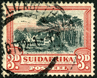


The 1927 engraved 3p has a pictorial vignette of Cecil Rhodes's residence. Both the engraved 1927 issue and the 1931 photogravure issue have no hyphen for the "SUIDAFRIKA" script.
The buildings were designed by architect Sir Herbert Baker, who also designed the Union Buildings in Pretoria. Later, the residence was used by the South Africa president. Now, it is a museum.
Since the engraved pictorial is supposed to be more delicate than the photogravure imitation, let's do a comparison.


The buildings were designed by architect Sir Herbert Baker, who also designed the Union Buildings in Pretoria. Later, the residence was used by the South Africa president. Now, it is a museum.
Since the engraved pictorial is supposed to be more delicate than the photogravure imitation, let's do a comparison.

"Groote Schuur" Rhodes's Home, Engraved
Pictorial vignette: 1927 Scott 27 3p red & black
Lovely detailed engraved drawing!

"Groote Schuur" Rhodes's Home, Photogravure
Pictorial vignette: 1931 Scott 38 3p red & black
Clearly cruder and less delicate. Note the lack of detail in the buildings. One should be able to distinguish the engraved and photogravure versions on appearance alone.

1931 Scott 38b (SG 45) 3p red & black, Photogravure
No Hyphen
No Hyphen
Here is the 1931 photogravure issue. Is there any way, besides general appearance, to determine between the 1927 engraved and 1931 photogravure 3p red & black?


Upper Border, 1927 Engraved 3p red & black
Three thick, two thin horizontal lines
Examine carefully the upper border of the 1927 engraved version. One should find five horizontal lines. From top to bottom they are: thick, thin, thin, thick, and thick.

Upper Border, 1931 Photogravure 3p red & black
Three thick horizontal lines
In contrast, the 1931 photogravure version only has three thick lines.
(Another difference is there are two horizontal lines under "postage" or "possell" in the engraved stamp, while the photogravure stamp only has one horizontal line. Enlarge the images, and verify.)

1933 Scott 39 (SG 45c) 3p ultramarine & blue
In 1933, after only two years, the color of the 3p was changed from red & black to ultramarine & blue. "SUIDAFRIKA" remains without hyphen. There should be little identification confusion with this issue.

1940 Scott 57 (SG 59)3p ultramarine Type
With Hyphen
With Hyphen
The last photogravure 3p in the Scott catalogue, using a similar design- but redrawn with trees taller and touching the frame, and the sky without lines, and in an ultramarine color- was Scott 57 issued in 1940. I don't think Scott catalogue users should have trouble with this.
But, as found with the 2p, Stanley Gibbons parses this design..
1940 SG 59 3d ultramarine, center diagonally screened, frame unscreened
1949 SG 117 3d dull blue, whole stamp screened with irregular grain, two cylinder printing
1951 SG 117a blue, whole stamp diagonally screened, one cylinder printing
In addition, there are differences in the appearance of the scrolls above "3d".
I am not going to get into the particulars- suffice to say this stamp issue is quite complicated. If the reader is interested, consult the reference links from the Part I post.
But, as found with the 2p, Stanley Gibbons parses this design..
1940 SG 59 3d ultramarine, center diagonally screened, frame unscreened
1949 SG 117 3d dull blue, whole stamp screened with irregular grain, two cylinder printing
1951 SG 117a blue, whole stamp diagonally screened, one cylinder printing
In addition, there are differences in the appearance of the scrolls above "3d".
I am not going to get into the particulars- suffice to say this stamp issue is quite complicated. If the reader is interested, consult the reference links from the Part I post.

1928 Scott 28a (SG 35b) 4p brown "Native Kraal"
Engraved; No Hyphen


The 4p "Native Kraal" design is interesting, as there were four major issues between 1928-1952, and each one shows unique changes in the design drawing.
The 1928 issue, with "SUIDAFRIKA" unhyphenated, is the only engraved version (shown above).
Let's compare the central pictorial vignette for all four issues, as they have some design differences.

The 1928 issue, with "SUIDAFRIKA" unhyphenated, is the only engraved version (shown above).
Let's compare the central pictorial vignette for all four issues, as they have some design differences.

1928 Scott 28 4p brown, Engraved
Note three drawn lines for the sloping roof on the right


Note three drawn lines for the sloping roof on the right
The engraved version is more delicately rendered, compared to the subsequent photogravure versions. A careful inspection will reveal three closely drawn lines for the sloping roof on the right- only seen with the engraved stamp.

1932 Scott 40 (SG 46) 4p reddish brown, Photogravure
The 1932 photogravure Scott 40 reddish brown pictorial vignette is clearly not as finely rendered (the other photogravure issues of this design aren't either) as the engraved 1928 issue.
The outline of the central hut is rather too thickly drawn, and the sloping roof on the right now consists of two (close) rough lines.

1936 Scott 41 (SG 46c) 4p brown, Photogravure
The photogravure 1936 Scott 41 now has the sloping roof on the right as one thick rough line.

1952 Scott 58 (SG 118) 4p chocolate brown, Photogravure
Hyphen
The 1952 Scott 58 (SG 118) central vignette is perhaps not diagnostic, but the entire stamp is completely screened, and there are other unique signs found in the frame, as we will see in a bit.

1932 Scott 40b (SG 46) 4p reddish brown, Photogravure
No Hyphen
No Hyphen
Here is the 1932 Scott 40 photogravure stamp. Scott states the color is "reddish brown", and this example clearly has that color. But Stanley Gibbons lists the color as "brown", although other sources state "red-brown".
But now let's look at another design difference for the major issues, focusing on the upper corners...


But now let's look at another design difference for the major issues, focusing on the upper corners...

1928 Scott 28 4p brown, Engraved
The 1928 engraved stamp has, for the background in the upper corners, horizontal and vertical lines (or dots).

1936 Scott 41 4p brown, Photogravure
Both the 1932 Scott 40 4p reddish brown (not shown) and the 1936 Scott 41 4p brown (above) exhibit a solid background in the upper corners.

1952 Scott 58 (SG 118) 4p chocolate brown,
Photogravure- completely screened
Clear white line down the right and left side of the stamp, mostly "white" leaves (lack of shading lines), and obvious screening of frame.

1936 Scott 41 (SG 46c) 4p brown
No Hyphen
No Hyphen
The photogravure 1936 Scott 41 4p brown had a long run (16 years), and Stanley Gibbons states it can be found in various brown shades.
Let's now look at the scroll design, which is unique for all four major issues. And, for good measure, we will also look at the differences in the value tablet.....


Let's now look at the scroll design, which is unique for all four major issues. And, for good measure, we will also look at the differences in the value tablet.....

1928 Scott 28 (SG 35b) 4p brown , Engraved
* Note the diagonal lines within the inside of the scroll.
* Value tablet filled with horizontal lines

1932 Scott 40 (SG 46) 4p reddish brown, Photogravure
* Solid color within the inside of the scroll.
* Value tablet lines thick and coarse.

1936 Scott 41 (SG 46c) 4p brown, Photogravure
* Scroll is not continuous, filled with white, and has a crooked line through the middle.
* Value tablet lines thin; "4" shadow extends to bottom of tablet.

1952 Scott 58 (SG 118) 4p chocolate brown
* Scroll is again continuous, and is redrawn.
* Value tablet- no lines, only shading.
* (Note the fully screened frame.)

1952 Scott 58 (SG 118) 4p chocolate brown
Hyphen in SUID-AFRIKA
Hyphen in SUID-AFRIKA
The 1952 Scott 58 4p has a hyphen in the Afrikaans stamp, and has design changes as described before. It was produced from new cylinders with fully screened rotogravure.
Scott lists the color as "chocolate brown", which appears to be the case with my sample. Stanley Gibbons has the color as "brown".
The size is slightly smaller- 27 X 21 1/2 mm (previous 27 1/2 X 21 3/4 mm).
Scott lists the color as "chocolate brown", which appears to be the case with my sample. Stanley Gibbons has the color as "brown".
The size is slightly smaller- 27 X 21 1/2 mm (previous 27 1/2 X 21 3/4 mm).

1927 Scott 29a (SG 36) 1sh deep blue & bister brown "Gnu"
Engraved; No Hyphen

The 1 shilling denomination features a lovely "Gnu" pictorial.
There are three major Scott numbers: 1927 Scott 29, engraved, no hyphen; 1930 Scott 43, photogravure, no hyphen; and 1939-1950 Scott 62, photogravure, hyphen. There are also several minor numbers, depending on color and year of issue.
Stanley Gibbons lists SG 120 for the fully screened hyphen 1950 issue, and lists SG 62 for the 1939 hyphen issue. Scott puts both SG issues under "Scott 62" hyphen type.
The engraved version (illustrated above) has a very nice detailed central pictorial. We will look more closely at the pictorial images in a bit, as they offer identification clues.

1930 Scott 43 (SG 48) 1sh blue & brown (shades)
Photogravure; No Hyphen


The 1930 photogravure issue comes in shades of blue & brown. I doubt if the collector will have much trouble with recognition, as the central pictorial is not nearly as fine in detail as the preceding engraved version. And there are some clues for identification purposes that we will look for in a moment.

1939-1950 Scott 62 Type (SG 62, 120)
1sh chalky blue & light brown
Photogravure; Hyphen
1sh chalky blue & light brown
Photogravure; Hyphen
The "Hyphen" issue was first released in 1939. Most have a "chalky blue" frame. As mentioned, SG parses these into 1939 non framed screened (SG 62) and 1950 complete screened (SG 120) versions.
Let's look at the details....

Let's look at the details....

1927 Scott 29 (SG 36) 1sh deep blue & bister brown
Engraved; No Hyphen

Besides admiring the lovely engraving of "Gnu's" (Actually, Black and Blue Wildebeest), note the short horizontal blue lines along the left edge of the pictorial. They go almost to the top of the small scroll by the upper left section of the vignette. Although partially obscured by the cancel, this is an important sign, as we will soon see.

1930 Scott 43 (SG 48) 1sh blue & brown (shades)
Photogravure; No Hyphen
 1939-1950 Scott 62 Type (SG 62, 120)
1sh chalky blue & light brown
Photogravure; Hyphen

Here, the blue horizontal lines travel up the left side of the vignette, but stop short of covering and jutting out from the scroll. This is an excellent marker for positive identification of Scott 43.

1sh chalky blue & light brown
Photogravure; Hyphen
The hyphen photogravure stamps of 1939-1950 again show the short blue horizontal lines covering the scroll on the upper left side.

1927 Scott 29 (SG 36) 1sh deep blue & bister brown
Engraved; No Hyphen

For the 1927 engraved stamp, note the "A", the shadow and the flower below....

1930 Scott 43 (SG 48) 1sh blue & brown (shades)
Photogravure; No Hyphen
 1939-1950 Scott 62 Type (SG 62, 120)
1sh chalky blue & light brown
Photogravure; Hyphen
In contrast, the 1930 photogravure stamp has the shadow underneath the "A" partially covering several pedals of the flower below. An excellent marker for Scott 43 if the "scroll sign" is also suggestive!

1sh chalky blue & light brown
Photogravure; Hyphen
The 1939-1950 Scott 62 Type also covers the flower pedals.
Do you think the frame is fully screened? If so, a 1950 SG 120; if not, a 1939 Scott 62. (I like to see nervous little dots along the edge of the frame to make sure it is fully screened. I do not see them here. See "Scott 55" 1950 SG 116 2p slate-blue and purple earlier in this post for a fully screened example.)

1927 Scott 30 (SG 37) 2sh6p brown & blue green "Trekking"
Engraved; No Hyphen


The 1927 engraved 2sh6p brown & blue green is an absolutely lovely stamp pair.
It is called "Trekking", but not the usual meaning of hiking over hill and dale.

Voortrekkers (1909- by Smithard and Skelton)
The Voortrekkers ("Pioneers"- from Afrikaans and Dutch) were 2,500 Afrikaner families who left Cape Colony, mainly to escape British rule, during the 1830s-1840s for the interior on "The Great Trek".

1927 Scott 30 (SG 37) 2sh6p brown & blue green, Engraved
The engraved center pictorial drawing is quite detailed, and almost life-like to me. For some reason, I have seen photogravure specimens not uncommonly represented (and sold) as this engraved issue.
Is there another way to tell?

1927 Scott 30 (SG 37) 2sh6p brown & blue green, Engraved
Note two white lines between thicker horizontal brown line and country script
The 1927 engraved version has thin horizontal lines. In particular, there are two white lines between the country script and the thicker brown horizontal line.

1945 Scott 44 (SG 49, SG49b) 2sh6p brown & blue,
Photogravure; No Hyphen
Photogravure; No Hyphen
Beginning in 1932, various shades of photogravure 2sh6p were issued. Scott lists minor numbers 1932 red brown & green, 1936 brown & slate green, 1937 chocolate & deep green, and major number 1945 brown & blue. To my eyes, my own example is the brown & blue shade (Scott 44 (major number); SG 49b).


1945 Scott 44 (SG 49, SG49b) 2sh6p brown & blue, Photogravure
This is the pictorial close-up for the photogravure no hyphen specimen. Lovely enough, but muddy compared to the engraved specimen.

1945 Scott 44 (SG 49, SG49b) 2sh6p brown & blue, Photogravure
Note one white line between thicker brown horizontal line and country script
The no hyphen photogravure issue of 1932-45 shows only one ragged white line between the thicker brown horizontal line and the country script. The lines in general are rougher. I see some dots, but the frame does not appear to be screened.

1949 Scott 63 (SG 121) 2sh6p brown & bright green
Hyphen
Hyphen
The 1949 hyphenated issue is brown & bright green, and is fully screened by new cylinders in rotogravure.
SG: "In screened rotogravure, the design is composed of very small squares of color arranged in straight diagonal lines".


SG: "In screened rotogravure, the design is composed of very small squares of color arranged in straight diagonal lines".

1949 Scott 63 (SG 121) 2sh6p brown & bright green
Hyphen; Fully Screened
The vignette shows little squares or dots, and is rougher in appearance (Fuzzy) compared to the engraved version.
But, how can one tell this stamp is fully screened?

1949 Scott 63 (SG 121) 2sh6p brown & bright green
Frame Screened
Take a look at the "nervous dots"on the border, and then compare to the 1945 version earlier that is not framed screened. The 1945 photogravure version appears to have more lines rather than discrete dots everywhere. (I must admit I am still in a learning mode about this topic, however. ;-)

1936 Scott 51 (SG 57) 1 1/2p dark green & gold "Gold Mine"
Photogravure; 27 X 21 1/2 mm

In 1936, a new design produced by photogravure for the 1 1/2p denomination was issued. There is nothing complicated about this issue from the Scott perspective, save for awareness about size. All have the SUID-AFRIKA hyphenated script.
Specialists parse this issue into three printings.
Specialists parse this issue into three printings.

1941 Scott 52 (87) 1 1/2p slate green & ochre
22 X 18 mm
In April, 1948, an even smaller size issue (22 1/2 X 12 1/2 mm) was produced (Scott 107, SG 124). They are generally collected as vertical pairs, as they are rouletted @ 6 1/2 between the pairs.

In 1941, a smaller version was issued, and printings continued until 1949. Five printings are recognized by specialists.
In 1948, a booklet pane of 6 with postal slogans on the margins (SG 87b) was issued.
In 1948, a booklet pane of 6 with postal slogans on the margins (SG 87b) was issued.
In April, 1948, an even smaller size issue (22 1/2 X 12 1/2 mm) was produced (Scott 107, SG 124). They are generally collected as vertical pairs, as they are rouletted @ 6 1/2 between the pairs.

1933 Scott 64 (SG 64) 5sh green & black "Ox Wagon"
Photogravure; Die I


In 1927, an engraved no hyphen version of the 5sh "Ox Cart" was issued (Scott 31, SG 38). I happen to not have a copy, but illustrated is the 1933 photogravure hyphenated 5sh green & black.

There were actually two types (Dies) of the photogravure 1933-1954 5sh issued, with three major Scott numbers....
* 1933 Scott 64 (SG 64) 5sh green & black, Type I,
* 1949 Scott 65 (SG 122) 5sh blue-green & black, Type I
* 1954 Scott 66 (SG 122a) 5sh deep yellow green & black, Type II

1933 Scott 64 (SG 64) 5sh green & black, Photogravure
One way to check for engraved vs photogravure versions, (besides the generally rougher presentation of photogravure, and the fact that the photogravure Afrikaans stamps are hyphenated), is that the area of the stamp between the country script and the upper border shows no short nearly vertical lines in the photogravure stamp.
There were actually two types (Dies) of the photogravure 1933-1954 5sh issued, with three major Scott numbers....
* 1933 Scott 64 (SG 64) 5sh green & black, Type I,
* 1949 Scott 65 (SG 122) 5sh blue-green & black, Type I
* 1954 Scott 66 (SG 122a) 5sh deep yellow green & black, Type II

1949 Scott 65 (SG 122) 5sh blue green & black, Die I
Fully Screened
Fully Screened
Here is an example of the 1949 Scott 65 5sh in blue green & black with Type I or Die I. (My copy is very blue to me. SG calls the color "pale blue green" I don't see much green, though.)


1949 Scott 65 (SG 122) 5sh blue green & black, Die I
Fully Screened
Note the projection (bump) on the right lower portion of the "U"? And the sharp triangular point the "A" comes to on the left upper portion of the letter? This is Type I or Die I. In the 1954 Die II, these projections are smoothed out.
Also, note the fully screened nature of the 1949 Scott 65 (SG 122) with "nervous dots" on the border and everywhere? ;-)

1939 Scott 67 (SG 64c) 10sh olive black & blue
"Groot Constantia", Hyphen
Lastly, the only example I have of the 10sh is the photogravure 1939 Scott 67 olive black & blue "Groot Constantia". No problems with identification, as the design was only issued once, although SG recognizes two shades (1939, 1944).
There was an earlier 1927 10sh with a pictorial of "Cape Town and Table Mountain", but it likewise was only issued once.
There was an earlier 1927 10sh with a pictorial of "Cape Town and Table Mountain", but it likewise was only issued once.

1949 Scott 65a 5sh blue green & black "Ox Wagon"
Out of the BlueThis concludes our excursion through the English-Afrikaans Se-Tenants of 1926-1954.
What a Long Strange Trip It's Been. !!!!
I understand better for myself the signs for identifying the myriad issues...and I hope you do also!
Note: South African Collectors Society Resource
Note: Voortrekkers drawing appears to be in the public domain.
Comments appreciated!