
Figure 4: Used 6d stamps from my collection, which hopefully show the four different color shades for the Perkins Bacon printings. Top Left: COGH, SG7 (Sc5) Pale Lilac on White Paper. Top Right: COGH, SG7b (Sc5a) Deep Rose Lilac on White Paper. This stamp shows some patchy discoloration, which is consistent with comments made by Stevenson. Bottom Left: COGH, SG7c (Sc5b) Slate Lilac on Blued Paper. Bottom Right: COGH, possible SG7d (Sc5c) Slate Purple on Blued Paper. This last stamp was the first one I had located in my searching for which the color shade looked different to me from other slate shades. In my mind, this gave it a chance to be Slate Purple.
Into the Deep Blue
By Christopher K. Dorn, aka “The Beryllium Guy”
Introduction
This is the second article in a short series about the Cape of Good Hope (COGH) Triangular Issues. The first one was published by the Big Blue 1840-1940 Stamp Blog in Nov-2024 [1] and the Cape & Natal Philatelic Journal (CNPJ) in Jan-2025 [2]. Sincere thanks to Jim Jackson at Big Blue and Simon Solomon at CNPJ for making that possible.
As this is a series of articles, for
best understanding, it is advised that Part 1 of this series should be read
first if that has not already been done.
The background information provided in the first article still applies
to this installment, but it will not be covered in detail again. So, let’s start digging into our
next mystery!
Mystery #2: The Case of the 6-Pence Slate Purple on Blued
Paper, 1863
Similar to the 1857 COGH 1-Penny (1d) Brick Red on Cream-Toned Paper, our second mystery is another case of a stamp that is listed in both the Stanley Gibbons (SG) and Scott Catalogues, the 6-Pence Slate Purple on Blued Paper. Once again, despite the longstanding listings in these major catalogues, there are still persistent doubts of its existence cast by specialists and experts in the field who assert that they have never seen a genuine example of this stamp [3].
The Slate-Purple stamp is currently listed as SG7d and
Sc5c. Based on the comments from the
aforementioned source [3], in this case, the contention seems to be that the
color-shade difference between SG7c Slate Lilac and SG7d Slate Purple is
negligible and/or not distinct enough to make a clear identification
possible. With that in mind, let’s take
a look at some examples of both Slate-Lilac and Slate-Purple stamps from
collections of historical significance and/or notable provenance.
Note: Click on image to enlarge!
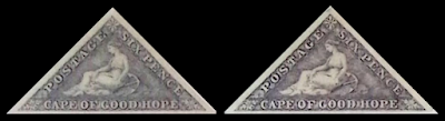
Figure 1: Two unused reference examples from the
collection of the internationally recognized philatelist, Joseph Hackmey. Left: COGH, SG7c (Sc5b) 6-Pence Slate Lilac
on Blued Paper. Right: COGH, SG7d (Sc5c)
6-Pence Slate Purple on Blued Paper. The
above individual images have been digitally cropped from their original source,
“The Museum of Philately” [4] and placed into this composite image to
facilitate comparison.
With that said, the question remains: is this sufficient evidence to state that these stamps clearly represent two distinguishably different color shades? And moreover, two color shades that merit separate catalogue listings? I think that in order to wrestle with these questions, we need to go back to our most important dedicated reference on the subject of Cape Triangles, the work of Stevenson.
It was noted in the previous article in this series that the COGH, SG5 (Sc3b) 1d Brick Red on Cream-Toned Paper was referred to by Stevenson as only “possible.” In our current case, the Slate-Purple color is not mentioned at all. Stevenson refers only to Lilac and Slate Lilac [5]. From the SG Catalogue, and more or less replicated in Scott, we know that there are four distinct color varieties listed:
· SG7 (Sc5): Pale Lilac
· SG7b (Sc5a): Deep Rose Lilac (Scott: Rose Lilac)
· SG7c (Sc5b): Slate Lilac (Scott: Grayish Lilac)
· SG7d (Sc5c): Slate Purple

Since Stevenson made no distinction between Slate-Lilac and Slate-Purple shades, there is no explicitly stated help in his book for catalogue identification. However, what does seem clear, at least to me, is that the stamp on the right is a deep, rich color, which seems very similar to the Slate-Purple example from the Hackmey Collection shown in Figure 1.
There are still a couple more historical references where we can look for additional information. The Maxwell Joseph Collection, auctioned in 1982, was extensive, and it did contain some examples of 6d stamps identified as Slate-Purple [6]. Please see Figure 3 below

Figure 3: Images of two unused reference examples from
the Sir Maxwell Joseph Collection. Left:
COGH, SG7c (Sc5b) 6-Pence Slate Lilac on Blued Paper. Right: COGH, SG7d (Sc5c) 6-Pence Slate Purple
on Blued Paper. The above individual
images have been digitally cropped from their original source [6] and placed
into this composite image to facilitate comparison.
Looking at the preceding image, it appears to be “good news, bad news,” to my thinking. The good news is that the two stamp images do seem to show two distinctly different color shades. The bad news is that those color shades do not seem to align with what we would expect to see, i.e., that the Slate Lilac should be the lighter color and the Slate Purple the darker one. Also, the Slate-Purple image looks much more charcoal gray than purple, but as it was originally a photograph, it should be noted that lighting could easily have played a role in the appearance of the color in this image.
Examples of Stamps on Hand
Now that we have seen some images of stamps from reference
sources, let’s take a closer look at some actual stamps that can be viewed together
under various kinds of light and lighting conditions and scanned side by side. For sake of comparison, and to try to
illustrate the color differences, please see images of four stamps shown in Figure
4 below.

Figure 4: Used 6d stamps from my collection, which hopefully
show the four different color shades for the Perkins Bacon printings. Top Left: COGH, SG7 (Sc5) Pale Lilac on White
Paper. Top Right: COGH, SG7b (Sc5a) Deep
Rose Lilac on White Paper. This stamp
shows some patchy discoloration, which is consistent with comments made by
Stevenson. Bottom Left: COGH, SG7c
(Sc5b) Slate Lilac on Blued Paper. Bottom
Right: COGH, possible SG7d (Sc5c) Slate Purple on Blued Paper. This last stamp was the first one I had
located in my searching for which the color shade looked different to me from
other slate shades. In my mind, this
gave it a chance to be Slate Purple.
In looking at the images of the stamps in Figure 4, I hope at least that the two non-slate shades can be readily differentiated from the two slate ones. The overall difference seems clear to my eye, where the slate component is absent from the two top-row examples, while certainly present in the bottom-row ones. The challenge, of course, is figuring out if two distinct slates shades can be discerned in a credible way from one another.
In addition to my own collection, which is admittedly a bit limited in its total quantity of 6d stamps, I had the good fortune of being recently given access to view and scan examples from the collection of my fellow Stamp Forum (TSF) member, Warren Parker [7]. I had the chance to meet Warren last month and to see some of his collection, including the 6d issues. Warren has a more extensive collection of Cape Triangles than I do, including some unused examples of the SG7 (Sc5) varieties, which are probably better to consider than my used ones. Furthermore, because I was able to scan his stamps using my machine, we should be able to make better side-by-side comparisons of the 6d color shades than if we had each scanned them independently. See Figure 5 below.

Personally, I think that Warren’s Slate Lilac and
Slate Purple compare quite favorably with my two. In fact, I think that his examples show the
shade difference even better than mine do.
His Slate Lilac is a woollier print than mine, but that seems to show a
bit better evidence of the lilac component to the shade, I think. His possible Slate Purple is a spectacular
deep, rich color that, at least to my eye, is clearly distinguishable from the
lilac one and actually shows its purple-shade component.
So, Does COGH
SG7d (Sc5c) Really Exist?
We can summarize our findings as follows:
Arguments For:
· Like the COGH, 1d Brick Red on Cream-Toned Paper, both SG and Scott have
listed the 6d Slate-Purple stamp in their catalogues for many years. While we cannot completely rule out that it
is simply a mistake, I like to think that would have been figured out by now.
· In addition to these two major catalogues, the Maxwell Joseph Collection,
which did not include an example of the 1d Brick Red on Cream, lists 6 copies
of the 6d Slate Purple, of which 3 came with certificates of expertization from
BPA in 1982 [6].
· It is possible to find examples of stamps that appear to match the catalogue
color-shade description. Such examples seem
to be less common than those of Slate Lilac, but they do exist. Even a color illustration in Stevenson seems
like it could be Slate Purple, although it was not identified as such (see Fig.
2).
· Side-by-side comparison of stamps from my colleague Warren’s and my
collections appear to confirm the stamp’s existence, visibly distinguishable
from the Slate Lilac shade.
· Internationally recognized philatelist Joseph Hackmey has 5 examples of stamps he has identified as Slate Purple in his collection, as documented in the Museum of Philately [4]. By comparison, he has 22 copies identified as Slate Lilac.
Arguments Against:
· Despite the aforementioned image in Stevenson, he only differentiated slate
shades from non-slate ones and does not mention Slate Purple at all. As before, I imagine that strict disciples of
Stevenson would see this as a negative.
· There were no examples identified as Slate Purple in the collections of Louise
Dale & Alfred Lichtenstein, which is considered a noteworthy absence by
some in the field [8]. Please see Figure
6 below for a couple of interesting stamp images from those collections.
· Professional philatelists and leading Cape Triangle specialists have said
that they have never seen an “acceptable” example of this stamp and seem to
cite the fact that the Maxwell Joseph Collection had only 6 examples
identified as Slate Purple as an argument against the validity of its existence
[3]. In truth, I struggle to follow this
argument, as it would seem to be precisely the nature of a rare stamp, be it
for color shade or other attribute, that there would only be a limited number
of such items available.
· Multiple sources, both current and historical, agree that color shades
for Cape Triangles are wide bands when it comes to varieties. There seems no doubt that this is true, but
the question is, where does one “draw the line” between one shade variety and
another?

Figure 6: of two unused reference examples from
the Dale-Lichtenstein Collections, showing their respective auction catalogue
numbers [8]. Left: COGH, SG7c (Sc5b) 6-Pence
Slate Lilac on Blued Paper. Right: Also
identified in the auction catalogue as COGH, SG7c (Sc5b) 6-Pence Slate Lilac on
Blued Paper, but I think it could arguably be identified as an SG7d (Sc5c) 6-Pence
Slate Purple on Blued Paper. The above
individual images have been digitally cropped from their original source [8]
and placed into this composite image to facilitate comparison.
Conclusion
Once again, on one hand, as I have a stamp in my collection that I think has a chance of being a genuine COGH SG7d (Sc5c), and my colleague Warren has a couple, too, I certainly have reason to hope that the stamp exists, despite the claims to the contrary. In addition to Warren’s and my potential examples, I still think that stamps identified as Slate Purple from the Hackmey and Maxwell Joseph collections are meaningful.
Three of the six in the Maxwell Joseph collection were
expertized by BPA as being Slate Purple, and BPA has been cited by current senior
staff at Stanley Gibbons in London as the most trusted source for expertizing
Cape Triangles [9]. That should count
for something, I would think, as I imagine that it was SG who first distinguished
the Slate Purple from the Slate Lilac and created the variety listing. If anyone should know what it looks like and
who is able to properly identify it, arguably, SG should.
On the other hand, having said all that, there is no doubt that there are, indeed, “wide bands” when it comes to color shades and discernable shade varieties in Cape Triangles (SG also said this [9]). It is also clear that color-shade differentiation is a difficult area for many philatelists, owing to the myriad of factors that impact color-shade perception, such as condition of the stamp, lighting (for photos and viewing actual stamps), scanning equipment and their settings, displays for viewing images, etc. So, it comes down to whether or not the color differences we can see in these stamps are within the aforementioned wide bands or are they distinguishable as distinct color shades?
Stevenson himself called for a “simple yet truly scientific basis” for distinguishing the color shades of the De La Rue (DLR) printings of the 4d Blues [5], which are the COGH, SG19 (Sc13) varieties, and I think that his observation is also applicable to the Slate-Lilac and possible Slate-Purple shades. Luckily for us, we have access to more advanced analytical tools than Stevenson did back in the 1940s-1950s, so I believe we now have the means to tackle this question.
Along with those pesky DLR 4d blue color shades, I am now also planning to include the Perkins Bacon 6d slate shades in a digital color-quantification project, hopefully to resolve this issue once and for all. It is my understanding that using modern numerical means to define colors, there are scientific standards for stating that one color is different enough from another to make it clear that it is, indeed, a discernably different color shade, and it is legitimate to claim it and name it as such.
But until that day comes, our second mystery also remains…. Happy hunting!
Acknowledgement
I would like to take a moment to express my sincere thanks to my TSF colleague and friend, Warren Parker. Warren very kindly arranged to meet me personally to see his 1d and 6d Cape Triangles, and he generously allowed me to scan all of his material using my machine. Warren, I cannot thank you enough for your help, which has been invaluable to my research into this question and hopefully, to the quality of this article.
References &
Credits
[1] Dorn, Christopher. “Three Enduring Mysteries of the Cape of Good
Hope Triangular Issues, 1853-64.” Big
Blue 1840-1940 stamp blog (Jim Jackson, Editor), posted 20-Nov-2024,
accessed 11-Feb-2025. URL: Big Blue
1840-1940: 2024
[2] Dorn, Christopher. “Three Enduring Mysteries of the Cape of Good
Hope Triangular Issues, 1853-64 (Part 1).”
Cape & Natal Philatelic Journal (CNPJ), Vol. 28, No. 4 (112),
December 2024. Website: Journal
Topics - December 2024 — Cape and Natal Study Circle
[3] Debney, Richard. Cape of Good Hope, 1853-1864 (6-frame
exhibit). Stockholmia International
Stamp Exhibition, Stockholm, 2019; accessed on 01-Sep-2022. Link to exhibit content: https://www.stampboards.com/viewtopic.php?t=92215
[4] Hackmey, Joseph D. CAPE OF GOOD HOPE: The Triangular Stamps
of the Cape of Good Hope. Museum of
Philately: https://www.museumofphilately.com/collection/102/94, accessed on 11-Feb-2025. Pages 90-92
of 161 feature the 6-Pence Slate Lilac on Blued Paper, while pages 94-95
feature the 6-Pence Slate Purple on Blued Paper.
[5] Stevenson, D. Alan. The Triangular Stamps of Cape of Good Hope. H.R. Harmer Ltd., London, 1950.
[6] Postage Stamps of the
Cape of Good Hope: The Collection formed by Sir Maxwell Joseph including Postal
History from 1652 and 1900 Siege of Mafeking. Sotheby’s, London, 1982.
[7] Parker, Warren M. (posting
as @wm). Cape of
Good Hope: Triangular Issues, 1853-1864. The Stamp Forum (TSF)
website. Post made on 11-Nov-2023,
accessed on 08-Mar-2025. https://thestampforum.boards.net/post/179615/thread
[8] The Louise Boyd Dale
and Alfred F. Lichtenstein Collections - Sale Thirteen - Cape of Good
Hope. Harmers of New York Inc., New
York, 1989.
[9] James, George. Stanley Gibbons Ltd., London. Personal interview on 22-Jun-2022
O Out of the Blue
Jim's comment: Chris - You have convinced me! I don't think my eyes are lying!
Comments appreciated!
The Sir Maxwell Joseph Collection - it almost looks like the descriptions and images are flipped! I wonder if they made a mistake?
ReplyDeleteThis is an excellent question, Jim. Forty years on from when the Maxwell Joseph Auction Catalogue was put together, we can only speculate why the images and descriptions don't seem to match.
DeleteI agree that it could be a mistake. Alternatively, I have wondered if it was something to do with the lighting when the photos were taken. However it came to be as it is, unfortunately, at least to my thinking, it renders the images a bit useless as indicators of what the color shades should look like.
The best piece of information we can take away from the Maxwell Joseph Catalogue, in my opinion, is the fact that the collection had 6 stamps identified as Slate Purple, and 3 of the 6 were expertized as such by BPA, which is considered a reliable judge of Cape Triangles.
Chris - although I think getting a scientific analysis of color is a good idea, I do think the eye is a very good arbiter also. And I can clearly see a difference in the shades you present. And you can too. And most others can too. And I suspect someone at SG did also, and that is why we have the purple shade.
ReplyDeleteThanks for your insightful comment here, Jim. I agree with you that the human eye is certainly a good arbiter of color shades, and of course, it is virtually always the starting point for collectors.
DeleteI suppose that wanting to get some sort of quantifiable, scientific analysis of the color shades is an indication of my engineering and analytical tendencies coming through. I also imagine that those who are skeptical about the color shade difference would want to see more objective evidence than simply my observation that "it sure looks different to me."
On top of that, Stevenson also called for a "truly scientific basis" for identifying the rare color shades of the De La Rue 4d blue varieties, and as I suggest in the article, I think that call for future work should be applied to the 6d Slate Purple as well.
I am also in complete agreement with you that clearly, someone at SG saw a difference at some point along the way, which is how the shade became listed in the catalogue in the first place. I acknowledge that SG's publications are not perfect in all respects, but I am inclined to trust that in this case, they felt that they had enough visual evidence to support the listing for Slate Purple.
I think we also have to keep in mind that surely SG, as not only catalogue-makers but stamp dealers, too, have had thousands of Cape Triangles pass through their hands over their 100-year+ business. They would have had arguably one of the best opportunities of any entity or person to judge whether there is a discernable Slate-Purple shade or not.
If we use the Gibbons "Colour Key" chart as the base reference, then the Maxwell Joseph image is correct. On the Key, slate-lilac is clearly lighter and contains more hue ; a non-collector might describe it as deep purple. Whereas slate-purple has almost no hue and looks like dark grey, virtually monochrome.
ReplyDeleteBut the problem with this analysis is that Gibbons' notes at the start of the Key pretty much tell us to ignore their product when looking at old stamps! The text says "Classic stamps and rare shades of early issues are universally known by a particular colour name which has become established over the years. This Colour Key is not intended to match these rarities, nor will they be renamed.... the colour descriptions are those thought to be most familiar to collectors."
Personally, I think that logic also points to the Maxwell Joseph image being correct, on the simple argument that lilac is lighter than purple.
Finally, IMHO there are certainly four shades not three ; the two shades in the Maxwell Joseph image are different from each other, and both are different from the pale rose-lilac and deep rose-lilac stamps.
Many thanks for your comment, Bob. It's nice to see you posting here.
DeleteI appreciate what you have mentioned, the disclaimer that exists in the modern SG Colour Keys, which I believe is the cause of most of the confusion about what these rare color shades are supposed to look like. I do have info on when the 4d Slate and Steel Blue shades were first listed in the catalogue, but I don't have that for the 6d Slate Lilac and Slate Purple.
I really should check for that info, and once I have an idea about how long ago that was, I should try to find an SG Colour Key from that same time period. That's my plan for the 4d rare shades. Thanks for reading!