1870 Scott 39 2c red brown/ yellowish
"Ceres", Lithographed, Imperforate
Bordeaux Issue
Into the Deep Blue
In November, 1870, the printing of French stamps was moved to Bordeaux in order to supply stamps to the non occupied portions of France. The French emperor, Napoleon III, had just been captured by the German army (Franco-Prussian War), the monarchy was gone, and the nascent French 3rd Republic was ready.
Rather than print using the more complicated and expensive typographic method, as had been done with prior issues, the fledgling provisional republican government elected to use lithography for their new "Bordeaux" issue. The stamps would feature the same "Ceres" design as the 1849-50 2nd Republic issue, and would again boldly proclaim "REPUB FRANC".
How did the original 1849-50 2nd Republic issue look?
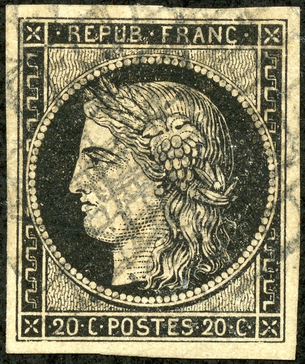
1849 Scott 3 20c black, yellowish "Ceres"
Typographic, Imperforate (CV $34)
As said, the eight stamp issue featured "Ceres", the Roman goddess of grains, motherhood, and the earth. No king or emperor visage for France! (That didn't last long as Louis Napoleon became president (1852), then emperor (1853).)
Some consider the 1849 "Ceres" issue to be one of the most beautiful ever produced. The typographic print is exquisite!
An 1849 "Ceres" close-up: Note the shading in the neck and face
consists of colored dots (Here black)
The nice detail on the face and neck consists of dots. This is an important point, as the 1870-71 Bordeaux "Ceres" show the face and neck detail as colored lines or dashes.
Well, let's look at the hastily prepared provisional 1870-71 eight denomination "Bordeaux" issue...
1870 Scott 41 5c yellow green/ greenish "Ceres"
Lithographed, Imperforate (CV $160)
It has the same "Ceres" stamp design as the 1849 issue (Except the 1c, 2c & 4c have a changed frame), but to say it is beautiful?
I'm afraid not.
The appearance is "flat", because of its lithographic origins. And the detail is coarse compared to the 1849 original.
I recall when I was investigating the "Ceres" stamps some years ago, I came across one that was crude and "ugly". I thought it was a forgery, until it dawned on me that I had my first "Bordeaux" issue stamp.
An 1870 Bordeaux "Ceres" close-up: Note the shading in the neck and face
consists of colored lines and dashes.
A face close-up reveals rather thick and heavy colored lines and dashes for the detail.
But the stamps intrigued.
I made a note to myself, that someday I might want to investigate this fascinating "homely" issue in more depth.
As luck would have it, recently I acquired a cache of "Bordeaux" stamps from a local dealer.
Should we see what we can discover together?
I should first mention, for the purposes of this blog post, I will be referring to the Scott catalogue numbers and information found in the Scott Classic Specialized WW 1840-1940 catalogue.
But one also needs a proper French specialized catalogue.
Maury Catalogue
Indispensable
The Maury catalogue is an absolute delight, and shows all the detail one needs for the Bordeaux issues. I've borrowed several images from it to show what the catalogue can do.
I propose we look at each "Bordeaux" denomination, and see what we can find. We might look at other "Ceres" issue stamps for comparison. I am sure this evaluation will take a number of posts. Let's begin!
1870 Scott 38 1c olive green/ pale blue "Ceres"
Lithographed, Imperforate
Bordeaux Issue (CV $125 unused)
The 1870-71 Bordeaux Issue has the "Ceres" vignette, and this frame design for the 1c, 2c, and 4c denominations. One cannot confuse the Bordeaux issue for the 1849-50 "Ceres" imperforate issue. as the 1849-50 "Ceres" does not have this frame design.
On the other hand, the typographic 1870-73 perforated France 1c, 2c, 4c, & 5c has this frame design. Then the typographic imperforate 1872-77 French Colonies general issue also has this 1, 2c, 4c & 5c frame design. Clearly the imperforate typographic French Colony 1c, 2c, & 4c might have to be differentiated from the imperforate lithographic 1870-71 Bordeaux 1c, 2c, & 4c.
1870 Scott 38 1c olive green/ pale blue "Ceres"
Lithographed, Imperforate, Bordeaux Issue
Close-up shows the heavy horizontal lines along the neck. This is characteristic for the Bordeaux lithographic issues. The eye is totally filled in with color. There is very heavy eyebrow markings.
1872 Scott 50a 1c bronze green/ pale blue "Ceres"
Typographed, Perf 14 X 13 1/2 (CV $14)
This is the minor number of the typographic French Perf 1870-73 "Ceres" 1c - a bronze green shade. (The major number shade is olive green/ pale blue.)
Closeup: 1872 Scott 50a 1c bronze green "Ceres"
Note the colored dots on the face and neck. Since the Bordeaux stamps have heavy lines for the neck, there should be little confusion between the issues. The eye is not totally filled in. There are graceful eyebrow lines.
1873 Scott 16 1c olive green/ pale blue "Ceres"
French Colonies general issue - Imperforate
Looks like a (Gua)daloupe cancel (CV $14+)
This French Colony Scott 16 example should be identical to the Scott 50a French stamp shown a bit above, except it is imperforate. In fact, that is how one can tell the difference between the issues - the French issue is perforated, while the French Colony issue is imperforate.
It is helpful if the French colony example has wide margins (thin margins could be a trimmed down French stamp), and also a French colony postmark is welcome, but not always found. One does not need to worry that the French Colony 1c shown here could be an 1849 "Ceres" stamp, as this frame design (found on the French Colony 1c, 2c, 4c, 5c) was not used for the 1849-50 "Ceres" issue.
Close-up: 1873 Scott 16 1c olive green/ pale blue
"Ceres" French Colonies general issue - Imperforate
Compare the face and neck markings (dots) to the perforated 1872 French issue shown a bit above. They should have a similar look, as they used the same plates. - but perhaps not identical due to plate wear (or variation) on a particular stamp.
Is it be possible that one could mistake an 1873 French Colony stamp for an 1870-71 French Bordeaux stamp? After all, they are both imperforate.
I think you will agree that it is unlikely if one is paying attention.
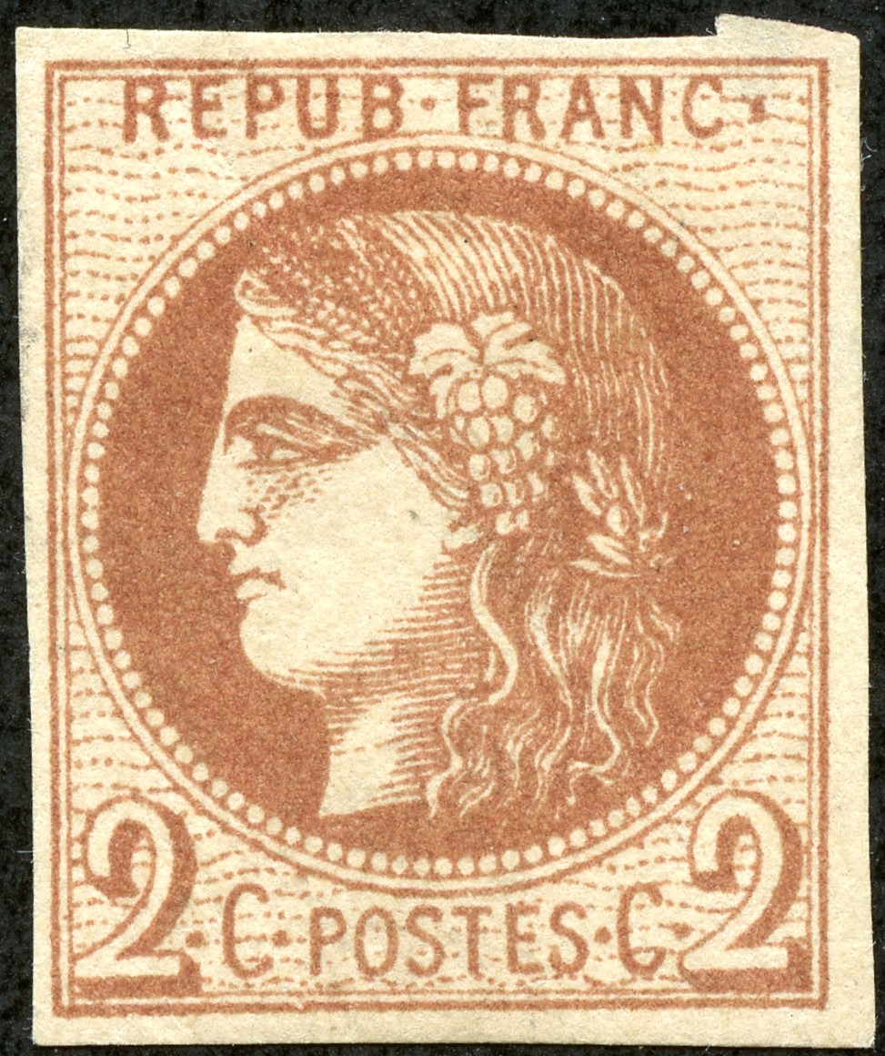
1870 Scott 39 2c red brown/ yellowish "Ceres"
Lithographed, Imperforate
Bordeaux Issue (CV $225 unused)
The 2c red brown has the same design (A7) as the 1c Bordeaux. Note the someone "flat" appearance of Ceres due to the coarser lithographic printing.
Closeup - 1870 Scott 39 2c red brown/ yellowish "Ceres"
Lithographed, Imperforate, Bordeaux Issue
The thick eyebrow and neck lines, and the filled in eye gives this away as a lithographic Bordeaux issue.
1870 Scott 39 2c red brown/ yellowish
"Ceres", Lithographed, Imperforate
Bordeaux Issue (CV $225)
The crude appearance (doesn't Ceres look like she has a black eye?), and the thick lines (rather than dots) on the neck and face argues convincingly that this is also a Bordeaux stamp.
Now it turns out there are 300 stamps to a sheet. A lot! But the sheets were made by using a block of fifteen stamp cliches (lithographic block), and repeating it 20x to make up the 300 stamp sheet.
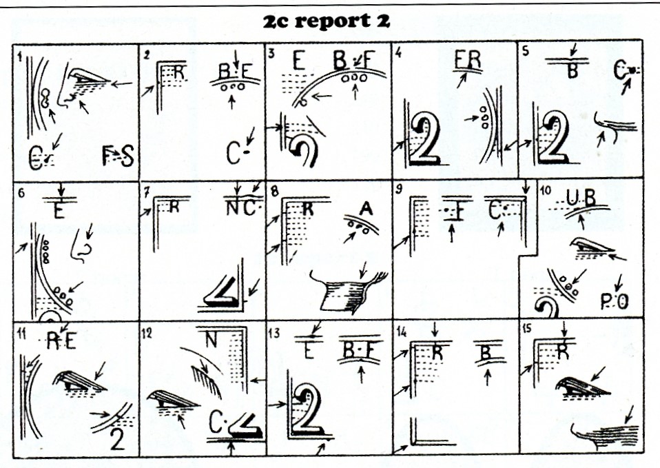
For the 2c denomination, there were two 15-stamp cliches lithographic blocks made up, called Report 1 (Type 1 block) and Report 2 (Type 2 block). (A 2c sheet is made up of either all Report 1 or all Report 2 stamps.)
Report 1 stamps and Report 2 stamps can be distinguished, as Report 1 stamps share certain common signs that are different than Report 2 stamps.
Report 2 signs
For Report 2, the stamps have linear horizontal lines inside the loop of "2", as shown here. For Report 1, there are dots inside the "2" loop. Note, that for Report 2, two pearls are fused at the 9 o'clock position of the pearl string. See it? There is no such pearl fusion for Report 1. (The general signs for Report 1 & Report 2 are illustrated in the Maury catalogue.)
But that is not the end of the fun! Each individual cliche (stamp image) within each Report has its own signs!
Bordeaux 2c Report 2 in Maury
Note there are 15 boxes which show the unique characteristics of each stamp found within Report 2. There is similarly an illustration like this for Report 1.
What that means, for a 300 stamp sheet, is that there should be 15 piles of stamps, each pile having 20 stamps, where all the stamps within a pile are identical. This goes for each Report. Since the 2c denomination exists as two Reports, there are, in total, 30 different stamps (15 X 2) that can be identified by close examination.
Now, am I going to dig down to this level to identify the individual stamp? I could, but for me, I am content to categorize the Bordeaux 2c stamp as belonging to Report 1 or Report 2. My general ambition is try to identify the Bordeaux stamps I have by their Report number. I will leave the individual stamp identification within a Report for another day. ;-)
1870 Scott 2c red brown/ yellowish "Ceres"
1870-73 Issue, Typographed, Perf 14X131/2
Here is an example of the perf typographed 1870-73 2c stamp (CV $13+). Typography yields a finer stamp in appearance compared to the "Bourdeaux" lithographic 2c red brown shown a bit above. The face and neck markings are still primarily dots ( a few fused dots also). If nothing else, that should help determine that this stamp is a "Ceres" 1870-73 variety ( to say nothing about it being perfed!).
There does exist an imperforate 1876 French Colony Scott 17 2c red brown stamp with a high CV of $475 unused. One doesn't need to worry that this stamp could be confused with the 1849 "Ceres" issue, as the frame design is different.
? 2c red brown on salmon-pink paper
Looks like a "Bourdeaux" issue, but a Forgery?
Out of the Blue
Well, this will serve as an introduction to the "Bordeaux" issue and other Ceres stamp issues (1849, 1870-73, French Colonies 1871-77) that can be compared/ contrasted with it.
More specifically, the 1c and 2c denominations were reviewed.
Hope you enjoyed it!
On to the next blog post entry soon!
Comments appreciated!
Note: If a reader has any information on the probable 2c fake shown above, please comment. !!











.jpg)