A is for Aden and Z is for Zanzabar


A is for Aden and Z is for Zanzibar... Now what is between? For the world wide classical era philatelist and stamp collector, a country specific philatelic survey is offered by the blog author, Jim Jackson, with two albums: Big Blue, aka Scott International Part 1 (checklists available), and Deep Blue, aka William Steiner's Stamp Album Web PDF pages. In addition, "Bud" offers commentary and a look at his completely filled Big Blue. Interested? So into the Blues...

Thursday, January 12, 2023

Persia - Bud's Big Blue

Naser al-Din Shaw, Scott #59, buff, red and black

Bud's Big Blue
Bud's Observations

Most folks don’t give stamp borders a second thought -- the little lines that, along with the perforations, show where one stamp stops and another begins. Many modern designs do away with them altogether.

But nearly all of Big Blue’s stamps have clearly defined borders, frames, or edges. On some it’s a single line.  On others the frames become works of art in their own right, sometimes reflecting the culture of the issuing country more clearly than the central vignettes do. The display on Big Blue’s Persia pages, with the foremost examples of extravagant borders, resembles an art gallery. Such frames are privileged windows into the supreme ideal; at least the depicted shahs hoped so.
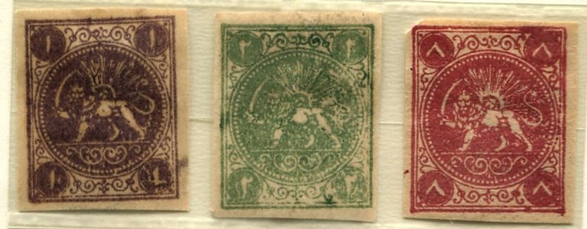
Scott #s 1, 2, and 4

The elegant borders begin with Persia’s first stamps (above), often called the bāqeri issue for reasons that remain unclear. The design is based on an essay by Albert Désiré Barre (1818-1878), the chief engraver at the Paris Mint. He also designed the French Napoleon III series (1863-70) which bears a coin-like resemblance to the first Persian stamps.

Barre essay, mid 1860s (1) and France Scott # 29, bronze green on pale blue

For Persia, Barre added flowing arabesques, Farsi calligraphy, and a classical symbol of Persian royalty for the central image (a sword wielding lion and a sun with a man’s face). Lion and sun images continue, either together or separately, throughout early Persian philately. I regard my three bāqeris as reprints, if not outright forgeries. When compared to expertized examples, many minor variations show up. Moreover, Scott Catalog warns that forgeries far outnumber genuine examples and provides a description of the reprints.

Scott #461, gold, orange and bister brown

Subsequent issues have more elaborate borders – naturalistic wreaths (oak and olive branches), furled banners, gold outer frames, crowns, additional calligraphy, and even more extravagant arabesques. All, from the most primitive of them to the most flamboyant, are symmetrical surrounds of central clichés.

Mohammed-Ali Shah Qajar, Scott #445, gold, vermilion and black

From 1881 onward “Postes Persanes” and values recognizable to Europeans were inscribed, a result of the designs being produced mostly in France and Austria, and of Persia’s entry into the Universal Postal Union (1877). Consistent with the tradition of cultural blending apparent in Persia’s classical sculpture, Persia’s stamps borrow designs from sources assistant as Europe and Mongolia. This confluence is apparent in Scott 571 that shows part of the ruins of the Apadana at Persepolis. King Darius sits on a throne holding a lotus blossom in his left hand, attended by crown prince Xerxes I (in Hebrew known as King Ahasuerus) who married the biblical Esther (possibly, but debated among scholars).

Scott #571, silver, blue and rose

“A Ruler on His Throne” (2)

Persian cultural hybrids continue in the works of Rabee Baghshan, a contemporary Iranian digital artist. She salvages the frame surrounding the sitar player from stamps featuring Ahmed Shah Qajar, Scott #s 667-689. The befogged men standing behind the musician hold Coca Cola bottles. (3) Titled “Woman Stamp 2”, it is part of a series. A limited-edition print is available for $2300, approximately the value of my Persia collection shown below. 

“Woman Stamp 2,” 2021, multicolor,
 and Ahmed Shah Qajar, Scott #677, red and brown 

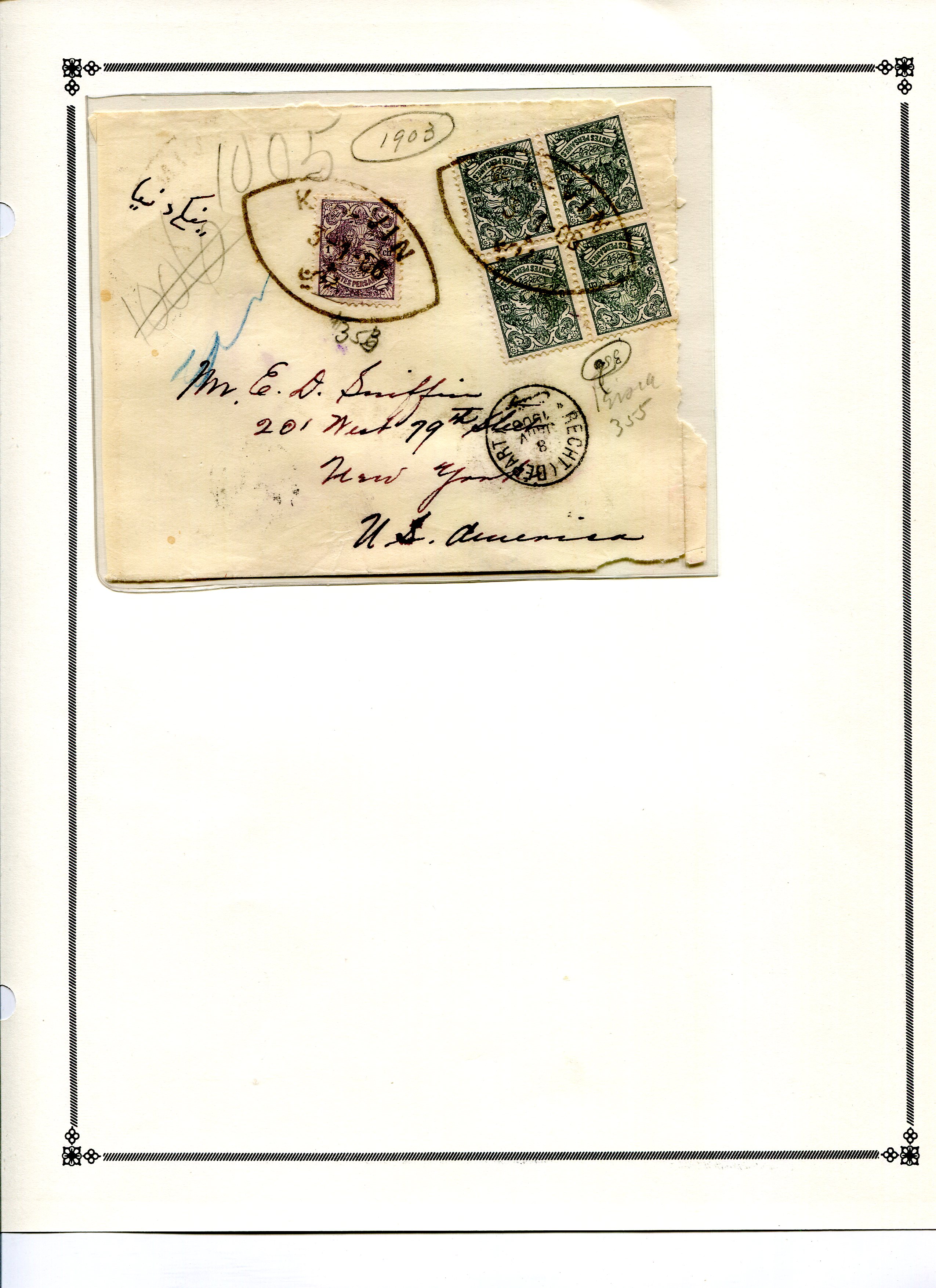
Many articles have been written about Persian stamp forgeries, so many that I have trouble keeping up with experts’ findings and debates about them. I have, however, started a forgery jail at the end of the Persia supplement pages. It’s a work in progress.

Census: 412 in BB spaces, 11 tip-ins, 258 on supplement pages

(1) http://farahbakhsh.com/IranStampHistoryEn/IranStampHistory.html

(2) https://www.biblicalarchaeology.org/daily/ancient-cultures/ancient-near-eastern-world/what-a-lotus-in-the-left-hand-means/

(3) https://www.artsy.net/artwork/rabee-baghshani-woman-stamp-2


Jim's Observations

In the classical stamp collection world, Persia is known for it's beautiful designed stamps, as Bud's post above shows so well. 

But even more so, Persia is known for the forgeries that are quite abundant. In fact, most Persian stamp collections are discounted heavily, as the assumption is there are many forgeries : Alas, often true.

For me, I have a love/ambivalent relationship with the stamps of Persia. I generally really like the stamp issues. But I know one has to be quite aware of forgeries. Yet, I enjoy the challenge!

My blog link below shows some of the more common genuine/forgery differences.


Note: Bud's "Persia" post is found under "Iran" in Bud's Big Blue Post Index.

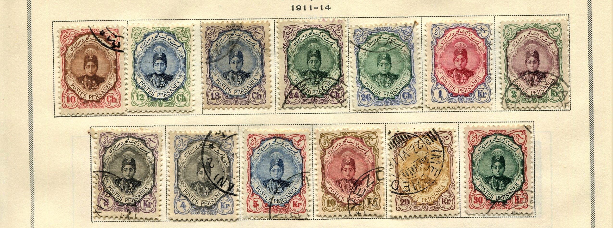
Page 1


1a


1b


1c


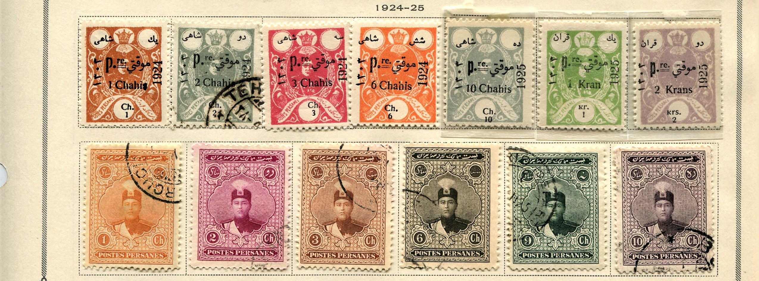
Page 2


2a


2b


2c


Page 3


3a


3b


3c


Page 4


4a


4b


4c


Page 5


5a


5b


5c


5d


Page 6


6a


6b


6c


Page 7

7a


7b


7c


Page 8


8a


8b


8c


Page 9


9a


9b


9c


Page 10


10a


10b


10c


Page 11


11a


11b


11c


Page 12


12a


12b


12c


Supplements
Page 1


Page 2


Page 3


Page 4


Page 5


Page 6


Page 7


Page 8


Page 9


Page 10


Page 11


Comments appreciated!

Tuesday, January 3, 2023

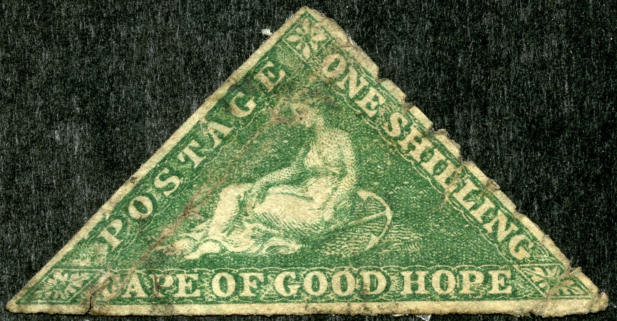
COGH 1858-64 Triangular One Shilling Varieties

1863-64 SG 21 1 Shilling bright emerald green
(Sc 15 emerald) / De La Rue Printing

Into the Deep Blue

The main collector challenge for the Cape of Good Hope One Shilling varieties is cost (CV $300-$725), but identification can still be a bit tricky.

As the previous posts have outlined with the COGH triangles, the main separation, for the One Shilling denomination, is between the Perkins, Bacon (PB) printings of 1858-59, and the De la Rue (DLR) printings (using the PB plates) of 1863-64.

One Shilling Shade Study SG colors
Upper Row PB issue: 1859 Deep Dark Green (two stamps); 1858 Bright Yellow Green (two stamps)
Lower Row DLR issue: 1863-64 Bright Emerald Green (two stamps)

Perhaps the easier determination is looking at color.

The PB printings are found in SG deep dark green and SG bright yellow green (Scott: Dark green and yellow green).

The DLR printings are found most commonly in SG bright emerald green (Scott: emerald).

There is enough of a difference with the "emerald" (DLR) and the "yellow or dark green" (PB) colors, that most collectors should have little trouble.

Then, one can also look at general characteristics that identify and separate out the PB and DLR printings.

Scott says (regarding DLR stamps): "Often appear with granular ink or with background lightly printed in whole or part".

SG says (regarding DLR stamps, and 1 shilling in particular): "the fine lines of the background appear blurred, and broken when examined under glass".

Let's take a look at some PB and DLR 1 shilling examples. 

Example 1

1858 SG 8 1 sh bright yellow green/ white paper
(Sc 6 1 sh yellow green)/ PB printing

The most common (at rather the least expensive CV @ $300) is the 2-18-58 issued PB yellow green.

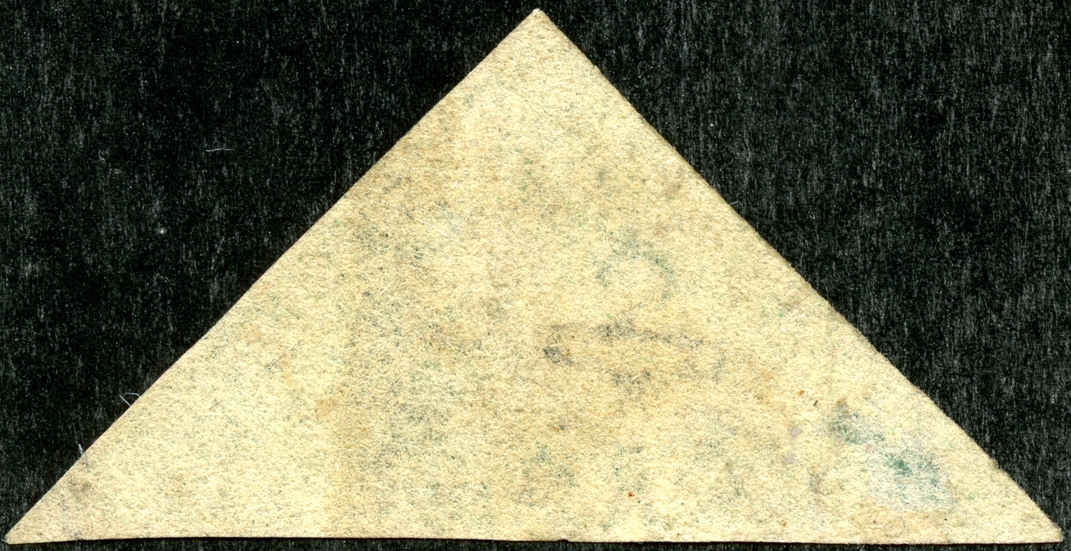
Reverse- 1858 SG 8 1 sh bright yellow green/ white paper
(Sc 6 1 sh yellow green)/ PB printing

The reverse is on "white" paper. Note the "anchor" watermark. I should remind the collector that "white paper" really means "non-blued paper". The paper itself for PB printings can be white, yellow, cream or tan.

Close-up: 1858 SG 8 1 sh bright yellow green/ white paper
(Sc 6 1 sh yellow green)/ PB printing

Note The PB "Hope" is a fairly sharp printing, and the background shows enough detail to be called "semi-sharp". (Compare with a DLR printing later.)

Example 2

1858 SG 8 1 sh bright yellow green/ white paper
(Sc 6 1 sh yellow green)/ PB printing

This PB yellow green has a fine large obliterator cancel.

Example 3

1859 SG 8b 1 sh deep dark green/ white paper
(Sc 6a 1 sh dark green)/ PB printing

The other color shade seen for the PB printings is "dark green" This was issued in 1859, and the CV is $600 used/ $450 unused.

Example 4

1859 SG 8b 1 sh deep dark green/ white paper
(Sc 6a 1 sh dark green)/ PB printing

This rather worn copy also shows the "dark green" shade.

Example 5

1863-64 SG 21 1 sh bright emerald green
(Sc 15 1 sh emerald)/ DLR printing

Definitely an "emerald" color. CV is $725 used/ $625 unused.

Reverse: 1863-64 SG 21 1 sh bright emerald green
(Sc 15 1 sh emerald)/ DLR printing

DLR printings of the one shilling always have a "white" paper reverse. Note the "anchor" watermark.

Example 6

1863-64 SG 21 1 sh bright emerald green
(Sc 15 1 sh emerald)/ DLR printing

This is a pretty "emerald" DLR stamp, except for the tear/gouge/hole at the top.

Close-up: 1863-64 SG 21 1 sh bright emerald green
(Sc 15 1 sh emerald)/ DLR printing

Note, characteristic of 1 sh DLR stamps "Hope" is less finely printed, and the engine-turned background is devoid of pattern detail.

Out of the Blue

This concludes our survey of the COGH triangular PB/DLR stamps. What fun it has been!

Comments appreciated!