A is for Aden and Z is for Zanzabar


A is for Aden and Z is for Zanzibar... Now what is between? For the world wide classical era philatelist and stamp collector, a country specific philatelic survey is offered by the blog author, Jim Jackson, with two albums: Big Blue, aka Scott International Part 1 (checklists available), and Deep Blue, aka William Steiner's Stamp Album Web PDF pages. In addition, "Bud" offers commentary and a look at his completely filled Big Blue. Interested? So into the Blues...

Thursday, July 30, 2020

Martinique - Bud's Big Blue

Madras headgear, Martinique
Bud's Big Blue
Bud's Observations
There’s more to women’s headgear in Martinique than a casual observer might suspect. And, I suspect, the two French colonial stamp engravers who featured Martiniquan Creole headgear in their designs -- L. Colmet-Daage and Ch. Rollet -- were clueless, too.

Scott # 62, brown and red brown
L. Colmet-Daage, designer, 1908

The story goes back to the time immediately following the emancipation of slaves. Freed black women, although no longer laboring on sugarcane, banana and cocoa plantations, were still forbidden to wear hats. Hats were considered symbols of coquetry and propriety; only white women had the right to wear them.  A 1779 ordinance about fashion specifies: “We expressly forbid [the free people of color] to affect through their clothing, hairstyles, dress or apparel, a reprehensible assimilation of the way in which white men or women attire themselves.…”(1) A black woman in a hat, the legislators must have thought, would prove irresistible to a planter-class male.

Although hatless and suffering under other coercive sartorial restraints, Black Creole women did want to appear distinguished and refined. So, they added to their code-specified ensembles brightly colored madras scarves and headpieces. Madras cloth was probably introduced by plantation workers emigrating from India following emancipation, some of whom came from Madras (Chennai). 

The number of spikes or poufs on the headpieces, as highlighted on Colmet-Daage’s and Rollet’s stamps, eventually came to signify the kinds of romantic attention the wearer would accept. 

Scott # 169, imperf proof, brown violet
 Ch. Rollet, designer, 1933

According to Creole tradition, one spike announces "the heart is free for you to win;” two spikes suggest "the heart is already taken, but luck may smile on the bold;" three spikes mean "the heart is linked by marriage, so don’t bother;" and four spikes say "the heart still welcomes all lovers who try.” A postcard from the 1930s (?) illustrates these significations.

The fifth headpiece, upper left, is ceremonial and lacks a romantic hint

Do you suppose Rollet knew what the spikes meant? I don’t know for sure, but suspect not. French colonial stamp designers, Rollet and Colmet-Daage included, usually based their sketches on photographs or postcards. They weren’t ethnologists and they didn’t use live models who might tell them about meanings hidden in what they were drawing. Nor did they live in the colonies whose stamps they contrived; they didn’t even visit there.

While working on her master’s degree, Mylène Florentin discovered a photograph that Rollet probably used for #169 (see below). Her thesis on the stamps of Martinique, well worth reading, identifies symbolic elements represented in stamps and explains the messages they convey. (2) 

Inspiration for Ch Rollet’s 1933 design
Anonymous © ANOM sous réserve des droits réservés aux auteurs et ayants droit

The photograph, which likely predates the stamp by several decades, shows clothing acceptable for free black Creoles -- white blouse, two skirts (one colorful and the other plain muslin), and silver jewelry. The women have rejected the white cotton headpieces that were specified in former times and donned flouncy madras. More recently, madras headpieces have become internationally popular among style-conscious women and political activists. Vendors gladly promote romantic interpretations of the spikes.

 Similar to Colmet-Daage’s 1908 design

Census: 98 in BB spaces, two tip-ins, 91 on supplement pages.

(1) Quoted in Tom Reiss, The Black Count: Glory, Revolution, Betrayal, and the Real Count of Monte Cristo. (Crown Publishing Group, 2015), p. 44.

(2) Mylène Florentin. Les représentations du Centre sur ses Ultra-périphéries: Le timbre-poste en Martinique (1859-2013). (Université Paris 1 Panthéon-Sorbonne, 2014), p 73.

Jim's Observations
Bravo Bud!  I very much enjoyed the well researched essay on Madras headgear and Martinique stamp illustrations.

Unlike a certain country that has a predictable key plate design of the current monarch for all of its colonies, the French provide designs specific and appropriate for that possession, at least after the "Navigation and Commerce" issue. Vive la France! But as Bud shows, their stamp designers worked off of photographs and postcards with little true understanding of cultural meaning.

Martinique Blog Post & BB Checklist

Page 1

1a

1b

1c

Page 2

2a

2b

2c

Page 3

3a

3b

3c

Page 4

4a

4b

4c

Supplements
Page 1

Page 2

Page 3

Page 4

Comments Appreciated!

Sunday, July 26, 2020

Marienwerder - Bud's Big Blue

Bud's Big Blue
Bud's Observations
The Versailles Treaty, following World War I, provided opportunity for people living in seven disputed territories contiguous to Germany to decide by plebiscite (referendum) whether or not to continue as a part of Germany or to join another nation. BB provides spaces for the stamps that publicized all seven plebiscites: Allenstein, Danzig, Marienwerder, Memel, Saar, Schleswig, and Upper Silesia.

The League of Nation supervised the voting and, because of that, these stamps could legitimately be included as a part the League of Nations album that is being serialized in this blog.  That has not been done, however, except for some of the Saar stamps.

Most plebiscite-promoting stamps are overprints; that’s true for some but not all of Marienwerder’s. The caption Commission Interaliée Marienwerder overprinted on German Empire stamps is French for “Inter-allied Commission Marienwerder,” the League’s agency for plebiscite oversight. Overprints exist in several fonts and colors, making Marienwerder an interesting technical specialization.

 Scott #39, lilac rose

The Commission also issued two Marienwerder series with unique designs and no overprints, both printed in Milan. They feature a female allegory for the Commission standing on a ballot box inscribed populi voluntas, Latin for “the people wish” or “the will of the people.” She is surrounded by the flags of four of the five allied victors in WWI -- Italy, France, Japan, and Great Britain. Missing, of course, is the United States flag -- the ally that rejected membership in the League of Nations, a political humiliation for President Woodrow Wilson who had strongly promoted populi voluntas.

Scott # 5, deep blue, CTO

The two Milan issues differ in noticeable ways. The first, Scott #s 1-14, has Commission Interalliée at the top and Marienwerder at the bottom while the second, Scott #s 40-53, has Plébiscite at the top and Marienwerder Kwidzyn at the bottom, Kwidzyn being the Polish name for Marienwerder. The Commission wanted, I suppose, to appear unbiased, although “Kwidzyn” appears in a smaller font. The actual voting reflected strong pro-German sentiments. Both series became postally invalid on 14/9/1920 but, during the following week, they could be exchanged for German empire stamps.

Scott #51, dark violet

 Marienwerder town cancellations provide an interesting historical specialization, there being some 64 of them, alphabetically from Altfelde to Troop. At the time, the popularity of CTOs resulted in many socked-on-the-nose local post office sets. See: https://www.stampsofgermany.com/germany-specialised-stamps-and-postal-history-for-sale/weimar-1919-1932/plebiscites/marienwerder.htm

Census: twelve in BB spaces, 20 on supplement page.

Jim's Observations
After WW I, some territories, namely Alleinstein in East Prussia, and Marienwerder in West Prussia, because of a vocal German population, and the sympathies of the British Prime Minister Lloyd George, were allowed  to vote whether to join Poland or East Prussia (Germany).

The Plebiscite was scheduled for July 11, 1920. It was sponsored by Inter-Allied Commissions for the League of Nations. British and Italian contingents were on the ground, but civil administration was handled by the Germans.

Naturally, the plebiscite was promoted and publicized through the use of stamp issues.

The result for Marienwerder (Kwidzyn) was a very lopsided 96,000 votes for East Prussia, and 8,000 votes for Poland. Consequently, Marienwerder joined East Prussia and the Weimar Republic.

Marienwerder Blog Post & BB Checklist

Page 1

Supplements
Page 1

Comments appreciated!

Friday, July 17, 2020

Hungary Franz Josef I: 1871 Litho vs 1871-72 Engraved issue

1871-72 Scott 7a 2k yellow "Franz Josef I"
Engraved; Perf 9.5
Into the Deep Blue
The Austro-Hungarian Compromise of 1867 began the dual monarchy of Austria-Hungary. Franz Josef then became both the Emperor of Austria and the King of Hungary. 

More on this can be found with my previous posts...
Hungary 1871-1916

Hungary had now a good deal of autonomy vis-a-vis Austria, and eventually issued their own stamps using the State Press of Buda on May 1, 1871.

But this messy in appearance lithographic six stamp issue was considered sub-optimal in terms of presenting and honoring the King of Hungary.  It was soon succeeded by an identical engraved design issue by the same designer ( Janos Unrein) on six stamps beginning on August 31, 1871, and continuing into 1872.

Both issues used perforation 9 1/2, and there was no watermark.

Both issues (lithographic and engraved) can be found being used for postage in Hungary and valid until 1876, although the use of the lithographic stamp is rare after 1871.

So how easy is it for the WW collector (non specialist) to discern the difference between the lithographic 1871 issue and the engraved 1871-72 issue?

Apparently difficult based on the confusion and mistakes in identification between the two issues when I checked internet "stamps for sale" sites. !!!! 

The more common mistake was representing a lessor CV engraved stamp specimen as belonging to the greater CV lithographic issue.

The truth is one can usually discern without too much trouble between the two issues by a reasonable inspection of  the stamp. !!

1871 Lithographed vs 1871-72 Engraved "Franz Josef I": a closer look
100 Krajczar (Kreuzer) = 1 Forint

We will begin with a few observations...

1) The lithographic stamp presents a "flat" appearance for the visage of Franz Josef I, while the engraved stamp visage seems more three dimensional.

2) The color of the stamp is an important clue in many cases.

3) In general, the lithographic stamp seems to have a "bushier" beard than the engraved one.

4) One can use the lithographic vs engraved "aluminum foil" test. Engraved stamps have ridges which leave an impression on the rubbed aluminum foil, while lithographic stamps have a smooth surface, and leave no impression on the rubbed aluminum foil. But, these are old engraved stamps (150 years), and the ridges, although present with my testing, are subtle and require a careful examination of the foil impression.

I should mention these stamp issues are modest to expensive (CV wise- major numbers), with the engraved stamp denominations ranging from $1+ to $40, and the lithographic stamp denominations ranging from $25 to $600.

For evaluating the stamp specimens, I'm going to start with the highest denomination, and then evaluate the next highest denomination etc. In general, the lower denominations are more complicated. But, by then, we will have some experience with these issues.

The 25k denomination

1871 Scott 6 25k violet "Franz Josef I"
Lithographic Issue
"Penzutalvany" = "Money Order"
Observations...
1) The violet color for the lithographic 25k is unique, and shouldn't get confused with the lilac shades for the engraved issue.
2) Note the poor centering? This is common for both lithographic and engraved issues.
3) Note cancellation marking "PENZ-UTALVA"? The 25k denomination (Both lithographic and engraved) were typically used for money orders with the above cancellation inscription, or for special delivery.
4) Note the "bushy" beard and "flat" appearance of head.

1871-72 Scott 12 25k lilac "Franz Josef I"
Engraved Issue
Observations...
1) The lilac color (here, more of a blue-lilac shade) is typical for the 25k engraved stamp.
2) The eye/eyebrow detail is evident. (Lithographic examples often are crude/over-inked with loss of detail.)
3) Beard appears less bushy. Head appears more three dimensional.

1871-72 Scott 12 25k lilac "Franz Josef I"
Engraved Issue
Observations...
1) The lilac color (here, more of a gray-lilac shade) is typical for the 25k engraved stamp.
2) Note eye/eyebrow detail, less bushy beard, three dimensional head.

The 15k denomination


1871 Scott 5 15k yellow brown "Franz Josef I"
Lithographic Issue
The yellow brown color of the 15k lithographic issue appears different than the engraved shades.

1871 Scott 5 15k yellow brown "Franz Josef I"
Lithographic Issue - Close-up
Note the lack of detail for the eyes/eyebrows. The beard is rather bushy.  Note the white hairless chin patch without shading lines. The pearls surrounding the medallion head each have a shaded comma inside which is thick and crude.

1871-72 Scott 11 15k brown "Franz Josef I"
Engraved Issue
The major number engraved Scott 11 15k has a dark brown, slightly purple shade. Note the elegantly engraved visage of the King.

1871-72 Scott 11 15k brown "Franz Josef I"
Engraved Issue - Close-up
The eye/eyebrow detail is excellent. Note the hairless chin patch has engraved hair lines entering into it. The pearls surrounding the medallion each have a shaded comma that is clean and delicate.

1871-72 Scott 11b 15k black brown "Franz Josef I"
Engraved Issue
There are two (minor number) shades recognized by the Scott catalogue for the engraved 15k. One is a black-brown color (Scott 11b). CV is $80+.

1871-72 Scott 11a 15k copper brown? "Franz Josef I"
Engraved Issue
The second recognized shade is Scott 11a: "copper brown". Is this the "copper brown" color?

 Two examples of "copper brown" color stamps
(Illustration from Cherrystone Auction catalog 
"The Santa Fe Collection", December 7-8, 2011)
I checked an auction catalogue that showed examples of this rare color, and my stamp seems to have the appropriate color. The problem/good news is the catalogue value is $1,500! Being a natural skeptic, I will need to send this for certification.

The 10k denomination

1871 Scott 4 10k blue "Franz Josef I"
Lithographic Issue
The lithographic 10k has a light blue or blue color which is substantially different than the "deep blue" of the engraved issue. Note the "flat" appearance of the stamp - much different than the engraved appearance.

1871-72 Scott 10 10k deep blue"Franz Josef I"
Engraved Issue
Deep blue color, good eye detail, and delicate lines forming the beard clearly show this is an engraved specimen.

The 5k denomination

1871 Scott 3 5k rose"Franz Josef I"
Lithographic Issue
The lithographic 5k rose has a "flat" appearance, with little detail noted for the eye/eyebrow and chin patch area. Since both the lithographic and engraved stamps have similar shades (rose, brick red), color will not be much help in determining the two issues.

This example is nicely centered (unusual). 

1871 Scott 3 5k rose"Franz Josef I"
Lithographic Issue
Another example of the lithographic 5k rose, this one with the more usual poor centering.

Lets look closer...

1871 Scott 3 5k rose"Franz Josef I"
Lithographic Issue - Close-up
This example perhaps shows as much eye detail as one will find with the lithographic stamps. The commas within each pearl surrounding the medallion also are not as smeared out and crude as usual.

5k rose - postcard
Lithographic - "Imperforate" cut square
One can find postcards (or cut squares) of the same era in collections. 

1871-72 Scott 9 5k rose "Franz Josef I"
Engraved Issue
Here is the engraved 5k rose version.  Note the finer detail King visage.

1871-72 Scott 9 5k rose or ?Scott 9a 5k brick red? "Franz Josef I"
Engraved Issue
OK, what color is this? - a deep "rose" color or the minor number "brick red"?

I initially thought this might be a 5k "brick red", but comparison with internet examples suggest the "brick red" color is a deeper "red wine" or claret color. I will leave it as a ? for now. 

3k denomination

1871 Scott 2 3k light green "Franz Josef I"
Lithographic Issue
The lithographic 3k has a "light green" color, different from the green shades of the engraved version.
The Michel catalog notes that only 46,000 stamps were produced of the 3k, compared to 2,800,000 stamps of the 5k. This perhaps explains the CV value for the 3k of $600!

1871-72 Scott 8 3k green "Franz Josef I"
Engraved Issue
The engraved 5k major number color is "green" Note the perforation process has left a lot of the circular punch-outs still intact.

1871-72 Scott 8a 3k blue green "Franz Josef I"
Engraved Issue
The minor number color for the engraved 3k is "blue green". CV is $30, compared to "green" ($25).

2k denomination

1871 First Printing Destroyed Except
A few examples of 2k "dark yellow" posted in Pest August, 1873
(Illustration from Cherrystone Auction catalog 
"The Santa Fe Collection", December 7-8, 2011)

The very first lithographic issue printing attempt in early 1871 was not acceptable,. All stamps were destroyed, EXCEPT a few 2k "dark yellow" (Michel #1) that were posted from Pest in August, 1873. The stamp has spots ("pock-marked") on the King's face. (CV $3,000).

The subsequent printings of the lithographic issue were released and used for postage beginning May 1, 1871. But as a mentioned at the outset, the lithographic issue was not happily received, and an identical engraved issue was introduced August 31, 1871.

1871 Scott 1 2k orange "Franz Josef I"
Lithographic Issue
(Note: Not my stamp: This scan image is from 
Stamp Forgeries of the World)
The vagaries of collecting left me curiously without an example of the lithographic 2k orange stamp in my collection. I'm not sure why, as the lithographic 3k, 10k, 15k, 25k, all of which I have, are of the same or greater CV.

So, for the purposes of this post, I am using an internet scan example here for educational purposes.

Scott 1 - Types
(Illustration from Cherrystone Auction catalog 
"The Santa Fe Collection", December 7-8, 2011)

OK, now we get to the really good philatelic stuff. ;-) Turns out that there are (probably) ten types of stamps for each denomination of the lithographic issue.


“Based on the process of lithography, during the transfer of the subject from the master engraving to the stone from which the 100 subject stamp sheets were produced, some minute flaws naturally occurred. These included breaks in lines, dots, spots, etc. A study of these flaws led to the possibility of the existence of the types. With the material on hand Hugo Grieber found that from the master engraving ten impressions were made and transferred to the stone and this was repeated nine times more to give the 100 subjects for the stone from which the stamps were produced."

As the page illustration of stamp types for Scott 1 2k shows above, adventure awaits for the assiduous collector!

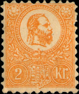
1871-72 Scott 7 2k orange "Franz Josef I"
Engraved Issue
Here is the engraved version of the 2k orange. I hope by now, the reader can quickly see which stamp is lithographic and which stamp is engraved. It is almost done by a gestalt glance at the stamp. ;-)

1871-72 Scott 7a 2k yellow "Franz Josef I"
Engraved Issue
The engraved 2k is also found in a bright "yellow" shade. This stamp - on an envelope piece - the reader has seen before, as it is the "header" for this post.

--------------------------------------------------------------------------

What about forgeries of these issues? Certainly the 1871 Lithographic issue would be a prime target - as many classical era forgery stamps were also produced through lithography.

Yes, there are definitely forgeries: See Stamp Forgeries of the World website. 

But that would be too big of a topic for me to tackle with this post. For one, I don't have any copies of forgeries (as far as I know).

1871-72 Scott 11 15k brown "Franz Josef I"
Engraved Issue
Out of the Blue
I really enjoyed putting together this post (which took some six months preparation in total)!

I hope, by now, the reader feels more confident in spotting the differences between the lithographic and engraved first issues of Hungary.

Note: Most of the stamp images for this post are from my collection.  Exceptions are specifically noted under the stamp or illustration identification labeling.

I am grateful to Cherrystone auctions and the Stamp Forgeries of the World website, as I used some of their scan images for educational purposes.

Comments appreciated!