A is for Aden and Z is for Zanzabar


A is for Aden and Z is for Zanzibar... Now what is between? For the world wide classical era philatelist and stamp collector, a country specific philatelic survey is offered by the blog author, Jim Jackson, with two albums: Big Blue, aka Scott International Part 1 (checklists available), and Deep Blue, aka William Steiner's Stamp Album Web PDF pages. In addition, "Bud" offers commentary and a look at his completely filled Big Blue. Interested? So into the Blues...

Wednesday, April 18, 2012

The Kaiser and his Horse: Loose or Tight Reins Variations

"Tighter horse rein" noted on Scott 94 (Michel 96B II)
"Deutsches Reich" inscribed 3m violet gray 
The Question
I was examining my engraved DEUTSCHES REICH inscribed "Unveiling Kaiser Wilhelm I Memorial, Berlin" stamps ("Enthüllung des Denkmals Kaiser Wilhelm I, Berlin"), and noticed a tighter horse rein (Zügel straff) in the grip of the Kaiser on a Scott 94 (Michel 96B II). But my other Scott 94 stamp had a loose rein; the rein hung down more (Zügel durchhängend).

Illustrated below...

Two Scott 94 (Michel 96B II) stamps
The upper has loose horse reins, the lower has tighter horse reins
Enlarge image to see well : Agree or disagree?
Could this be a major new variation or type discovered by a general world wide classical era collector, which has been missed by thousands of avid Germany specialty collectors?    ;-)  As far as being missed, I suspect not, as the changes and variations are quite obvious.  But since I independently discovered them, I will take credit for them here. ;-)

This blog will analyse the Deutsches Reich inscribed 3m "Unveiling Kaiser Wilhelm I Memorial, Berlin" stamp that was in production from 1902 to 1919, and during that time, had 5 Scott numbers assigned to them.  But more specifically, we will look at the design around the Kaiser and his horse and the "Loose or Tight Reins" variations.

Some background....

It is well known by the rest of the world that the earlier 1900 REICHPOST inscribed 3m  "Unveiling Kaiser Wilhelm I Memorial, Berlin" comes in two major types. This is illustrated on page 360 of the Michel Deutschland Spezial 2010 Band 1. The Scott 64 (Michel 65) is subdivided by Michel into Type I (65 I), and Type II (65 II).

I say "the rest of the world", because Scott does not recognize or display these types.  A very good reason to have a Michel if one is at all interested in the German stamp realm.  ;-)

Let's look at the REICHPOST Type I.....

Michel 65I (Type I)  REICHPOST issue- Note the looser reins of the horse
One should note the looser rein of the horse. But let's take a close-up look....


Michel 65I (Type I) close-up- note a looser rein
And the Kaiser's upper body leans back slightly
With a  convex (rounder) front (Breastplate) profile 
Note there is no "white indentation" between the Kaiser's hand and his front torso

Michel Type I has all the above characteristics. It will perhaps be clearer when one compares to Type II below. 

REICHPOST Michel 65 II (Type II) exhibiting tight or straight horse reins.
Note the tighter horse reins in Type II of the REICHPOST issue. But there are more differences that a close-up view will highlight.

Close-up of REICHPOST Type II-Note tight/straight reins
Also, a "white indentation" between the Kaiser's hand and his front torso
And the front (Breastplate) profile of the torso is angled straight, not curved
Summarizing the differences:
A) Loose rein (Type I) vs tight rein (Type II)
B) Kaiser's torso leans back slightly in Type I
C) Rounder (Type I) vs straight angled (Type II) front Breastplate torso profile
D) "White indentation" noted between the Kaiser's hand and his front torso in Type II

Fine and good.
But what does that have to do with the DEUTSCHES REICH inscribed 3m stamps?
Well, Michel DOES NOT report differences (or Types) for the 3m DEUTSCHES REICH inscribed issues!

Yet my eyes tell me there IS a difference between the two Scott 94 stamps I have.

So let's examine the evidence, sift it through, and then come to a (tentative) conclusion.

The Evidence
If you have read the 1871-1921 German blog just presented, you know these Germania era stamps come in a bewildering variety.

Tools
A) We discussed watermarking to separate out these stamps. The 1902 Deutsches Reich 3m does not have a watermark. The 1905-13 Pre-War (Friedensdruck) 3m does have a watermark, as well as the 1915-19 War (Kreigsdruck) 3m stamp. Scott calls the watermark "Lozenges"-wmk 125, while Michel calls them "Rauten" (Diamonds).

The "Lozenges" watermark is on the left

B) Counting the perforation holes. The 3m "Unveiling Kaiser Wilhelm I Memorial, Berlin" design come in 25X16, 26X17 and 25X17 holes for the Deutsches Reich inscribed stamps. ( Also various perforations, but I will use perforation holes to separate out here.)

C) The 3m stamps are reported in different shades. This might help with identification.

So let us take a look at the 3m stamps in my collection and verify their issue and catalogue number by using the tools above. We will then provide a close-up of the Kaiser and horse for each stamp issue of the Deutsches Reich inscribed stamps, and carefully examine the position of the horse's reins.

Let's take a look again at the two Scott 94 stamps in my collection (Michel 96B II)...

Scott 94's (Michel 96B II) with the loose rein/tight rein varieties 
How do we know they are Scott 94's?
Wmk Lozenges, 25X17 holes, Color violet gray (schwarzviolettgrau)
The stamps are watermarked "Lozenges", so that places them either in the Pre-War 1905-13 or War 1915-1919 issues. 
But they both have 25X 17 perforation holes (Go ahead, count!), and that slots them, as the only choice, in the War 1915-19 issue. They are, therefore, Scott 94 (Michel 96B II). (The 26X17 holes Pre-War or War varieties, therefore, has been eliminated.)

The color does look to me to be compatible with "violet gray", the color Scott has for this issue.

Here is a scan of the back of the stamps....

Scan of the back of the Scott 94's: loose/tight rein varieties
One can make out the "Lozenges: watermarks

Pic of the Scott 94's: loose/tight rein varieties
In the tray with watermarking fluid applied
Although one can see the "Lozenges" watermarks in the scan, the watermarking pic leaves no doubt. ;-)

So this establishes that the stamps are indeed Scott 94's (Michel 96B II). If you disagree, please comment.
;-)

Let's now take a look at the earlier year issues of the Deutsches Reich inscribed  3m "Unveiling Kaiser Wilhelm I Memorial, Berlin" stamps, at least those that are in my collection. We will take a look at each stamp, then a close-up of the Kaiser and horse for each stamp. As a result, We will  have some evidence to judge the "loose/tight reins"  varieties.

First, the 1902 unwatermarked issue, Scott 77 ( Michel 80A)...

1902 Scott 77 (Michel 80A) 3m with loose reins
How do we know it is Scott 77?
Unwatermarked, 26X17 holes, color black violet (schwarzviolett)
The stamp is unwatermarked (scan and pic later), and the perforation holes are 26X17 (count them!). The hole count eliminates the somewhat less common 25X16 variety.
The color is compatible with "black violet", and definitely has a different shade than the "violet gray" seen with the Scott 94's.

Let's have a close up of the 1902 Scott 77....

Close-up of 1902 Scott 77
Notice the somewhat droopy reins?
Clearly, my copy of the 1902 3m shows the Kaiser holding the reins in a loose (Zügel durchhägend) fashion.
This is the normal and typical way the the reins should present.

Next, the 1905-13 pre-war Scott 94a (Michel 96A I)...

1905-13 Scott 94a (Michel 96A I) 3m with loose reins
How do we know it is Scott 94a?
Wmk Lozenges, 26X17 holes, color brownish violet (schwarzbraunviolett)
This stamp is watermarked Lozenges, and has 26X17 perforation holes (count them!). The 26X 17 hole variety was issued after 1911, and the "brownish violet" color after October, 1912. The postmark is compatible with this criteria. True, there was a "rare" 26X17 War variety issued, but only after May,1919.

The color is definitely compatible with "brownish violet", and looks different than either the 1902 "black violet", or the 1915-19 War "violet gray" I have in the collection.

Before we continue, here is a pic of the unwatermarked 1902 Scott 77 and the watermarked 1905-13 Scott 94a.

1902 Scott 77 (Michel 80A) above : unwatermarked 
1905-13 Scott 94a (Michel 96A I) below : wmk Lozenges
Quite clear ( to my eyes) that the top stamp is unwatermarked, while the bottom is obviously watermarked.

Let's take a closer look at Scott 94a....

Close-up of 1905-13 Scott 94a (Michel 96A I)
Hmmm,, it droops a little, but not as much as my Scott 77
The close-up is quite revealing, and may offer a clue to the loose/tight reins seen with the Scott 94's. Yes, the reins do droop a bit, but not as much as was seen with the Scott 77. Also, the reins seems a little broader in this illustration. Important? Maybe.

Now we are getting to the heart of the question. Let's take a look at the "loose rein" Scott 94...

1915-19 Scott 94 (Michel 96B II) with loose reins
Wmk Lozenges, 25X17 holes, Color violet gray (schwarzviolettgrau)
Here is the "loose rein" example of Scott 94. We haven't, though, yet, had a close-up of horse and rider.

  The close-up...

Close-up of 1915-19 Scott 94 (Michel 96B II) with loose horse reins
Quite obvious here, with clear "Zügel durchhägend"
No doubt the reins are quite relaxed and droopy here. The reins appear to be not as broad in width as those seen in Scott 94a, but  perhaps slightly thicker than Scott 77.

Now for the last, and most important example: the "tight" rein Scott 94....

1915-19 Scott 94 (Michel 96B II) with tight horse reins
Wmk Lozenges, 25X17 holes, Color violet gray (schwarzviolettgrau)
The reins appear tight (certainly compared to the other Scott 94) even with an overall view of the stamp, but let's get a close, than an even closer look...

Closer look of Scott 94 (Michel 96B II)
Those reins look pretty tight!
A closer view confirms that, for this stamp example, the reins look "straight", perhaps only having the slightest concave suggestion. Compared to the earlier "loose rein" Scott 94, shouldn't the differences be enough to give a "Type" to these stamps?  ;-)

Now for the close-up....

Close-up of Scott 94 (Michel 96B II) with "tight" horse reins
Quite dramatic difference compared to the "loose" rein variety
Wow! There is no doubt that there is a visible and significant difference between these stamps, most clearly seen with the two Scott 94 (Michel 96B II) examples.

Here is another view, with red arrows along the reins....

Loose reins Scott 94


Tight reins Scott 94

Well now it is time to remove the stardust from our eyes, and do some critical thinking...

Analysis and Conclusion
I think you will agree that there are clear differences between these Deutsches Reich stamps as demonstrated by the appearance of the horse's rein. Absolutely no doubt. ( But, as far as I can tell, there is no difference in the appearance of the Kaiser as one saw with the REICHPOST stamps.)

Well, what is causing the apparent differences in appearance?

Do we have an engraving change, unknown to Michel?

I doubt that very much.

( I suppose there could have been minor plate "touch-up" done, but I have no knowledge on that score.)

(Perhaps too there was some minor changes between issues, but Michel makes no mention of this.)

Do we have a printing (stamp impression) difference?

I think we are getting much closer.

As you may be aware by now, the "reins" are made visible by the absence of pigment. They are not drawn in, except in an "outline" sense. So any "bleeding" of pigment, or local lack of pigment in the area will change the shape of the reins.

Certainly, a large clue is that all the "rein" shapes varied-  from subtle to obvious.

Then do we have a MAJOR stamp type(s)?  ;-)

No and Yes.

Clearly, this is not an engraving change that would signify "major", but it is definitely more than a haphazard fly-specking plate flaw.

The differences are quite obvious from stamp to stamp.

I do believe the archetype variations are definitely collectible.  And remember- differences much less than this are often given catalogue recognition.

Why don't you check your own Deutsches Reich 3m "Unveiling Kaiser Wilhelm I Memorial, Berlin" stamp(s), and see if you can find similar variations?


And sending a note to Scott or Michel- well, who knows what will happen. ;-)


Caveat: Since I am a general classical era collector, not a German specialist, my speculations and theories here need to be taken with a grain of salt. ;-)


What do you think? Put your thoughts in  the "comment" section below.


Thursday, April 12, 2012

Germany: 1871-1921

1872 Scott 3 1/2gr red orange "Imperial Eagle with small shield"
Quick History
With the addition of the southern German States- primarily Bavaria, Wurttemberg and Baden, the North German Confederation morphed itself into a unified German Empire in 1871. Wilhelm I was declared German Emperor and the politically astute Otto von Bismarck was Chancellor. The Territory of Alsace-Lorraine was added as spoils from  the Franco-Prussian war.

German Empire (Deutsches Reich) 1871-1918
Prussia was still the dominant State, with 60% of the population.  The Capital was Berlin, and the population was 41,000,000 in 1871. The German Empire consisted of 27 territories: Kingdoms, Grand Duchies, Duchies, Principalities, Free Hanseatic Cities, and the Imperial Territory of Alsace-Loraine. (For specifics, see the "North German Confederation" blog.)

Stamp production began for the German Empire in 1872 with the "Imperial Eagle with small shield" stamps, followed quickly by the large shield design. The German States ceased their own issues; although not all. Bavaria continued with stamp production until 1920, while Wurttemberg issued regular stamps until 1902, and official stamps until 1920.

The Great War  found Germany with two weak allies: Austria-Hungary and the Ottoman Empire. The Central Powers were defeated , and by the end of 1918 Germany had signed the Armistice and the Empire collapsed. 

This blog entry will follow the stamp issues through the 1900-1921 "Germania" design and the end of the German Empire. The Treaty of Versailles with the heavy penalties, the Weimar Republic, hyperinflation, and the rise of the Nazis with all the myriad stamp issues will be featured in the next blog.

1872 Scott 17 1gr rose "Imperial Eagle with large shield"
Into the Deep Blue
The Scott Classic Specialized catalogue, from 1872 through the "Germania" design issues of 1921, has 132 major number descriptions. Of those, 28 stamps from 1972-1899 are <$1-$20 CV, and 67 stamps are <$1-$5 CV from 1900-1921. A reasonable "Affordability" estimate then is 72%. There are, however, 31 additional minor numbers for the 1905-1919 "Germania" issues. Eighteen of these minor numbers are <$5.

The recommended necessities for evaluating German Stamps
I must admit that evaluating German stamps is a little awkward with an American Scott Classic catalogue. No doubt, the "gold standard" is the German language Michel catalogue. But the Scott does a reasonable job ( with some exceptions), so we will view the German stamp world using the Scott as the primary source.

But if one is interested in plate flaws, color variations, a more detailed parsing (with appropriate illustrations) of the issues, or communicating with German specialists, then a Michel (Deutschland-Spezial) is recommended. 

Now I kid you not that the German prose in the catalogue is dense indeed. ;-)  And I have had (in the not too distant past) a working "conversational" knowledge of German. But the Michel does pay dividends with sustained effort.

The other recommended tools are a watermarking tray and fluid, a magnifying glass, and a perforation gauge.

There are designs (Germania, von Hindenburg) that require careful watermark testing to determine which issue one has, and the value.

A magnifying glass (or scanning and viewing on a computer) is useful for perforation hole counting (General Post Office and other Designs 1900-1920), or examining various subtypes.

The perforation gauge can confirm an issue.

So with the catalogue(s) and tools in place, let's begin. :-)

A closer look at the stamps and issues

Closeup of the 1872 Eagle small shield embossed design
The opening dilemma for the world wide classical generalist begins with the first issue. Does one have the small or large shield embossed design? 140 years after the issue, the embossed section is not necessarily obvious.

The small shield and the large shield
The more prominent tail of the Eagle in the small shield, the different feather distribution between the two shields, and the difference in size of the shields are all markers.

1872 small shields
1/2gr red orange & 1gr rose & 1kr green
The eleven stamp small shield issue is interesting because six stamps are valued in Groschen, and five stamps are valued in Kreuzer, reflecting the different denomination values in use in the various German States. Catalogue values range from $5+-$350+, with five stamps <$40.

Closeup of 1872 large shield
One can spot the larger shield as well as the more prominent feather design with this closeup view.

1872 Scott 15 1/3gr yellow green & Scott 17 1gr rose
Imperial Eagle with large Shield
The second 1872 issue, the large shield design, consisted of thirteen stamps. Seven are valued for <$30, with four <$8. As with the first issue, seven are in Groschen, and six are in Kreuzer.

1872 Scott 18 2gr ultramarine "Large shield"
The 1gr rose, the 2fr ultramarine, and the 3kr rose were the most commonly used denominations.

1872 Scott 21 1kr yellow green & Scott 23 3kr rose
The large shield Kreuzer denomination
What is particularly noticeable are the frequent socked-on-the nose cancellations for these issues. I find the heavy cancellations actually attractive, as they imply a genuine postally used specimen. Not always though, as we will sadly observe with the inflationary German stamps. ;-)

1875-77 "Pfennige" design issue
3pf blue green & 10pf rose
1875 brought a seven stamp new design: known as the "Pfennige" issue with the final "e" present. Valuations range from $1+-$15+. The image above illustrates the two major designs.

The 25pf  red brown "Pfennige" & a shade
The 1875 and other 19th century German issues come in a variety of a shades. Although Scott does list shades, Michel lists more. Without examples of shades (already identified), one is left generally not sure. A Michel color guide might be helpful. Even with an apparent difference in shade, one has to wonder if it is real or a changeling.

1880-83 "Pfennig" issue
3pf yellow green & 50pf deep grayish olive green
The two major designs for the 1880-83 "Pfennig" issue are illustrated above. This six stamp issue is valued from $1+-$5+.

5pf violet "Pfennige" and "Pfennig"
Which is which?
Not uncommonly, a cancellation can obscure the difference between the two issues. Certainly, the stamps seem to be misplaced not infrequently in albums. Careful examination will usually solve the question.

1875-77 Scott 40 20pf bright ultramarine "Pfennig"
Just to complete the presentation, here is the remaining denomination. Of interest, both the "Pfennige" and "Pfennig" issues use the embossed large shield Imperial Eagle motif.

1875-90 Scott 36 2m brownish purple
The two mark stamp was in use for 15 years, and actually has a number of listed shades. Of interest, the stamp is covered with "Zwei Mark" lettering: as a counterfeit measure?

1889-1900 Numeral and Eagle issue
2pf gray & 50pf chocolate
A seven stamp issue was produced  from 1889 to 1900, and featured a Numeral or an Eagle. All values can be found at $1+ or less. A close eye will notice the Eagle is again a small shield design.

1889-1900 3pf brown and shades
Again, shades abound with this issue. Guessing, I would say the shades are Scott 46 "brown", Scott 46a "yellow brown", and Scott 46c "reddish brown".

Deep Blue and the 1889-1900 "Numeral & Eagle" issue
Illustrated above is an overview of the "Numeral & Eagle" issue in the Deep Blue album. As Scott lists 25 shades for these stamps ( and Michel more), a serious attempt at shade parsing would find the space not enough. Inserting an extra quadrilled page would solve the problem here.

The Germania, and General Post Office and other Designs issues
Next, we come to the major design(s) of the German Empire, lasting from 1900-1921. I suspect "Germania" is in the top 2-3 most recognized stamp designs by all stamp collectors. For me, when I think of the German Empire, I think of the iconic "Germania" stamp.

So what does the "Germania" stamp represent?

She was considered the personification of the German Nation, especially during the romantic era and the European revolutions of 1848. Long flowing hair, with armor and shield, she was adopted on the stamps of the German Empire as a unifying symbol. The engraving model for the stamp was that of a real actress, Anna Fuehring.
Anna Fuehring as Germania 1891
So how shall we go about presenting the two main design issues? I am going to separate out the "Germania" issues per se from the accompanying higher denominated "Main Post office and other designs" issues, as there are enough specific differences to justify that. First, I will present the "Germanias", then the higher denomination stamps.

The 1900 "Reichspost" Germania issue design
5pf green & 40pf lake & black
The year 1900 introduced the "Germania" themed design to the German Empire. Using Anna Fuehring as a model, Germania was presented with both a sword and an olive branch. Thew lower denominations (2pf-20pf) were one color, while the higher denominations (25pf-80pf) were "bi-colored" with a black vignette, and sometimes on colored paper.

Complete set of the 1900 "Reichspost" Germanias
The ten stamps in the issue are valued between <$1-$4+. This issue is unwatermarked, but more importantly, it is the only set with the "Reichspost" label. Find the "Reichpost" on the Germania stamp, and one can be assured it is a 1900 issue.

1902 "Deutsches Reich" Germania issue
Only "Deutsches Reich" issue unwatermarked
In 1902 a new set of Germanias was issued with a "Deutsches Reich" label. The ten stamps are valued from <$1-$2+, quite inexpensive. (BTW, when I give a CV, it is for the least expensive (used or mint) for the denomination.) For purposed of identification, these stamps are the only "Deutsches Reich" Germania designs that are unwatermarked. (More about the specific watermark with the next issue.) Be aware of several things.
A) Feeder albums not infrequently have watermarked Germanias where one would expect unwatermarked specimens and vice-versa. One will need to verify every stamp that goes into one's album.
B) Dealer stock is often rife with misplaced stamps. The dealer doesn't have time to check every stamp.
C) Assure oneself that the stamp is really unwatermarked. The Germania war time printings often have weak watermarks. Remember, these 1902 printings should be "fine" in design, not "rough and dark" as the war time printings often are.

1902 "Deutsches Reich" Germania designs
Scott 69 20pf ultramarine & Scott 72 40pf lake & black
Above is a close-up of the "Deutsches Reich" design, which is quite similar to the preceding "Reichspost" issue. Note the image printing is clear and fine, and, of course, unwatermarked.

Now on to the 1905-19 Germania issues...

Overview of the 1905-19 Germania issues
The remaining Germania issues are all watermarked.

"Lozenges" (Rauten) watermark (wmk 125) on the left beginning with the 1905 "Germania" issues
The "Network" watermark (wmk 126) is found on stamps in the 1920's.
Clearly, if one finds a watermark (Lozenges) on a Germania stamp, that means it was produced after 1905. An unwatermarked Germania "Deutsches Reich" stamp should then be the 1902 issue. 
But caution is advised. The later issue Germania stamps (wartime printing 1915-18) may have indistinct watermarks.

How does Michel break down the 1905-19 Germania issue? Michel is quite clear. The 1905-13 pre-war printings (Friedensdruck) are given their own section with Michel number (say Michel 84 for the 3pf brown) with the addition of a "I" (Type I) after the number. So a pre-war 1905-13 3pf brown would have Michel 84I as a number.

The 1915-18+ year printing, the wartime printing (Kreigsdruck), are given the same Michel number, but with a "II" ( Type II) appended. So a 1915-18 3pf brown would have Michel 84II as the number. The war time printings are given equal status with the pre-war printings.

Why is this important? Because the printings look different. ;-)

Characteristics of the pre-war 1905-13 printings:
Clear, clean printing,the lines in the vignette follow through, silky shimmering of colors,satin glossy paper,watermark clear,gum white with soft glaze.

Characteristics of the 1915-1918+ wartime printings
Murky, not clear,not precise, Lines in the vignette are interrupted, paper rough, not shiny, watermark unclear,  gum has high gloss.

In other words, "Fine" vs "Rough". ;-)

Admittedly, these characteristics are sometimes hard to identify with a specific stamp exactly, and I end up guessing which category a Germania resides in. Sometimes a postmark date will help also.

A caution about the 1902 Germanias that usually are identified by no watermark. This issue should have a "fine" appearance. If one has a "rough" stamp, and it has no clear watermark, then it could be a wartime printing (1915-18)  rather than the 1902 issue.

How does Scott break down the 1905-1919 Germanias?

Unfortunately, with a very confusing presentation. :-(

Scott presents all the major numbers (81-91:except 1905 Scott 80 2pf gray) under the 1905-19 date. This would certainly appear that both pre-war (1905-13) and wartime (1915-18) printings can be put there, willy-nilly.

But...

Then Scott headlines the 1905-19 date section with "Wartime printing-dark colors, indistinct impression, yellow gum"! ? ! So does that mean only wartime printings should be put there? That can't be right as surely there were no wartime printings between 1905-13. Remember this is were virtually all the Scott major numbers for the issue are to be put.

Then, to confuse further, there is a long separate minor number section for "Pre-war printings -bright colors, sharp impressions, high quality paper, white gum". Does the clearly identified pre-wars go here, and one ignores the 1905-19 major number section- the one headlined with the wartime printing identification?

Confusing.

The Scott orientated (American) albums, both Big Blue, and more surprising Deep Blue (Steiner), follows suit with only giving spaces for the 1905-19 major number section.

What to do?

The "simple" approach...
Simply ignore any pre-war/war printing differences for the 1905-19 watermarked Germanias and put the whole issue there (yes-willy-nilly).  ;-) After all, it is a bit subjective anyway. ;-)

The "separate out the pre-war and wartime printings the best we can" approach....
For me, I put the 'rough" more likely wartime printings under the 1905-19 major number category. Then I have a separate space/page for the more likely pre-war printings, with the Scott minor numbers labeled. 

So now, on to the 1905-1919 Germania issue...

1905-19 Scott 80-91 "Germania" wmk "Lozenges"
I reserve these spaces for the 'rougher" wartime printings
Above is Deep Blue's only formal spaces for the 1905-19 issue, as the album follows the Scott major number scheme. I am attempting to separate the likely wartime and pre-war printings by adding another  page.
As Scott headlines the 1905-19 section with the wartime printing discussion, I put the likely wartime printings here. Then a separate page holds the Scott minor number pre-war printing stamps; at least those I believed I have identified. ;-)

For the 1905-19 Scott major number valuations,all are $1+ or less. The minor number pre-war category has six @ $1+, and six more @ $2+-$4+.

Scott 83 10pf red & Scott 88 50pf purple & black/buff
War time printings?
Here are a couple of examples of wartime printings, I think. :-) I'm still working on this aspect.

10pf red: wartime vs pre-war printings
Scott 83 & Scott 83g
Two 10pf reds that might illustrate the difference in the printings. Both of these Germanias have watermarks.

40pf lake & black: wartime vs pre-war printings
Scott 87 & Scott 87a
Again two examples that might fit the categories. I still find the determination a bit subjective, however. ;-)

1916-19 Germania issue with clear background
There was a six stamp Germania issue produced between 1916-19. The valuations range from <$1 to $2+. Of interest, most of the issues are less expensive mint. There should be little confusion with these easily identifiable stamps.

1920 Germania types of 1902-16
All new colors and some new denominations
In 1920, a fourteen stamp issue was produced based on the earlier Germania stamps. This issue, however, was produced in different colors compared to earlier denominations, and there are also some new denominations. All are watermarked with the lozenges imprint. There should not be confusion with earlier issues because of the obvious color differences. All of the valuations are <$1 mint.

1920 Scott 127 75pf red violet "Germania" lozenges wmk
1921-22 Scott 169 network wmk
Be aware that the 75pf red violet was issued in 1920 and 1921-22 with different watermarks as outlined above.

1 1/4m vermilion & magenta: Three different watermarks
Scott 130 (wmk Lozenges) & Scott 174 (wmk network)
The 1 1/4m vermilion & magenta "Germania" presents a special challenge as it exists in three watermark varieties: the 1920 Scott 130 (wmk Lozenges), the 1921-22 Scott 174 (wmk network), and the 1920-22 Scott 210 (wmk 127-Quatrefoils). The Quatrefoils watermark was only intended to be used on revenue stamps, so this was a mistake. Valuation for Scott 210 is $400+!.

1921 Scott 135 5m on 75pf
Four Germania stamps of 1920 were surcharged
Finally, in 1921, four of the 1920 Germania stamps were surcharged. They are all inexpensive, and as is generally true for the inflationary era, are cheaper mint.

I'm not going to discuss here the myriad other Germania stamps that were used for semi-postals or overprinted as occupation issues. They will be discussed in due time. ;-)

End of Germania section...

The General Post Office and other designs stamps
The higher denomination stamps issued in conjunction with the Germania issues were of four general designs.
1m carmine rose to red "General Post Office in Berlin"
2m gray blue to bright blue "Union of South and North Germany"
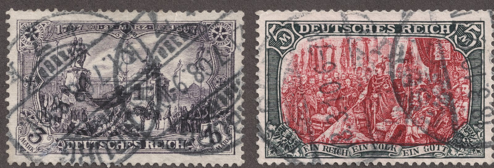
3m black violet to violet gray "Unveiling Kaiser Wilhelm I Memorial, Berlin"
5m slate & carmine "Wilhelm II Speaking at Empire's 25th Anniversary Celebration"

Let's take a closer look...

1900 "Reichspost" Scott 62 carmine rose
"General Post Office in Berlin"
The one Mark denomination illustrated the main Post office in Berlin. The design would be used for the next 21 years. The "Reichspost" label gives this stamp away as the 1900 issue, valued at $1+.

1900 "Reichspost" Scott 63 2m gray blue
"Union of South and North Germany"
The two Mark stamp (CV $5+)  illustrates the unification of north and south Germany. The image shows the allegorical Germania raising the imperial crown over the two warriors of the north and south. "Seid Einig-Einig-Einig!" translates as "We are united-united-united!" (Note: actually "Be united-united-united"; see comment section.)
Michel lists two types, differing in the etching marks in the leaves around the upper right "2 Mark". Illustrated is type I. For more information, consult your Michel catalogue. ;-)
Pay attention to the alternating rays in the sky emanating from Germania. This part of the design will change soon.

1900 "Reichtspost" Scott 64 3m black violet
"Unveiling Kaiser Wilhelm I Memorial, Berlin"
The 3 Mark "Unveiling Kaiser Wilhelm I Memorial, Berlin" stamp is listed by Scott with a valuation of >$40. But Michel actually lists two types (I and II) that can make a difference in worth.  The image shows Type II (Michel valuation $100+): focus on the Kaiser on Horse statue.
At this level of resolution one can spot the (tight) straight reins and the upright posture of the Kaiser. The less expensive type I (Michel valuation $70+) will have a slightly (loose) downcurved reins and the upper back of the Kaiser will be bent backwards slightly.

Actually, I will have much more to say about both the "Reichpost" and "Deutsches Reich" 3 Mark issues in the next blog.

1900 "Reichspost" Scott 65A 5m slate & carmine (Type II)
"Wilhelm II Speaking at Empire's 25th Anniversary Celebration"
Scott lists two types (as does Michel) for the 5 mark "Reichspost" design. The Scott  65A Type II is illustrated above with a "thinner" 5. Also, note the older gentleman (Minister Boetticher) at the extreme lower right of the vignette where one can just see his ear? In Type I (Scott 65), the vignette is shifted slightly so the ear is not visible, and the 5 is "thicker". Values for these stamps range from $300+ (Type II)-$1,200+ (Type I), and I don't have any. ;-)  I am using the image above (from an old auction catalogue) for teaching purposes.

Next, we will review the 1902 issues...

1902 "Deutsches Reich" 1m carmine rose 
Scott 75 (26X17 perforation holes) & Scott 75b (25X16 holes)
The salient points for the 1902 higher denomination stamps:
A) Are labeled "Deutsches Reich", and..
B) Are unwatermarked.
C) All four denominations (1m,2m,3m,5m) are found either with 26X17 perforation holes (Major number 75-79), or with 25X16 holes (Minor numbers). Since the value can change significantly, a wise collector will count the holes with a magnifying glass or a scan. They also differ in perforations (Consult Scott).

The example of the 1m carmine rose above shows both perforation hole types. I found the $25 CV Scott 75b in an ordinary collection, and fortunately did not mistaken it for the more common Scott 75 (CV $2+).

I do not have a copy of the 1902 "Deutches Reich" Scott 76 2m gray blue, but it looks similar in design ( specifically the alternating rays in the sky) to the 1900 "Reichpost" 2m stamp illustrated elsewhere above in this blog. Keep that in mind, as that will change with the next 2m issue.

1902 "Deutches Reich" unwatermarked 26X17 holes
Scott 77 3m black violet & Scott 78 5m slate & carmine
The remaining two denominations for the 1902 issue are illustrated above. Remember they are unwatermarked, and have two perforation hole varieties as outlined for the 1m above.

Of interest, a careful examination of the 5m reveals the '5" is thin like the 1900 "Reichspost" Type II issue, but the ear of the older gentleman (Minister Boetticher) on the extreme lower right of the vignette is missing  like the 1900 "Reichpost" Type I issue. ;-)

"1902 Scott 79 2m gray blue  "Union of South and North Germany"
Notice the sky rays now look cross striped and less defined than the earlier 1902 and 1900 issue
There was a second 1902 2m stamp issue; this time with a clear change in appearance of the sky rays as illustrated above. If you need a visual reminder, check out the 2m "Reichspost" issue image further above. This issue also is unwatermarked, which will help differentiate later 2m issues.

Next, the 1905-1919 issues...

1905-19 wmk "Lozenges" 25X 17 holes
Scott 92,94,95 1m carmine rose, 3m violet gray, 5m slate & carmine
The 1905-19 1m-5m issues are characterized by having a "lozenges" watermark. Then one needs to count the perforation holes. Here they are 25X 17, which makes these stamps major number Scott 92,94, and 95 respectively. The valuations range from $2-$4. ( There is a rare "wartime" 26X17, but unlikely to be found in a generalist's WW collection.)

But we are not done with the 1905-1919 issues...

1905-13 wmk "Lozenges"  26X17 holes
Scott 92b 1m carmine red & Scott 93c 2m bright blue
These are pre-war printings
Again we have "Lozenges" watermarks, which makes these issues 1905 or later. But a measurement of the perforation holes (26X17) marks these as almost certainly a pre-war printing, Scott 92b & 93c. These examples are actually 1906 issues. Valuation is $2-$3. 
One might note the 2m bright blue has the "new" sky rays as first seen with the second 1902 issue. (The difference is this example is watermarked, and hence post 1905.)

One final general comment about the 1905-19 issues: There is a suggestion from Michel that one can also split the issues based on pre-war (fine) or wartime (rough) printings. One of course can do that.

End of 1905-1919 issues

The 1920 issues...

In 1920, Germany produced stamps similar but not identical to the prior issues.  They consisted of a "General Post Office in Berlin" design for the 1m red, 1.25m green, 1.50m yellow brown, and the "Union of North and South Germany" design for a 2.50m lilac rose. Valuations range from <$1-$1+. Because of the differences in colors as well as denominations, there should not be any confusion, except perhaps for the 1m red.

1906 1m carmine red & 1920 1m red
Note the differences!
For fun, we will compare the 1906 "pre-war" issue with the 1920 version. One should note the vignette design for the 1M stayed essentially the same through 1919.
I see differences in the horse and buggy and pedestrians, the sky, the frame design, the numerals, and the fact that the 1920 stamps were produced offset rather than engraved as those before. But be aware that the 1920 stamp is not infrequently mistaken for others, and can be found wandering in various spaces in albums. ;-)

As stated, the 1.25m and 1.50m have the same design, but no where else to go but their own space in an album.

1920 Scott 114 2.50m lilac rose & Scott 144a 2.50m magenta
"Union of North and South Germany" 
The 1920 2.50m comes in several shades, all inexpensive. In fact, deep Blue provides three spaces for the variations. Here, without consulting a color chart are my intrepretations. ;-)

1920 1.25m on 1m green & 1.50m on 1m orange brown
The 1920 issues surcharged
Finally, some of the 1920 issue was surcharged the same year. Examples are as above.

This concludes the "General Post Office and other designs" overview.


Deep Blue
Deep Blue has nine pages for the Germany 1872-1921 issues as presented. I've already included some photos of Deep Blue's pages with stamps, so will not add any here. As per usual, Deep Blue follows the major number sequence of the Scott catalogue. This is unfortunate for the Germania 1905-19 section, as Scott makes a bit of a mess with these issues.  The 1905-13 pre-war Germanias then are given no spaces in Deep Blue. A quadrilled page, however, quickly solved the problem. ;-)

1900 "Reichspost" Germania Scott 54 5pf green ($1 valuation)
But bisect, add 3PF handstamp surcharge, and mail from the German cruiser "Vineta"
And one has a Provisional (1901 Scott 65B) with valuation $7,500!
Big Blue
Big Blue '69 has 103 spaces on three pages for the 1872-1921 German issues. Coverage is 78%.

A couple of comments before getting into the checklist......
A) BB includes 17 of the first 1872 24 Imperial Eagle small & large shield stamps. Very generous. There are also a number of fairly expensive spaces to fill. ;-)
Scott 14 1/2gr violet $70+
Scott 7 1kr green $50+ (least expensive blank space choice)
Scott 2 1/2gr green $35+
Scott 8 2kr orange $35+
Scott 26 18kr bister $35
Seven more stamps $12+-$30

B) There is also spaces for 1872 Scott 12 10gr gray ($50+) and 1874 Scott 27 2 1/2gr on 2 1/2gr brown ($35+)

C) For the 1880 "Pfennig" issues, BB specifies 37b 3pf "green" rather than 37 3pf "yellow green"; 39b 10pf "rose" rather than 39 10 pf "red"; 41a 25pf "red brown" rather than 41 25pf "dull rose brown". My '47 Scott catalogue has the "green" and the "rose" as still major numbers, but the "red brown" was already relegated to a minor number. Clearly, BB needs a major number upgrade.

D) Under the date "1902-11", BB combines the 1902 Germania 10 stamp unwmk issue and the 1905-19 12 stamp Germania wmk issue into 11 spaces. As usual, BB considers watermarking entirely optional. ;-) No parsing of the pre-war and war printings needs to be done either. Counting perforation holes for the 2M-5M issues might be advisable if the collector wants to know what they have.

Simple Checklist

1872
2,3,4,5,8,9,(7),
14,15,16,17,18,20,
21,23,24,26,

1872
12,

1874
27,

1881
36,

1875-77
29,30,31,32,33,34,35,

1880
37b or 37, 38, 39b or 39, 40,41a or 41, 42,

Next Page

1889
46,47,48,49,50,,51,

1900
45,

1900
52,53,54,55,56,57,58,
59,60,61,62,63,

1902-11
65C or 80, 66 or 81, 67 or 82, 68, 69,70 or 85, 71,
72 or 87, 73 or 88, 89,74 or 91,
75 or 92 or 92b, 79 or 93 or 93c, 77 or 94, 78 or 95 or 95c,

1916-19
96,97,98,99,100,101,90*,

1919-20
105,106,107,108,

1920
111,112,113,114,
115,116,117,
118,119,120,121,123,124,125,
126,127 or 169, 128,129,130 or 174 or 210,131,132,

1921
133,134,135,136,

Comments
A) Most expensive stamps ($10 threshold)
Scott 2 1/2gr green $35+
Scott 3 1/2gr red orange $35+
Scott 5 2gr ultra $10+
Scott 8 2kr orange $35+
(Scott 7) 1kr green $50+
Scott 14 1/2gr violet  ($70+)
Scott 15 1/3gr yellow green ($10+)
Scott 20 5gr bister $20+
Scott 21 1kr yellow green $20+
Scott 24 7kr ultra $30
Scott 26 18kr bister $35
Scott 12 10gr gray ($50+)
Scott 27  2 1/2gr on 2 1/2gr brown $35+)
Scott 33 25pf red brown $10+
Scott 34 50pf gray $10+
Scott 35 50pf olive gray $10+

B) *90 75pg green and black is a regular issue Germania at the end of a row of clear background Germanias. Could be confusing. See the pic below.

C) There is much information on these stamps in the blog elsewhere. Please read! ;-)

1919 Scott 90 75pf green & black "Germania"
Out of the Blue
Wow! That was fun. One large gain I accrue from blog researching, scanning and writing is I have a much better grasp on German stamps now. I hope you do likewise. :-)

Note: Map and upload scanning material used for this blog or to illustrate a teaching point appear to be in the public domain.

Links
Germany 1872-1921 - Bud's Big Blue

Would like to hear some comments!