Friday, September 23, 2022

Portuguese Colonies "Crown" issues: Introduction to the Fournier Forgeries


Portuguese India 1880 Scott 69 50r dark blue
"Portuguese Crown"
 Fournier Forgery

Into the Deep Blue

The "Portuguese Crown" issues for the Portuguese colonies offer a challenge for the WW collector.

For Angola, they are found in 12 1/2 Perf (thin to medium paper), Perf 13 1/2, Perf 14 (25r rose), and Perf 12 1/2 (thick paper): altogether 29 bolded numbers in Scott for nine denominations. Reprints (1885, 1905) of these issues on smooth white chalky paper or ivory paper were also produced. 

There are also some minor number color variations.

But all the above is not the real problem. Unfortunately, there are plentiful forgeries. The major players were Fournier and Spiro, but there were others also.

Let's talk about the Fournier forgeries of the "Portuguese Crown" issues for Angola and the other Portuguese colonies.

As it turns out, Fournier first used the Angola "Portuguese Crown" issue for his forgery template. That consequently makes it more difficult to tell Fournier forgeries apart from the genuines for Angola, as they appear ( without close scrutiny and certain signs) to be identical. There will be much more about this later with the next post.

For the other Portuguese colonies, the design of the genuines are somewhat different than Angola's design. But Fournier kept some of the attributes of his Angola forgeries for the other Portuguese colonies forgeries, which makes it easier to spot a Fournier forgery for the other Portuguese colonies.

Let's take a look at a genuine and a Fournier Forgery for Portuguese India, as an example.

Portuguese India 1977 Scott 61 50r yellow green
"Portuguese Crown"; Genuiine

1) Note the solid green circular tablet (with India Portugueza script on it) is below the lower horizontal line of the "Correio" tablet. All genuines of the Portuguese colonies (except Angola) have this characteristic.

2) The clamshell design in the upper right corner (below horizontal line that separates "Correio") has all it's lines intact, creating seven lobes without a line break. This is characteristic for all genuines of the Portuguese colonies (except Angola).

3) The Maltese cross (which has a definite Maltese cross shape) on the crown has a white button in the center, and is attached to the globe below.

4) The line of crown pearls on the sides of the crown are more angular in shape for the Portuguese colonies stamps than the "rounder" line of pearls found for the Angola stamps. This will become clearer as we show more examples.

Now, let's look at a Portuguese India Fournier forgery...

Portuguese India 1877 Scott 60 40t blue
"Portuguese Crown"
Fournier Forgery

The following signs are valid for the Fournier forgeries for all Portuguese colonies, except Angola- which is a special case.

1) Note the solid blue circular tablet (with India Portugueza script on it) intersects heavily with the lower horizontal line of the "Correio" tablet. This is a sign that this is a Fournier forgery for all Portuguese colonies, except Angola. Also note the right upper clamshell appears to also touch the line.
These signs are easily used to separate out the genuines from the Fournier forgeries for all Portuguese colonies, except Angola.

(For Angola, both the genuines and the Fournier forgeries show the circular solid line below the "Correios" tablet to intersect heavily with the lower horizontal line of the "Correios" tablet. Therefore, this sign is not helpful for Angola. The reason this sign is helpful for the other Portuguese colonies is because the genuine design was changed, but Fournier did not change his, after he made the forgery template for Angola.)

2) The clamshell design in the upper right corner (below horizontal line that separates "Correio") has a line broken, specifically creating a large center lobe with a partial center-left thick open line, leaving six intact lobes. This is a sign of a Fournier forgery for Portuguese colonies, excepting Angola. (Angola's situation is complex and a bit confusing. We will address it later with the next post.)

3) The "Maltese" cross on the crown does not have a "Maltese" shape, and is smaller, and sometimes deformed. There is no white button in the center, rather a "hole". Often the cross is detached a bit from the globe. These are all signs we may be dealing with a Fournier forgery. These signs can be found for all the Portuguese colonies AND Angola.

4) For the Fournier forgery, the line of crown pearls on the sides of the crown are "rounder", compared to the angular line shape of the crown pearls in the genuines.  This is true for all the Portuguese colonies stamps, except Angola. 

I think I will show another example of a Portuguese colony "Crown" stamp vs a Fournier forgery, just to make sure we know the differences. (Remember these differences are valid for all Portuguese colonies, EXCEPT Angola.)  Let's look at Mozambique...

Mozambique 1877 Scott 6 25r rose
"Portuguese Crown"
Genuine

1) Note the solid red circular tablet (with Mocambique script on it) is below the lower horizontal line of the "Correio" tablet, or just touches it for a short while. All genuines of the Portuguese colonies (except Angola) have this characteristic.

2) The clamshell design in the upper right corner (below horizontal line that separates "Correio") has all it's lines intact, creating seven lobes without a line break. This is characteristic for all genuines of the Portuguese colonies (except Angola). There is no touching of the horizontal line of the "Correio" tablet.

3) The Maltese cross (which has a definite Maltese cross shape) on the crown has a white button in the center, and is attached to the globe below.

4) The line of crown pearls on the sides of the crown are more angular in shape for the Portuguese colonies stamps than the "rounder" line of pearls found for the Angola stamps. This will become clearer as we show more examples.

Mozambique 1877 Scott 8 40r blue
"Portuguese Crown"
Fournier Forgery

The following signs are valid for the Fournier forgeries for all Portuguese colonies, except Angola- which is a special case.

1) Note the solid blue circular tablet (with Mocambique script on it) intersects heavily with the lower horizontal line of the "Correio" tablet. This is a sign that this is a Fournier forgery for all Portuguese colonies, except Angola. Also note the right upper clamshell appears to also touch the line.
These signs are easily used to separate out the genuines from the Fournier forgeries for all Portuguese colonies, except Angola.

(For Angola, both the genuines and the Fournier forgeries show the circular solid line below the "Correios" tablet to intersect heavily with the lower horizontal line of the "Correios" tablet. Therefore, this sign is not helpful for Angola. The reason this sign is helpful for the other Portuguese colonies is because the genuine design was changed, but Fournier did not change his, after he made the forgery template for Angola.)

2) The clamshell design in the upper right corner (below horizontal line that separates "Correio") has a line broken, specifically creating a large center lobe with a partial center-left thick open line. (This is obscured here because of the cancel). This is a sign of a Fournier forgery for Portuguese colonies, excepting Angola. (Angola's situation is complex and a bit confusing. We will address it later with the next post.)

3) The "Maltese" cross on the crown does not have a "Maltese" shape, and is smaller, and sometimes deformed. There is no white button in the center, rather a "hole". Often the cross is detached a bit from the globe. These are all signs we may be dealing with a Fournier forgery. These signs can be found for all the Portuguese colonies AND Angola.

4) For the Fournier forgery, the line of crown pearls on the sides of the crown are "rounder", compared to the angular line shape of the crown pearls in the genuines.  Also, some of the pearls may be smaller. This is true for all the Portuguese colonies stamps, except Angola. 

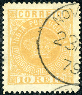
Portuguese India 1877 Scott 57 10r yellow
"Portuguese Crown"
Fournier Forgery

Out of the Blue

I hope this introduction to the "Crown" Fournier forgeries for the Portuguese colonies, other than Angola, was helpful. Actually, in most cases, other than Angola,  determining these Fournier forgeries is not too difficult.

Also, I should mention that Ron of Classic Stamp Forgeries website fame, has recently updated his "Portuguese Crown" Genuines & Forgeries post. He has lots more examples of Fournier forgeries and other forgeries for the Portuguese colonies. Check it out!

But we have left the challenging determinations for the next several posts, where we will be looking at Angola. There, we not only encounter the Fournier forgeries, but also Spiro forgeries, and other more obscure forgery examples. Then there are the "borderline" examples where it is difficult to tell for sure if genuine/forgery. 

Stay tuned. 😎

Comments appreciated!

Thursday, September 15, 2022

Orange Free State (Orange River Colony) - Buds Big Blue

Orange Free State, Scott # 43, ultra, overprint #6
Bud's Big Blue
Bud's Comments 

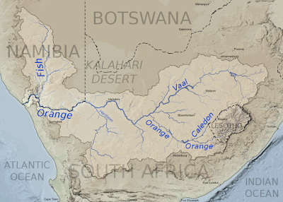
Orange Free State (OFS) didn’t get its name because oranges grow there, although there they do grow in great profusion. Nor did the Orange River get its name because of its muddy, orange-colored flow, although orange it is for much of its westward 1511-mile course across South Africa, from Lesotho’s mountains to the Atlantic. Even a fish species is named after its mud.

Map of the Orange River (1)

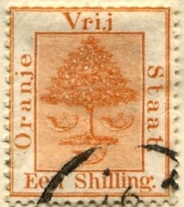
Moreover, the triangular topiary orange tree design that appears on all Orange Free State stamps doesn’t look anything like the orange trees that grew in Orange Free State. And, contrary to what some stamp experts and many collectors think, the three horns dropping from the orange tree are not post horns.

Orange Free State, Scott # 10, orange

Why the seeming deception? The explanation is straightforward.

In fact, the image on these stamps isn’t meant to depict anything African at all. It’s a thoroughly European design.

Robert Jacob Gordon, a Dutch explorer and nature artist, named the river “Orange” in 1799 after the Dutch House of Orange, a European dynasty that traces its lineage to the medieval principality of Orange in Provence, southern France. Later, the river lent its colorful name to the government formed in 1836 by the Trekboers (Afrikaners, staunch Calvinists farmers – Dutch, French, German). In 1824, Trekboers arrived in what became Orange Free State (OFS) from Cape Colony in search of pastureland for their cattle. The Boers’ subsequent “Great Trek” increased their numbers rapidly.

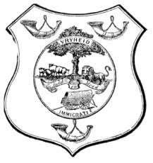
By 1854 the Boers were bold enough to ask King William III of The Netherlands to give them a proper coat of arms and a flag, even though OFS was not a Dutch colony. The King complied and, being of the House of Orange, he bequeathed them the heraldry of that heritage. The stamps’ orange topiary is reminiscent of the carefully coiffured shrubbery that European royalty grew in their glass-enclosed orangeries. The three “buglehorns” come from an old House of Orange emblem and have no association with mail delivery.

Arms of Oranje Vrijstaat, from the Government Gazette, 1863 (1)

Delighted with their fanciful coat of arms, the Boers garnished their stamps, coins, magazines and documents with all or parts of the design, especially the orange tree with a pruned lower branch. I suppose it helped legitimize their defiant existence in remote Africa.

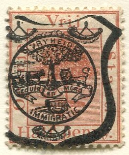
OFS penny, 1894 (2)

A variation was used as a hand-stamped precancel on postcard stamps.

Postcard stamp, Gibbons #P5, mauve

Postcard stamp, Gibbons #P1, red brown

By the end of the 19th Century, what had started out as friendly relations between the British and the Boers turned sour and the 2nd Boer War ensued. The British ultimately won by using a brutal scorched earth strategy. As a result, OFS was renamed Orange River Colony (ORC) in 1900 and “V.R.I” (Victoria Regina et Imperatrix) was overprinted on remaining supplies of OFS stamps. 

Orange River Colony, Scott #s 47 and 48, ultra

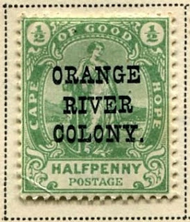
When these ran out, overprinted Cape of Good Hope stamps were placed in service. Then, after the Peace Treaty of Vereeniging was signed in 1902, standard British colony designs were issued featuring the crowned Edwardian profile flanked by African animals, a gnu and a tommie (Thompson gazelle).

Orange River Colony, Scott #54, green

Orange River Colony, Scott #s 68 violet and carmen and 69 bister and carmen

South Africa stamps were used after the colony became the Orange Free State Province within the Union of South Africa, 1910. As a tribute to Trekboers, though, South Africa continued issuing orange topiary stamps until the 1950s. Half of them have the Afrikaans inscription “Suidafrika” at the top; all have a nipped off lower branch, as on the original House of Orange emblem. Anomalies and variations sprouted like orange tree buds.

South Africa, Scott #60, red orange and green

After South Africa’s state-enforced apartheid was dismantled (1993-94), the province was renamed Free State, dropping its imaginary connections with the House of Orange. Orange River retains its original name - and its orange color, too, thanks to diamond prospecting, farming, and elephant wallowing.

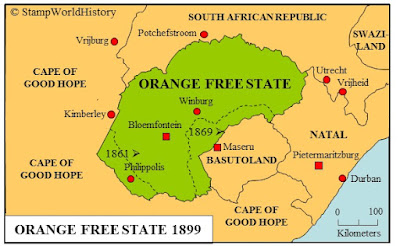
Map of Orange Free State, now known as Free State (4)

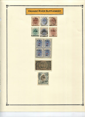
Census: 31 in BB spaces, 12 on supplement page.

(1) Map Credit: Keenan Pepper - Own work, CC BY-SA 4.0, https://commons.wikimedia.org/w/index.php?curid=66101365

(2) Photo credit: OFS Archives.

(3) Photo credit: https://www.ngccoin.com/price-guide/world/south-africa-orange-free-state-penny-x-pn1-1874-cuid-1101652-duid-1559932

(4) Map salvaged from Gerben Van Gelder’s now sadly defunct "Stamp World History" web site.

Orange River mudfish (5)

(5) Photo credit: https://paracaddis.wordpress.com/tag/orange-river-mudfish/


Jim's Comments

Big Blue '69, has Orange River Colony (Orange Free State) on one page, with 31 spaces. Coverage is 41%. The page is  located between "Oltre Giuba" and "Palestine".

The 40s BB editions have Orange River Colony located between "Panama" and "Papua". There are only 22 spaces on 2/3 page in those editions.

True-  the '69 editors cut out a number of smaller countries and BOB issues. But, in other cases (such as here), there is better coverage. ;-)


Page 1


1a


1b


1c


Supplements
Page 1


Comments appreciated!
Tuesday, September 6, 2022

Recent Acquisitions Update - United States


USA Air Post 1930 Scott C15 $2.60 blue
"Zeppelin Passing Globe"
Into the Deep Blue

The June 13th post for this year featured some U.S. stamps I acquired recently....

Recent Acquisitions - United States

One of the comments following stated that the "acquisitions" posts were their favorite type.

Well, I have another one. 😎

Our local stamp club had a "club donation auction" that consisted of donated stamps/albums. All money raised would support club expenses. This time, the items were again U.S., and some of them were quite impressive. I bid on the following, and managed to obtain them at ~25-38% CV.

USA 1869 Scott 121 30c ultramarine & carmine
"Shield, Eagle and Flags"

The 1869 issue is notorious for being off-center, so I was pleased to get this very fine specimen. CV is $375 (2021 catalog), and bidding, starting at $60, was spirited. I had already had lost the 1869 Scott 116 10c yellow "Shield and Eagle" when bidding reached 3x the minimum bid, so I was happy when my friendly competitor dropped out this time.  Of interest, the CV in 2011 was $525, so there has been some softening of CV prices.

USA Scott 229 90c orange "Perry"

As mentioned before, I have a U.S. collection, but since my focus is classical WW, I only obtain a U.S. classical stamp when serendipity occurs. 

The 1890 regular issue was printed by the American Bank Note Company, and is characterized by no triangles in the upper corners.  The triangles are found in the similar Bureau Issues of 1894 & 1895.

And the 1890 90c orange "Perry" became the $1 black "Perry" for the 1894 & 1895 issues.

I didn't have the 90c "Perry" (CV $130 (2021)), and, fortunately,  it got knocked down for me.

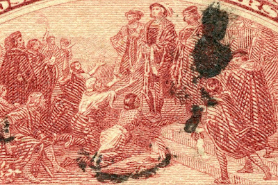
USA 1893 Scott 242 $2 brown red
"Columbus in Chains" 

I, like many collectors, had the 1893 Columbians up to the 50c denomination for many years. Then I obtained the $1 value, as shown on my June 13th post. I thought I was done, as the Dollar values do not come my way very often. 


Yet here was a fine $2 Columbian Expo on the auction docket. This $2 stamp had a production run of 45,000 stamps - as opposed to the 2c Columbian @ 1. 4 million (30X). The CV was $525 (2021 catalog), but 30% CV was enough. My 2011 catalog had the CV @ $625, which  again shows some softening of prices has occurred this last decade.

USA Air Post 1930 Scott C15 $2.60 blue
"Zeppelin Passing Globe"

Now this is interesting. The June 13th post reveals I finally obtained a Zeppelin: the C13 65c green.

Collectors often evaluate a U.S. collection by flipping through the album and stopping by the Zeppelin spaces. Now I had one. Great! - but I didn't expect any more. After all, the numbers of Zeppelins produced for the two higher values was a low 60-70 thousand, and the CV was $$$.

Yet, the auction had a very nice C14 $1.30 brown (CV $260) and a C15 $2.60 blue (CV $525) on the list.

A bidding competitor quickly snapped up a C13. But I already had that stamp, so O.K.

Then a spirited back and forth for the C14: I dropped out - too rich for me.

The "very fine" C15 came up. Again, a sword fight. But I think he had spent more than he wanted already for the C14.  I couldn't believe it. One of the iconic U.S. stamps was mine. 

Closeup of C13 from June 13th post
Out of the Blue

Hope you enjoyed this light hearted (but wallet draining) post. 😎

Comments appreciated!