Saturday, April 23, 2022

Egypt 1872 & 1874-75 Issues: 2pi, 2 1/2pi, & 5pi Differences?

1872 Scott 25 5pi green "Sphinx and Pyramid"
Clear Impressions, Thick Opaque Paper
Perf 12 1/2 X 13 1/3 Clean Cut 

Into the Deep Blue

The higher denominations (2pi, 2 1/2pi, 5pi) for the 1872 & 1874-75 printings pose their own identification challenges. But unlike the preceding post in this series ( 20pa, 1pi), there are no lithographic stamps to consider; They are all typographic.

Alas, the color differences between printings for the 2pi, 2 1.2pi & 5pi, although there are indeed some, are not enough for absolute identification. Therefore, one may need to lean on careful perforation measurement as a primary tool for identifying the printings. 

For the 1872 printing, all three values considered here come as Perf 13 1/3 clean cut, and are not found in this perf combination for the 1874-75 printings. For the 1874-75 printing, all three values considered here come as Perf 12 1/2 rough, and are not found in this Perf for the 1872 printing. In addition, the 1874-75 printing has a Perf 13 1/3 X 12 1/2 rough for the 2pi value which is exclusive to the printing.

Then there is the general differences between 1872 and 1874-75 printings which are helpful (Clear impressions vs blurred impressions; Thick Opaque paper vs Thinner paper; Clean cut perfs vs rough cut perfs).

Unfortunately, the common 12 1/2 X 13 1/3 Perf is found for all three values considered here in both the 1872 & 1874-75 printings. That, clearly, will make it more difficult to identify these Perf stamps. (Perhaps "clean cut" vs "rough" perfs might help: not so much - see comments further below.)

Fortunately, Peter A.S. Smith (Egypt: Stamps and Postal History: A Philatelic Treatise, 1999) points out some constant changes seen in the plates between the 1872 & 1874-75 printings that will be most helpful indeed.

Lets begin, but if you haven't already read the preceding blog posts in this series, you should do so now, as much valuable information resides there.


1872 Scott 23 2pi dull yellow
Clear impressions; Thick Opaque Paper
Perf 12 1/2 X 13 1/3 Clean-cut
Color: Yellow 
This is Scott 23 (this example and the next one) with unique perfs for the 1872 printing. CV is $15/$100.

Before we talk about more important variables between the 1872 & 1874 printings, let's look at color. 
Scott has "dull yellow" for the 1872 printings; "yellow" for the 1874 printings: SG has "chrome yellow for the 1872 printings, and "yellow" for the 1874 printings: Michel has "chrome yellow" for the 1872 printings; "yellow" for the 1875 and later printings. (Interestingly, Michel says November, 1875 for "yellow" for the later printing, but Smith states the earliest postmark for the later issue was December 2, 1874. Is Michel wrong, or was there a subtle color switch a year into the later printing?)

Smith states the colors for the 1872 issue are "yellow", and, for the 1874 issue, "yellow to chrome yellow". I trust Smith's evaluation the most. For myself, I don't see much color differences between the 1872 & 1874 printings, other than some stamps are a bit orange-yellow, which might be die to oxidation of the color. Unfortunately, I don't think color evaluation will be helpful in parsing out the 1872 & 1974 printings. 

1872 Scott 23 2pi dull yellow, Example 2
Clear impressions; Thick Opaque Paper
Perf 12 1/2 X 13 1/3 Clean-cut
Color: Yellow 

I also think we will need to rely heavily on Perf measurements for the 2pi yellow stamps. 

Why? For myself ( and I think for others), a "yellow" stamp is hard to evaluate for "clear" or "blurred" impressions. The state of the stamp does not pop out, due to the yellow color. 

Also the "clear-cut" vs "rough" state of the Perfs do not show as much difference for the higher values (2pi, 2/12pi, 5pi) as the lower values. Many of the perfs for the 1874 printing actually look rather "clean-cut". Perhaps they took more care cutting the perfs for the higher values? Also, Smith states "Distinction on the basis of clean-cut vs rough perforations are not reliable for the three higher values".

The 1872 printing for the 2pi was 360,000 stamps (1800 sheets), and for the 1874 printing, 800,000 stamps (4000 sheets). What was the 2pi stamp used for? According to Smith: "The 2pi stamps were used  to frank double-weight letters or single weight letters traveling between Egypt and the Consular offices. They were also needed to pay the registration fee on internal letters until April 1st, 1878".

1872 Scott 23a 2pi dull yellow
Clear Impression, Thick Opaque Paper
Perf 13 1/3 clean cut (Unique to 1872 Issue)
Color: yellow

This Scott 23a (and the next example below) are Perf 13 1/3, which is unique to the 1872 printing. CV is $4.50/$20.

Despite the yellow color, it is obvious that this stamp has a very clear impression. The quite early postmark would argue that too, in addition to confirming this is a 1872 issue (provided the postmark is not fake - although why would one ruin a more valuable unused to make a used?  ;-).

1872 Scott 23a 2pi dull yellow, Example 2
Clear Impression, Thick Opaque Paper
Perf 13 1/3 clean cut (Unique to 1872 Issue)
Color: yellow

I have been holding back one of the most important ways to separate out the 1872 & 1874 printings until now. :-)

It turns out there are some Die characteristics that are markers respectively for the 1872 & 1874 printings.

1874 Scott 23b 2pi yellow
Blurred impressions, Thinner paper
Perf 12 1/2 rough (Unique for 1874 printing)
Color: yellow to chrome yellow (shades)

The 1874 Scott 23b (This example and the next one below) has Perf 12 1/2, which is unique for the 1874 printing. There is some roughness to the perfs in this example. CV is $5.75/$90.

Recall that the earliest postmark for the 1874 2pi found so far is December 2, 1874. That means if you have an earlier  postmark on a 2pi, the stamp should be a 1872 printing.

Now, what is the Die difference between the 1872 & 1874 printing?

Top/Bottom: 1872 Scott 23/ 1874 Scott 23b
Example One

For the 1872 printing, The left hand Arabic character (next to the "2") in the top inscription is one complete shape, resembling an inverted "V" with a horizontal line on top. For the 1874 printing, the character is three separate components, consisting of a line and two dots below. (I am going to show you plenty of examples, so it should become clear, if it isn't for you at the moment.)

1874 Scott 23b 2pi yellow, Example 2
Blurred impressions, Thinner paper
Perf 12 1/2 rough (Unique for 1874 printing)
Color: yellow to chrome yellow (shades)

How did the Die change happen? Smith states: "The die for the 2pi apparently underwent a small touchup before the stereos were cast. At the left end of the top panel, the last Arabic letter should have a pair of dots below the horizontal stroke, but on the 1872 stamps there is instead a clearly defined inverted V. This was corrected on the die."

Top/Bottom: 1872 Scott 23/ 1874 Scott 23b
Example Two

This comparison should be easier to see, as there is no postmark ink obscuring the difference.  Note the horizontal stroke with an attached inverted "V" below for the 1872 printing, while the 1874 printing has a fat horizontal stroke with two separate dots below?

1874 Scott 23c 2pi yellow, 
Blurred impressions, Thinner paper
Perf 13 1/3 X 12 1/2 rough (Unique for 1874 printing)
Color: yellow to chrome yellow (shades)

The Scott 23c (This example and next one below) has a unique 13 1/3 X 12 1/2 Perf, which should help to place the printing. The perfs do appear a bit rough along the lower horizontal edge.  CV is $6.25/$10.

Top/Bottom: 1872 Scott 23a/ 1874 Scott 23c
Example One

Another comparison. Hopefully, you are spotting the differences now.

1874 Scott 23c 2pi yellow, Example 2
Blurred impressions, Thinner paper
Perf 13 1/3 X 12 1/2 rough (Unique for 1874 printing)
Color: yellow to chrome yellow (shades)

OK, let's re-capitulate the major differences for the 2pi 1872 & 1874 printings.

1) Careful Perf measurements are important, because Perf 13 1/3 is unique for the 1872 printing, while Perf 12 1/2  and Perf  13 1/3 X 12 1/2 are unique for the 1874 printings. However, Perf 12 1/2 X 13 1/3 are found for both the 1872 & 1874 printings with the 2pi, 2 1/2pi & 5pi values. The 1875 Scott 23d 2pi yellow (CV $17/$80) and the 1872 Scott 23 (CV $15/$100) have the same perfs. (Note: I don't have a copy of Scott 23d.)

2) Look for the 2pi Die difference between the 1872 & 1874-75 printings. There is another comparison below, if you need more work on this. This is the "secret" that you have learned by reading this blog post. ;-) Why not use it?

3) The other features that distinguish the 1872 & 1874 printings are of variable help with the 2pi yellow stamp (Clear vs Blurred; Thick Opaque paper vs Thinner; Clean cut perfs vs Rough perfs). These can certainly assist to confirm the correct printing.

Top/Bottom: 1872 Scott 23a/ 1874 Scott 23c
Example Two

Last 2pi Die comparison example: I think of the 1872 Arabic character as looking like "Running Man", while the 1874 Arabic character is obvious with the two lower dots. What is good is, if you are buying this stamp and it is illustrated, you should be able to determine the printing before purchase.

1872 Scott 24 2 1/2pi dull violet
Clear impressions, Thick Opaque paper
Perf 12 1/2 X 13 1/3 clean cut
Color: slate violet (pale to deep)

The 2 1/2pi has its own challenges in determining the difference between the 1872 printing and the 1874 printing.

Color is a bit too close between the printings to be helpful. Scott has "dull violet" for the 1872 printings, and "deep violet" for the 1874 printings. SG has "violet" for all the printings. Michel has "dark violet" for the 1972 printings; "dark violet to gray violet (Nov, 1875) for the 1874 printing. Note the first postmark for the 1874 printing was November 15, 1874. (A stamp with a postmark prior should be a 1872 printing.)

Smith has "slate violet (pale to deep) for the 1872 issue; "slate violet" for the 1874 issue (a rare "reddish-slate violet" color can be found, most frequently on the 1878-79 provisionals).

Quantity of stamps issued for the 2 1/2pi are 20,000 for the 1872 printing; 500,000 for the 1874 printing. There was much more for the 1874 printing, as the 2 1/2pi could then be used for simple letter mail to Italy, or two 2 1/2pi stamps (5 pi total) for mail to Great Britain.

The Perf here (for the stamp above) is 12 1/2 X 13 1/3. This can be found for the 1872 printing (Scott 24 CV $25/$95) or the 1874 printing (Scott 24d CV(1875) CV $20/$80).  The perf for 1872 is "clear cut", and the perf for 1874 is "rough", but that is not always reliable, according to Smith. The stamp above does have decent perfs on three sides, with not great perfs on the right side. 

But here is, fortunately, another marker to evaluate.

1872 Close-up Scott 24 2 1/2pi
Perf 12 1/2 X 13 1/3

Smith states: "for the 1874 printing, the 2 1/2pi was not touched up, but it suffered minor damage to the shading of the left face of the pyramid at about the level of the eye.  The fact that this feature does not show up on any of the other values which shared the same center Die implies that the plate for the 2 1/2pi was the last to be made." 

As you will see in a bit when I show some 1874 printings, this 1874 change shows the left eye ink of the Sphinx smearing over into the left side. This stamp close-up (above) does not show the sign, so this is probably a 1872 printing.

I should mention that there are 1872 13 1/3 perfs, but they are extremely rare for the 2 1/2pi stamp. CV is $800 unused. Smith states " 2 1/2pi Perf 13 1/3 is a major rarity and is the rarest Egyptian stamp that is not an error or variety". He also states that he has never seen a genuine "used" for this, although catalogues do value "used" @ $225. 

1872 Scott 24 or 1874 Scott 24b?
Perf 12 1/2 

Now this stamp poses a question.

It has most of the characteristics of a 1872 printing, except it has Perf 12 1/2. This perf is ordinarily found with the 1874 printings as Perf 12 1/2 "rough" (Scott 24b CV $6.25/$9.25).  The 1872 Scott 24 is CV $25/$95. 

Close-up 1872 Scott 24 or 1874 Scott 24b?
Perf 12 1/2 

The close-up shows no significant smearing of the eye ink toward the left side. Is this a 1872 printing? For the Perf 1 2/12 (ordinarily seen with 1874 printings), Smith states, for the 1872 printings, "As an exception, stamps are sometimes found with other combinations of gauge such as 12 1/2 X 12 1/2 X 12 1/2 X 13 1/3".

So, is this a 1872 or 1874 printing? It could be a 1872 printing, based on the fact that Perf 12 1/2 exists (although rare). But, perhaps this "smeared eye" sign for 1874 stamps is not universal, and this stamp is in fact a 1874 stamp.

1874 Scott 24d 2 1/2pi deep violet 
Blurred impressions; Thinner paper
Perf 12 1/2 X 13 1/3 rough
Color: Slate violet

Here is a rough perf, blurred impression Perf 12 1/2 X 13 1/3 stamp. Should be Scott 24d (CV $20/$80).

Close-up 1874 Scott 24d 2 1/2pi 
Note Left eye ink smears over to the left

I think this stamp shows the "left eye smeared" marker for the 1874 printing, to say nothing about the overall blurred impression.

1874 Scott 24d 2 1/2pi deep violet, Example 2 
Blurred impressions; Thinner paper
Perf 12 1/2 X 13 1/3 rough
Color: Slate violet

Here is another example of what appears to be 1874 Scott 24d, although admittedly, the perfs do not meet the "rough" criteria. 

Close-up 1874 Scott 24d 2 1/2pi, Example 2 
Note Left eye ink smears over to the left

This shows the "Left eye ink smear" sign. Example 2 is not as blurred overall as Example 1. 

Overall, the evaluation of 2 1/2pi stamps for 1872 vs 1874 printings is not as satisfying as the 1pi stamps.

If one has a 12 1'2  perf, it has a large probability of being a 1874 stamp. (But I showed an example where it could be a 1872 stamp, based on other criteria.)

One will probably not encounter a Perf 13 1/3 2 1/2pi 1872 stamp, as they are rare.

The Perf 12 1/2 X 13 1/3 stamps are found in both 1872 and 1874 printings. One will then need to double check other criteria listed below.

1) Is the image clear or blurred? (Judgement call in some cases.) I should mention that an "oily appearance" almost always means a 1874 printing.

2) Are the perfs clean-cut or rough? (Again, judgement call, and not all that reliable, according to Smith.)

3) Color? - not that helpful.

4) "left smeared eye" sign for 1874 printings - very helpful, but I wonder if this sign is universal for 1874 printings?

1879 Scott 29 5pa on 2 1/2pi dull violet
Perf 12 11/2 rough

Finally, I will show the provisionals of 1879, which used the 2 1/2pi stamp.

1879 Scott 28 10pa on 2 1/2pi dull violet
Perf 12 1/2 rough
You will note that the color here for the 10pa on 21/2pi is a dark violet, while the  5pa on 2 1/2pi is more of a light dull violet. Recall that there is a "reddish-slate violet" color, that is rare, but found more frequently on the provisionals.

1872 Scott 25 5pi green "Sphinx and Pyramid"
Clear Impressions, Thick Opaque Paper
Perf 12 1/2 X 13 1/3 Clean Cut 
Color: Bright green

The colors for the 5pi 1872 & 1874 printings are close enough, that the minor differences are not that helpful. And the catalog colors disagree with each other (Scott vs SG/Michel). Scott has "green" for the 1872 printing; "yellow green" for the 1874 printings. SG has the opposite: "yellow green" for the 1872 printings; "green" for the 1874 printings. Michel follows SG color scheme. 

Smith has "Bright green" for the 1972 printing; "yellow green to bright green" for the 1874 printing.

The earliest first postmark for 5pi 1874 printing is November 2, 1874. (A stamp with a postmark prior should be a 1872 printing.) 

Production for the 1872 printing was 30,000 stamps, and 90,000 stamps for the 1874 printing.

The 1872 Scott 25 (shown above) is CV $35/$325.  The Scott 25a - Perf 13 1/3 ( I don't have) is CV $75/$375.

1874 Scott 25b 5pi yellow green
Blurred  Impressions/Thinner paper
Perf 12 1/2 Rough
Color: yellow green to bright green

The Perf 12 1/2 is unique for the 1874 issue, and Scott 25b (CV $22.50/$65) is usually what people have in their collections for the 1874 issue. Yes, there is the Scott 25d with Perf 12 1/2 X 13 1/3, and can be confused with the 1872 stamp (Scott 25) of the same perf, except the Scott 25d is CV $300/$375, and so fairly rare.

So, besides the usual differences (clear vs blurred impressions, paper, clean cut vs rough perfs), are there other differences?

Yes, there was some slight damage to the 5pi Die in the side panels, and some touch-ups.


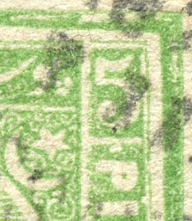
Close-up Right Upper
1872 printing top; 1874 printing bottom

The major differences are...

1) For the 1872 printing, there is a white dot above the "P" of PIASTER in the right side panel. This is altered significantly or absent for the 1874 printing.

2) The thin frameline above the upper right numeral "5" is bent downward slightly for the 1874 printing. (Unfortunately, I don't even see the thin frameline in my 1874 example I show here. (plate wearing?))

3) In the 1872 printing, the top frameline is horizontally split ( a colorless gap) along the entire frameline. The 1874 printing shows the frameline filled in (solid).

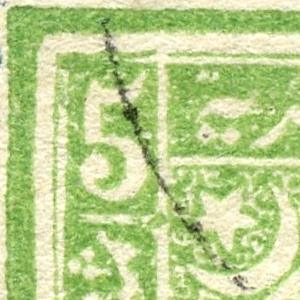
Close-up Left Upper
1872 printing top; 1874 printing bottom

3-repeat) In the 1872 printing, the top frameline is horizontally split ( a colorless gap) along the entire frameline. The 1874 printing shows the frameline filled in (solid).

4) Left side inscription panel framelines  deformed at top "north-east" junction in 1874 printing (Small spur protruding in upper right corner).  Absent in 1872 printing. 

These changes between the 1872/1874 printings specific to the 5pi are quite helpful in determining which printing one has. And, remember, to carefully check perfs, as that is also very helpful.


Out of the Blue

Well, if you are this far - congratulations!...there was a lot of information here to digest, as well as information in previous posts.

I think the 1872 & 1874 printings are no longer scary. ;-)  

Comments appreciated!

Friday, April 15, 2022

North Ingermanland - Bud's Big Blue


North Ingria Republic coat of arms

Bud's Big Blue
Bud's Observations

The largest country in the world, Russia, has a long history of troubling its neighbors. As I begin writing this post, Russia’s bombs are falling on Ukraine, although their ill-prepared ground troops appear to be floundering. Optimism about negotiations is fading.

I’m struck by the similarities between Russian atrocities in Ukraine and those that Bolsheviks heaped on Ingria a century ago.  

Ingrian Russia and the North Ingria Republic (1)

The Ingrian Finns did not want to be Russian but, in 1919, they found themselves under Bolshevik control. A few Lutheran farmers in a northern tip of Ingria, about 60 kilometers from St. Petersburg (see map), managed to secede and form a republic. It lasted less than two years. They hoped to join Finland, but it never happened. The Treaty of Tartu between Finland and Russia (1920) ended that dream and, in the following decades, a genocidal nightmare ensued. There were approximately 130,000 Ingrian Finns in 1919; today they number fewer than 21,000 (2).

The short-lived republic did, however, leave a philatelic record. Big Blue provides spaces for nine of their 14 stamps under the heading “North Ingermanland”, a Swedish designation for the territory. They also created other legitimizing marks for their breakaway state -- coat of arms (above), flag, anthem, army, navy, military uniform, military awards, legal court, and newspaper (3). Kirjasalo, in 1919 a village of fewer than 500 residents, now abandoned, served as the capital.

North Ingria military medal

The coat of arms and the military award bear the same design as the first North Ingria Republic stamps, which have a striking similarity to the first stamps of the Finnish Republic.

Finland Scott #s 99 violet and 102 red orange, 
North Ingermanland Scott #s 3 bister and 5 carmine and black

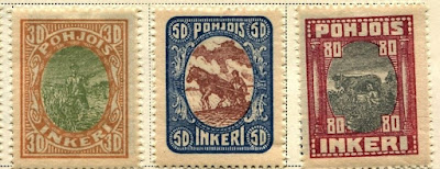
Vignettes on higher value stamps depict everyday country life – plowing, reaping, sowing seeds, milking a cow, playing zithers.

Scott #s 9, 10, and 11

Interestingly, the 5 Markka stamp shows a church with a toppling steeple. I cannot find a record of the specific church tragedy, but surviving descendants of the Inger Finns recall churches being destroyed by the Soviets and priests being imprisoned and executed (4).

Scott #13 dark violet and dull rose

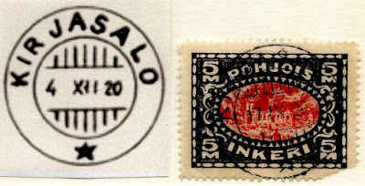
Legitimate postmarks are scarce and many of those found in today’s market were struck as CTOs after the North Ingria Republic ceased to exist. The one in my collection appears to be on a genuine stamp, but I’m unsure whether it’s a CTO or not. The Kirjasalo cancel is dated 17 September, 1920, about a month before the Treaty of Tartu was signed.

Kirjasalo cancel on Scott #13

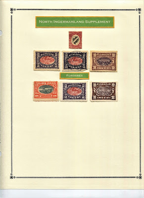
Forgeries, of course, abound. Jim offers some clues for detection (here), the easiest of which is the genuine cream-colored paper as opposed to white. Forgers, despite their chicanery, have helped keep the memory of the North Ingria Republic alive.

As I wrote this post, a plan for a small tribute to North Ingrian survivors occurred to me. I decided to buy a few stamps from a dealer in Kyiv, even as the bombs were dropping. I found the dealer thanks to an online auction and sent the payment after I received her invoice. Ukraine Post provides excellent tracking service and apparently my stamps safely are on their way. One of those I bought shows the Russian warship Aurora being attacked, so it seems, by a Ukrainian Trident. It’s a Russian stamp overprinted in Kyiv when Ukraine broke away from Russia (1992). The Aurora, now a naval museum, is permanently docked at St. Petersburg in what was formerly North Ingria.

Russia Scott #5724 (1988) 
with Kyiv local overprint (1992), the Cruiser Aurora

Census: nine in BB spaces, seven on supplement page including three fakes.

1) Map salvaged from Gerben Van Gelder’s now sadly defunct "stamp world history" web site

Jim's Observations

Thanks Bud for your thoughtful idea of purchasing stamps from a dealer in Kyiv. 

Regarding the uprising, the reality was the only area the Regiment controlled in Russia was Kirjasalo, and the "Kirjasalo Post Office" was actually located in an office room of the railroad station at Rautu, just across the Finnish border!

For more on forgeries, see my blog post link below.


Page 1


Supplements
Page 1


Comments appreciated

Wednesday, April 6, 2022

Egypt 1872 ( Litho /Typo) & 1874-75 (Typo) Issues: 20 Paras & 1 Piaster Differences?


1875 Scott 22b 1pi vermilion
Perf 12 1/2 Rough
Blurred Impressions, Thinner paper
Color: Scarlet to Vermilion (shades)
All 1875 printings are Typographed

Into the Deep Blue

This blog post will look at the 20 Paras and 1 Piaster denominations for the 1872 and 1875 printings.

These denominations are the only ones within the 1872 issue that were printed both lithographically and with typography. For the collector, the lithographic stamps are rarer (20 Paras: $65-$80 vs $4.75-$22; 1 Piaster: $20-$50 vs $2.25-$4).   That means it is much more difficult to find them. And then, when one is on sale, is it in fact a lithographic specimen? (Dealers and collectors are terrible at this: many purported Litho specimens are in fact Typo.) Reality is, if I have a specimen I think is Litho, even with all the knowledge shared in this post, I would need to send for a Cert to feel absolutely comfortable.

But, comparing the more common typographic specimen printings of 1872 and 1875, is there a surprising pearl of advice I can give at the outset that will separate them out nicely?

Yes! Color!

The typographed 20 Paras for 1872 are Prussian blue, while the 1875 examples are commonly slate-blue to grey-blue.

The typographed 1 Piaster for 1872 is rose red to deep rose red, while the 1875 examples are scarlet to vermilion (shades).

That is enough of a color difference so one can almost always place the stamp into the correct printing based on color alone. (Of course, recommendation is to also check other confirming signs.)

(Now, for color, the 1872 lithographic stamps versus the 1872 typographic stamps is a different kettle of fish ( more color possibilities for lithographic stamps), and we will get to that further along the blog post.)

By the way, the postal authorities did not plan in an intentional way to change the colors of the 1875 printing compared to the colors of the 1872 printing. It just happened to some stamps. The happy result is, for the 10 Paras, 20 Paras, and 1 Piaster stamps, there is enough color drift found within the 1875 printings compared to the original 1872, that this can be used to place the stamp into the correct printing.

Before we get started in detail on the 20 Paras and 1 Piaster differences, if you haven't done so, I recommend reading the prior blog post in this series to get you up to speed.

What are the differences between the 1872 and 1874-75 stamps for Egypt?

1972 Scott 21 20pa blue
Perf 12 1/2 X 13 1/3 clean cut
Clear Impressions, Thick Opaque paper
Color: Prussian Blue

Peter A.S. Smith (Egypt- Stamps and Postal History- A philatelic History 1999) states that the 20 Paras stamp is the most complicated of the issues. He has a number of pages detailing plate flaws and other details. For instance, there was a Stone A and a Stone B. The bottom frameline is partially split with Stone A, while the frameline was redrawn for Stone B. 

I should mention that, for both the 20 Paras and the 1 Piaster, the lithographic stones were made from transfers from the typographic plate.  So flaws on the Typos can be matched with their Lithographic counterparts. Consequently, there is basically no difference between a typographic stamp and a lithographic stamp, except for the process itself (The Litho process, and what it does to the stamp vs the Typo process and what it does to the stamp). 

Production was 440,000 stamps (2200 sheets) for the 1872 20pa stamps.

The 20pa denomination served no particular postal rate, but often paid fees for postal orders With the formation of the UPU in 1874, it paid the foreign rate for printed matter up to 50g.

1972 Scott 21 20pa blue, Example 2
Perf 12 1/2 X 13 1/3 clean cut
Clear Impressions, Thick Opaque paper
Color: Prussian Blue

The Prussian blue color is so distinctive for the 1872 issue, that there should be little worry in placing these stamps correctly. Once more, the 12 1/2 X 13 1/3 Perf (Scott 21 CV $4.75 used) and the 13 1/3 Perf (Scott 21a CV $22 used) are unique for the 1872 20pa stamps.

The worry is, that one would like to know if the 20pa stamps one has are Typo or Litho..

1872 Scott 21m 20pa blue
Perf 12 1/2 X 13 1/3
Lithographed, Stone B
APEX Cert (not my stamp)

OK, what I did was raid the APEX site (APS web site), and download (for educational purposes) image scans of the 20pa and 1pi lithographic stamps. I needed Cert examples to make sure I wasn't leading you and I astray. (If I get Cert examples for myself in the future, I will add them to this post.)

Lithographic impressions are described as "flat", as the stones have a smooth surface. The ink is evenly spread. Typographic impression may show a more heavily inked border. (I've done discussions about Litho/Typo differences in the past, so I am not going to get into an extended discussion - read the intro to catalogs for more information.)

Stone B lithographs are evident because of the redrawn (filled in) lower frameline (see above example). Turns out many Litho stamps are Stone B stamps (not all). The lower framelines have uniform thickness, in some cases showing slight extensions at the corners.

Another feature is color: If "Indigo" or "Light or Pale or Milky Blue"  (Colors only found with 20pa lithographs), then probably a Litho stamp. Unfortunately, the common color Prussian blue also appears with both Typo and Litho stamps- in fact the majority of Litho stamps are "Prussian blue".

It is also thought the majority of lithographic 20 Paras stamps were actually produced first (A small consignment went out December, 1871 (Went on sale January 1, 1872)). The bulk of the order (6,790,000 stamps) was delivered in March. According to Dr. Byam  (Egypt specialist), in a 1948 report, he saw no 20pa typographs postmarked prior to April 6, 1872. I'm not sure this is still an absolute date, but clearly there should be very few (perhaps none?) 20pa typographic stamps found between January 1, 1872 and April 6, 1872. 

1875 Scott 21b 20pa gray blue
Perf 12 1/2 Rough
Blurred Impressions, Thinner paper
Color: Slate-blue to grey-blue and (Rare-azure (light sky blue))
All 1874-75 printings are Typographic

Here is our first 1875 20pa stamp- note the distinctive color difference. - more gray than blue. The Perf is 12 11/2 rough, which is unique to the 1875 printings. The image is definitely blurred also.

Note that the 1875 printing was from new plates from the original dies used for the 1872 issue.

The first date cancellation was Feb 4, 1875. If a postmark is earlier, should be a 1872 printing. (But, if a postmark is later, could be either a 1872 or 1875 printing.) Production was 1,300,000 stamps (6500 sheets). CV for Scott 21b is $4/$105 used/unused.

1875 Scott 21b 20pa gray blue, Example 2
Perf 12 1/2 Rough
Blurred Impressions, Thinner paper
Common Color: Slate-blue to grey-blue 

Note the stamp appearance is sometimes described as "oily". According to Smith, the thinner paper used for the 1874-75 issue may have a bearing on the oily, translucent appearance of a large proportion of the stamps.

1875 Scott 21c 20pa gray blue
Perf 13 1/3 X 12 1/2 Rough
Blurred impressions, Thinner Paper
Common Color: Slate-blue to grey-blue 

Scott 21c has Perf 13 1/3 X 12 1/2, and is unique to the 1875 printings. CV is $3.75/ $11.

1872 Scott 22 1pi rose red
Perf 12 1/2 X 13 1/3 clean cut
Clear impressions, Thick Opaque  Paper
Color (typographed): rose red to deep rose  red

The rose red to deep rose red are the usual colors found for the 1pi denomination during the 1872 printing. The Scott 22 has the 12 1/2 X 13 1/3 perfs, which confirms this is a 1872 issue. The perfs, although blunted, look clean cut. The upper horizontal panel with Arabic inscriptions does not show the fine background scrollwork (basically shows a solid background), which would argue this is a later printing with a worn plate. This stamp, without the fine scrollwork, is, no doubt, a typographed stamp.

1872 Scott 22m 1 pi rose red, Lithographed
13 1/3, Clear Impressions
Color: carmine-red? (lithograph only)
APEX certificate (not my stamp)

Well, the 1872 1pi, if it is a lithographic stamp, can also come in a rose-red to deep rose red color. And, unique to the lithographic stamp, it can also be found in a deep carmine red.

I borrowed some images (for educational purposes) from the APEX site (APS web site), and this shows a carmine red? color 1pi stamp that is lithographed, according to the Cert. It does have a clear impression, and a clear cut 12 1/2 X 13 1/3 Perf, which would make this stamp a Scott 22m (CV $20/$550 used/unused). The upper horizontal panel with the Arabic inscriptions show a hint of the fine scrollwork, but not much. Perhaps this a a later printing? Although this has a Cert, and indeed has a clear central impression, and perhaps the right color (carmine red?), I prefer that a lithographic 1pi stamp also show fine scroll work, just to make sure. ;-)

1872 Scott 22m 1 pi rose red, Lithographed
12 1/2 X 13 1/3, Clear Impressions
Color: rose-red (glossy)?
APEX certificate (not my stamp)

Well, this lithographic stamp (according to the Cert) does show more of the fine scrollwork in the upper panel. It is labeled as a Scott 22m (as is the stamp before). I think the color is more of a red-rose-red.

Smith states "The ink of the lithographs is slightly glossy compared to the softer texture of the typos". This stamp (to me) does seem a bit glossy.

1872 Scott 22n 1 pi rose red, Lithographed
13 1/3, Clear Impressions
Color: carmine-red? (lithograph only)
APEX certificate (not my stamp)

This is a Lithographic Scott 22n (Perf 13 1/3): CV $50/$875.

872 Scott 22m 1 pi rose red, Lithographed
Close-up: Fine scrolling in upper panel
APEX certificate (Not my stamp)

This is the fine scrollwork, which frankly one want to see in a 1pi lithographic stamp.

This is important , so I am including Smith's paragraph on this: "On the 1pi, the background of the top panel consists of fine scrollwork. The lithographs show this more or less clearly, whereas all but the very earliest impressions from typographic plates have a nearly solid background. This feature is a consequence of the fine lines becoming filled with ink crusts. In extreme cases many other thin white areas are filled in also. A blotted impression is thus a sure sign of a typograph, and a sharp clean impression is highly likely (but not certainly) to be a lithograph. "

1872 Scott 22 or 22m? 1pi rose red
Typographic or Lithographic?
Perf 12 1/2 X 13 1/3 clean cut
Clear impressions, Thick opaque paper
Color: Rose-red shade?
O.K., how about some more of my own 1872 1pi stamps? : Let's play a game: Typographic or Lithographic? 

This is a rose red color to me, which can be found with either typographic or lithographic stamps.

The fine upper panel scroll work is definitely present. So, this stamp is either lithographic or very early typographic when the plates were fresh.

I see no clear squeezing of ink as seen with a typographic stamp.

This is a fine looking stamp with very clear impressions. CV is $20 used if lithographic Scott 22m. If Scott 22m, it is the most common of the lithographic varieties.

Once more, it has a postmark (Feb 21?, 1872), which is very early. This could be a lithographic, or perhaps a very early typographic stamp with a very clear impression.

So what do you think?

I think there is enough evidence to at least consider sending in for a Cert.

1872 Scott 22 or 22m? 1pi rose red
Typographic or Lithographic?
Perf 12 1/2 X 13 1/3 clean cut
Clear impressions, Thick opaque paper
Color: Deep red shade?

This stamp also has excellent fine scroll work for the upper horizontal frame, but I'm bothered by the blotchiness of the frame lines. 

What do you think?

My inclination is to think this is an early Typographic print - 1872 Scott 22 (CV $2.25/$$72.50).

By the way, the 1pi was the only die constructed as a single unit. For all the other denominations, the dies consisted of the central part common to them all, and a separate die for the denomination panels and a part of the frame. They were put together, and locked in a frame for the casting step.

1872 Scott 22a or 22n? 1pi rose red
Typographic or Lithographic?
Perf 13 1/3 clean cut
Clear impressions, Thick opaque paper
Color: rose-red (glossy)? (Not my stamp)

This last example I borrowed from the internet (for educational purposes). The collector wanted to know if this was a lithographic specimen, and then decided it was. It does have fine scroll work with a very clear impression. I see no ink squeezing. 

I think the collector was right. ;-) If so, this is 1872 Scott 22n (CV $540/$850).

1875 Scott 22b 1pi vermilion
Perf 12 1/2 Rough
Blurred Impressions, Thinner paper (Oily appearance)
Color: Scarlet to Vermilion (shades)
All 1875 printings are Typographed

Well, we finally reached the 1875 1pi printing. The quantity printed was ~ 6,600,000 (33,000 sheets) - large amount!.  The first postmark recognized for the 1pi 1875 printing was April 11, 1875.

You might notice that the 1pi denomination was the work-horse of the values, as the 1pi was the letter rate up to 10 grams.

One doesn't have to worry about litho/typo differences with this printing, as all stamps were typographed.

You will note that the 1875 printing differs in color, and should be enough of a difference to place them correctly. Smith does state that some people have difficulty in distinguishing between rose red and vermilion. For myself, I think the difference in color is quite telling.

The above stamp has all the characteristics one would expect for the 1875 issue - in spades. ;-)

CV for Scott 22b is $1.75/$12.

1875 Scott 22b 1pi vermilion, Example 2
Perf 12 1/2 Rough
Blurred Impressions, Thinner paper
Color: Scarlet to Vermilion (shades)

Another example of the 1875 22b 1pi vermilion.

I should mention that the catalogs use different color descriptions for the 1875 printing. Scott has "vermilion", while SG has "red (shades)", and Michel has "brick red". I prefer Scott's description.

Out of the Blue

Well this was fun! I learned a lot, and hope you did too. I must admit I am especially getting a bit more comfortable with the 1pi lithographic/typo differences after this review.

Next up in the 1872 & 1874-75 blog post series is a review of the 2pi, 2 1/2pi and 5pi. They present their own challenges as we shall see.

Comments appreciated!