
Most folks don’t give stamp borders a second thought
-- the little lines that, along with the perforations, show where one stamp
stops and another begins. Many modern designs do away with them altogether.
But nearly all of Big Blue’s stamps have clearly defined borders, frames, or edges. On some it’s a single line. On others the frames become works of art in their own right, sometimes reflecting the culture of the issuing country more clearly than the central vignettes do. The display on Big Blue’s Persia pages, with the foremost examples of extravagant borders, resembles an art gallery. Such frames are privileged windows into the supreme ideal; at least the depicted shahs hoped so.
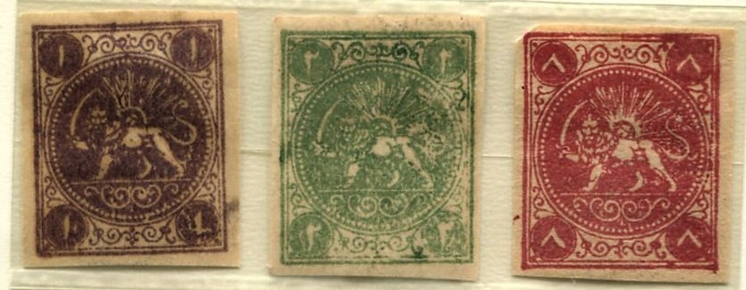
The elegant borders begin with Persia’s first stamps
(above), often called the bāqeri issue for reasons that remain
unclear. The design is based on an essay by Albert Désiré Barre (1818-1878),
the chief engraver at the Paris Mint. He also designed the French Napoleon III
series (1863-70) which bears a coin-like resemblance to the first Persian
stamps.

For Persia, Barre added flowing arabesques, Farsi
calligraphy, and a classical symbol of Persian royalty for the central image (a
sword wielding lion and a sun with a man’s face). Lion and sun images continue, either together or
separately, throughout early Persian philately. I regard my three bāqeris as
reprints, if not outright forgeries. When compared to expertized examples, many
minor variations show up. Moreover, Scott Catalog warns that forgeries
far outnumber genuine examples and provides a description of the reprints.


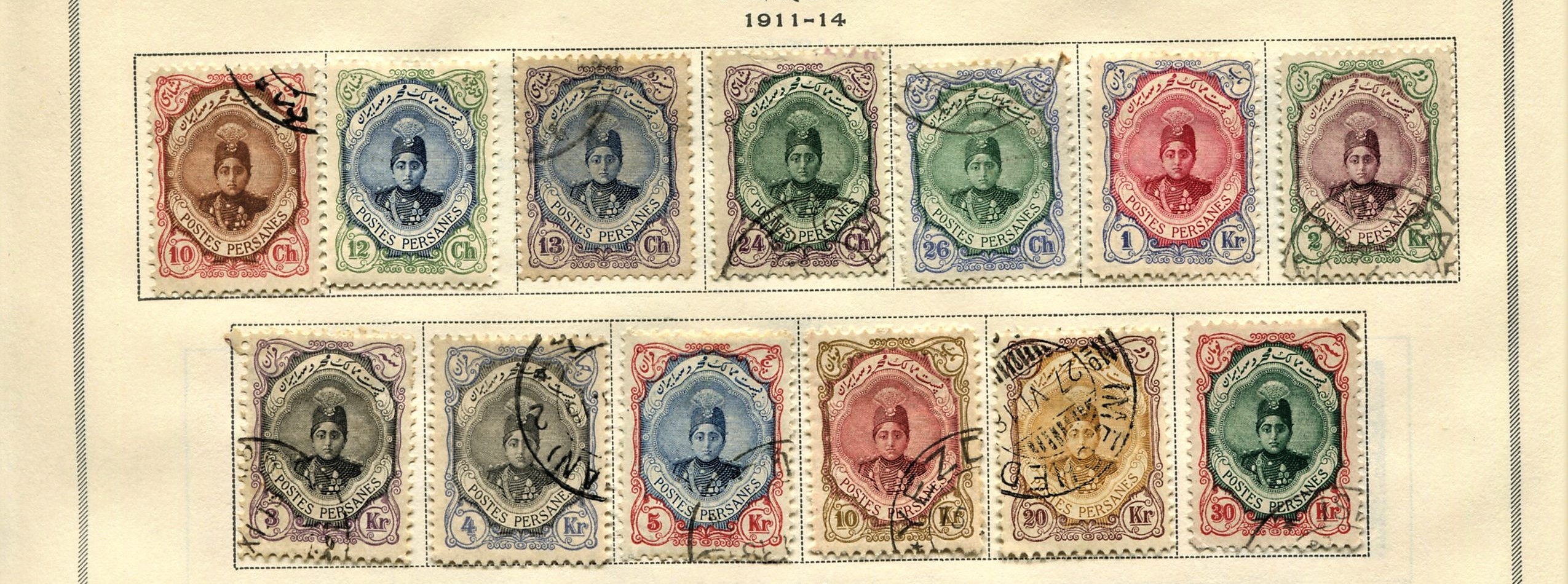
From
1881 onward “Postes Persanes” and values recognizable to Europeans were
inscribed, a result of the designs being produced mostly in France and
Austria, and of Persia’s entry into the Universal Postal Union (1877).
Consistent with the tradition of cultural blending apparent in Persia’s
classical sculpture, Persia’s stamps borrow designs from sources assistant as
Europe and Mongolia. This confluence is apparent in Scott 571 that shows part
of the ruins of the Apadana at Persepolis. King Darius sits on a throne
holding a lotus blossom in his left hand, attended by crown prince Xerxes I (in
Hebrew known as King Ahasuerus) who married the biblical Esther (possibly, but
debated among scholars).


Persian
cultural hybrids continue in the works of Rabee Baghshan, a contemporary
Iranian digital artist. She salvages the frame surrounding the sitar
player from stamps featuring Ahmed Shah Qajar, Scott #s 667-689. The befogged
men standing behind the musician hold Coca Cola bottles. (3) Titled “Woman
Stamp 2”, it is part of a series. A limited-edition print is available for
$2300, approximately the value of my Persia collection shown below.

Many
articles have been written about Persian stamp forgeries, so many that I have
trouble keeping up with experts’ findings and debates about them. I have,
however, started a forgery jail at the end of the Persia supplement pages. It’s
a work in progress.
Census:
412 in BB spaces, 11 tip-ins, 258 on supplement pages
(1) http://farahbakhsh.com/IranStampHistoryEn/IranStampHistory.html
(3) https://www.artsy.net/artwork/rabee-baghshani-woman-stamp-2


.jpg)


Hey Bud (and of course, Jim!),
ReplyDeleteI won a Persia lot in an auction last week—I didn’t overspend on it, since I’m assuming that all of the overprinted stamps aren’t the Real McCoys, but I was able to fill over 80 stamps for Persia in my '47 BB that I didn't have!
I’m also looking at your images and my new '23 Scott Classic when I’m entering them into my BB-- using your images as a reference as it's very helpful in ID'ing the stamps, and I’m wondering if the stamp you have in 174 is actually 175. My ’47 calls for the 2c Brown, and I think you have a 3c violet in that space. In your version, it might be the 3c instead of the 2c, but I figured if it’s not, that you want to get it correct.
In that lot I bought, there is an extra 2c if you want it!
Thanks to the both of you guys for all you do for us!
Ray
Ray - good pickup. ;-) Yes, 174 (rather than 175) for the space. We will see what Bud says.
DeleteYes, definitely it's an error. Many thanks for catching it. And thanks for helping me correct it.
Delete